
Recommended
More Related Content
What's hot
What's hot (20)
Viewers also liked
Viewers also liked (20)
Similar to Promotional Package Analysis
Similar to Promotional Package Analysis (20)
Recently uploaded
Recently uploaded (20)
Promotional Package Analysis
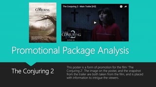
- 1. Promotional Package Analysis The Conjuring 2 This poster is a form of promotion for the film ‘The Conjuring 2’. The image on the poster, and the snapshot from the trailer are both taken from the film, and is placed with information to intrigue the viewers.
- 2. Images The images within both formats of promotion identify the products as ones for a horror genre. This is due to the imagery used in both such as the use of the rope in the centre of the film poster, and the use of crosses in the background of the still image for the trailer. In both of these products, the images, and video bring across the notion to the audience that there is suspense and tension within this horror genre. This is bought across through the idea of the desolated house in the poster, and the actual house that the film is being set in in the actual film trailer. All of the images present in both products use low key lighting, which connotes fear within the audience’s minds as it places their minds in the thought that something bad is going to happen. Overall, the images present in these packages make it obvious to viewers that this film contains a horror tragedy, creating a questionable and fearful brand identity.
- 3. Typography Serif font styles are used within both promotional packages which connote a sense of identity for the brand and show that they are well put together for the film they are promoting. They add to the branding of this promotional package as it gives the package a more mystical, supernatural feel, aimed at a teenager+ target audience. The fonts present are in dark colours, to add to the mystical feel of the genre even more and the suspense of the upcoming film can be highlighted here too due to the colour of the typography being black, white and an ice blue, which all add to the brand identity. The fonts are presented in an aggressive manner, due to the use of the serif fonts, which connotes sophistication, but also expresses to audience the type of film that it is that is being advertised.
- 4. Colours The colours present on these promotional packages highlight the fact that this package doesn’t always fit in well together to a high extent. This is due to the poster using high key lighting in order for audience to capture it in their eyesight from far away, whereas the film trailer uses a mixture of high and low key, in order to keep the readers intrigued for longer. The use of the colours also help tell the horror story that is being promoted. For example, the poster connotes the purity within the young girl before she becomes demonised, whereas the film trailer with the use of dark colours connotes the horror part of the film.
- 5. Mise-En-Scene There is lots of Mise-En-Scene portrayed within both of the promotional package elements, which help to engage the target audience with the film being advertised as one for the horror genre. On the poster, there are lots of elements such as the desolated house, the dark eerie setting, and the rope right in the centre of the image which connote to the audience that this is an advertisement for a horror film poster. All this use of mise-en-scene is very symbolic to this genre, and the promotion of the film for the target audience. This is because these are the types of things that they would be looking for to intrigue them into wanting to go and see the film. This links in with the mise-en-scene used in the film trailer for this same promotion. In the trailer, the main character us wearing old, ragged clothes which connotes the horror feel to the trailer. The colour of her outfit is red, which connotes danger and death. This is iconic, and conventional for horror films. This has allowed the film to create a good brand identity, as well as fitting in with the mise-en-scene of the poster which accompanies this trailer.