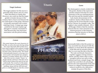
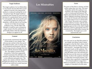
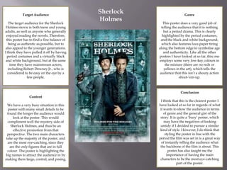
Ancillary Research Task
Target Audience
The target audience for this movie is
generally fairly broad, since it’s most
often described as a family film.
However, one could say that the target
gender is female, because of the
romance that is clear to see between the
two individuals on the poster. Romance
is typically associated with women
enjoying it more. A target age range
could be for the more mature age
(though it’s certainly not limited to
that) because they may find more
association with the period setting.
Content
This poster features the main characters of
the film, as well as the main driving setting
– the cruise ship itself. Both of these have
been used to appeal to the audience straight
away without them even reading any of the
text that comes with the poster. The Titanic
is internationally-famous, so having it on a
movie poster will instantly have people’s
attention. In similar fashion, this is why the
title of the movie is simply ‘Titanic’, as
people already will know what this movie
will be about without the need of any text
underneath. The overall art of the poster
has a period feel to it, looking almost like a
painting, along with the serif font used
gives it a suitable theme to what the content
itself is about.
Genre
The drama genre is clearly evident from
this poster, thanks to the expression
and the romance from the two main
characters in the eye-catching picture.
The serif font and the timeless artistic
look clearly demonstrates to the
audience clearly without them even
reading one bit of text that this would
not be a sitcom, for example’s sake. The
tagline is also notably dramatic. All in
all though, I believe that the emotion
between the two main characters is the
clearest giveaway of the dramatic
intentions that the narrative of the film
aims to deliver.
Conclusion
I personally believe that this poster is a
very successful one, because it tells the
audience so much about the intentions
of the film and its narrative before
they’ve even read the title of the film.
The male and female characters
together suggest a strong romance
theme, and the Titanic ship is iconic
enough to tell its own story to the
audience just from a simple image. The
poster has used this to its advantage,
and has also used appropriate fonts and
colours to a degree of professionalism
where it would be very difficult to
mistake the genre of this film.
Titanic
Target Audience
The target audience for Les Misérables
is very broad, because this film would
appeal to anyone who enjoyed the
musical, or enjoyed reading the novel.
In terms of age, the target audience
would be from around 16 years and up,
because it’s a particularly heavy movie
for some people. The movie poster gets
around this problem by being very
simplistic, with the idea of not scaring
anyone out of their broad target
audience away. On the other side
though, it could be seen as being too
vague on just who the audience is. I
personally believe that the simplistic
design is to appeal to all.
Content
As previously mentioned, the content
of this poster is very simple. The
obvious eye-catcher is the close up of
the child (Cosette), who is clearly seen
to be battered and bruised, with her
hair flowing around as though she was
outside with the elements biting against
her. The tagline consists of four
intransitive verbs that supposedly
would summarise the attitudes and
emotions of the film to the audience in
a very efficient and quick way. The
tagline also clashes with the child in a
thought-provoking way: these powerful
verbs are not what you would associate
with a child.
Genre
The genre of this film is a drama, and this
poster makes that very clear. The main
thing that catches the audience’s eye
instantly is the image of the little girl,
who is windswept and battered. The
taglines also help this poster point out its
genre. Fighting, dreaming, hoping and
loving are all concepts and actions that
you could expect to see in a drama film.
Like Titanic, this poster uses a darker
colour pallet for its style, with the dark
background and serif titles. The most eye
popping aspect of this is the child’s bright
blue eyes, which is appropriate when it’s
considered drama films follow human life
in normality. The bright eyes could
represent the soul.
Conclusion
It’s very easy to say that this poster is
too simple and doesn’t show clearly
enough on what the film’s about, but I
believe this poster has deeper – almost
subconscious – messages that leaves a
powerful mark on the audience. The
drama genre is clearly defined by not
only the battle scars, but with the fact
that the eyes are the most eye-catching
feature. It shows the audience that this
is a film that surrounds humans. The
simplicity does a good job of appealing
to its broad audience range, but I
believe it would be a very risky tactic to
employ if I decided to do the same.
Les Misérables
Target Audience
The target audience for the Sherlock
Holmes movie is both teens and young
adults, as well as anyone who generally
enjoyed reading the novels. Therefore,
this poster has to find a fine balance of
being as authentic as possible, but to
also appeal to the younger generations.
I think they have pulled it off by having
period costumes and a virtually black
and white background, but at the same
time they have mainstream actors,
including Robert Downey Jr., who is
considered to be easy on the eye by a
few people.
Content
We have a very busy situation in this
poster with many small details to be
found the longer the audience would
look at the poster. This would
compliment well the mystery side of
Sherlock Holmes, and thus be an
effective promotion from that
perspective. The two main characters
take up the majority of the poster, and
are the most eye-catching, since they
are the only figures that are in full
colour. The poster is highlighting the
big names to attract the audience in by
making them large, central, and posing.
Genre
This poster does a very good job of
telling the audience that it is nothing
but a period drama. This is clearly
highlighted by the period costumes,
and the black and white background,
which also features faux paper tiring
along the bottom edge to symbolise age
and authenticity. Like all the other
posters I have looked at so far, this one
employs some very low-key colours in
the mixture (there are no reds or
yellows in the art), which tells the
audience that this isn’t a shouty action
shoot-’em-up.
Conclusion
I think that this is the clearest poster I
have looked at so far in regards of what
it wants to show the audience in terms
of genre and the general gist of the
story. It is quite a ‘busy’ poster, which
may have the negatives of looking
untidy if I decided to pursue a similar
kind of style. However, I do think that
styling the poster in line with the
period the film was set in is a great way
of instantly telling the audience what
the backbone of the film is about. This
poster has also taught me the
importance of having the main
characters to be the most eye-catching
part of the poster.
Sherlock
Holmes

task 2

  • 1.
  • 2.
    Target Audience The targetaudience for this movie is generally fairly broad, since it’s most often described as a family film. However, one could say that the target gender is female, because of the romance that is clear to see between the two individuals on the poster. Romance is typically associated with women enjoying it more. A target age range could be for the more mature age (though it’s certainly not limited to that) because they may find more association with the period setting. Content This poster features the main characters of the film, as well as the main driving setting – the cruise ship itself. Both of these have been used to appeal to the audience straight away without them even reading any of the text that comes with the poster. The Titanic is internationally-famous, so having it on a movie poster will instantly have people’s attention. In similar fashion, this is why the title of the movie is simply ‘Titanic’, as people already will know what this movie will be about without the need of any text underneath. The overall art of the poster has a period feel to it, looking almost like a painting, along with the serif font used gives it a suitable theme to what the content itself is about. Genre The drama genre is clearly evident from this poster, thanks to the expression and the romance from the two main characters in the eye-catching picture. The serif font and the timeless artistic look clearly demonstrates to the audience clearly without them even reading one bit of text that this would not be a sitcom, for example’s sake. The tagline is also notably dramatic. All in all though, I believe that the emotion between the two main characters is the clearest giveaway of the dramatic intentions that the narrative of the film aims to deliver. Conclusion I personally believe that this poster is a very successful one, because it tells the audience so much about the intentions of the film and its narrative before they’ve even read the title of the film. The male and female characters together suggest a strong romance theme, and the Titanic ship is iconic enough to tell its own story to the audience just from a simple image. The poster has used this to its advantage, and has also used appropriate fonts and colours to a degree of professionalism where it would be very difficult to mistake the genre of this film. Titanic
  • 3.
    Target Audience The targetaudience for Les Misérables is very broad, because this film would appeal to anyone who enjoyed the musical, or enjoyed reading the novel. In terms of age, the target audience would be from around 16 years and up, because it’s a particularly heavy movie for some people. The movie poster gets around this problem by being very simplistic, with the idea of not scaring anyone out of their broad target audience away. On the other side though, it could be seen as being too vague on just who the audience is. I personally believe that the simplistic design is to appeal to all. Content As previously mentioned, the content of this poster is very simple. The obvious eye-catcher is the close up of the child (Cosette), who is clearly seen to be battered and bruised, with her hair flowing around as though she was outside with the elements biting against her. The tagline consists of four intransitive verbs that supposedly would summarise the attitudes and emotions of the film to the audience in a very efficient and quick way. The tagline also clashes with the child in a thought-provoking way: these powerful verbs are not what you would associate with a child. Genre The genre of this film is a drama, and this poster makes that very clear. The main thing that catches the audience’s eye instantly is the image of the little girl, who is windswept and battered. The taglines also help this poster point out its genre. Fighting, dreaming, hoping and loving are all concepts and actions that you could expect to see in a drama film. Like Titanic, this poster uses a darker colour pallet for its style, with the dark background and serif titles. The most eye popping aspect of this is the child’s bright blue eyes, which is appropriate when it’s considered drama films follow human life in normality. The bright eyes could represent the soul. Conclusion It’s very easy to say that this poster is too simple and doesn’t show clearly enough on what the film’s about, but I believe this poster has deeper – almost subconscious – messages that leaves a powerful mark on the audience. The drama genre is clearly defined by not only the battle scars, but with the fact that the eyes are the most eye-catching feature. It shows the audience that this is a film that surrounds humans. The simplicity does a good job of appealing to its broad audience range, but I believe it would be a very risky tactic to employ if I decided to do the same. Les Misérables
  • 4.
    Target Audience The targetaudience for the Sherlock Holmes movie is both teens and young adults, as well as anyone who generally enjoyed reading the novels. Therefore, this poster has to find a fine balance of being as authentic as possible, but to also appeal to the younger generations. I think they have pulled it off by having period costumes and a virtually black and white background, but at the same time they have mainstream actors, including Robert Downey Jr., who is considered to be easy on the eye by a few people. Content We have a very busy situation in this poster with many small details to be found the longer the audience would look at the poster. This would compliment well the mystery side of Sherlock Holmes, and thus be an effective promotion from that perspective. The two main characters take up the majority of the poster, and are the most eye-catching, since they are the only figures that are in full colour. The poster is highlighting the big names to attract the audience in by making them large, central, and posing. Genre This poster does a very good job of telling the audience that it is nothing but a period drama. This is clearly highlighted by the period costumes, and the black and white background, which also features faux paper tiring along the bottom edge to symbolise age and authenticity. Like all the other posters I have looked at so far, this one employs some very low-key colours in the mixture (there are no reds or yellows in the art), which tells the audience that this isn’t a shouty action shoot-’em-up. Conclusion I think that this is the clearest poster I have looked at so far in regards of what it wants to show the audience in terms of genre and the general gist of the story. It is quite a ‘busy’ poster, which may have the negatives of looking untidy if I decided to pursue a similar kind of style. However, I do think that styling the poster in line with the period the film was set in is a great way of instantly telling the audience what the backbone of the film is about. This poster has also taught me the importance of having the main characters to be the most eye-catching part of the poster. Sherlock Holmes