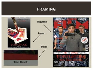
The document discusses the effectiveness of combining the main product (a horror film trailer) with ancillary texts (a poster and magazine front cover).
Some key points made:
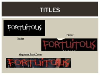
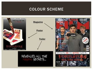
- The same distinct font and colors are used across all three products to brand the film and link the items together.
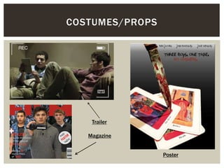
- Costumes in the trailer and magazine are similar everyday clothes to seem realistic, while the poster uses a prop knife and tarot cards.
- Colors like red, black, and white that suggest danger, death, and conflict are used consistently.
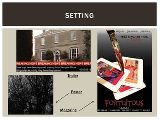
- Settings create a sense of vulnerability for the protagonists in different subtle ways across the products.
- Different elements are emphasized depending on the purpose and conventions of