
Recommended
More Related Content
What's hot
What's hot (20)
Viewers also liked
Similar to Red riding hood film poster analysis
Similar to Red riding hood film poster analysis (20)
More from leahwatts
More from leahwatts (20)
Recently uploaded
Recently uploaded (20)
Red riding hood film poster analysis
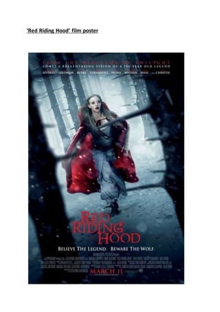
- 1. ‘Red Riding Hood’ film poster
- 2. The use of colour in this film poster for ‘Red Riding Hood’ is effective to look at as the audience as very few colours are used. The main colour that stands out from the rest of the poster is red. Firstly the use of red, which is a lot brighter than the rest of the poster, emphasises the main points that are key for the audience. For example ‘Red Riding Hood’ , ‘March 11’ and ‘From the director of Twilight’ are in red, showing these are the key features of the film and they are what you need to read to know whether to go and see the film. Secondly, the use of red is also effective as the colour red is usually associated with danger, but also could be linked to love. This colour could also be linked with blood and people getting hurt. This links to the genre of this film which is romance/thriller/mystery, which shows that this poster gives away the genre just by an image with text surrounding it, so the audience can see whether they want to see it according to their own genre preferences. This gives the audience an idea about what the film is going to entail and what kind of storyline it will follow. Red is also used on Amanda Seyfri ed’s cape which may reflect to the audience that she is the main character and also that she is the one the love and danger is based around, again giving the audience a clear insight into the film just through the colours used. Everything else on this film poster is quite dark and suttle, as some may want to know all of the small details, but they are not the most important things to know about the film. The image used for this film poster, also may give the audience an insight into what the film is about. From the positioning of everything in the image, the audience can see that it looks as if the main character is trapped somewhere, we can see this as at the front of the frame we can see trees with thorns coming out of them, and we can also see this at the back of the frame. The woman is the stuck in between all of this, which gives the impression that the woman is going to be stuck between things, whether it is about love or even something more dangerous. The main characters facial expression also tells the audience that this film may not be very happy throughout, as she looks quite afraid and worried about what is going to happen next. This gives the audience a sense of tension as they may want to find out why she is trapped and is afraid, which is a reason for them to go and watch the film, to find out the ending and the reason for this image. The text used in this poster links in with the colours used, as different text is in different colours to emphasise the importance of certain parts. The text used is a big selling point of the film/poster as it only features points that are going to make the film stand out from all other films of this genre. The text at the very top of the poster, in red (key point) states “From the director of Twilight”, this would be a very big unique selling point as the Twilight films were such a success and were watched by a very wide range of people all over the world, which from making a point of this could mean that this film might get some of that audience, making this film just as much of a success. The reference to Twilight would attract people to look at the poster as if they liked that film they may like this one, meaning the film will attract a larger audience, potentially meaning it could be a success. Another key selling point for this film is the title of it ‘Red Riding Hood’. ‘Little Red Riding Hood’ is known by most people all over the world as a children’s tale, so this links to this film and clearly has a mystery spin on it as the audience won’t really know what happens throughout the film until they go and see it. So the way it is a remake of the children’s story, may make people want to see it to see the difference and a new
- 3. take on it. The use of the text near the top of the poster, where it states the actor’s names may be a reason for the audience to go and see the film, giving a reason for this being added to the poster. Amanda Seyfried is the first name to be included, which links with the image used as that is her, so this helps the audience put a name to the face they see. They may recognise her from her other well known films, for example the very popular film ‘Mean Girls’, so fans of this and her may be influenced to go and see it due to the main character. The other text that is used on this poster shows the genre of the film along with the other elements that show this. The text ‘Believe the legend. Beware the wolf’ used shows the thriller genre in a way as the words ‘beware’ and ‘wolf’ show a feeling of danger and violence in order to achieve something. The layout of this poster is very effective in the way it sells the film to the audience. Directly in the middle of the poster at the bottom is says ‘March 11’ in red font, this tells the audience the exact date that it is coming out which informs them of when to go and see it before others. The use of the red and the positioning of this text is very effective, as all of the other text around it is grey and very small, making this one important fact stand out so they remember it for the release of the film, which is the most important part of a film’s release (opening weekend) . The way the title of the film is placed quite near the bottom of the poster along with the date, links to how trailers usually work, when the film title and date is shown at/near the end. This is the last thing the viewer will see so will remember the most, which is why they have been cleverly placed here in order to help the audience remember the two key points they need to know- the title of the film and the release date.