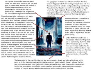
SlideShare a Scribd company logo
Poster analysis
By Georgia Gibbs
The typography for the main film title is in Red which connotes danger and is key when linked to the
genre of thriller. It also contrasts with the background as it stands out with the dark colours. The font
type is the same as used in the trailer which shows synergy has been used. However the typography is
hard to see to an extent as the font is a maze type font which makes it appear almost transparent,
this kind of contrast with the water makes it slightly hard to read and not in your face.
The typography at the top is a different font from the other
texts on the poster which immediately makes it stand out, also
the colour contrasts with the background making it evident to
the audience. Further, the text is the name of a famous actor
who is also the protagonist. This instantly is a hook to the
audience a it draws their attention to the fact that this actor is
in the film and this leaves enigma of the image being the
protagonist.The main image is like a silhouette, as it is very
dark and not much is revealed from the
protagonist. Also, the image is taken from behind
which uses enigma as the audience cannot see
the actors face and therefore cannot connect
with the audience. The actor has a prop in his
right hand which appears to be a gun, this shows
the genre coming to light and also connotes that
there may be violence/ action in this film. This is
typical of the thriller genre and will be a hook to
entice thriller lovers to watch the film.
The low-key lighting of the background image
also gives a mysterious feeling and follows typical
conventions of the thriller genre using dark
colours to show the genre. It also shows water in
the image and this is another enigma for the
audience as it is a new idea which could become
important in the film. Also the use of the blue
colours connote fantasy which links into the film
with the dreams. These are ideas which are often
used in the thriller genre to convey the idea.
The tag line ‘Your mind is the scene of the
crime’, this is the main slogan for the film, this
gives an idea of what the film may contain. It
is short and therefore fairly catchy. It is
personal to the audience as it uses the
pronoun ‘you’ and this leaves enigma with
the audience enticing them to watch the film.
The film credits are a convention of
every film poster and this is
traditional and therefore paramount
that this is included. The use of
translucent white writing and simple
font works as it does not stand out.
This is important as it reflects the fact
that it is not as important as the rest
of the writing.
Under the film credits there is a
release date in bolder writing which
can be seen clearly. ‘Summer 2016’
is the release date given and the
noun ‘experience’ used makes the
connection with the audience more
appealing and hooking and therefore
creates a sense of enigma and
excitement for the release of the
film.
The mise en scene of the image appears to be
a lake. This links into the establishing shot of
the trailer being by a lake, this connotes that
this may be significant in the storyline with
the disappearance of Amy.
The dark colours used in the image
include greys and blacks. These are
typical of the thriller genre as they
show mystery and sadness which links
to the storyline. The colours are subtle
as they are not intense and this
connotes an enigma in the storyline.
There are two images within this
poster and one is a lot more subtle
than the other. The eyes above the
main title ‘Gone Girl’ link in with the
film really well she is faded therefore
‘gone.’ This links well into the whole
poster as it shows the link of the title
and enigma in the storyline.
The other image is a small size, with
dark colours which make it look sort
of like a silhouette but it is still evident
that it is of the male. This shows
obviously that the two images are the
main characters and this causes
enigma.
The two main characters are written at
the top of the poster to show that these
are the protagonists and that the two
images are of them. Also, the fact that
these two are much larger than the cast
and crew at the bottom shows they are
probably well known actors.
The main typography of the name of
the film is in sans-serif font. The
cloud that surrounds it contrasts well
as it makes it stand out more. This
colour scheme is typical of working
out the genre, the darkness connotes
thriller genre and the typography
shows that it is a psychological
thriller.
The bottom of the poster shows typical conventions of a film poster. It has the release
date in a bolder colour than the rest of the film credits and this makes it stand out. The
rest of the typography is in a faint colour which makes it less significant and also shows
that there is no aim for this to be the attention of the audience. There is some use of
intertexuality as it has ‘#gonegirl’ which shows the audience can follow the film on social
media to keep up with the updates of the film.
The tag-line of the film is in a central
position and this shows it is
important in hooking in the
audience. This goes against generic
conventions as it is typical that a tag
line normally appears above the title
and at the top. Further, the ellipsis
connotes enigma in the film and also
hooks in the audience to find out
about the tag line. Further the pro
noun ‘you’ makes it feel personal to
the audience and this is important in
gaining the attention of the target
demographic as they feel connected
to the film.
‘Halloween’ is the text that stands out the
most from the poster; this is due to the size
of it being larger than other fonts and also
the use of the bold, contrasting colour of
orange. The use of the colour orange for the
main text signifies a number of things such as
fire, pumpkins, rope and also fear. These are
all conventions that link to the horror genre,
similarly the connotations of the word
‘Halloween’ are scary costumes and danger.
This is significant in the film meeting the
conventions of horror genre as well as the
sub-genre ‘slasher.’
The silhouette on the poster appears
to be holding a knife in his right hand
and a head in his left; this immediately
connotes danger, violence and ‘slasher’
sub-genre theme. The sharp weapon
which is a knife symbolises death and
gore, this links to the head which is
being held in his other hand that the
film will involve slaughter/ torture
meeting conventions of the slasher
horror genre.
The use of these props and the houses
in the background make you question
where he is, who he has harmed and
what will happen next, this is links to
the Enigma code that Roland Barthes
created.
The tag line that has been used ‘Evil has a
destiny’ is in white writing which signifies
purity which juxtaposes the content of the
poster but adds to the effect. The information
of the poster such as the director, producer
and credits is all in a darker colour so that the
attention is directed at the main title.
This is a generic horror poster as it
includes typical technical codes. This is
because there is use of fire which
connotes hell and links into the genre.
The lighting has made the villain appear
powerful as you can not identify the
person in the picture. This makes the
audience feel threat towards this
character as there is suspense.
Black, red and orange are the main
colours used and these signify hell,
danger and blood/gore. These link in
very well to the horror genre. The
white typography for the tagline
contrasts the colours and stands out,
this may also connote that there are
opposites in this film. The colours
also link into the event of
“Halloween” as they are orange and
both of the images are masked and
cannot be identified, linking into the
horror of this one night and leaving
enigma with the audience.
It is obvious that the genre of this poster is
horror immediately. This is because it is
objectified to make it easily identifiable,
the colours of darkness, props and obvious
violence all connote the horror genre, and
this will help with aiming at the target
audience. As soon as someone who enjoys
horror sees this poster they will be hooked
so these obvious conventions are good for
the target demographic.
The bottom of the poster shows typical
conventions of a film poster. It has the
release date in a bolder colour than the rest
of the film credits and this makes it stand out
as it is red. The rest of the typography is in a
faint colour which makes it less significant
and also shows that there is no aim for this
to be the attention of the audience.

More Related Content

What's hot

Evaluation q1
Evaluation q1Evaluation q1
Evaluation q1
Chloe1312
 
Structure types
Structure typesStructure types
Structure types
wisdoms
 
9 frame shot analysis
9 frame shot analysis9 frame shot analysis
9 frame shot analysis
christyBB123
 
Evaluation activity 1
Evaluation activity 1Evaluation activity 1
Evaluation activity 1
milo197
 
Treatment of Advanced Portfolio
Treatment of Advanced PortfolioTreatment of Advanced Portfolio
Treatment of Advanced Portfolio
Mediawork100
 
The insane essay
The insane essayThe insane essay
The insane essay
maddielois
 
Textual analysis of 2 soap opera trailers
Textual analysis of 2 soap opera trailersTextual analysis of 2 soap opera trailers
Textual analysis of 2 soap opera trailers
adamfox2052
 
Here is the name of the film
Here is the name of the filmHere is the name of the film
Here is the name of the film
Francesca Wenn
 

What's hot (20)

9.Conventions of Slasher
9.Conventions of Slasher9.Conventions of Slasher
9.Conventions of Slasher
 
Evaluation q1
Evaluation q1Evaluation q1
Evaluation q1
 
20.Poster Analysis - Friday the 13th
20.Poster Analysis - Friday the 13th 20.Poster Analysis - Friday the 13th
20.Poster Analysis - Friday the 13th
 
Structure types
Structure typesStructure types
Structure types
 
Generic conventions of Horror Film Posters
Generic conventions of Horror Film PostersGeneric conventions of Horror Film Posters
Generic conventions of Horror Film Posters
 
9 frame shot analysis
9 frame shot analysis9 frame shot analysis
9 frame shot analysis
 
Evaluation activity 1
Evaluation activity 1Evaluation activity 1
Evaluation activity 1
 
Analysing Horror Posters
Analysing Horror PostersAnalysing Horror Posters
Analysing Horror Posters
 
Treatment of Advanced Portfolio
Treatment of Advanced PortfolioTreatment of Advanced Portfolio
Treatment of Advanced Portfolio
 
The insane essay
The insane essayThe insane essay
The insane essay
 
M1 PPT
M1 PPTM1 PPT
M1 PPT
 
Horror Film Pitch
Horror Film PitchHorror Film Pitch
Horror Film Pitch
 
Analsying Screenshots
Analsying ScreenshotsAnalsying Screenshots
Analsying Screenshots
 
Trailer Analysis: LA Confidential
Trailer Analysis: LA ConfidentialTrailer Analysis: LA Confidential
Trailer Analysis: LA Confidential
 
Conventions of a Thriller
Conventions of a ThrillerConventions of a Thriller
Conventions of a Thriller
 
Textual analysis of 2 soap opera trailers
Textual analysis of 2 soap opera trailersTextual analysis of 2 soap opera trailers
Textual analysis of 2 soap opera trailers
 
Here is the name of the film
Here is the name of the filmHere is the name of the film
Here is the name of the film
 
AS Media - Conventions of a Thriller
AS Media - Conventions of a ThrillerAS Media - Conventions of a Thriller
AS Media - Conventions of a Thriller
 
Thriller Film titles analysis
Thriller Film titles analysisThriller Film titles analysis
Thriller Film titles analysis
 
Treatment
TreatmentTreatment
Treatment
 

Viewers also liked

Viewers also liked (10)

poster_final
poster_finalposter_final
poster_final
 
Grameen Final Paper 303
Grameen Final Paper 303Grameen Final Paper 303
Grameen Final Paper 303
 
Pavel Dabrytski - Agile Africa 2015 - Agile Economics - budgets, contacts, ca...
Pavel Dabrytski - Agile Africa 2015 - Agile Economics - budgets, contacts, ca...Pavel Dabrytski - Agile Africa 2015 - Agile Economics - budgets, contacts, ca...
Pavel Dabrytski - Agile Africa 2015 - Agile Economics - budgets, contacts, ca...
 
Eu ppt presentation pq projektledning allmän
Eu ppt presentation pq projektledning allmänEu ppt presentation pq projektledning allmän
Eu ppt presentation pq projektledning allmän
 
Silabus pai-kelas-ix
Silabus pai-kelas-ixSilabus pai-kelas-ix
Silabus pai-kelas-ix
 
Interactive Video for Teaching and Learning
Interactive Video for Teaching and LearningInteractive Video for Teaching and Learning
Interactive Video for Teaching and Learning
 
Business Intelligence and Big Data in Cloud
Business Intelligence and Big Data in CloudBusiness Intelligence and Big Data in Cloud
Business Intelligence and Big Data in Cloud
 
Presentacion algoritmos
Presentacion algoritmosPresentacion algoritmos
Presentacion algoritmos
 
Curso de Algoritmos - Presentación 1
Curso de Algoritmos - Presentación 1Curso de Algoritmos - Presentación 1
Curso de Algoritmos - Presentación 1
 
Renascimento Cultural
Renascimento CulturalRenascimento Cultural
Renascimento Cultural
 

Similar to Poster analysis

Appendix 9 - Film Posters
Appendix 9 - Film PostersAppendix 9 - Film Posters
Appendix 9 - Film Posters
bethholli
 
Mama poster annotation
Mama poster annotationMama poster annotation
Mama poster annotation
emilykingers
 
Poster Analysis
Poster AnalysisPoster Analysis
Poster Analysis
Tiffany TC
 
Poster Analysis
Poster AnalysisPoster Analysis
Poster Analysis
Tiffany TC
 
Movie poster analysis
Movie poster analysisMovie poster analysis
Movie poster analysis
chloow
 
Poster analysis
Poster analysisPoster analysis
Poster analysis
holly
 
Psychological Thriller Poster + Website analysis
Psychological Thriller Poster + Website analysisPsychological Thriller Poster + Website analysis
Psychological Thriller Poster + Website analysis
amyhowesmediastudies
 

Similar to Poster analysis (20)

a level film poster analysis
a level film poster analysisa level film poster analysis
a level film poster analysis
 
a level media film poster analysis
a level media film poster analysisa level media film poster analysis
a level media film poster analysis
 
Film poster analysis
Film poster analysisFilm poster analysis
Film poster analysis
 
Appendix 9 - Film Posters
Appendix 9 - Film PostersAppendix 9 - Film Posters
Appendix 9 - Film Posters
 
Poster Analysis
Poster AnalysisPoster Analysis
Poster Analysis
 
Poster Analysis 3
Poster Analysis 3Poster Analysis 3
Poster Analysis 3
 
Poster Analysis 3
Poster Analysis 3Poster Analysis 3
Poster Analysis 3
 
Mama poster annotation
Mama poster annotationMama poster annotation
Mama poster annotation
 
Poster Analysis 3
Poster Analysis 3Poster Analysis 3
Poster Analysis 3
 
Poster Analysis
Poster AnalysisPoster Analysis
Poster Analysis
 
Poster Analysis
Poster AnalysisPoster Analysis
Poster Analysis
 
Movie poster analysis
Movie poster analysisMovie poster analysis
Movie poster analysis
 
Poster analysis
Poster analysisPoster analysis
Poster analysis
 
Poster analysis me and hollz
Poster analysis me and hollzPoster analysis me and hollz
Poster analysis me and hollz
 
Poster Analysis x14
Poster Analysis x14Poster Analysis x14
Poster Analysis x14
 
Film poster analysis
Film poster analysisFilm poster analysis
Film poster analysis
 
Horror poster analysis
Horror poster analysisHorror poster analysis
Horror poster analysis
 
Psychological Thriller Poster + Website analysis
Psychological Thriller Poster + Website analysisPsychological Thriller Poster + Website analysis
Psychological Thriller Poster + Website analysis
 
Horror Film Poster Analysis
Horror Film Poster AnalysisHorror Film Poster Analysis
Horror Film Poster Analysis
 
Horror poster ancillary
Horror poster ancillaryHorror poster ancillary
Horror poster ancillary
 

Recently uploaded

Additional Benefits for Employee Website.pdf
Additional Benefits for Employee Website.pdfAdditional Benefits for Employee Website.pdf
Additional Benefits for Employee Website.pdf
joachimlavalley1
 

Recently uploaded (20)

Instructions for Submissions thorugh G- Classroom.pptx
Instructions for Submissions thorugh G- Classroom.pptxInstructions for Submissions thorugh G- Classroom.pptx
Instructions for Submissions thorugh G- Classroom.pptx
 
Telling Your Story_ Simple Steps to Build Your Nonprofit's Brand Webinar.pdf
Telling Your Story_ Simple Steps to Build Your Nonprofit's Brand Webinar.pdfTelling Your Story_ Simple Steps to Build Your Nonprofit's Brand Webinar.pdf
Telling Your Story_ Simple Steps to Build Your Nonprofit's Brand Webinar.pdf
 
Operations Management - Book1.p - Dr. Abdulfatah A. Salem
Operations Management - Book1.p  - Dr. Abdulfatah A. SalemOperations Management - Book1.p  - Dr. Abdulfatah A. Salem
Operations Management - Book1.p - Dr. Abdulfatah A. Salem
 
The Art Pastor's Guide to Sabbath | Steve Thomason
The Art Pastor's Guide to Sabbath | Steve ThomasonThe Art Pastor's Guide to Sabbath | Steve Thomason
The Art Pastor's Guide to Sabbath | Steve Thomason
 
Students, digital devices and success - Andreas Schleicher - 27 May 2024..pptx
Students, digital devices and success - Andreas Schleicher - 27 May 2024..pptxStudents, digital devices and success - Andreas Schleicher - 27 May 2024..pptx
Students, digital devices and success - Andreas Schleicher - 27 May 2024..pptx
 
How to the fix Attribute Error in odoo 17
How to the fix Attribute Error in odoo 17How to the fix Attribute Error in odoo 17
How to the fix Attribute Error in odoo 17
 
The impact of social media on mental health and well-being has been a topic o...
The impact of social media on mental health and well-being has been a topic o...The impact of social media on mental health and well-being has been a topic o...
The impact of social media on mental health and well-being has been a topic o...
 
size separation d pharm 1st year pharmaceutics
size separation d pharm 1st year pharmaceuticssize separation d pharm 1st year pharmaceutics
size separation d pharm 1st year pharmaceutics
 
Additional Benefits for Employee Website.pdf
Additional Benefits for Employee Website.pdfAdditional Benefits for Employee Website.pdf
Additional Benefits for Employee Website.pdf
 
Matatag-Curriculum and the 21st Century Skills Presentation.pptx
Matatag-Curriculum and the 21st Century Skills Presentation.pptxMatatag-Curriculum and the 21st Century Skills Presentation.pptx
Matatag-Curriculum and the 21st Century Skills Presentation.pptx
 
Sha'Carri Richardson Presentation 202345
Sha'Carri Richardson Presentation 202345Sha'Carri Richardson Presentation 202345
Sha'Carri Richardson Presentation 202345
 
Basic_QTL_Marker-assisted_Selection_Sourabh.ppt
Basic_QTL_Marker-assisted_Selection_Sourabh.pptBasic_QTL_Marker-assisted_Selection_Sourabh.ppt
Basic_QTL_Marker-assisted_Selection_Sourabh.ppt
 
How to Create Map Views in the Odoo 17 ERP
How to Create Map Views in the Odoo 17 ERPHow to Create Map Views in the Odoo 17 ERP
How to Create Map Views in the Odoo 17 ERP
 
[GDSC YCCE] Build with AI Online Presentation
[GDSC YCCE] Build with AI Online Presentation[GDSC YCCE] Build with AI Online Presentation
[GDSC YCCE] Build with AI Online Presentation
 
Keeping Your Information Safe with Centralized Security Services
Keeping Your Information Safe with Centralized Security ServicesKeeping Your Information Safe with Centralized Security Services
Keeping Your Information Safe with Centralized Security Services
 
Mattingly "AI & Prompt Design: Limitations and Solutions with LLMs"
Mattingly "AI & Prompt Design: Limitations and Solutions with LLMs"Mattingly "AI & Prompt Design: Limitations and Solutions with LLMs"
Mattingly "AI & Prompt Design: Limitations and Solutions with LLMs"
 
INU_CAPSTONEDESIGN_비밀번호486_업로드용 발표자료.pdf
INU_CAPSTONEDESIGN_비밀번호486_업로드용 발표자료.pdfINU_CAPSTONEDESIGN_비밀번호486_업로드용 발표자료.pdf
INU_CAPSTONEDESIGN_비밀번호486_업로드용 발표자료.pdf
 
2024_Student Session 2_ Set Plan Preparation.pptx
2024_Student Session 2_ Set Plan Preparation.pptx2024_Student Session 2_ Set Plan Preparation.pptx
2024_Student Session 2_ Set Plan Preparation.pptx
 
B.ed spl. HI pdusu exam paper-2023-24.pdf
B.ed spl. HI pdusu exam paper-2023-24.pdfB.ed spl. HI pdusu exam paper-2023-24.pdf
B.ed spl. HI pdusu exam paper-2023-24.pdf
 
Danh sách HSG Bộ môn cấp trường - Cấp THPT.pdf
Danh sách HSG Bộ môn cấp trường - Cấp THPT.pdfDanh sách HSG Bộ môn cấp trường - Cấp THPT.pdf
Danh sách HSG Bộ môn cấp trường - Cấp THPT.pdf
 

Poster analysis

  • 2. The typography for the main film title is in Red which connotes danger and is key when linked to the genre of thriller. It also contrasts with the background as it stands out with the dark colours. The font type is the same as used in the trailer which shows synergy has been used. However the typography is hard to see to an extent as the font is a maze type font which makes it appear almost transparent, this kind of contrast with the water makes it slightly hard to read and not in your face. The typography at the top is a different font from the other texts on the poster which immediately makes it stand out, also the colour contrasts with the background making it evident to the audience. Further, the text is the name of a famous actor who is also the protagonist. This instantly is a hook to the audience a it draws their attention to the fact that this actor is in the film and this leaves enigma of the image being the protagonist.The main image is like a silhouette, as it is very dark and not much is revealed from the protagonist. Also, the image is taken from behind which uses enigma as the audience cannot see the actors face and therefore cannot connect with the audience. The actor has a prop in his right hand which appears to be a gun, this shows the genre coming to light and also connotes that there may be violence/ action in this film. This is typical of the thriller genre and will be a hook to entice thriller lovers to watch the film. The low-key lighting of the background image also gives a mysterious feeling and follows typical conventions of the thriller genre using dark colours to show the genre. It also shows water in the image and this is another enigma for the audience as it is a new idea which could become important in the film. Also the use of the blue colours connote fantasy which links into the film with the dreams. These are ideas which are often used in the thriller genre to convey the idea. The tag line ‘Your mind is the scene of the crime’, this is the main slogan for the film, this gives an idea of what the film may contain. It is short and therefore fairly catchy. It is personal to the audience as it uses the pronoun ‘you’ and this leaves enigma with the audience enticing them to watch the film. The film credits are a convention of every film poster and this is traditional and therefore paramount that this is included. The use of translucent white writing and simple font works as it does not stand out. This is important as it reflects the fact that it is not as important as the rest of the writing. Under the film credits there is a release date in bolder writing which can be seen clearly. ‘Summer 2016’ is the release date given and the noun ‘experience’ used makes the connection with the audience more appealing and hooking and therefore creates a sense of enigma and excitement for the release of the film.
  • 3. The mise en scene of the image appears to be a lake. This links into the establishing shot of the trailer being by a lake, this connotes that this may be significant in the storyline with the disappearance of Amy. The dark colours used in the image include greys and blacks. These are typical of the thriller genre as they show mystery and sadness which links to the storyline. The colours are subtle as they are not intense and this connotes an enigma in the storyline. There are two images within this poster and one is a lot more subtle than the other. The eyes above the main title ‘Gone Girl’ link in with the film really well she is faded therefore ‘gone.’ This links well into the whole poster as it shows the link of the title and enigma in the storyline. The other image is a small size, with dark colours which make it look sort of like a silhouette but it is still evident that it is of the male. This shows obviously that the two images are the main characters and this causes enigma. The two main characters are written at the top of the poster to show that these are the protagonists and that the two images are of them. Also, the fact that these two are much larger than the cast and crew at the bottom shows they are probably well known actors. The main typography of the name of the film is in sans-serif font. The cloud that surrounds it contrasts well as it makes it stand out more. This colour scheme is typical of working out the genre, the darkness connotes thriller genre and the typography shows that it is a psychological thriller. The bottom of the poster shows typical conventions of a film poster. It has the release date in a bolder colour than the rest of the film credits and this makes it stand out. The rest of the typography is in a faint colour which makes it less significant and also shows that there is no aim for this to be the attention of the audience. There is some use of intertexuality as it has ‘#gonegirl’ which shows the audience can follow the film on social media to keep up with the updates of the film. The tag-line of the film is in a central position and this shows it is important in hooking in the audience. This goes against generic conventions as it is typical that a tag line normally appears above the title and at the top. Further, the ellipsis connotes enigma in the film and also hooks in the audience to find out about the tag line. Further the pro noun ‘you’ makes it feel personal to the audience and this is important in gaining the attention of the target demographic as they feel connected to the film.
  • 4. ‘Halloween’ is the text that stands out the most from the poster; this is due to the size of it being larger than other fonts and also the use of the bold, contrasting colour of orange. The use of the colour orange for the main text signifies a number of things such as fire, pumpkins, rope and also fear. These are all conventions that link to the horror genre, similarly the connotations of the word ‘Halloween’ are scary costumes and danger. This is significant in the film meeting the conventions of horror genre as well as the sub-genre ‘slasher.’ The silhouette on the poster appears to be holding a knife in his right hand and a head in his left; this immediately connotes danger, violence and ‘slasher’ sub-genre theme. The sharp weapon which is a knife symbolises death and gore, this links to the head which is being held in his other hand that the film will involve slaughter/ torture meeting conventions of the slasher horror genre. The use of these props and the houses in the background make you question where he is, who he has harmed and what will happen next, this is links to the Enigma code that Roland Barthes created. The tag line that has been used ‘Evil has a destiny’ is in white writing which signifies purity which juxtaposes the content of the poster but adds to the effect. The information of the poster such as the director, producer and credits is all in a darker colour so that the attention is directed at the main title. This is a generic horror poster as it includes typical technical codes. This is because there is use of fire which connotes hell and links into the genre. The lighting has made the villain appear powerful as you can not identify the person in the picture. This makes the audience feel threat towards this character as there is suspense. Black, red and orange are the main colours used and these signify hell, danger and blood/gore. These link in very well to the horror genre. The white typography for the tagline contrasts the colours and stands out, this may also connote that there are opposites in this film. The colours also link into the event of “Halloween” as they are orange and both of the images are masked and cannot be identified, linking into the horror of this one night and leaving enigma with the audience. It is obvious that the genre of this poster is horror immediately. This is because it is objectified to make it easily identifiable, the colours of darkness, props and obvious violence all connote the horror genre, and this will help with aiming at the target audience. As soon as someone who enjoys horror sees this poster they will be hooked so these obvious conventions are good for the target demographic. The bottom of the poster shows typical conventions of a film poster. It has the release date in a bolder colour than the rest of the film credits and this makes it stand out as it is red. The rest of the typography is in a faint colour which makes it less significant and also shows that there is no aim for this to be the attention of the audience.