Best practice
for UX deliverables
!
!

by Anna Dahlström | @annadahlstrom

05 March 2014

www.flickr.com/photos/jmsmith000/3169546564
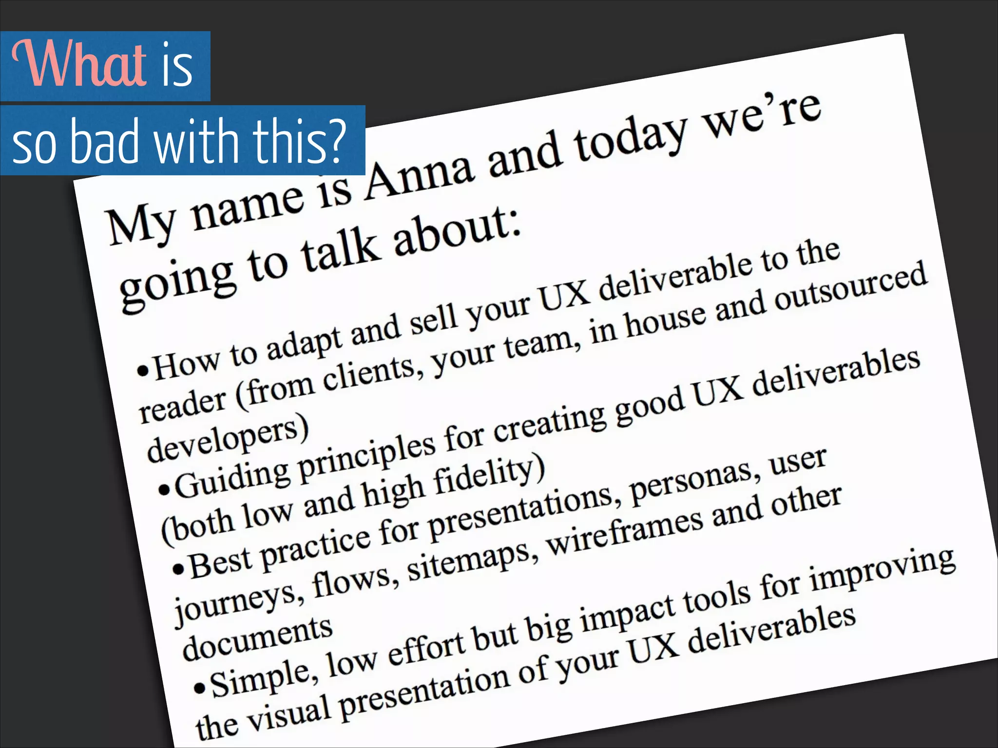
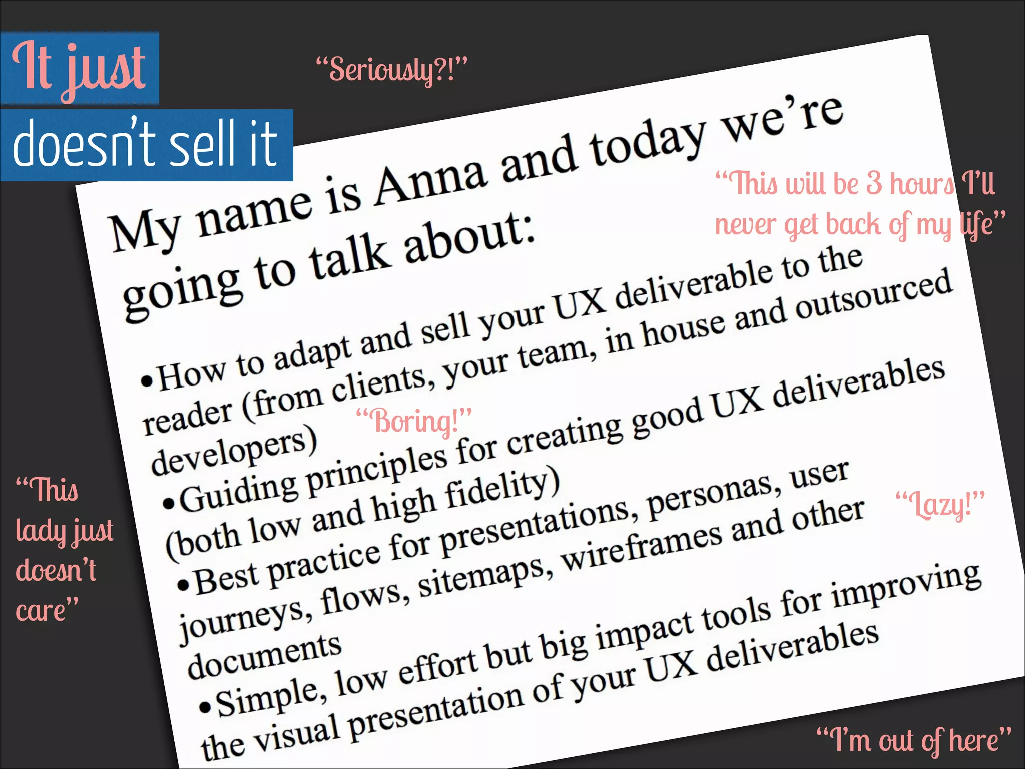
My name is Anna and today we’re
going to talk about:
!

•How to adapt and sell your UX deliverable to the
reader (from clients, your team, in house and outsourced
developers)
•Guiding principles for creating good UX deliverables
(both low and high fidelity)
•Best practice for presentations, personas, user
journeys, flows, sitemaps, wireframes and other
documents
•Simple, low effort but big impact tools for improving
the visual presentation of your UX deliverables
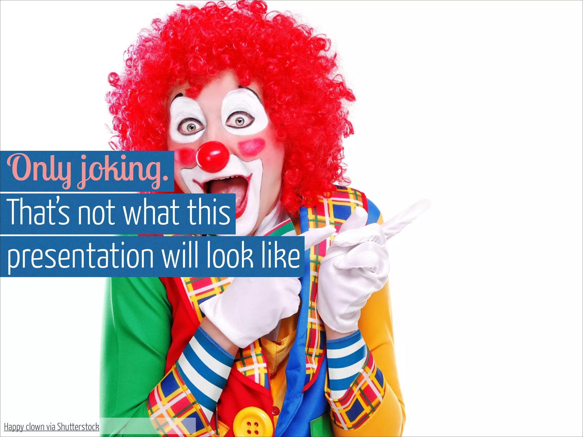
Only joking.
That’s not what this 

presentation will look like

Happy clown via Shutterstock
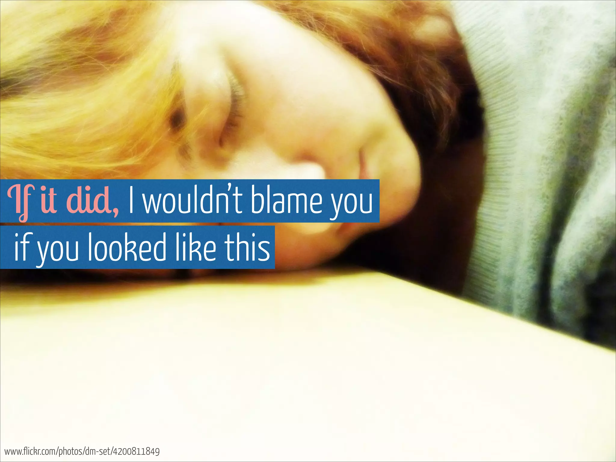
If it did, I wouldn’t blame you

if you looked like this

www.flickr.com/photos/dm-set/4200811849
What is 

so bad with this?
First of all, it makes you

want to do this

www.flickr.com/photos/dm-set/4200811849
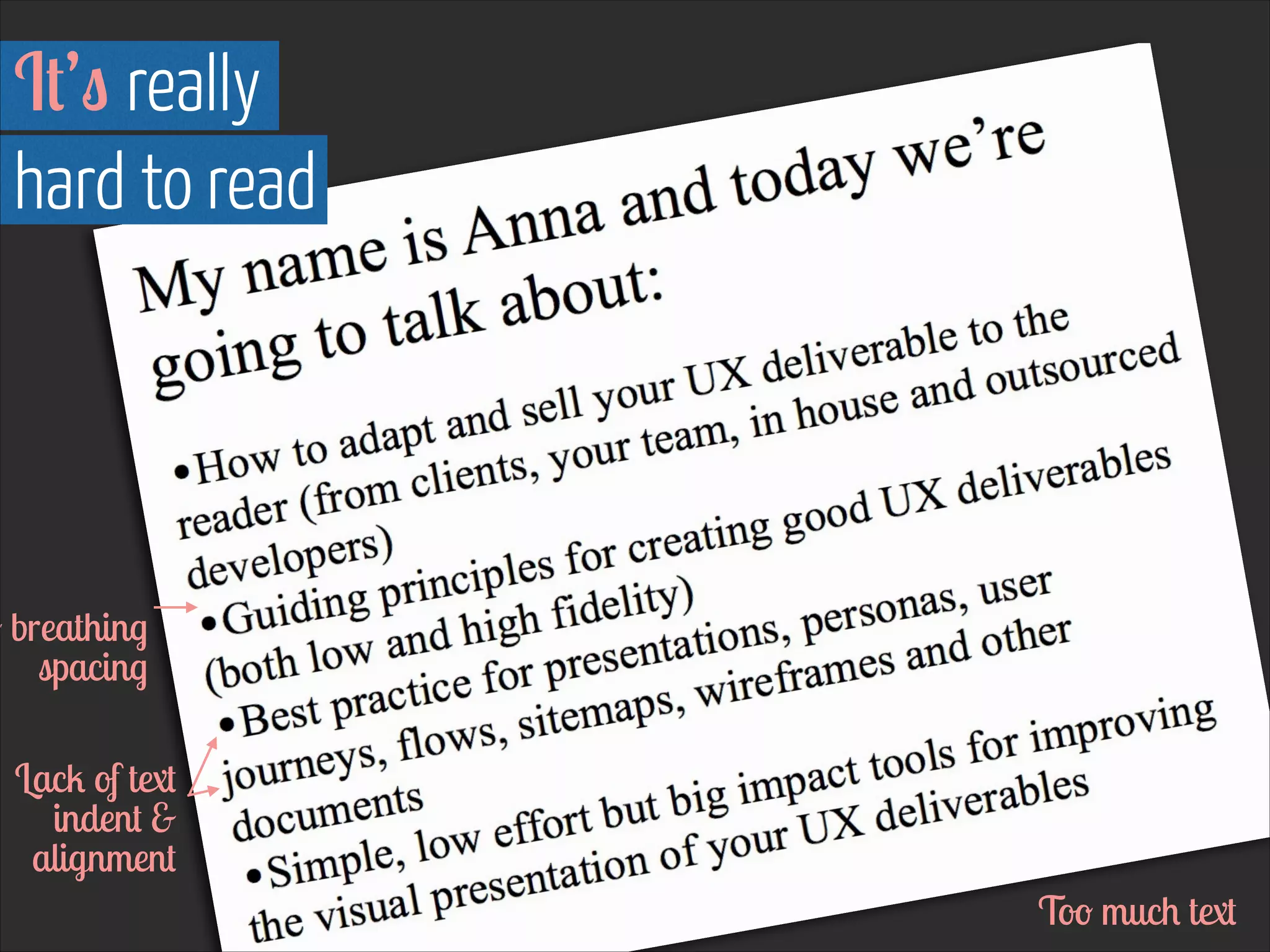
It’s really 

hard to read

o breathing
spacing
Lack of text
indent &
alignment
Too much text
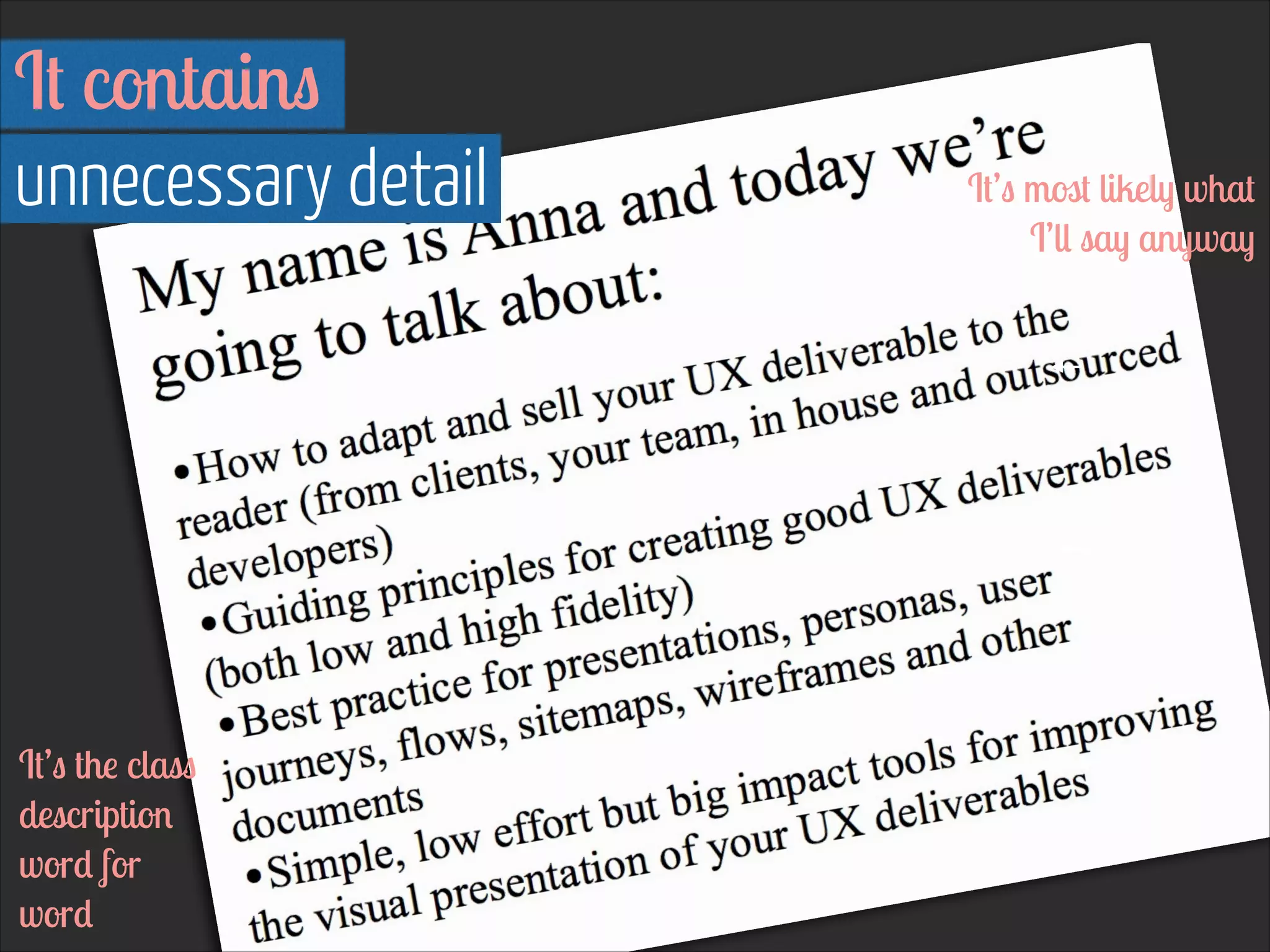
It contains
unnecessary detail

It’s the class
description
word for
word

It’s most likely what
I’ll say anyway
It just

doesn’t sell it

“Seriously?!”
“This will be 3 hours I’ll
never get back of my life”

“Boring!”
“This
lady just
doesn’t
care”

“Lazy!”

“I’m out of here”
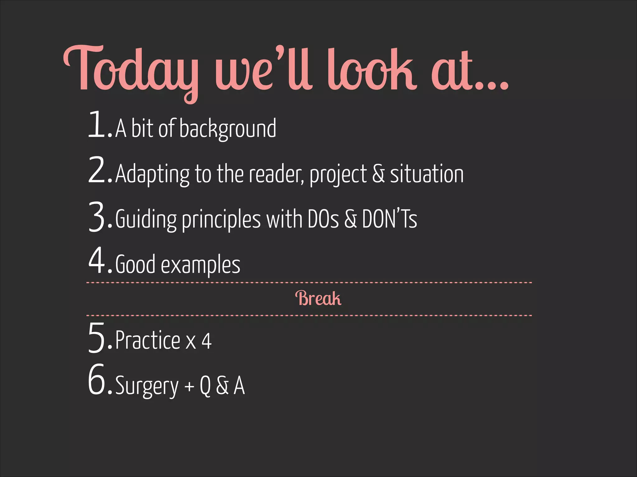
Today we’ll look at...
1. A bit of background
2. Adapting to the reader, project & situation
3. Guiding principles with DOs & DON’Ts
4. Good examples

5. Practice x 4
6. Surgery + Q & A

Break
2007 


I started working agency side
Much faster pace 

than what I was used to

www.flickr.com/photos/22032337@N02/7427822420
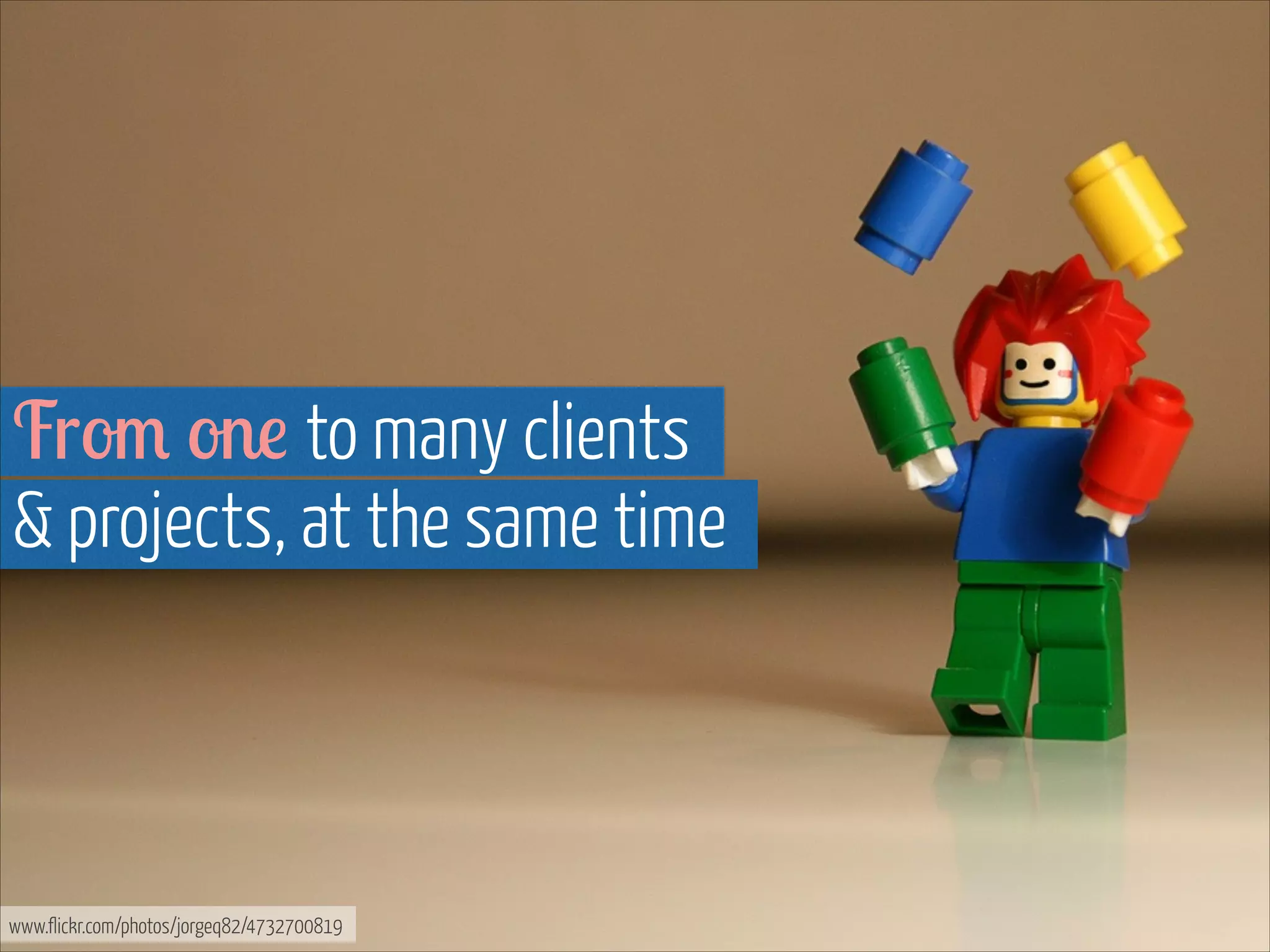
From one to many clients 

& projects, at the same time

www.flickr.com/photos/jorgeq82/4732700819
From tax applications to 

campaigns & large website redesigns

www.flickr.com/photos/9731367@N02/6988157282

www.flickr.com/photos/jpott/6214176279
Strategic 

thinking & communication 


+

Selling 


my work became very important
Creative 


approach to UX deliverables
+


Open 


with less set templates
Many 

talented people
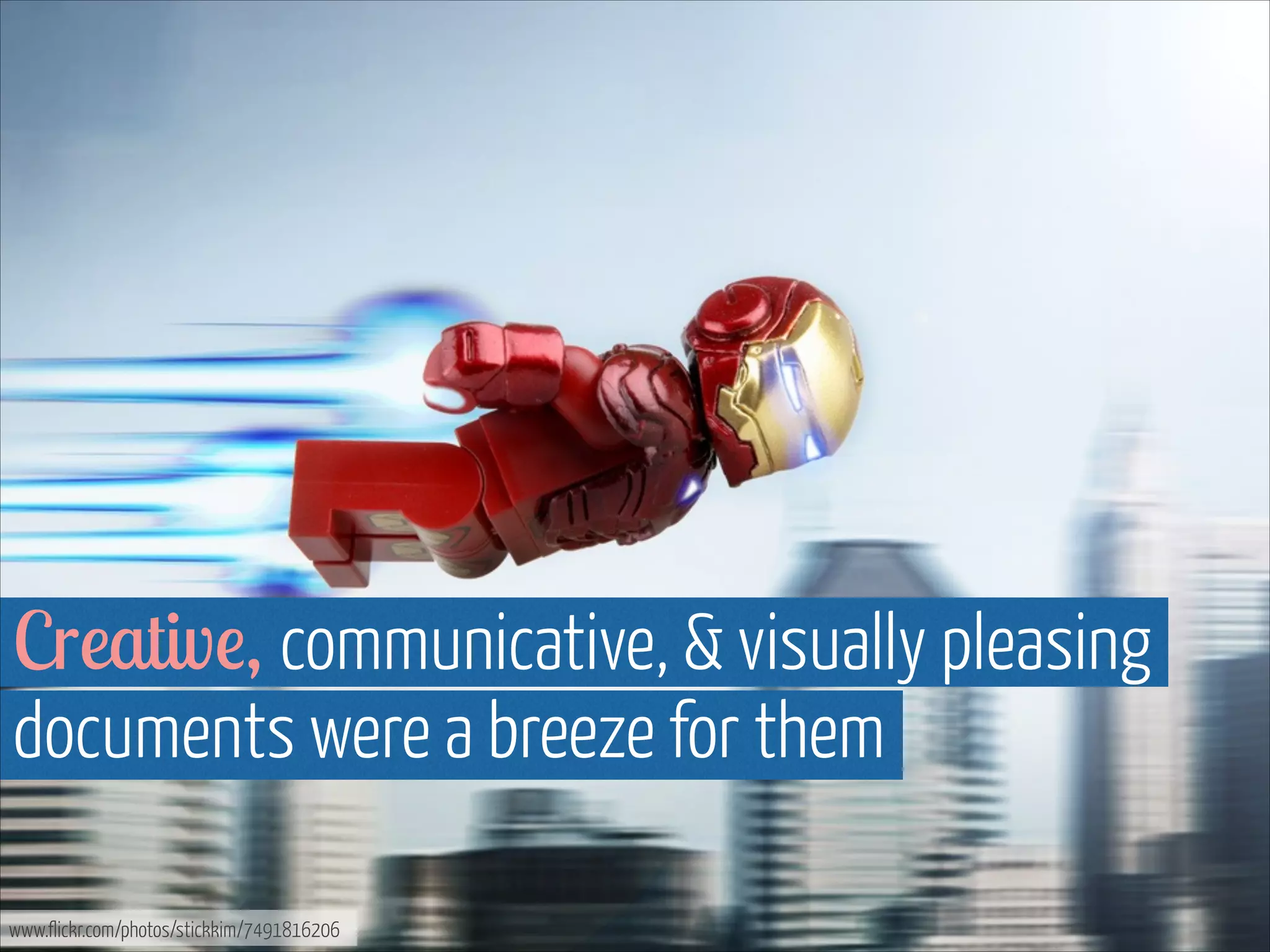
Creative, communicative, & visually pleasing
documents were a breeze for them
www.flickr.com/photos/stickkim/7491816206
They made 

clients & internal people smile

www.flickr.com/photos/31878512@N06/4941767047
For me... 

it took time

www.flickr.com/photos/snugglepup/4320372145
Advancing my 

wireframing skills was easy

www.flickr.com/photos/martinaphotography/7051511189
Less so with the 

strategic experience design documents

www.flickr.com/photos/sshb/3831637764
I had to find 

my own style

www.flickr.com/photos/msittig/610572129
Weekly 

one to ones
Critique, walk-throughs & tips 

was the best thing for my development

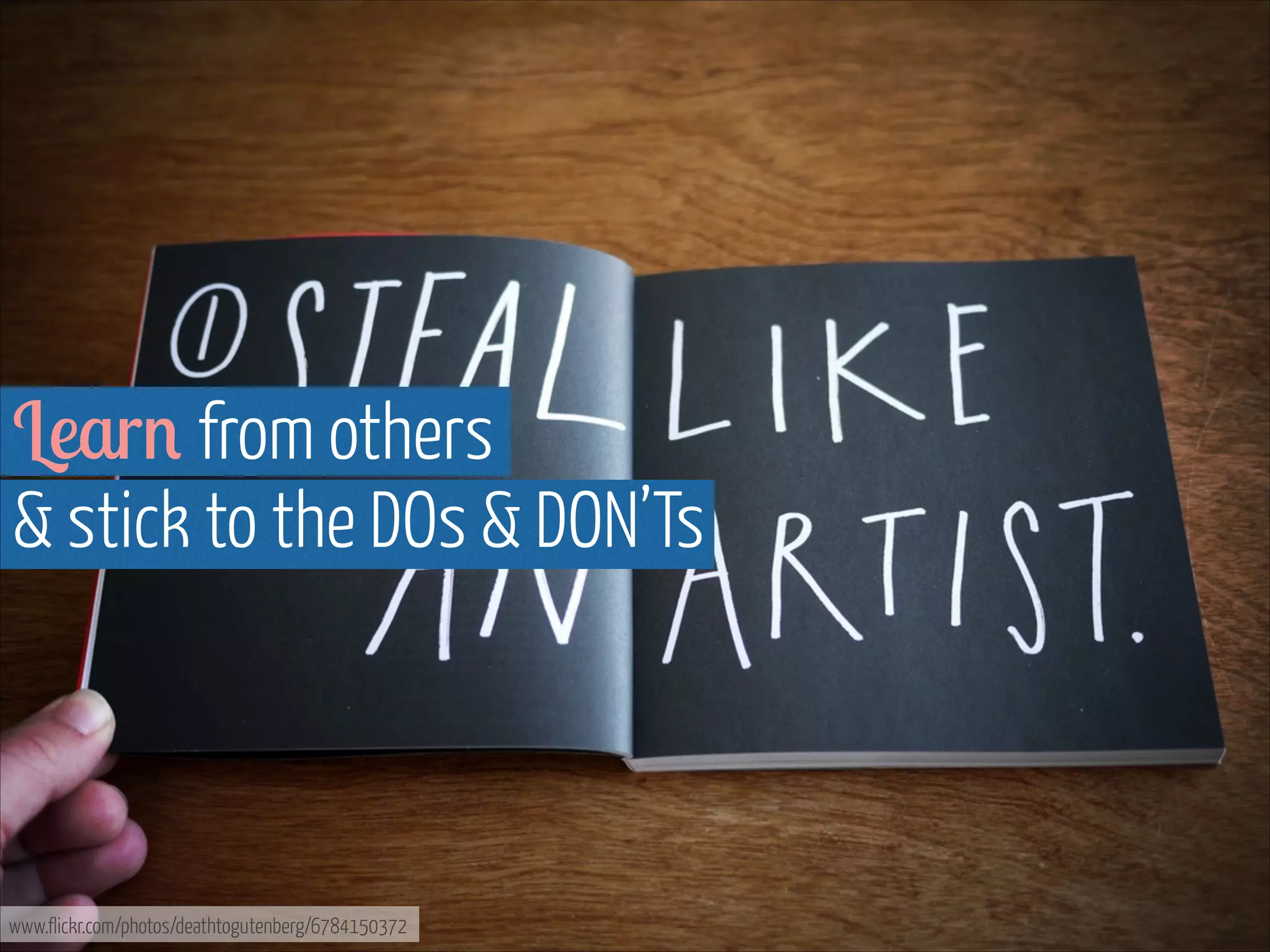
www.flickr.com/photos/deathtogutenberg/6784150372
That & experimenting

until I found my style

www.flickr.com/photos/17207222@N02/5601758478
Since then I’ve made clients & internal
stakeholders & team members smile

www.flickr.com/photos/31878512@N06/4945216951/in/photostream
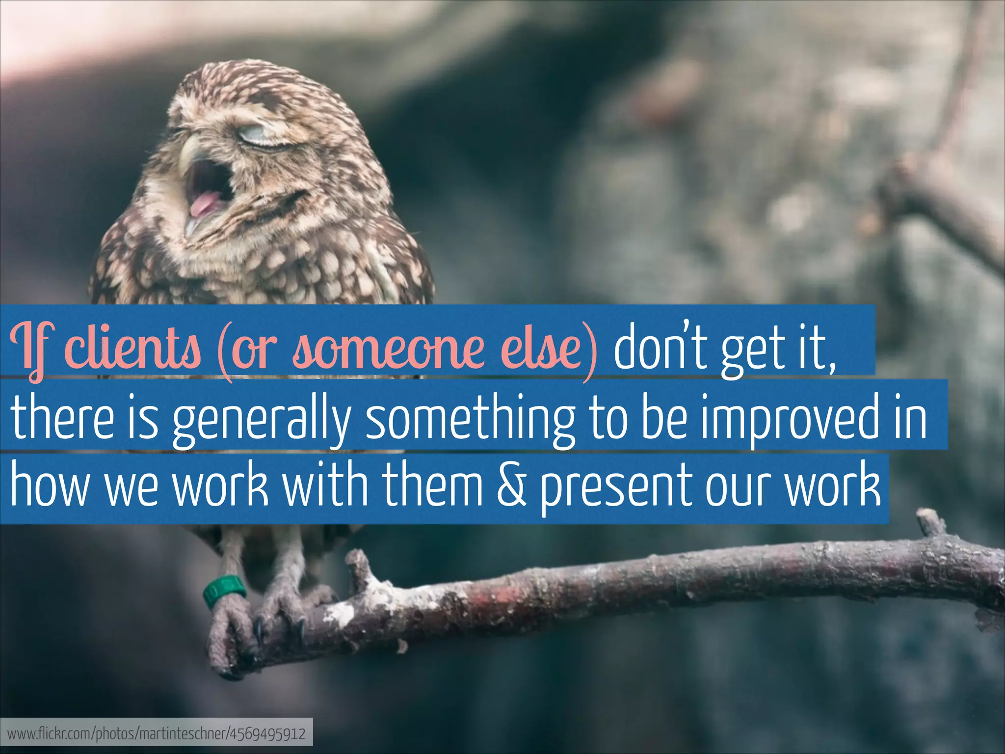
Though that’s not what it’s about, 

it was & continues to be one important aspect

www.flickr.com/photos/martinteschner/4569495912
Championing IA & UX internally as 

well as with clients was a big part of my job

www.flickr.com/photos/ittybittiesforyou/3879998804
It still is: the value of UX, 

collaboratively working & being involved from
start to finish is not a given everywhere

www.flickr.com/photos/donsolo/2888908733
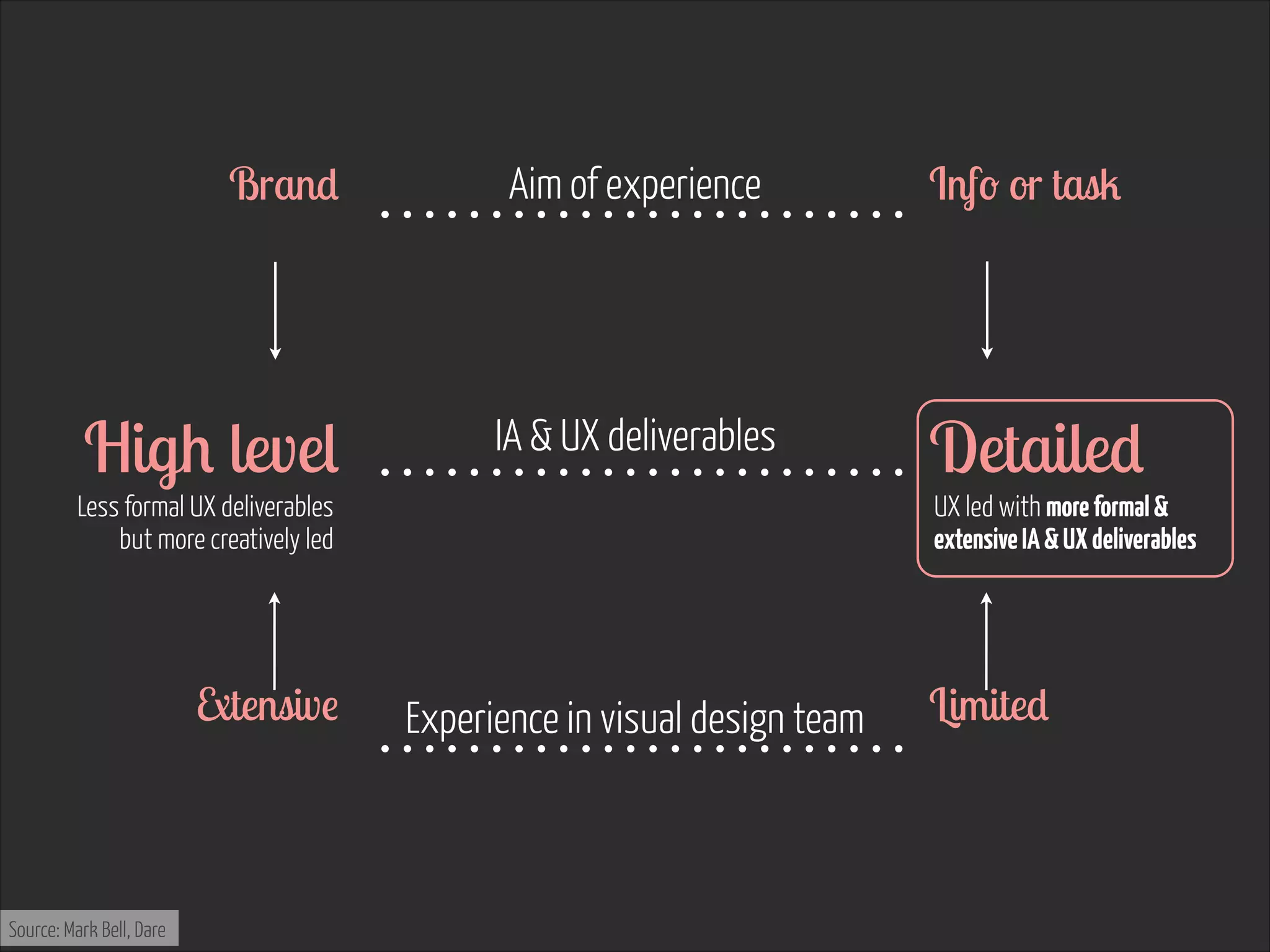
Whoever our work is for, 

we always need to sell it

www.flickr.com/photos/jox1989/5143301136
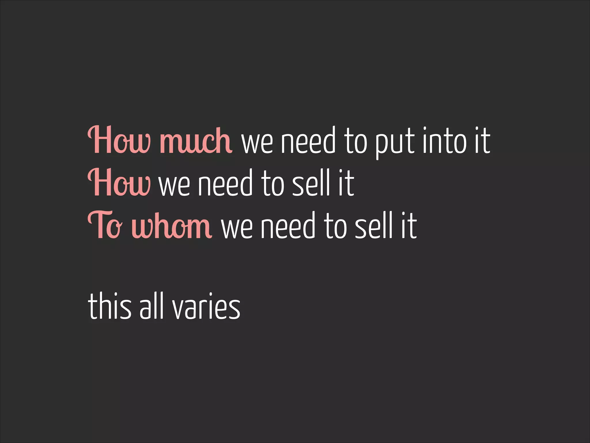
How much we need to put into it
How we need to sell it
To whom we need to sell it
!

this all varies
That’s what we’re 

going to be working on today

www.flickr.com/photos/suttonhoo22/2070700035
2. Adapting to the
reader, project & situation
Where we work
Who the deliverable is for
Why we do it
How it’s going to be used
!

impacts how to approach it
I asked a few people

in different roles what they considered
key with good UX deliverables

www.flickr.com/photos/helga/3952984450
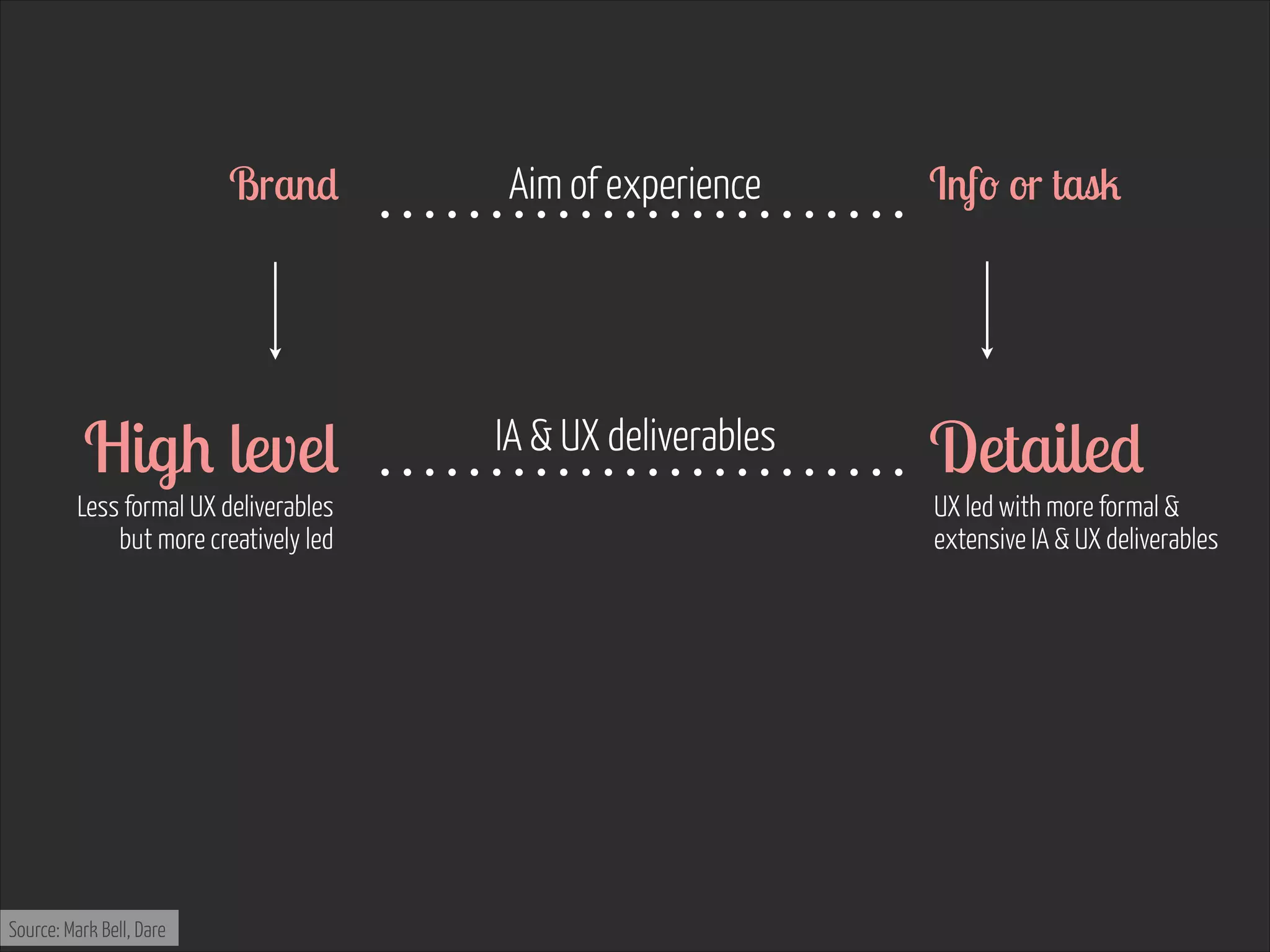
“ You need to produce a deliverable that meets the
needs of the audience it's intended for: wireframes
that communicate to designers, copy writers and
technical architects... Experience strategy documents
that matter to digital marketeers... ”
- John Gibbard

Associate Planning Director

Dare


www.flickr.com/photos/jmsmith000/3169546564
“ A good UX deliverable clearly communicates its
purpose and what it’s trying to achieve. It anticipates
any questions / scenarios which may be posed. ”
!
- Nick Haley

Head of User Experience

Guardian News and Media

www.flickr.com/photos/jmsmith000/3169546564
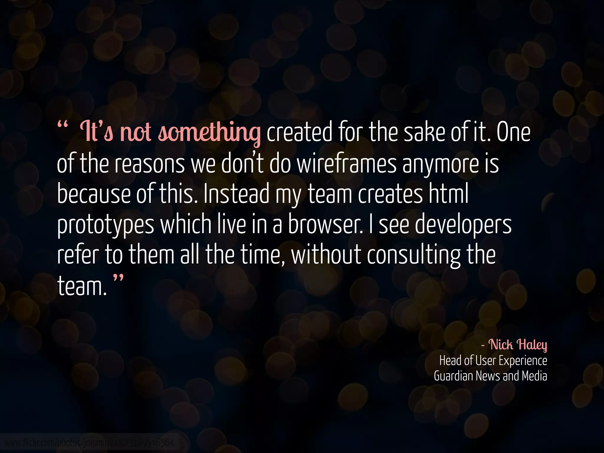
“ It’s not something created for the sake of it. One
of the reasons we don’t do wireframes anymore is
because of this. Instead my team creates html
prototypes which live in a browser. I see developers
refer to them all the time, without consulting the
team. ”
!
- Nick Haley

Head of User Experience

Guardian News and Media

www.flickr.com/photos/jmsmith000/3169546564
One immediate 

conclusion can be made

www.flickr.com/photos/ivanclow/4260762246
Client side is different from having clients
“ In the past I’d look for reams of documents going
into great detail, but as a result of the proliferation in
devices creating documentation is becoming too
cumbersome.
There needs to be some initial though into journeys,
personas and use cases for sure, but the need for
wireframes I think is reduced to identify the priority of
content/functionality. ”
!
- Alex Matthews

Head of Creative Technology

BBH, London
www.flickr.com/photos/jmsmith000/3169546564
“ Instead we should be wireframing in code using a
responsive framework so that we can immediately see
how everything looks on all devices, and rapidly
change how an element and its associated behaviours
looks across all these devices. ”
!
- Alex Matthews

Head of Creative Technology

BBH, London

www.flickr.com/photos/jmsmith000/3169546564
Second conclusion: 

approaches & what’s needed differ 

between companies

www.flickr.com/photos/ivanclow/4260762246
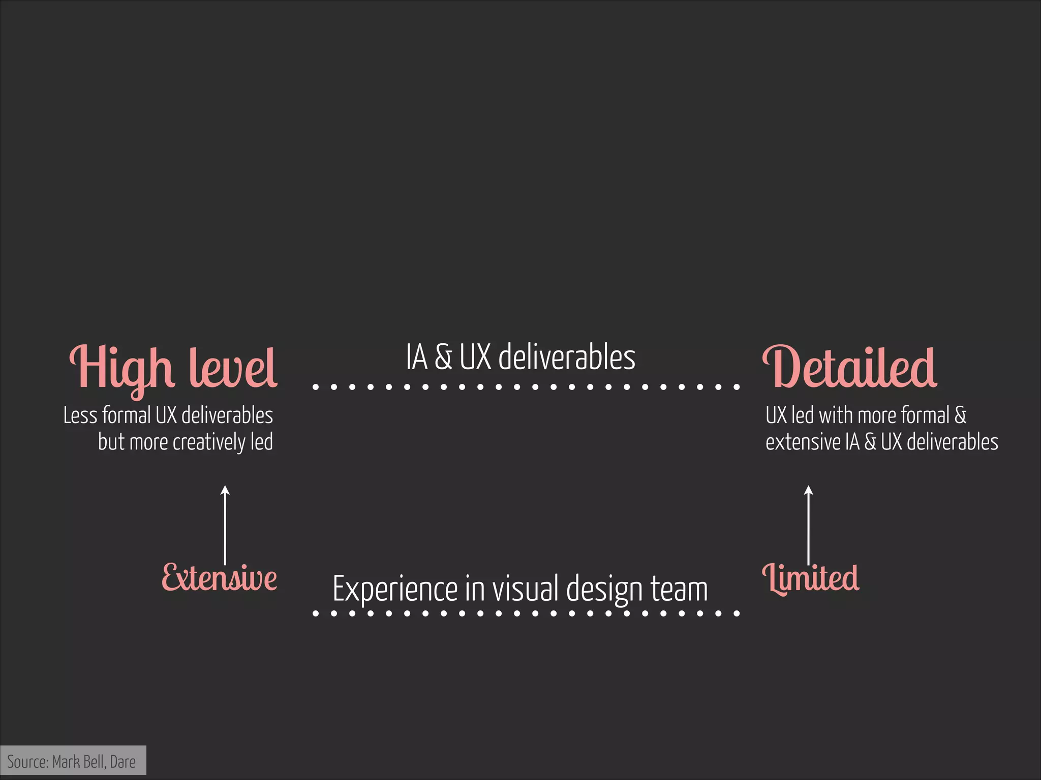
I asked Alex: 


“Would you agree though that the above works a lot
better if the teams are located together and work
collaboratively, and that the need for actual
wireframes with annotations increase, if the
development happens elsewhere?”

www.flickr.com/photos/helga/3952984450
Yes 

totally agree
Third conclusion: 

what inhouse developers need is 

different from if the build is outsourced

www.flickr.com/photos/ivanclow/4260762246
“ UX should not be a hander over, it should be part
of the full development cycle from product inception,
through to the MVP and each iteration beyond. ”
!
- Scott Byrne-Fraser

Creative Director

BBC User Experience & Design

Sport & Live

www.flickr.com/photos/jmsmith000/3169546564
However, sometimes 

we do need to hand things over

www.flickr.com/photos/martinteschner/4569495912
“ Rule for my team: I don’t care what you create or
how you create it, but it better be high quality.
!

A deliverable which isn’t used to move the project
forward is a waste of time. ”
!
- Nick Haley

Head of User Experience

Guardian News and Media

www.flickr.com/photos/jmsmith000/3169546564
“ UX is about delivery, not deliverables. So the
best design artefacts are the ones that take the least
time to convey the most insight and meaning.
Conversations are better than sketches, sketches are
better than prototypes and prototypes are better than
think specifications.
So if you're focussing on making pretty
deliverables, you’re focussing on the wrong thing. ”
!
- Andy Budd

Co-founder & CEO

Clearleft
www.flickr.com/photos/jmsmith000/3169546564
“ That being said, there are VERY RARE occasions
when creating a nice looking deliverable like a concept
map—to explain a difficult concept around a large
organisation—can pay dividends. But this is the
exception rather than the rule. ”
!
- Andy Budd

Co-founder & CEO

Clearleft

www.flickr.com/photos/jmsmith000/3169546564
Forth conclusion: 

it’s not about pretty documents, 

but about adding value

www.flickr.com/photos/ivanclow/4260762246
“ Make them f ****** appropriate
Practitioners love to pretend that they only need to
fart/cough near a client and they understand what’s
inferred, but that's nonsense.
The truth is you need to communicate to lots of
different people at lots of different levels. Make sure
your deliverables (at whatever fidelity) are appropriate
for your audience. ”
!
- Jonty Sharples

Design Director

Albion
www.flickr.com/photos/jmsmith000/3169546564
As we know, 

not every client is the same

www.flickr.com/photos/martinteschner/4569495912
From two dear ones, 

who have been both colleagues & clients

www.flickr.com/photos/jdhancock/4354438814
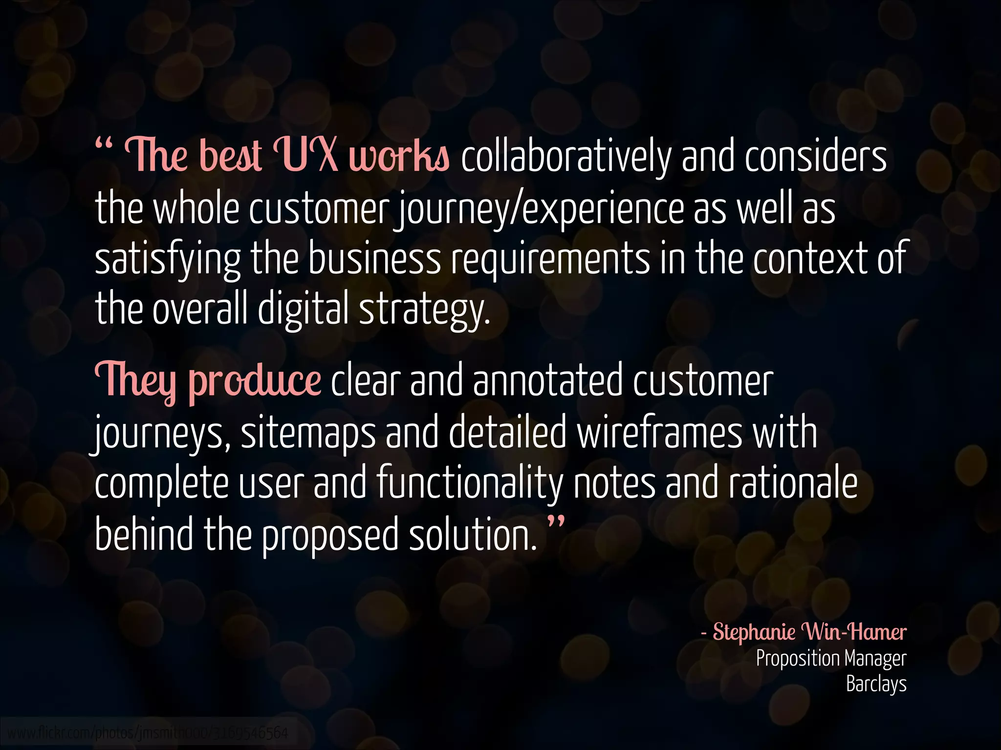
“ The best UX works collaboratively and considers
the whole customer journey/experience as well as
satisfying the business requirements in the context of
the overall digital strategy.
They produce clear and annotated customer
journeys, sitemaps and detailed wireframes with
complete user and functionality notes and rationale
behind the proposed solution. ”
!
- Stephanie Win-Hamer

Proposition Manager

Barclays
www.flickr.com/photos/jmsmith000/3169546564
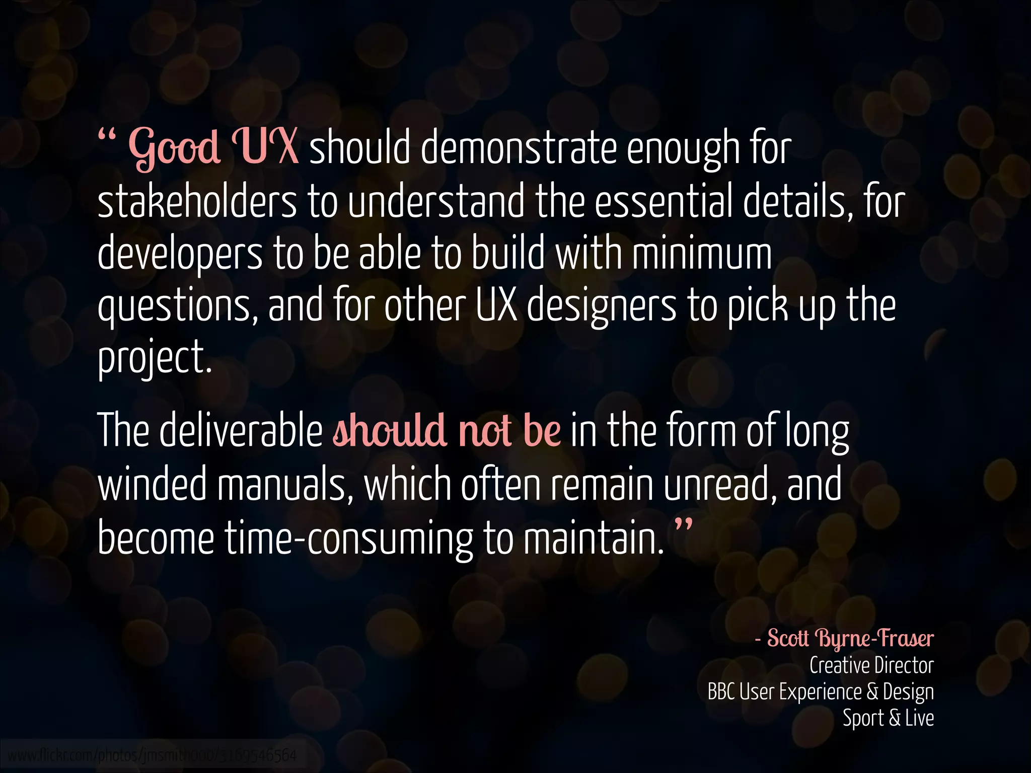
“ Good UX should demonstrate enough for
stakeholders to understand the essential details, for
developers to be able to build with minimum
questions, and for other UX designers to pick up the
project.
The deliverable should not be in the form of long
winded manuals, which often remain unread, and
become time-consuming to maintain. ”
!
- Scott Byrne-Fraser

Creative Director

BBC User Experience & Design

Sport & Live
www.flickr.com/photos/jmsmith000/3169546564
But, not every client 

is UX minded

www.flickr.com/photos/martinteschner/4569495912
“ UX is a critical part of any project but you'll often
find that clients sometimes don't understand what
they are looking at and/or are just itching to get to the
"pretty pictures" bit.
From my point of view therefore, it is vital that the UX
is super clear, with detailed annotations and notes
written in laymen's terms - and if it can be visually
engaging to keep their attention, all the better.
Personally I am a big fan of sketches, particularly in
the early stages. ”
- Hannah Hilbery

Board Account Director

Leo Burnett

www.flickr.com/photos/jmsmith000/3169546564
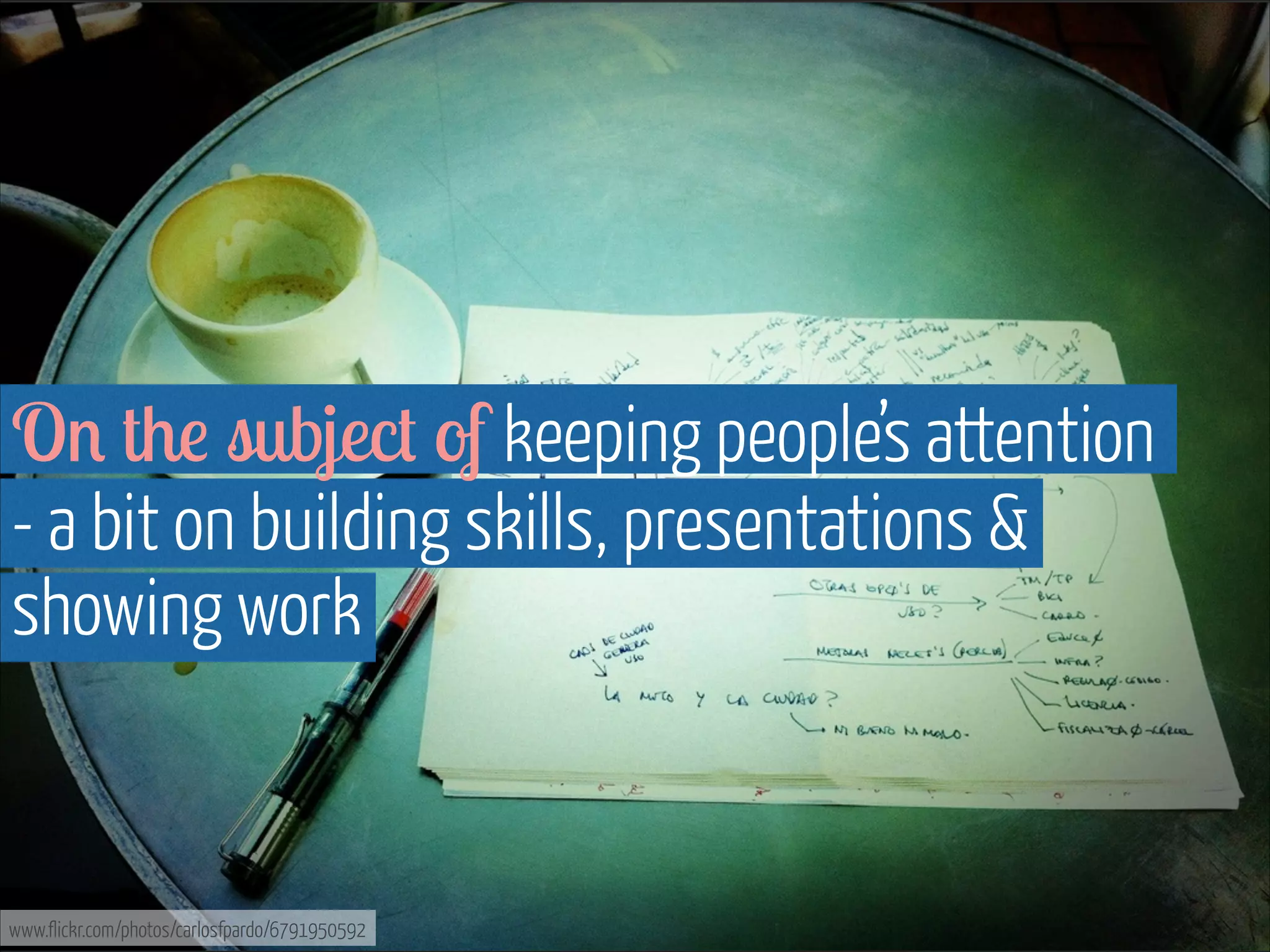
On the subject of keeping people’s attention
- a bit on building skills, presentations &
showing work

www.flickr.com/photos/carlosfpardo/6791950592
“ In building the skills of my team I'm looking for
them to produce beautiful, usable deliverables that
communicate their content appropriately in context. In
practical terms I 'd also hope that they're editable and
adaptable enough to evolve within and without the
project. ”
- John Gibbard

Associate Planning Director

Dare


www.flickr.com/photos/jmsmith000/3169546564
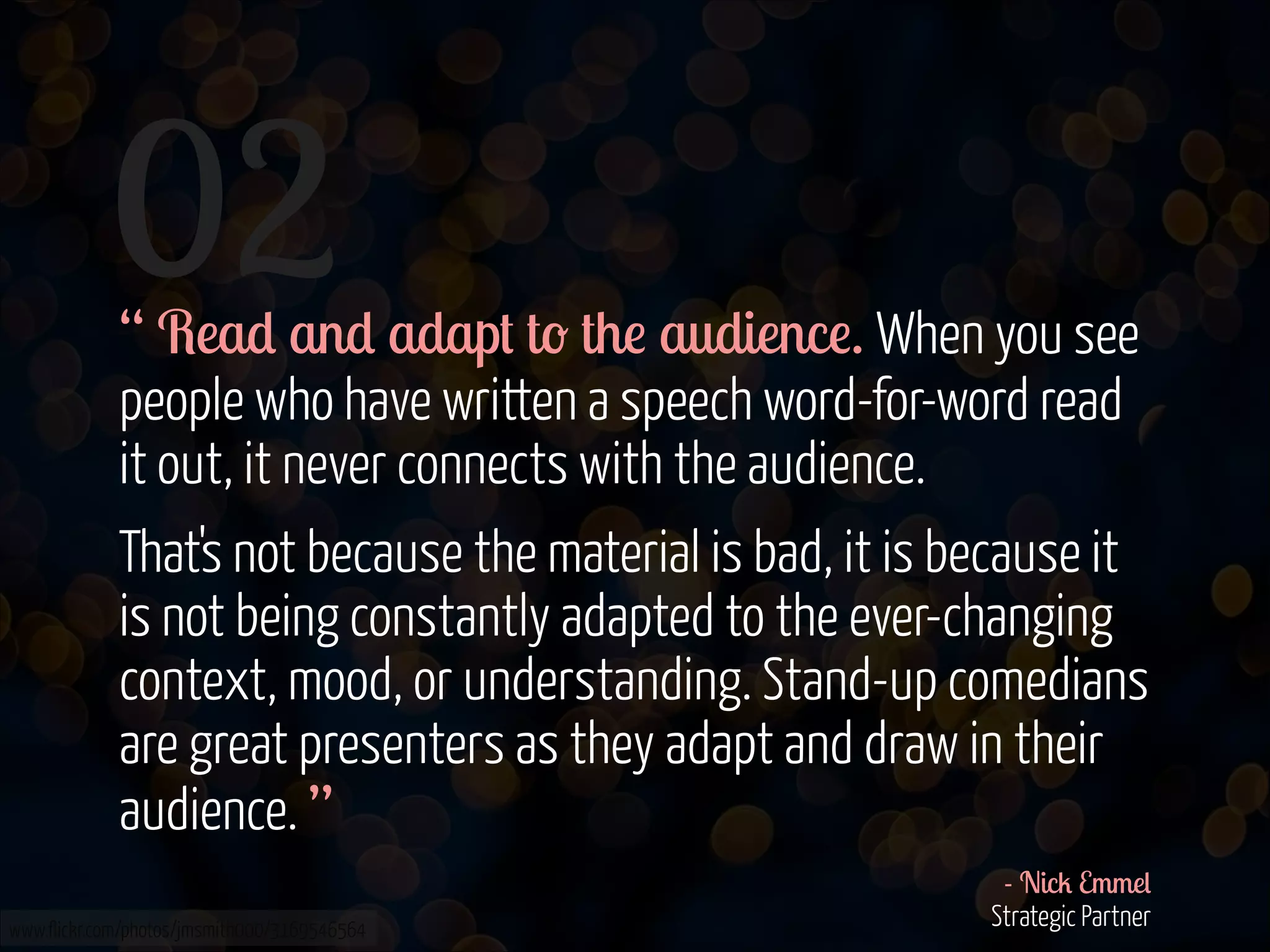
“ Presentations are for presenting, not reading.
Read and adapt to the audience. When you see
people who have written a speech word-for-word read
it out, it never connects with the audience.
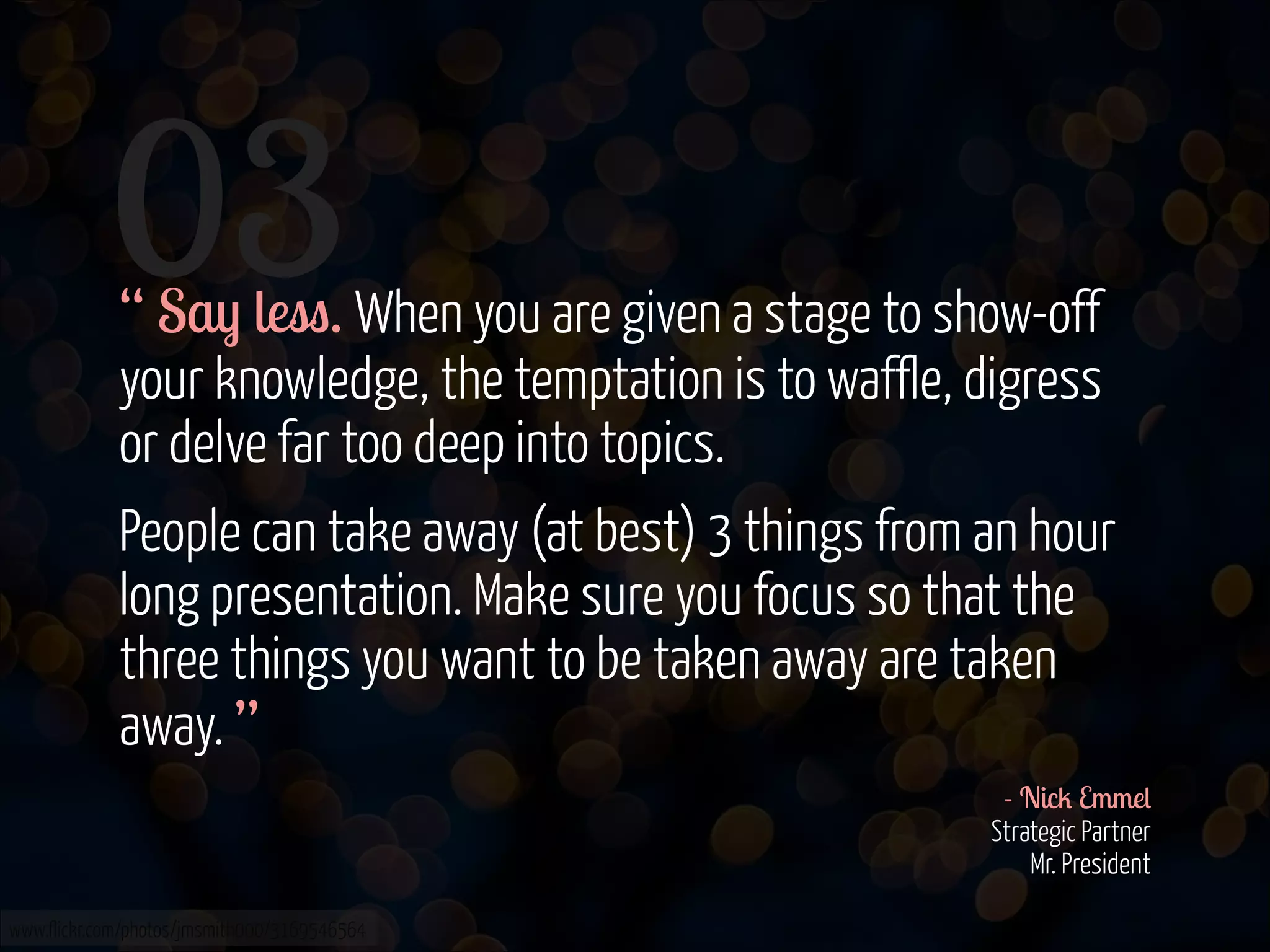
Say less. People can take away (at best) 3 things
from an hour long presentation. Make sure you focus
so that the three things you want to be taken away
are taken away. ”
- Nick Emmel

Strategic Partner

Mr. President

www.flickr.com/photos/jmsmith000/3169546564
“ Narrative is the key thing. A person needs to be
able to tell a good story about their deliverables and
why they made decisions, who they worked with along
the way and how they were produced (and for whom).
It's only really when people tell stories that people
feel engaged and connected with how a UX
practitioner practices.
The ones that don't have narrative come across
as samey, lumpy and can make you assume the
practitioner lacks passion. ”
www.flickr.com/photos/jmsmith000/3169546564

- Be Kaler

Director

Futureheads Recruitment 

Speaking of storytelling,
this is what visual design has to say

www.flickr.com/photos/carlosfpardo/6791950592
“ A good piece of UX has a narrative and clearly
tells a story, or at least part of a story on a particular
journey. As a designer - everything I do and make is
communicating something to someone. Therefore a
critical deliverable to establish that principle are good
personas. 

I need to understand who has to get what out of
the thing I'm designing and I'm only satisfied a visual
has been executed well once I'm confident it's telling
the right story to the right person in the right way. ”
- Steve Whittington

Design Director 

Dare

www.flickr.com/photos/jmsmith000/3169546564
“ Just as design shouldn't be paint by numbers, UX
shouldn't be build by boxes. The boundaries between
good content creation, well considered user
experience and effective design and layout are blurred.
I firmly believe that for one to be successful - all the
disciplines need to sing together. Hence, the single
most important deliverable isn't a physical one, rather
a common understanding - a pool of knowledge developed when these key disciplines work together. ”
- Steve Whittington

Design Director 

Dare

www.flickr.com/photos/jmsmith000/3169546564
So true, 

& so important

www.flickr.com/photos/jdhancock/4354438814
Last but not least, 

we wouldn’t have anything 

without content

www.flickr.com/photos/grimsanto/751075283/photos/carlosfpardo/6791950592
“ The best deliverables for a writer evidence a really
close understanding of our content so that there's
flexibility in wireframes for example, to fit more or
less words. Components can be useful in this respect.
There's nothing worse than having to fill space
when there's nothing to say. I also find personas
helpful for adjusting the copy in places, but only if
they're sufficiently different from each other. ”
- Emma Lawson

Freelance Senior Copywriter 

& Former Head of Copy

www.flickr.com/photos/jmsmith000/3169546564
3. Guiding principles
with DOs & DON’Ts
First 

THE DOs

www.flickr.com/photos/withassociates/3795212591
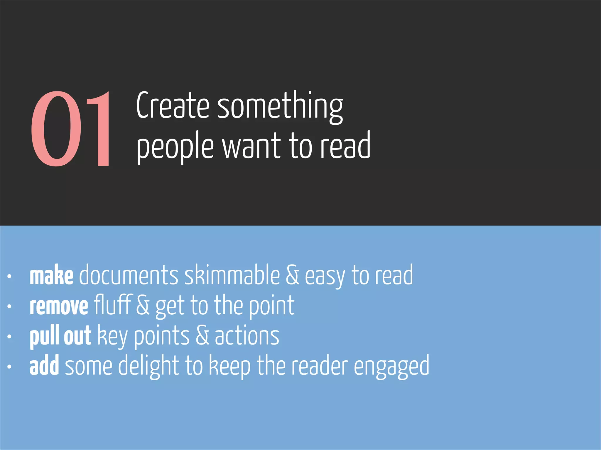
01
•
•
•
•

Create something 

people want to read

make documents skimmable & easy to read
remove fluff & get to the point
pull out key points & actions
add some delight to keep the reader engaged
Every reader has given you their time. 

Make the most of it & don’t waste it

www.flickr.com/photos/martinteschner/4569495912
02

Ensure the reader
knows what they are looking at

• always include page titles
• use visual cues for what you reference in annotations
• pull out or highlight what has changed from prior version

www.flickr.com/photos/pinkpurse/5355919491
03

Make it easy
to follow & understand

• a red thread is crucial & makes your work more engaging
• consistency in numbering & titles matters
• include page numbers, particularly if presenting over the
phone

www.flickr.com/photos/pinkpurse/5355919491
Though it (mostly) should be, 

it won’t always be YOU presenting YOUR work

www.flickr.com/photos/martinteschner/4569495912
04
•
•
•
•
•
•

Make things
reusable between projects

use stencils & avoid continuously creating from scratch
keep assets organised (icons, visual elements, assets for devices, social media etc.)
spend some time setting up elements properly
helps avoid having to go back & adjust every instance later
set up document templates that can be reused
all of the above saves time & ensures you spend yours wisely

www.flickr.com/photos/pinkpurse/5355919491
05
•
•
•
•
•

Avoid unnecessary
updates & maintenance

set up & automate document info (logos, page numbers, titles, version, file location, etc)
if software allows, place them on a shared canvas/ layer
ensures they are on every page & no manual update is needed
use layers/ shared canvases for consistent elements
& for keeping your document organised (great if someone else needs to pick it up)

www.flickr.com/photos/pinkpurse/5355919491
06

Adapt to the
reader, project & situation

• applies to verbal presentation & walkthrough
• as well as visual presentation & polish
• adjust your focus & detail - what’s most important to them

www.flickr.com/photos/pinkpurse/5355919491
07
•
•
•
•

Use a mixture of
colours, white space, fonts & styling

helps draw the user’s eye & guide the reader to what matters
useful for grouping information
adds delight & makes your documents a pleasure to the eye
really simple & takes very little time

www.flickr.com/photos/pinkpurse/5355919491
And 

THE DON’Ts

www.flickr.com/photos/withassociates/3795212591
01
•
•
•
•

Don’t be lazy

check spelling
ensure things are aligned
include spacing
always proof read

www.flickr.com/photos/pinkpurse/5355919491
02

Don’t create
unrealistic wireframes

• images tend to come in certain ratios
• typography needs to be big enough to read
• be true - making your wireframes bigger, or modules smaller
won’t make the content fit in real life

www.flickr.com/photos/pinkpurse/5355919491
03

Don’t spend
unnecessary time polishing

• work with simple tools to improve your documents
• spend your time where it adds the most value
• practice & re-use to save time

www.flickr.com/photos/pinkpurse/5355919491
4. Good examples
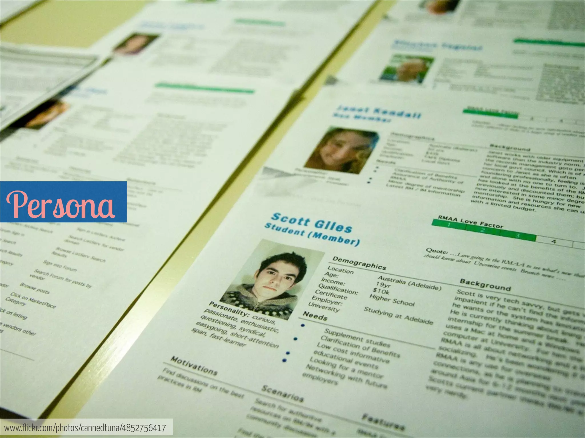
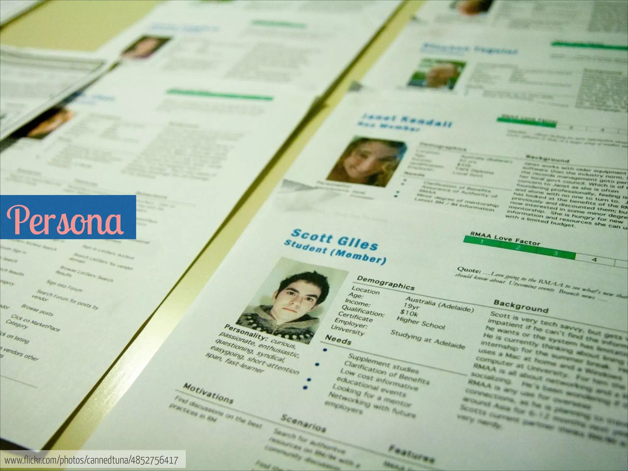
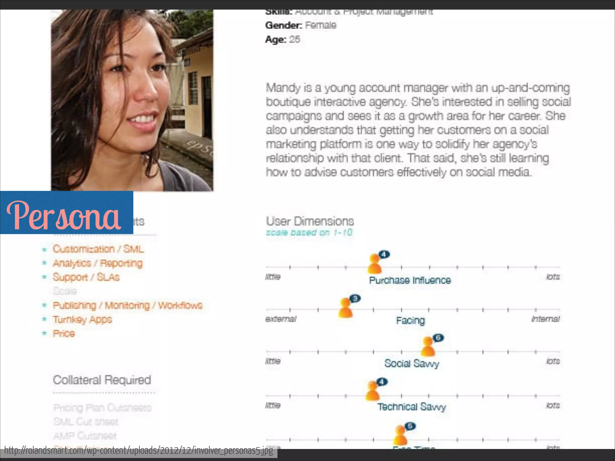
Persona 


www.flickr.com/photos/cannedtuna/4852756417
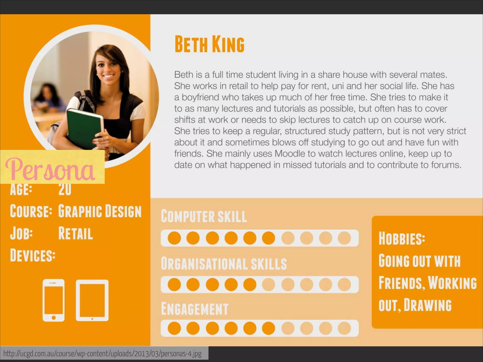
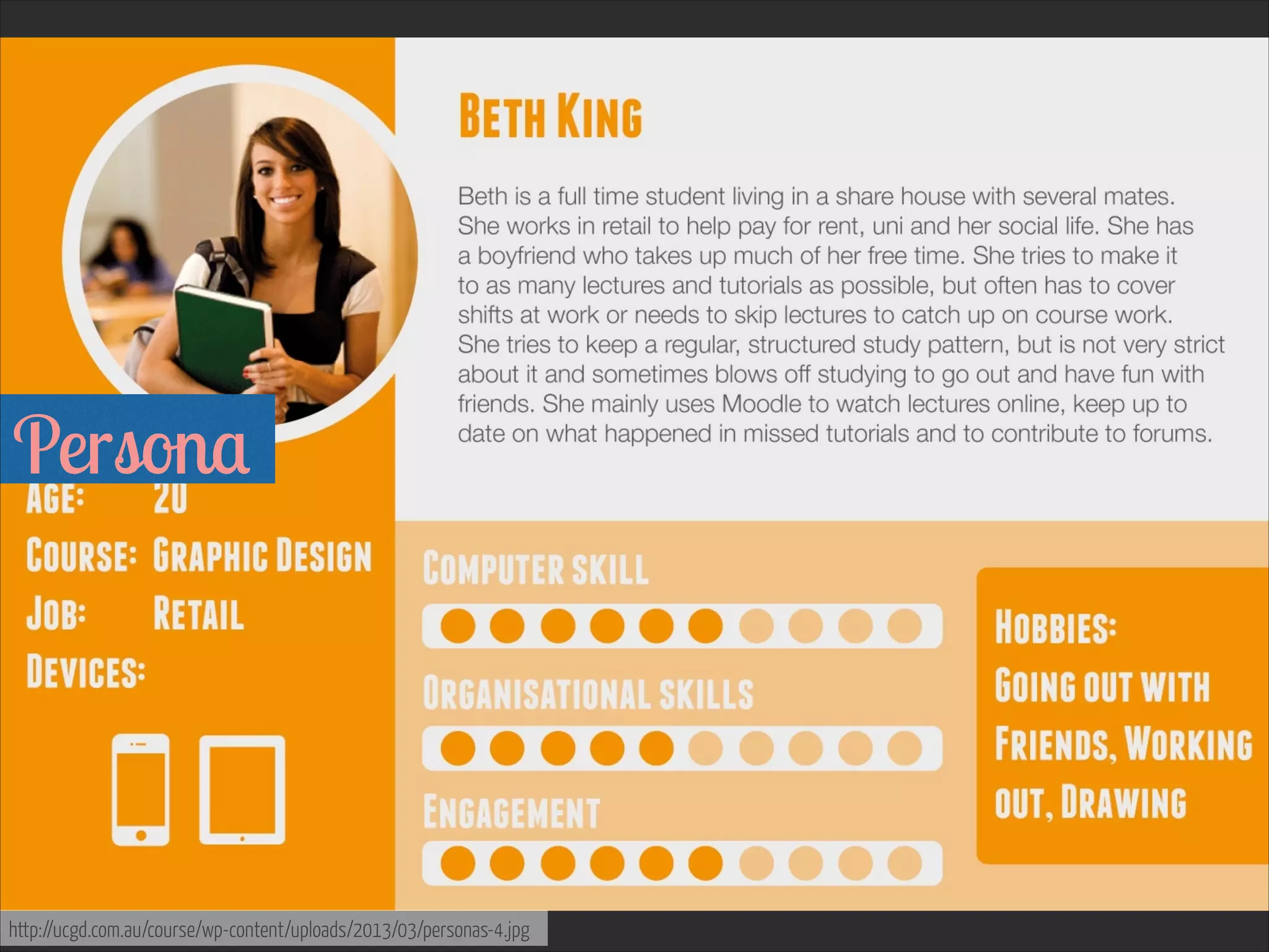
Persona 


http://ucgd.com.au/course/wp-content/uploads/2013/03/personas-4.jpg
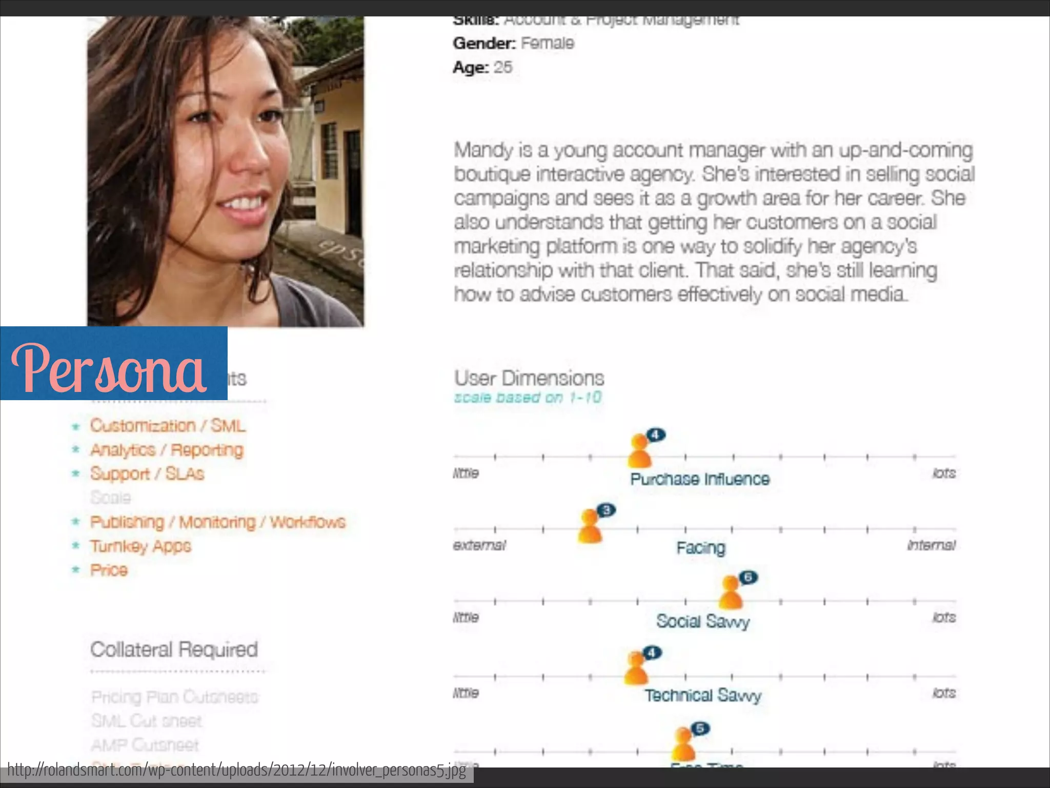
Persona 


http://rolandsmart.com/wp-content/uploads/2012/12/involver_personas5.jpg
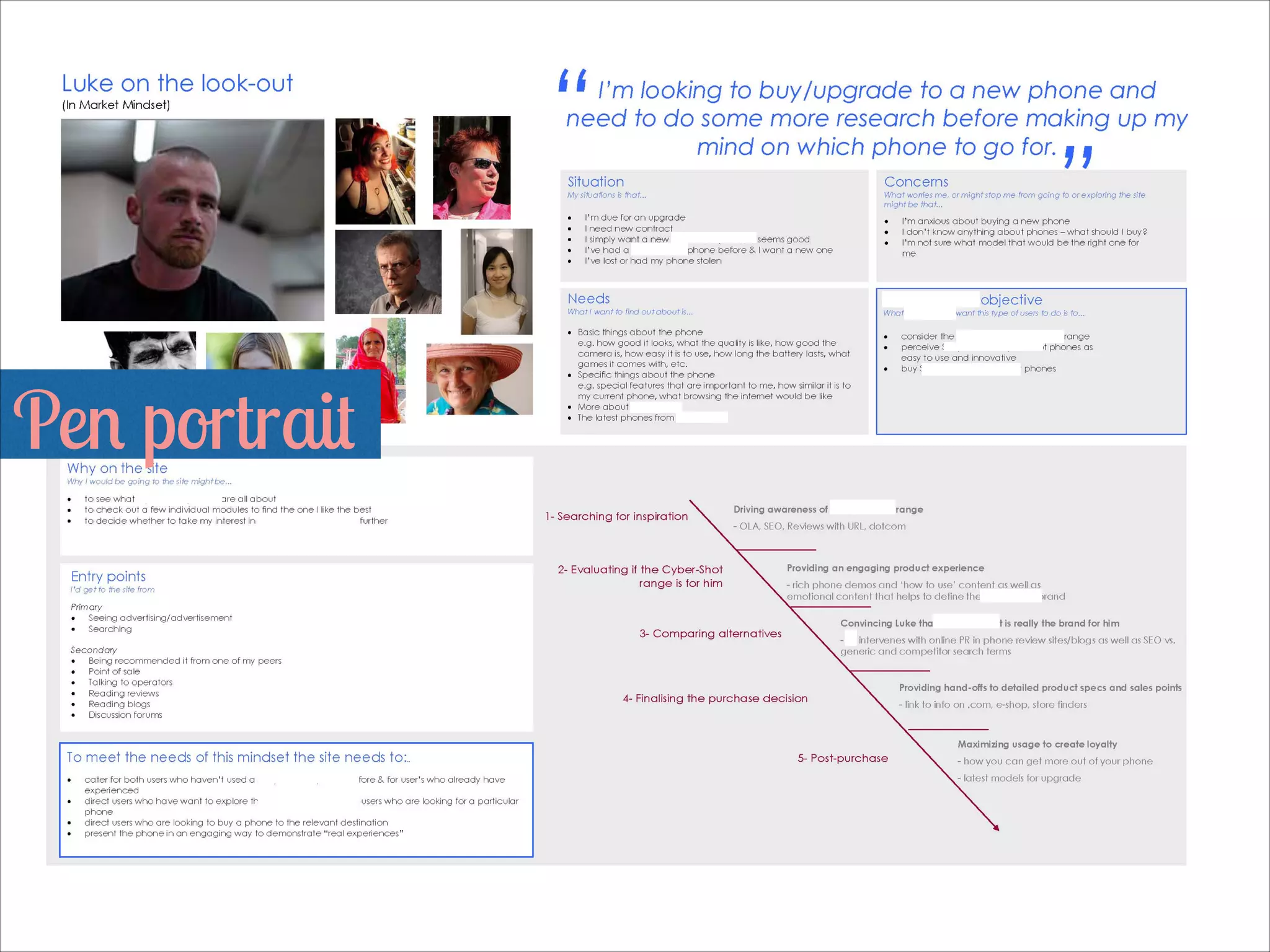
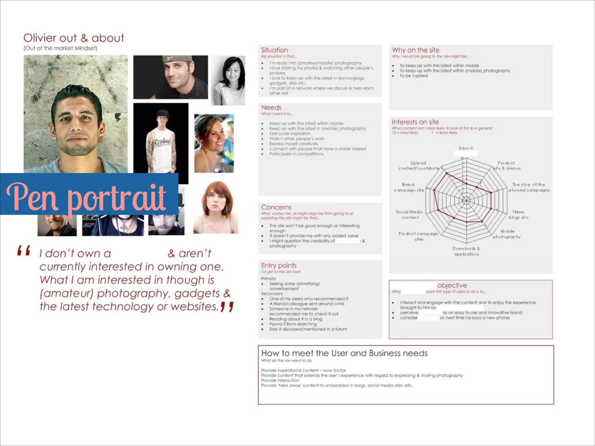
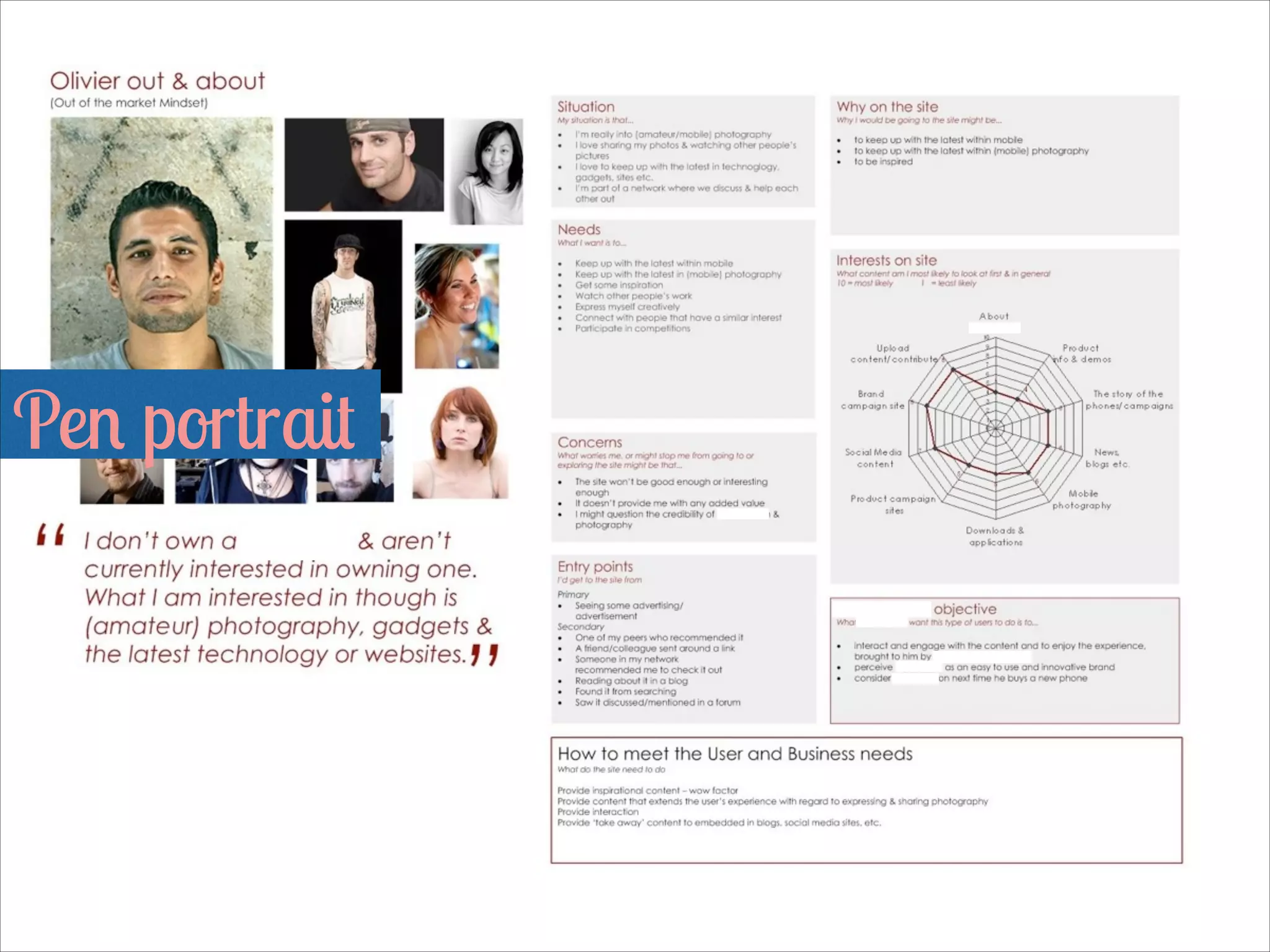
Pen portrait 

Pen portrait 

More personas & pen portraits
www.ux-lady.com/wp-content/uploads/2013/06/
portada-DIY-personas.jpg
http://rolandsmart.com/wp-content/uploads/
2012/12/involver_personas5.jpg
http://peterspannagle.com/wp-content/uploads/
2013/05/OBC-personas.png
http://ucgd.com.au/course/wp-content/uploads/
2013/03/personas-4.jpg
www.pinterest.com/pin/186195765816951260/
www.smartinsights.com/wp-content/uploads/
2012/06/social-media-personas-600x2223.jpg
http://dannyhearn.me/images/porfolio/speedy/
screen_02.jpg
www.flickr.com/photos/st3f4n/4387291247
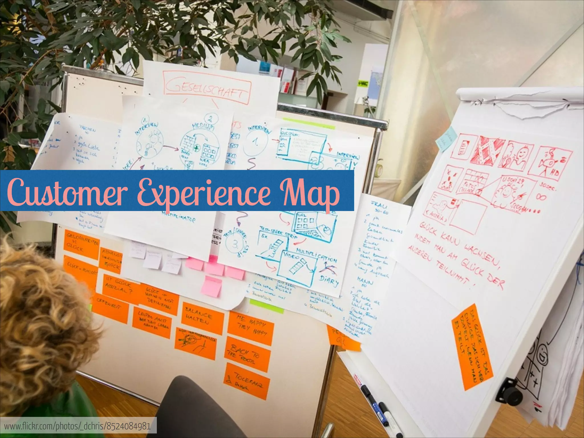
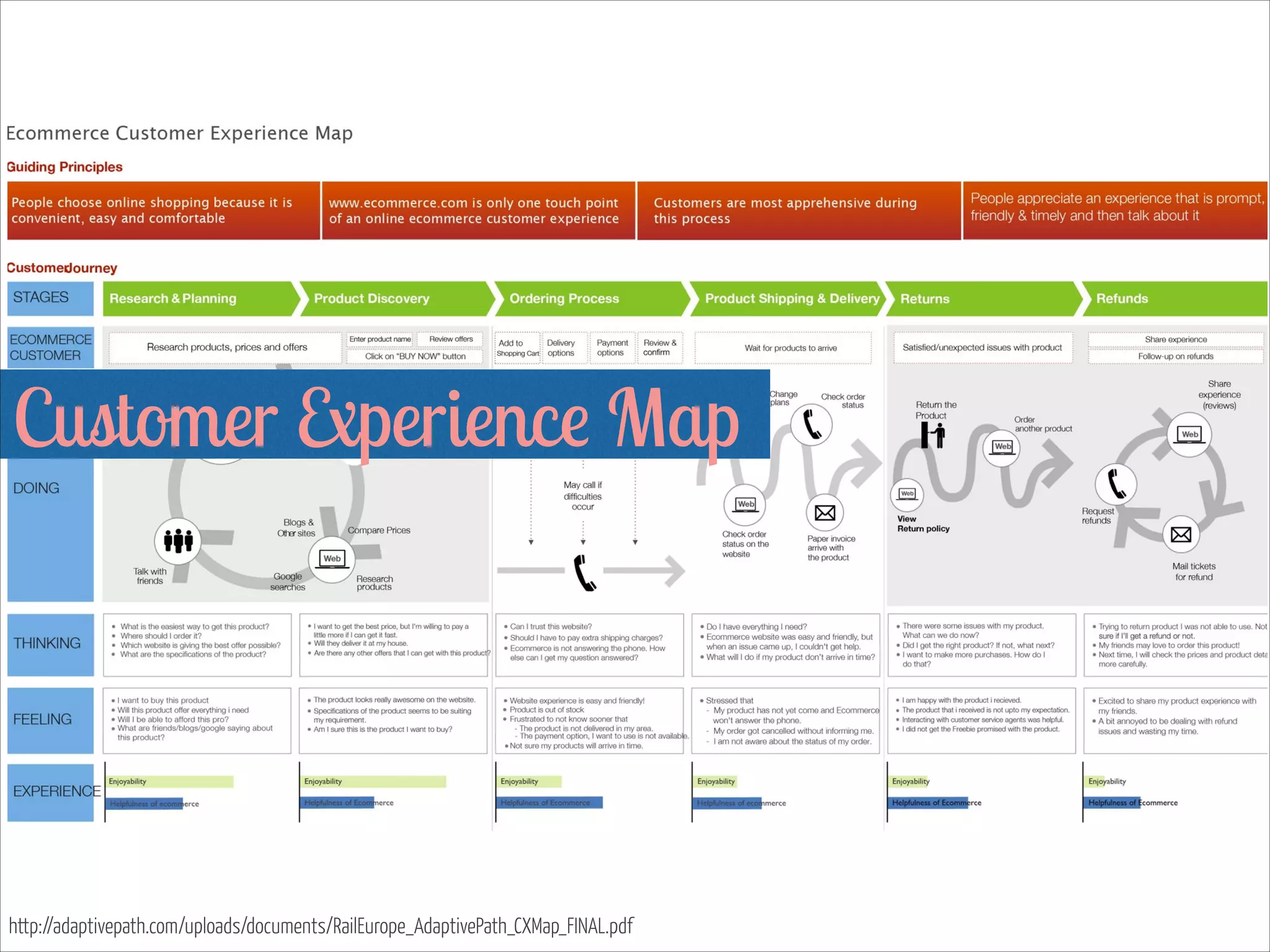
Customer Experience Map 


www.flickr.com/photos/_dchris/8524084981
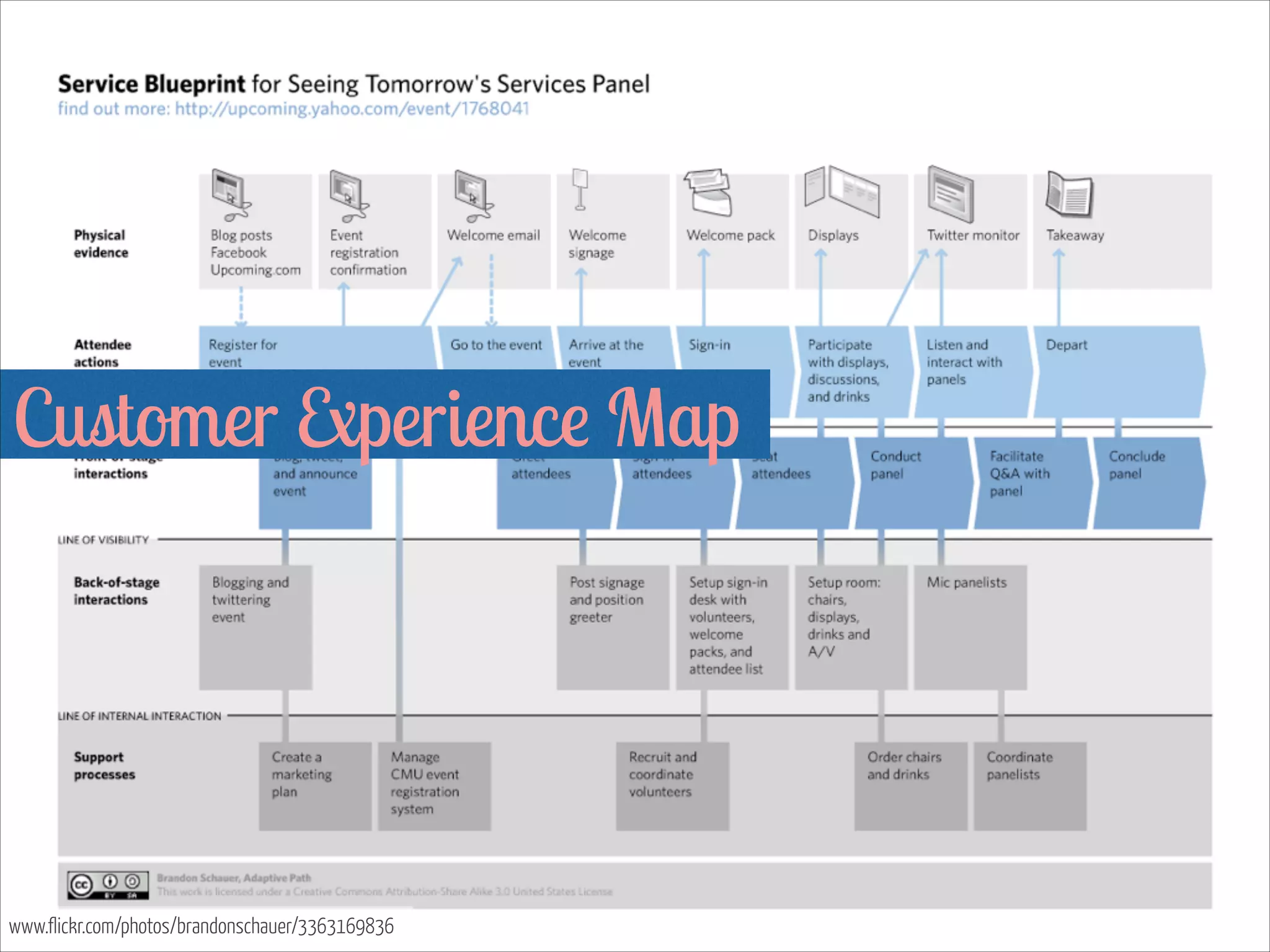
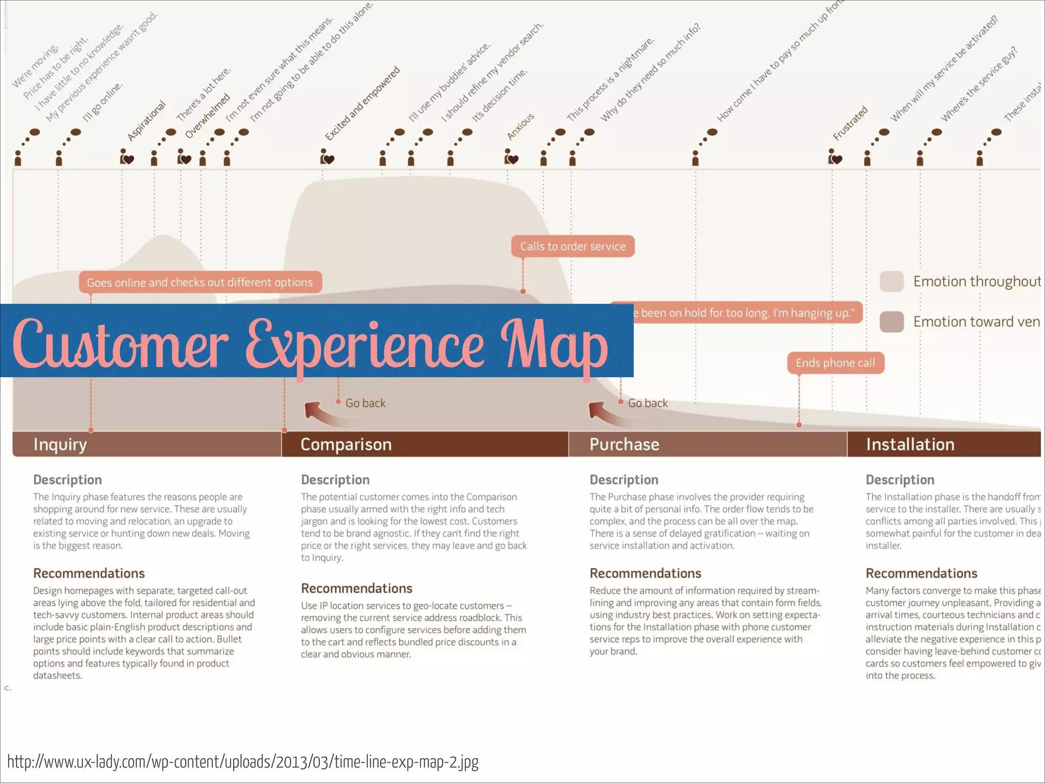
Customer Experience Map 


www.flickr.com/photos/brandonschauer/3363169836
Customer Experience Map 


http://adaptivepath.com/uploads/documents/RailEurope_AdaptivePath_CXMap_FINAL.pdf
Customer Experience Map 


http://www.ux-lady.com/wp-content/uploads/2013/03/time-line-exp-map-2.jpg
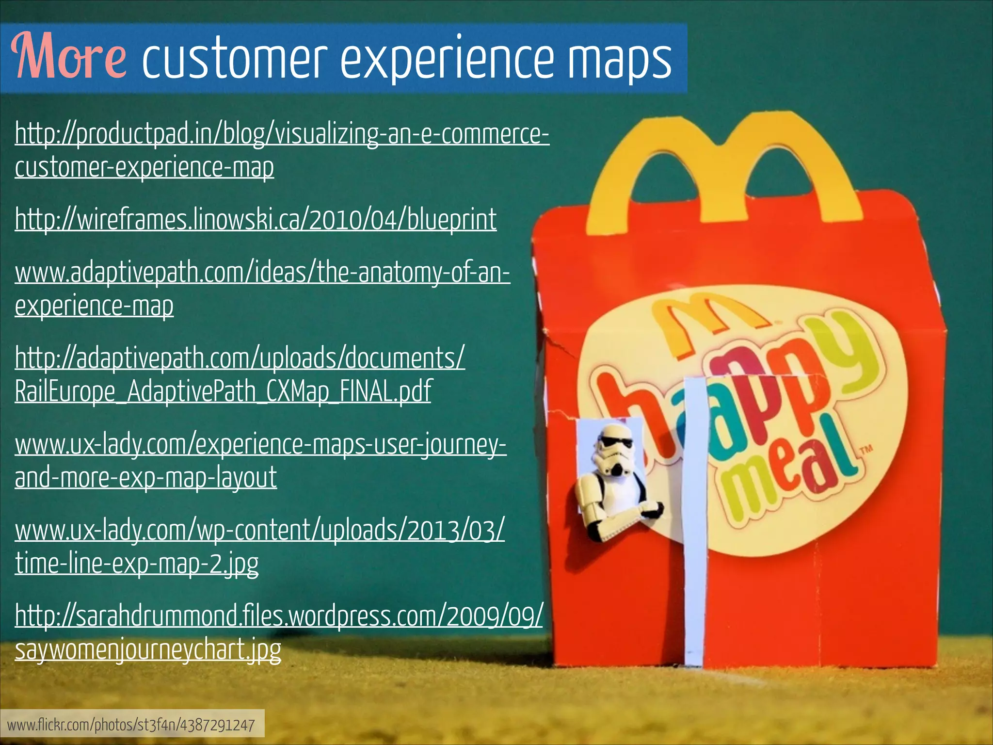
More customer experience maps
http://productpad.in/blog/visualizing-an-e-commercecustomer-experience-map
http://wireframes.linowski.ca/2010/04/blueprint
www.adaptivepath.com/ideas/the-anatomy-of-anexperience-map
http://adaptivepath.com/uploads/documents/
RailEurope_AdaptivePath_CXMap_FINAL.pdf
www.ux-lady.com/experience-maps-user-journeyand-more-exp-map-layout
www.ux-lady.com/wp-content/uploads/2013/03/
time-line-exp-map-2.jpg
http://sarahdrummond.files.wordpress.com/2009/09/
saywomenjourneychart.jpg
www.flickr.com/photos/st3f4n/4387291247
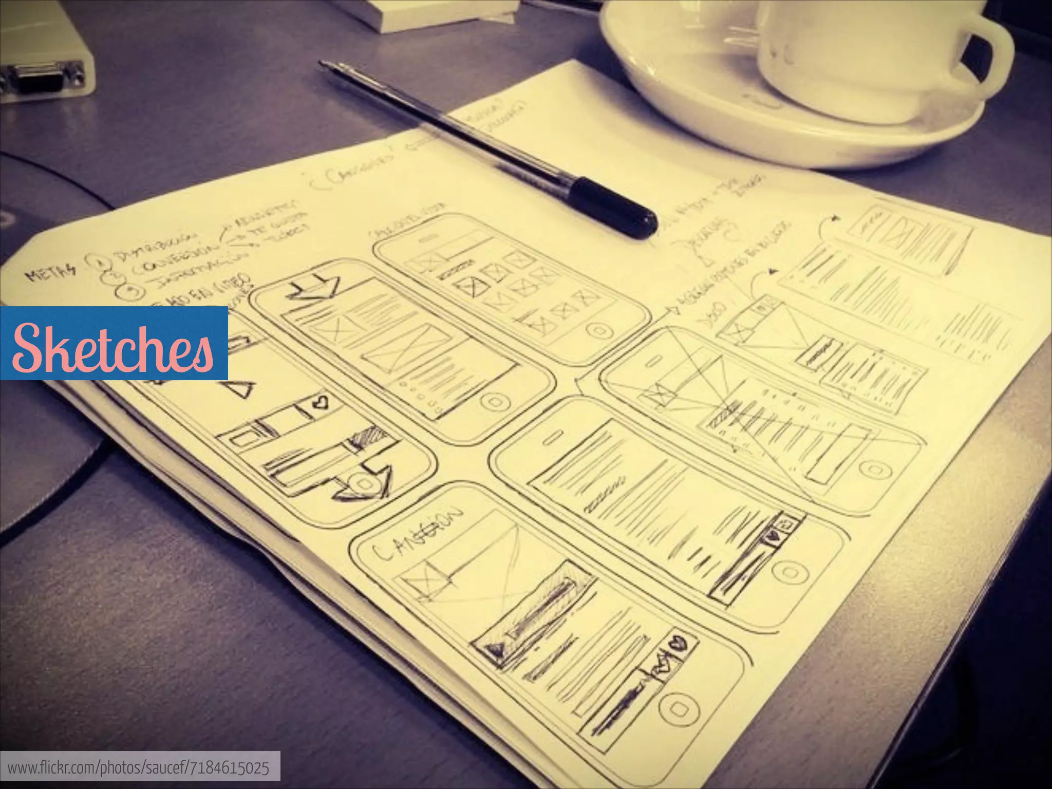
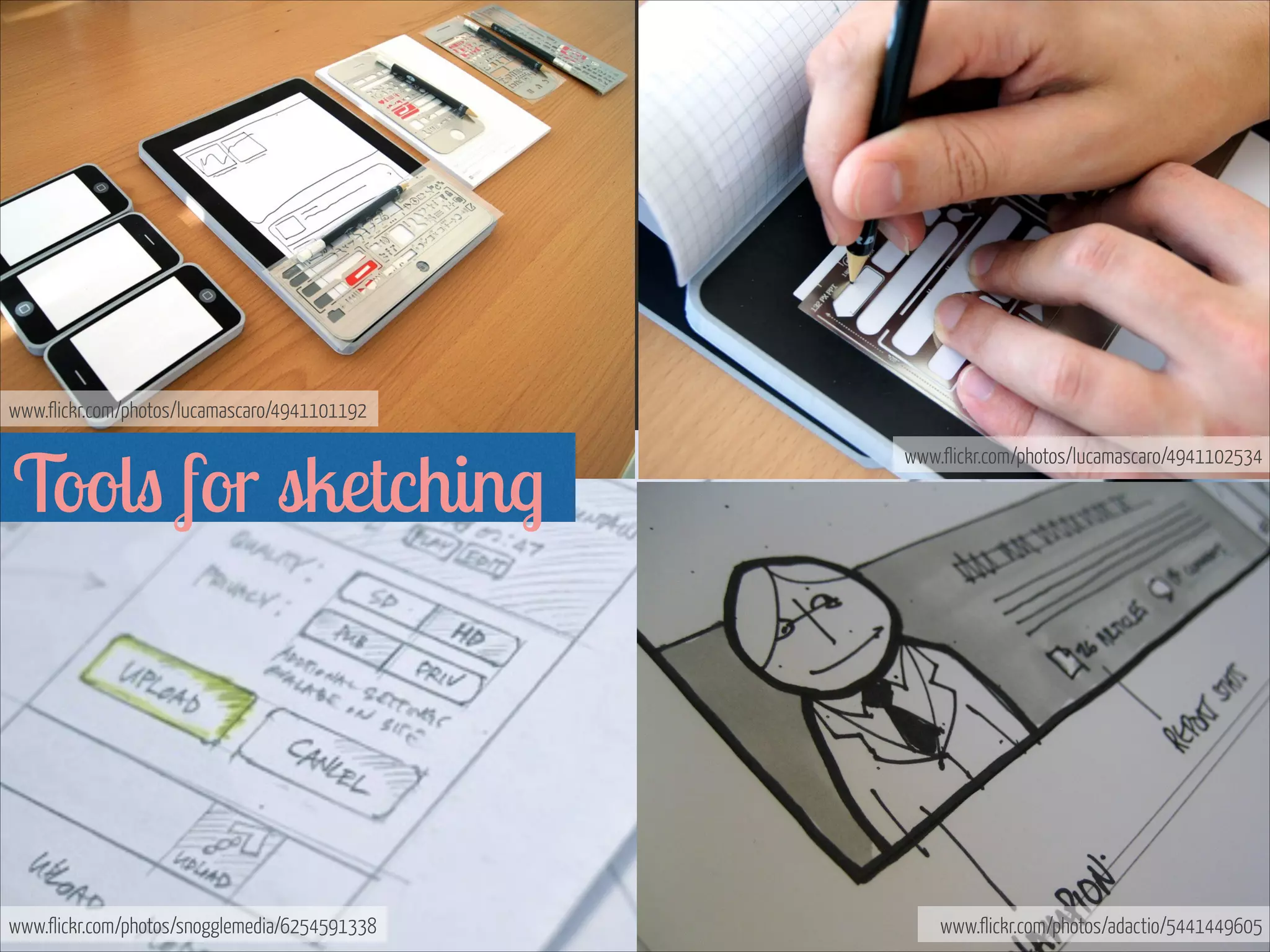
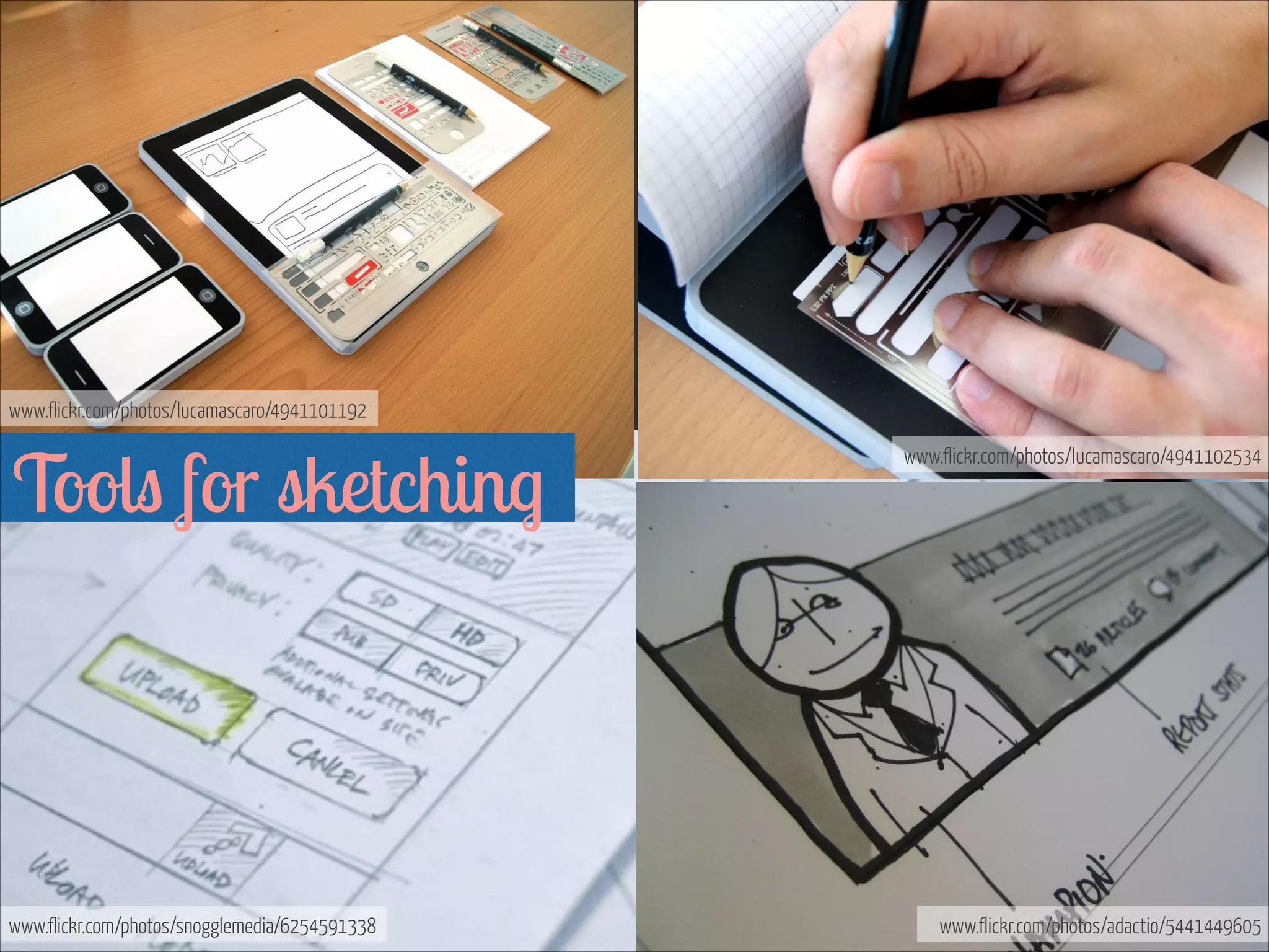
Sketches 


www.flickr.com/photos/saucef/7184615025
www.flickr.com/photos/lucamascaro/4941101192

Tools for sketching 


www.flickr.com/photos/snogglemedia/6254591338

www.flickr.com/photos/lucamascaro/4941102534

www.flickr.com/photos/adactio/5441449605
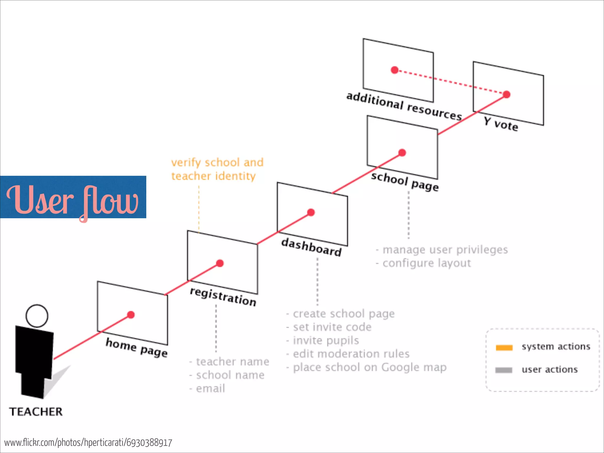
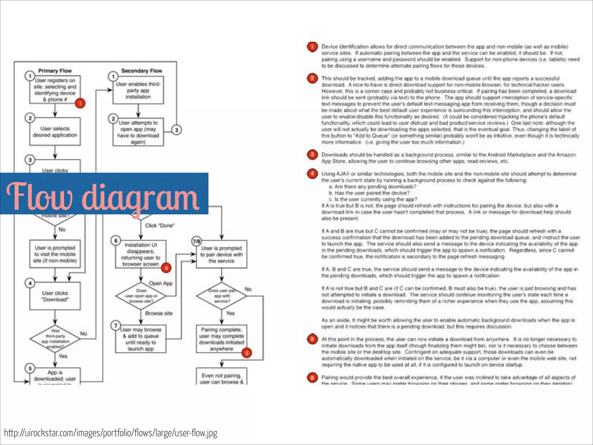
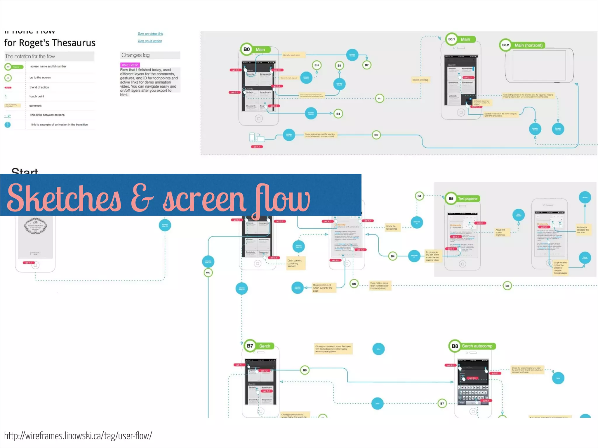
User flow


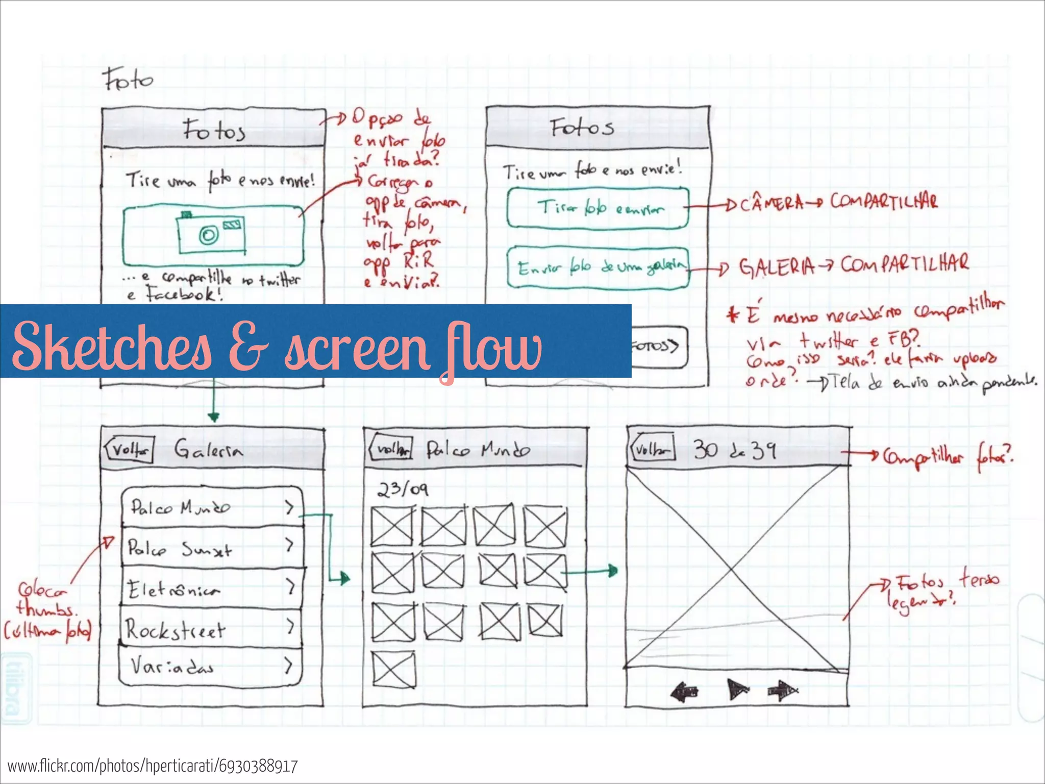
www.flickr.com/photos/hperticarati/6930388917