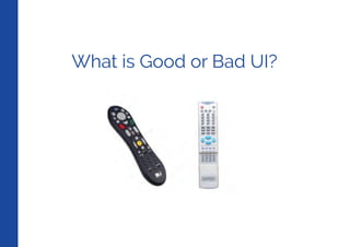
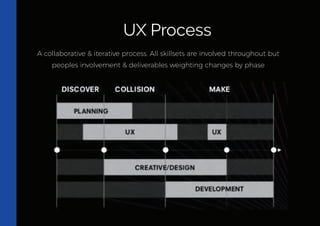
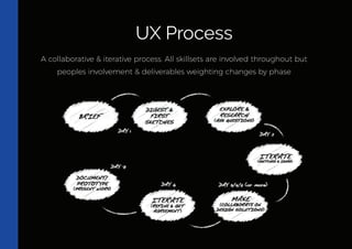
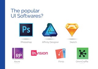
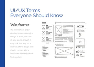
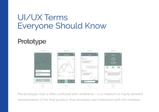
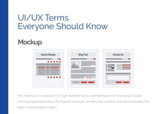
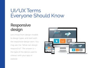
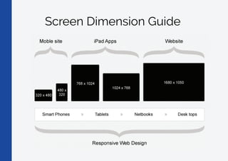
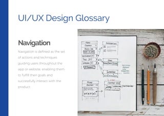
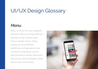
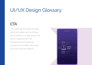
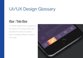
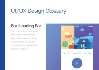
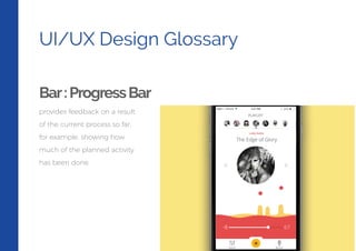
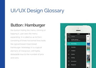
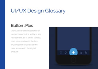
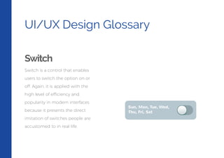
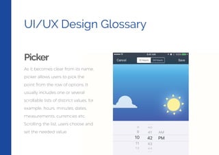
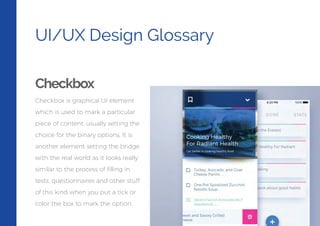
The document provides information on UI/UX design terms and concepts. It defines what UI, UX and UXD are, and describes common design types like skeuomorphic, flat, and material design. It also discusses the UX design process and popular UI design software. Finally, it defines and explains common UI/UX terms like wireframes, prototypes, mockups, responsive design, navigation, menus, calls-to-action buttons, loading bars, tabs, switches, pickers and checkboxes.
2. What is UI?
User Interface
How people interact with
other products/services
Used in Web & Mobile
Applications
A Bridge between a human
being and a system
InnovApp
Application Developer
Company
LOG IN
IF YOU DON’T HAVE AN ACCOUNT YET...
SIGN UP
3. What is UX?
User Experience
What a person feels as he
experiences a product or
service
Important role in all kinds of
marketing
Plays a crucial role in web &
mobile app
InnovApp
Application Developer
Company
4. What is UXD?
User Experience Design focuses on anticipating what users might need to do.
Design of websites, computers, appliances, machines, mobile communication
devices, software applications with the focus on the user experience and
interaction.
UI brings together concepts from interaction design, visual design and
information architecture
UI Design is the process of taking the way a machine works and translating it to
the way a person thinks.
5. Types of Design
SkeuomorphicDesign
• In terms of user interface, this means
applications that are designed to have
elements of them that look or behave
like their real-world counter-parts. For
example turning a digital page to
resemble the experience of reading a
physical book.
• Skeuomorphic interfaces feel instantly
familiar
• Visually rich and engaging •
Demonstrates attention to detail
6. Types of Design
FlatDesign
Flat design is a minimalistic design approach
that emphasizes usability. It features clean,
open space, crisp edges, bright colours and
two- • In flat design, ornamental elements are
viewed as unnecessary clutter. If an aspect
serves no functional purpose, it's a distraction
from user experience. This is the reason for the
minimalistic nature of flat design. • White space
has meaning • Flat design reverts back to the
basics of design as a functional tool. A website
is designed and judged by how well it works,
as opposed to what it looks like. •
7. Types of Design
MaterialDesign
Goal: Create a visual language that
synthesizes classic principles of good design
with the innovation and possibility of
technology and science. • Google states that
their new design language is based on paper
and ink • The material environment is a 3D
space, which means all objects have x, y, and
z dimensions. • Within the material
environment, virtual lights illuminate the
scene. Key lights create directional shadows,
while ambient light creates soft shadows
from all angles. • Material casts shadows.
9. A collaborative & iterative process. All skillsets are involved throughout but
peoples involvement & deliverables weighting changes by phase
UX Process
10. A collaborative & iterative process. All skillsets are involved throughout but
peoples involvement & deliverables weighting changes by phase
UX Process
12. UI/UX Terms
Everyone Should Know
Wireframe
The wireframe is a low
detailed presentation of a
design. It is not just a set
of grey blocks, though it
may look that way. It’s a
skeleton of the design that
should contain all the
important elements of the
final product.
13. UI/UX Terms
Everyone Should Know
Prototype
The prototype, that is often confused with wireframe — is a medium or highly detailed
representation of the final product, that simulates user interaction with the interface.
14. UI/UX Terms
Everyone Should Know
Mockup
The mockup is a medium or high detailed static representation of the design. Good
mockup represents the information structure, renders the content and demonstrates the
basic functionality in static.
15. UI/UX Terms
Everyone Should Know
Responsive
design
Let’s move from design models
to design types, and start with
the responsive design term. You
may ask me: “What can design
respond to?”. The answer is —
the type of the device used to
interact with your app or
website.
17. UI/UX Design Glossary
Navigation
Navigation is defined as the set
of actions and techniques
guiding users throughout the
app or website, enabling them
to fulfill their goals and
successfully interact with the
product.
18. UI/UX Design Glossary
Menu
Menu is one of the core navigation
elements. Menus can have different
locations in the interface (side
menus, header menus, footer
menus etc.) and different
performance of appearance and
interaction (drop-down menus,
drop-up menus, sliding menus etc.)
Any solution, which designer makes
about menu functionality,
19. UI/UX Design Glossary
CTA
This is actually the word of phrase
which stimulates users to interact
with a product in a way and for the
aim it is designed for. CTA
elements are the interactive
controls which enable users to do
the action they are called to.
20. UI/UX Design Glossary
Bar:TabBar
In mobile applications, it appears at
the bottom of an app screen and
provides the ability to quickly
switch between different sections
of an app.
21. UI/UX Design Glossary
Bar:LoadingBar
The control informing user on
the current stage of action,
when the process is in active
stage and user can see the
flow via timing or percentage
shown in progress.
23. UI/UX Design Glossary
Button:Hamburger
the button hiding the menu: clicking or
tapping it, user sees the menu
expanding. It is called so as its form
consisting of three horizontal lines looks
like typical bread-meat-bread
hamburger. Nowadays it is a typical
element of interaction, still highly
debatable due to the number of pros
and cons.
24. UI/UX Design Glossary
Button:Plus
the button that being clicked or
tapped presents the ability to add
new content, be it a new contact,
post, note, position in the list—
anything user could do as the
basic action with the digital
product.
25. UI/UX Design Glossary
Switch
Switch is a control that enables
users to switch the option on or
off. Again, it is applied with the
high level of efficiency and
popularity in modern interfaces
because it presents the direct
imitation of switches people are
accustomed to in real life.
26. UI/UX Design Glossary
Picker
As it becomes clear from its name,
picker allows users to pick the
point from the row of options. It
usually includes one or several
scrollable lists of distinct values, for
example, hours, minutes, dates,
measurements, currencies etc.
Scrolling the list, users choose and
set the needed value.
27. UI/UX Design Glossary
Checkbox
Checkbox is graphical UI element
which is used to mark a particular
piece of content, usually setting the
choice for the binary options. It is
another element setting the bridge
with the real world as it looks really
similar to the process of filling in
tests, questionnaires and other stuff
of this kind when you put a tick or
color the box to mark the option.