Download as PDF, PPTX


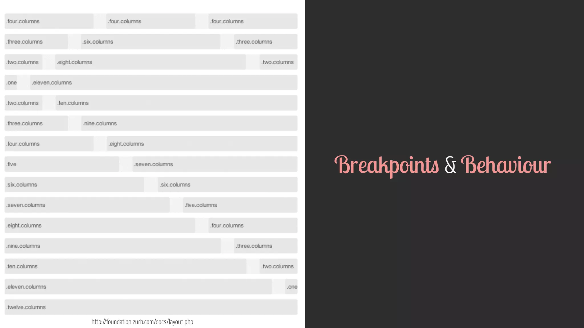
![http://foundation.zurb.com/docs/layout.php
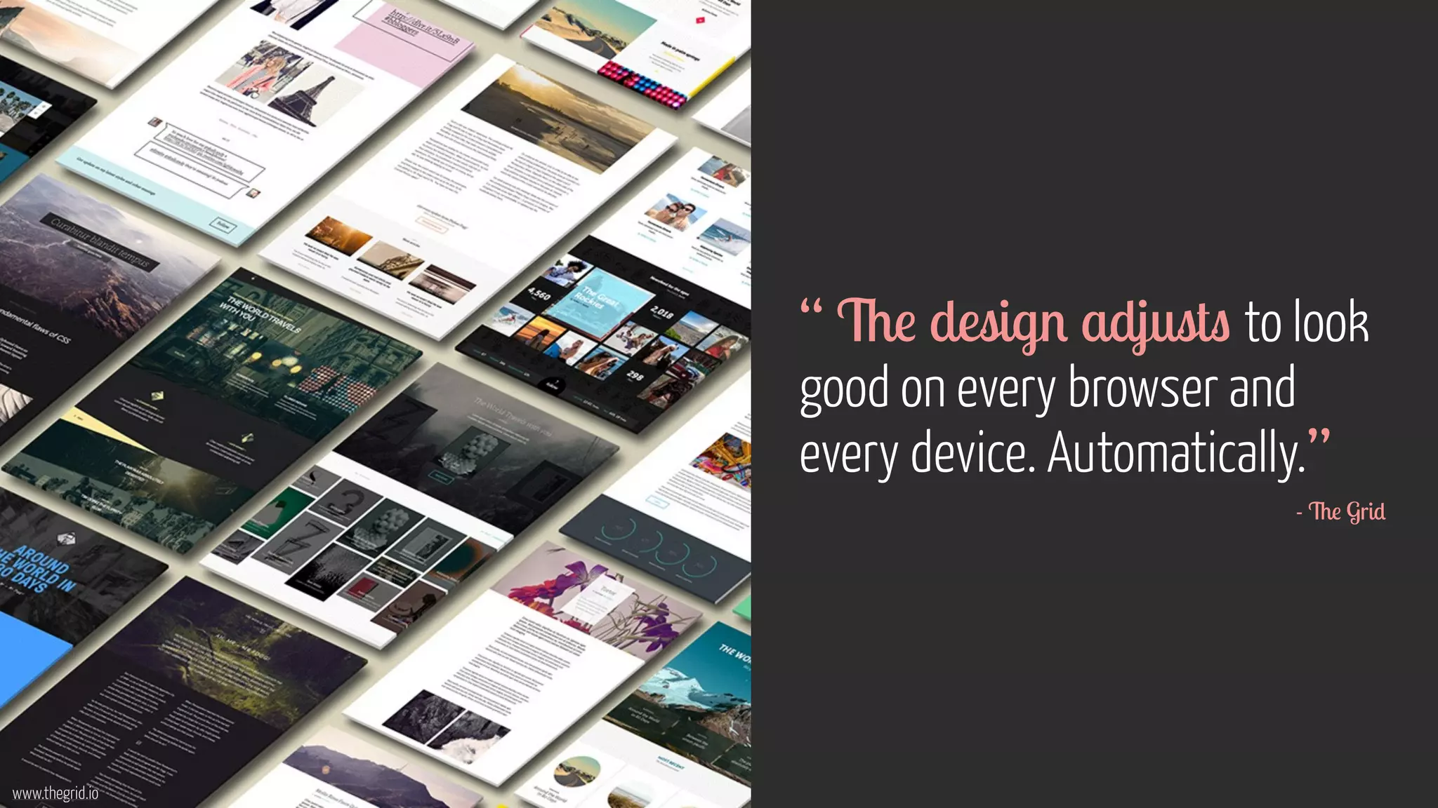
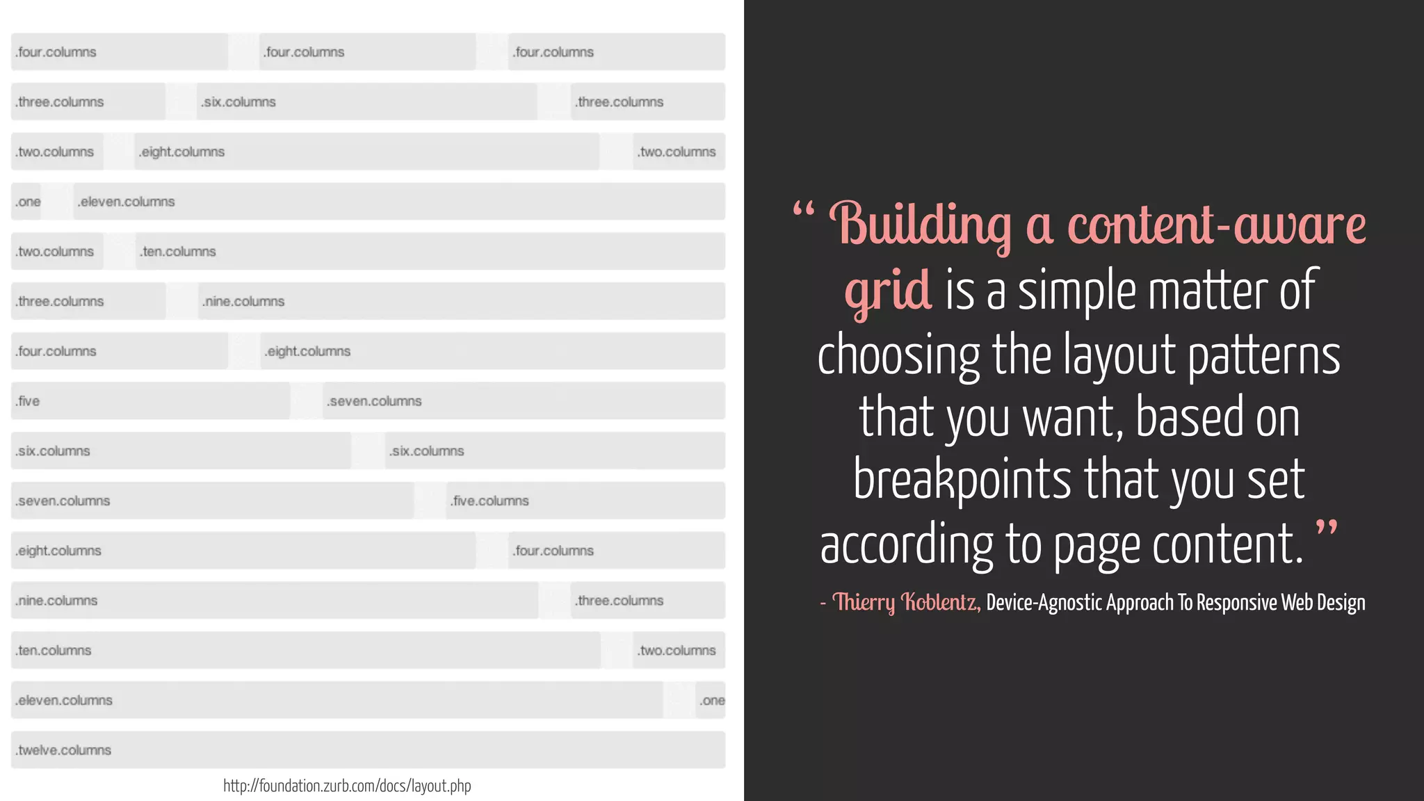
“ Design development
should respond to the user’s
behaviour environment based
on screen size, platform
orientation. [It’s]...a mix of
flexible grids layouts, images
an intelligent use of media
queries. ”
- Smashing Magazine](https://image.slidesharecdn.com/ucddeviceagnosticdesign25oct2014-141025092951-conversion-gate01/75/Device-Agnostic-Design-UCD2014-London-25-Oct-2014-35-2048.jpg)


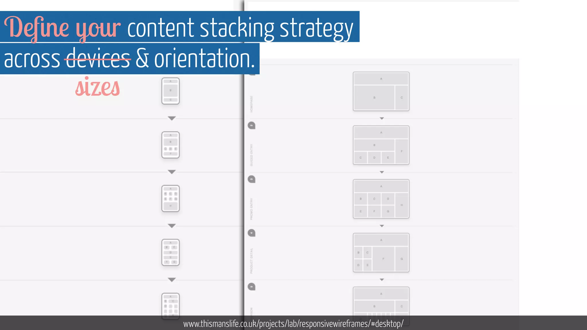


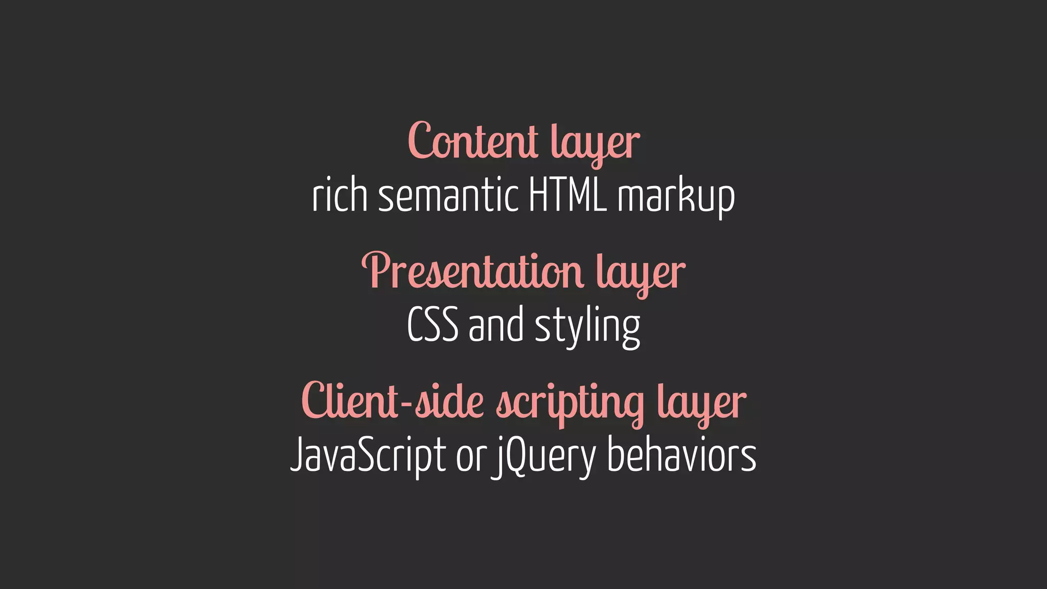
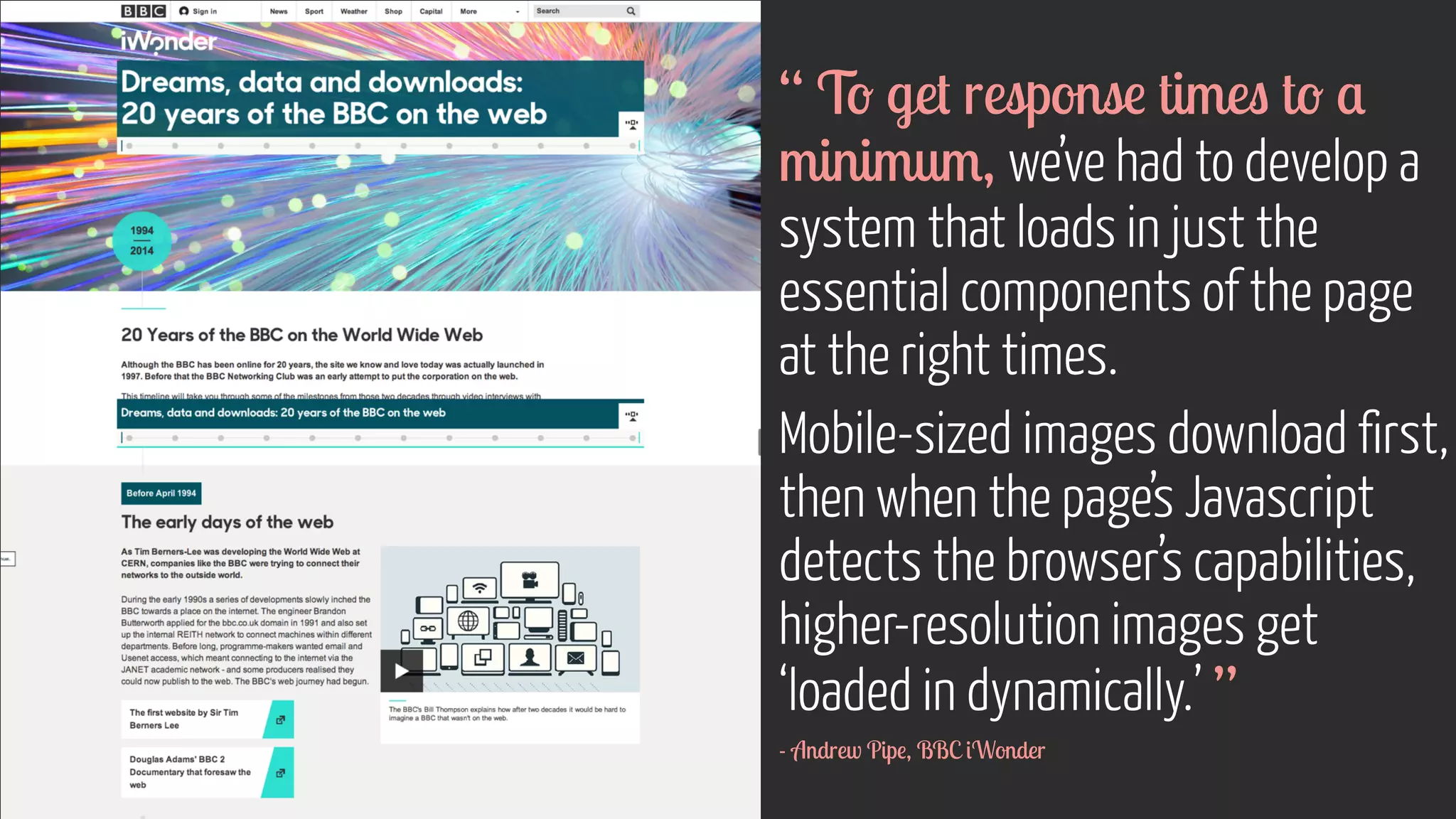

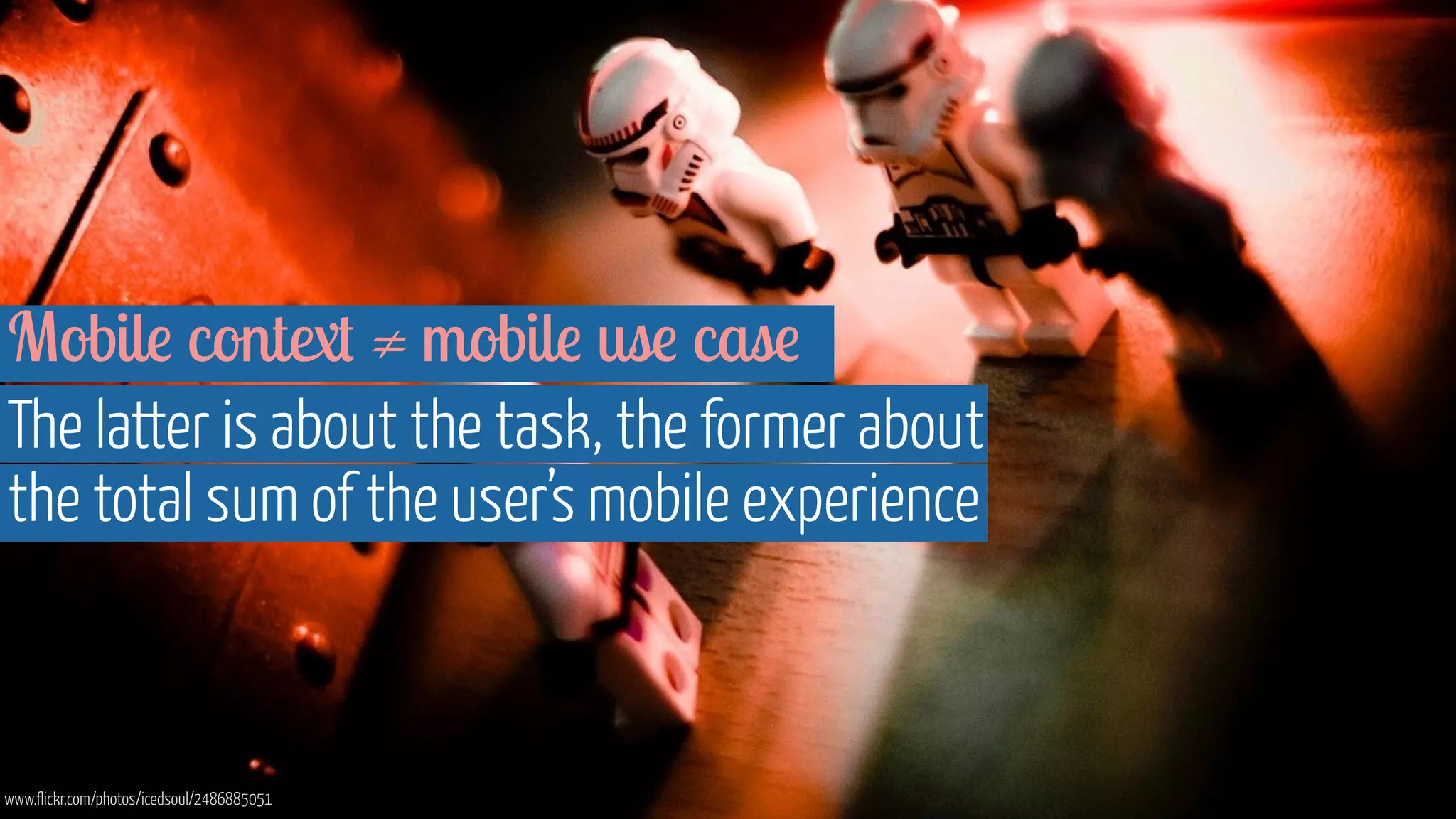


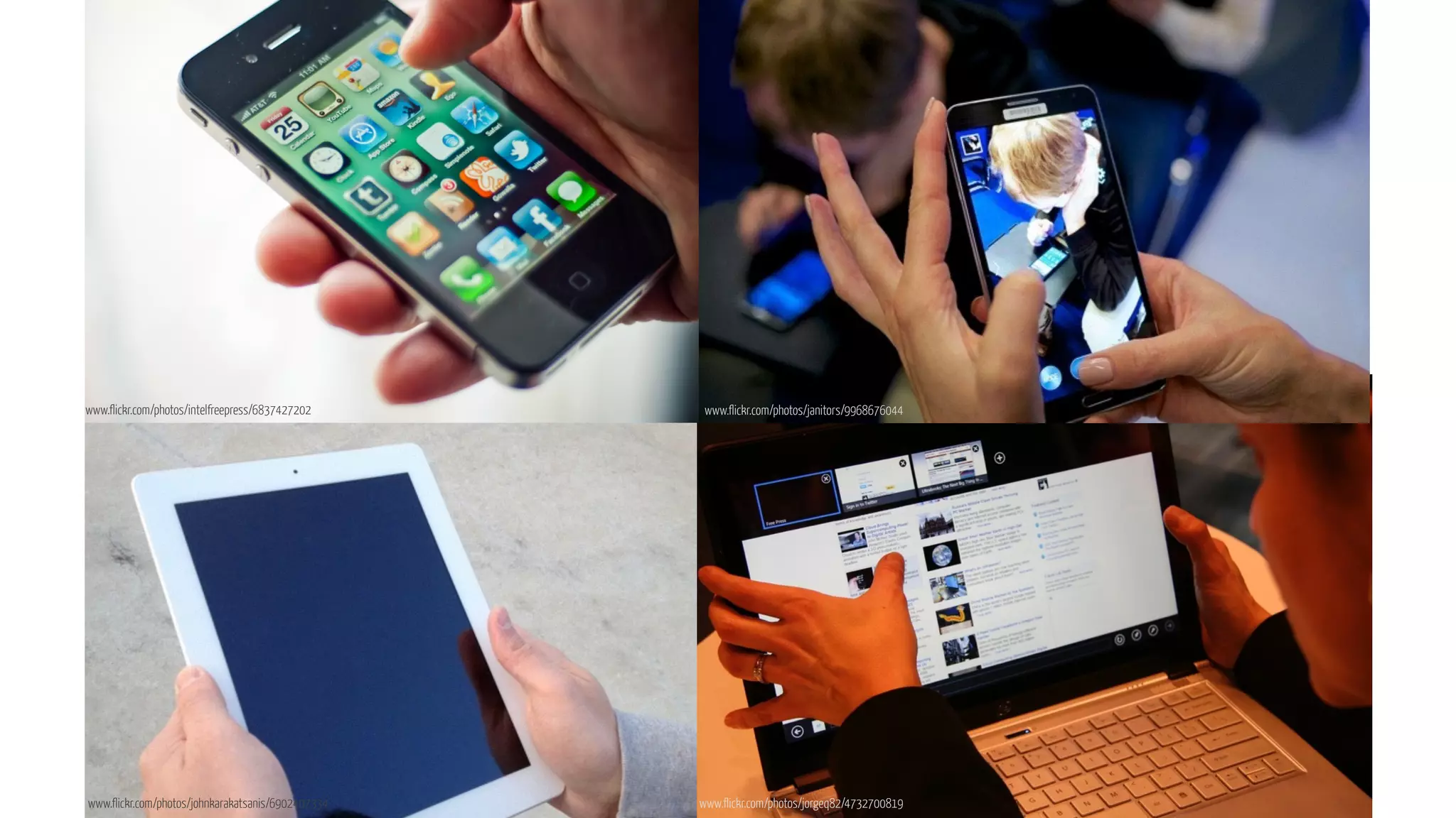


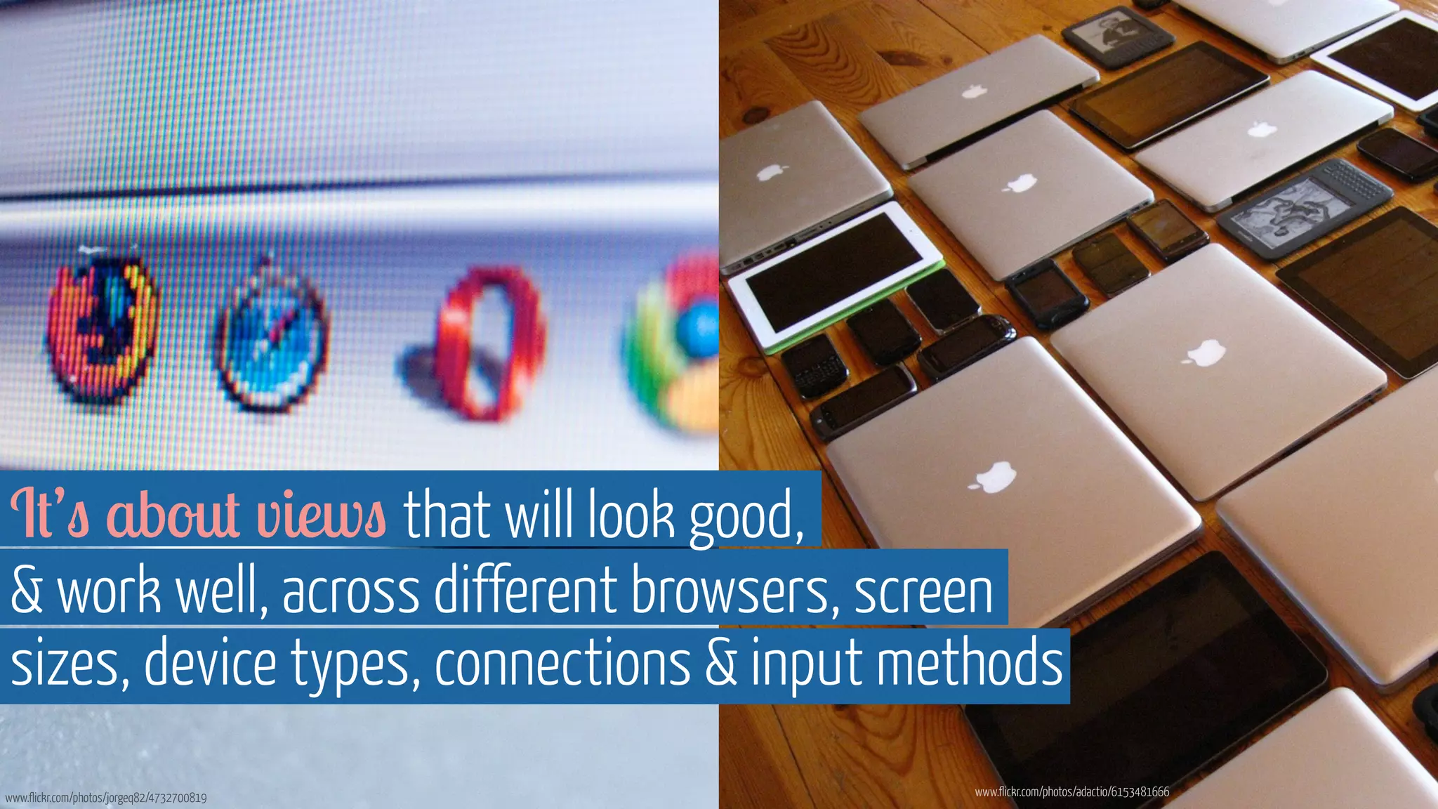

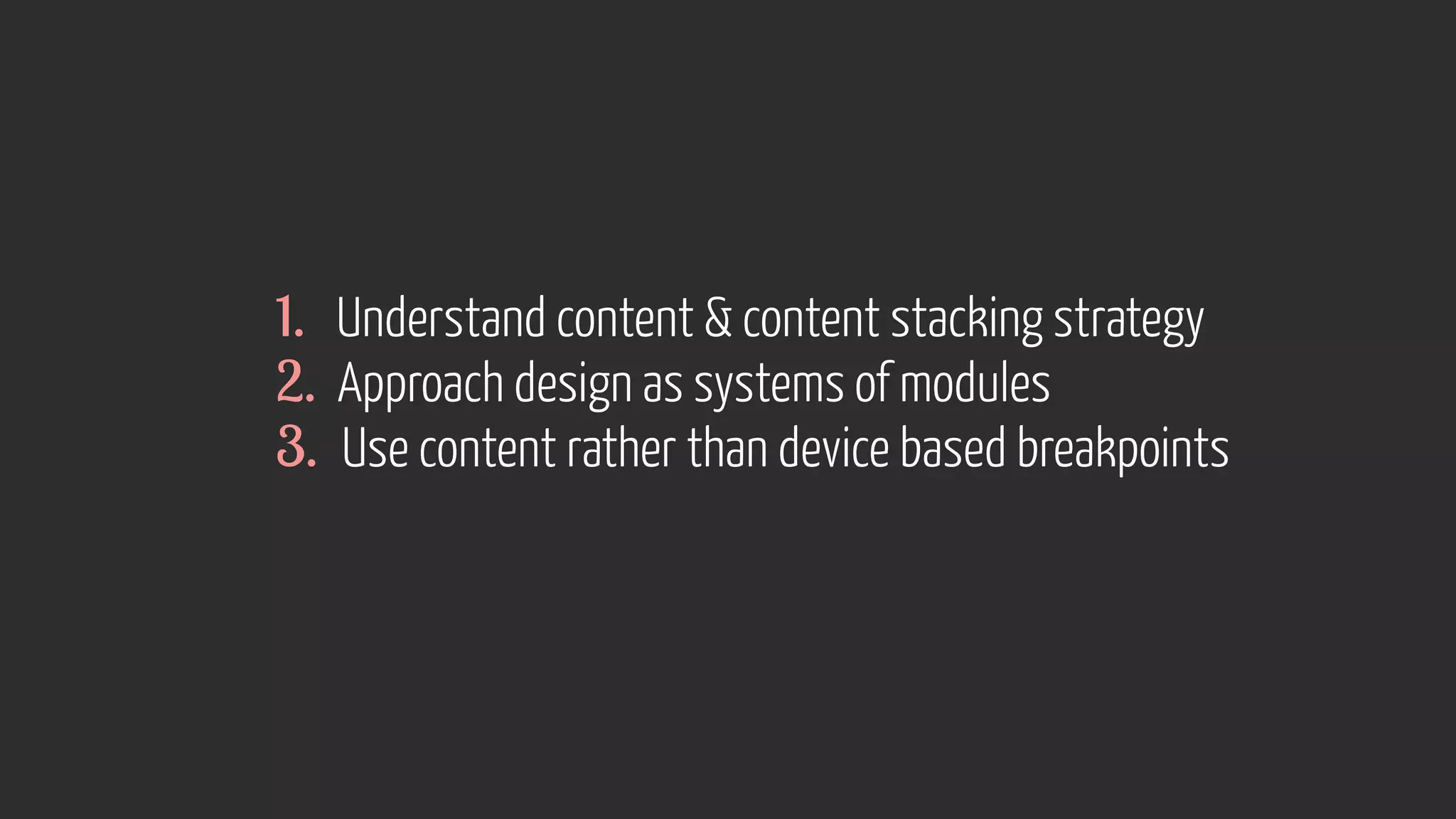
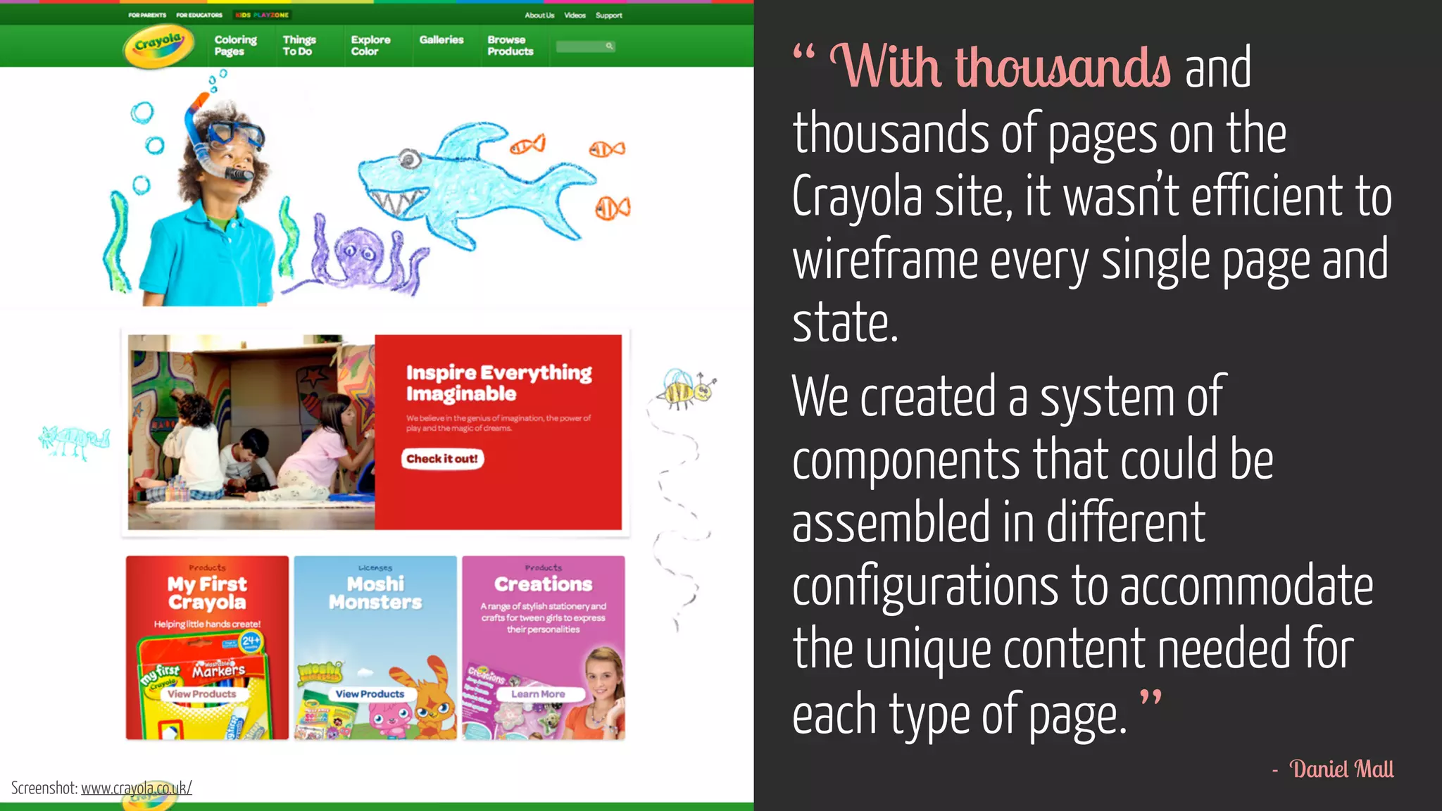
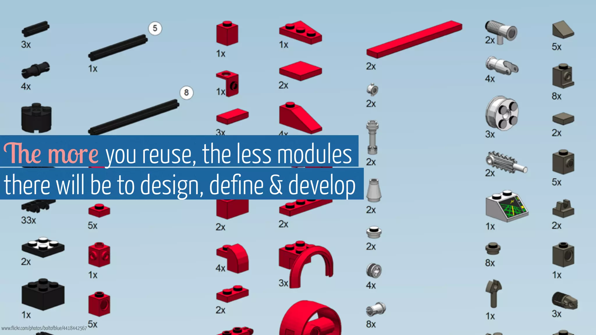
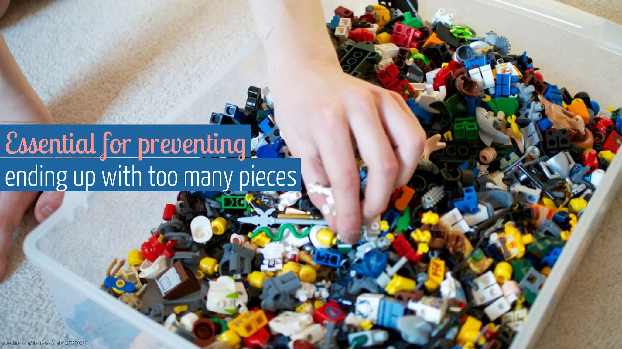
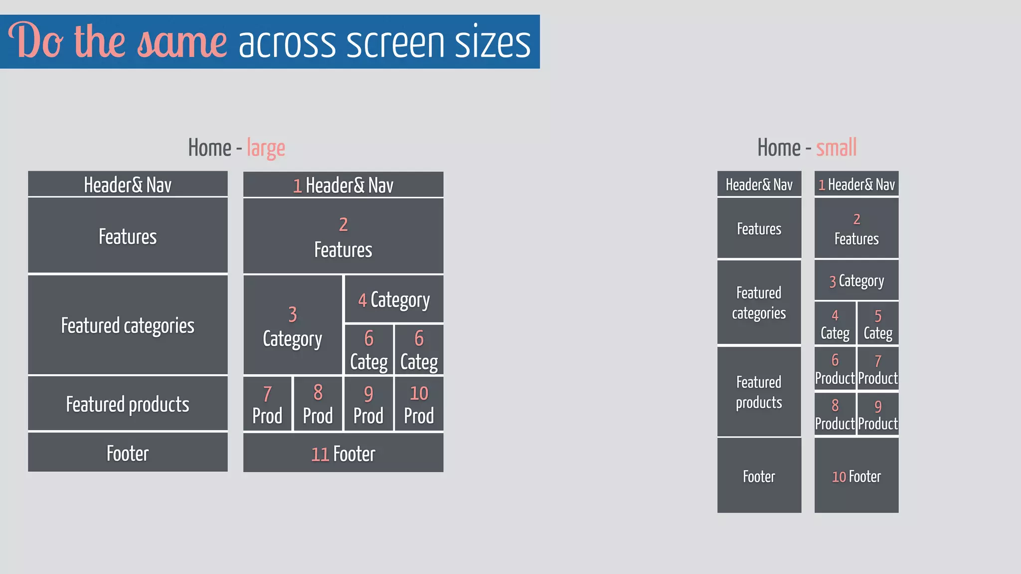
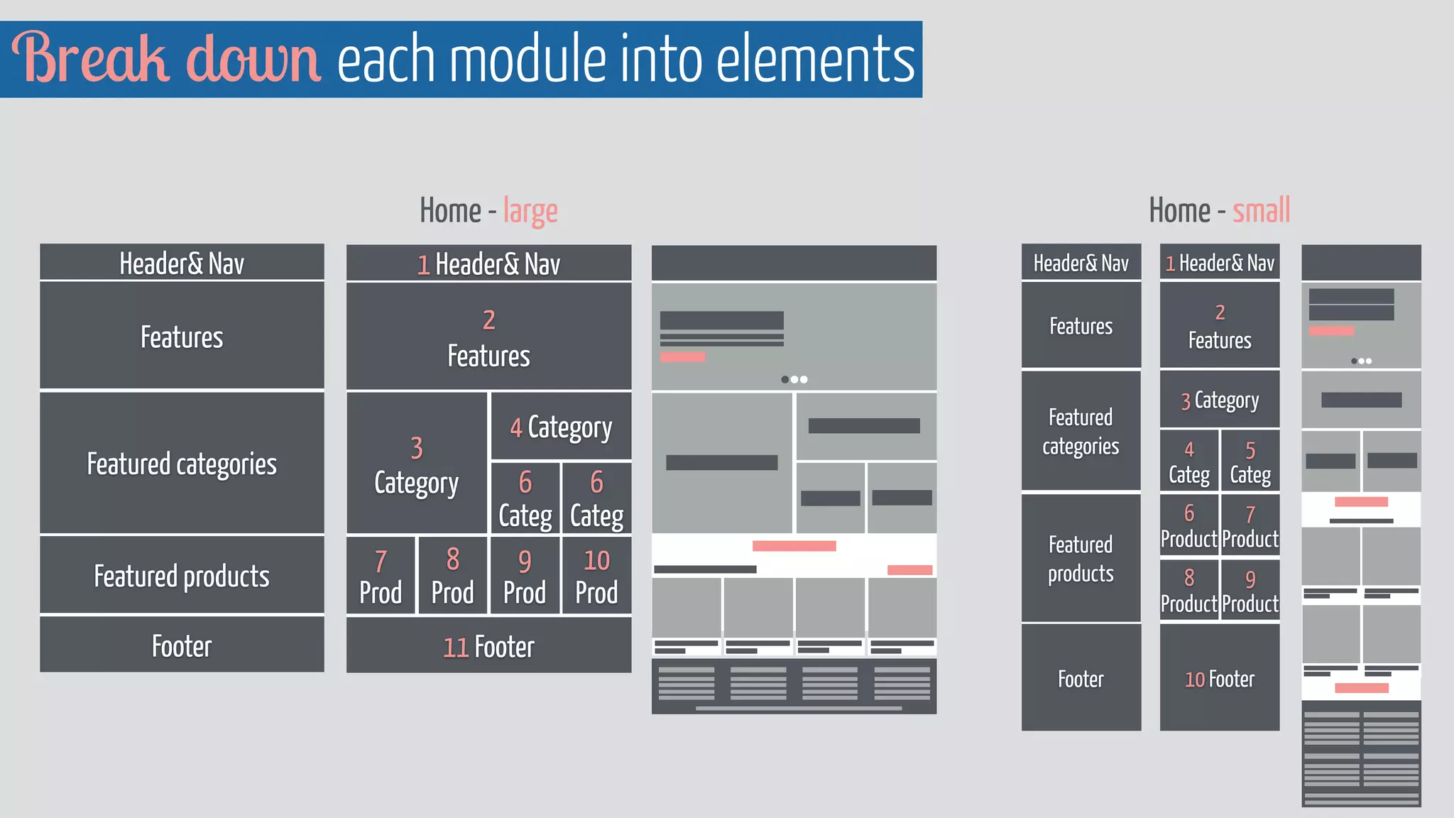
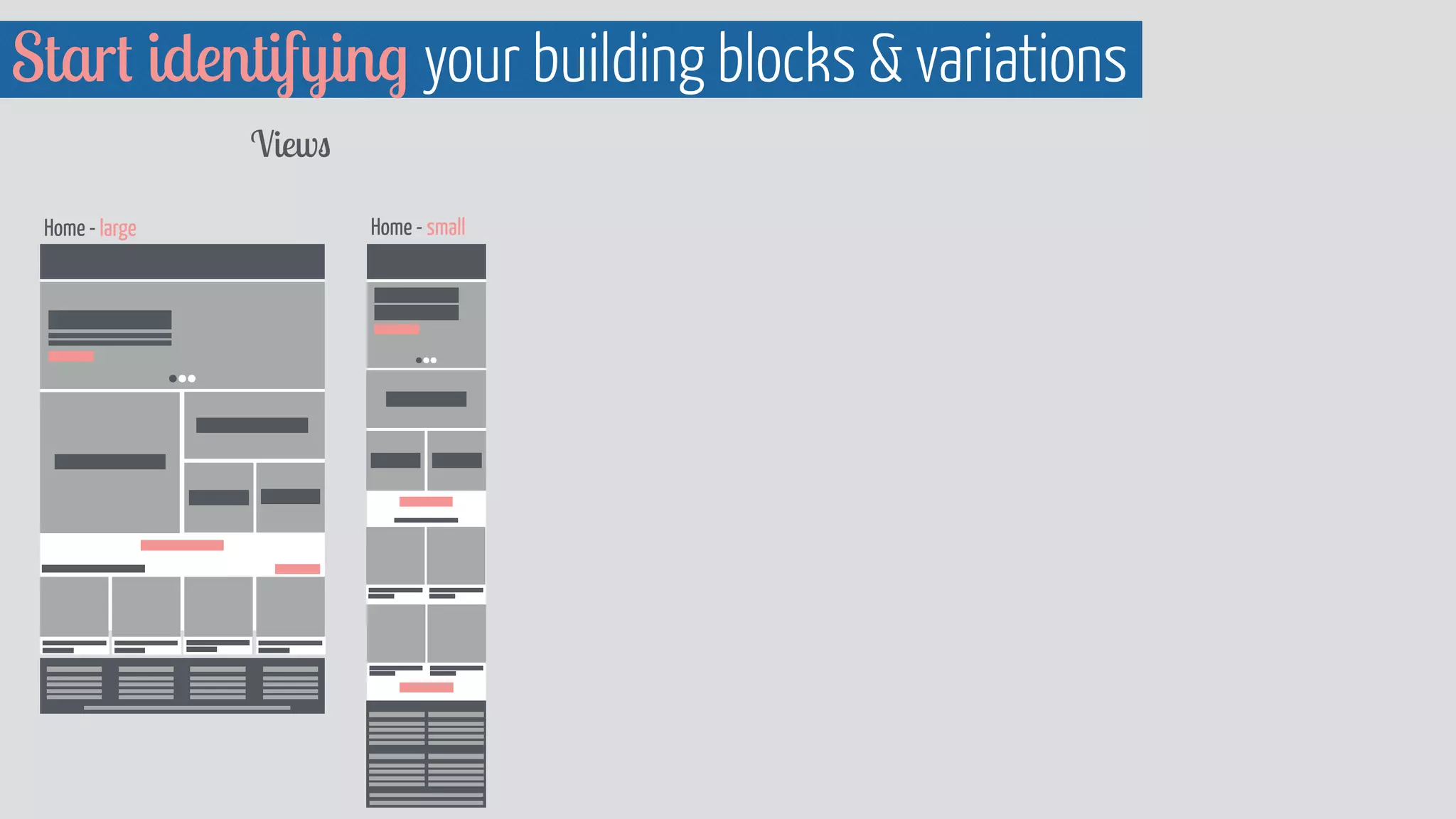
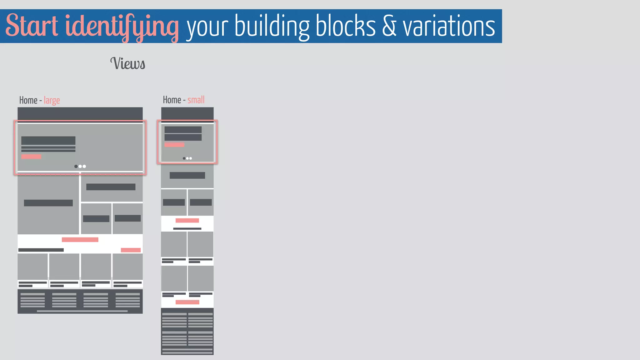
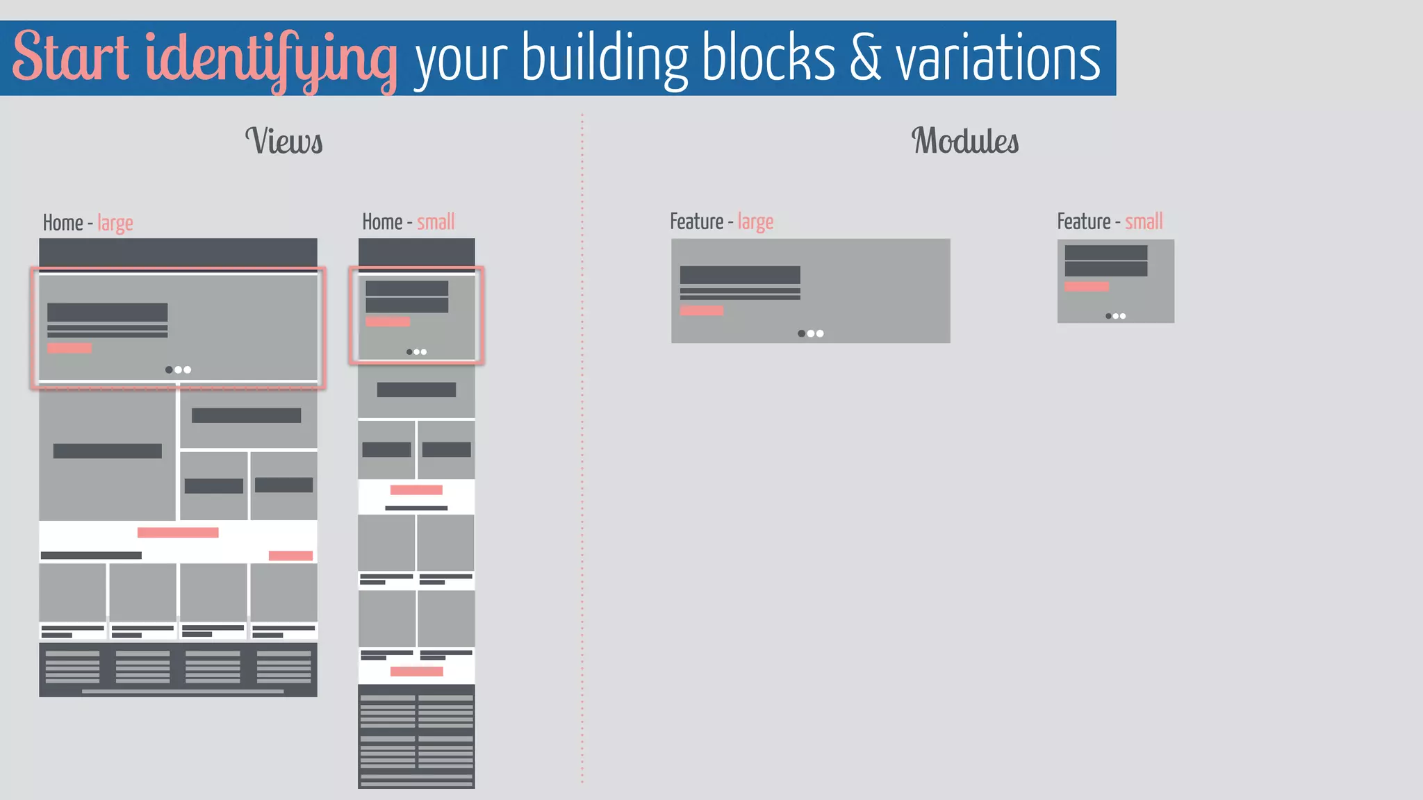
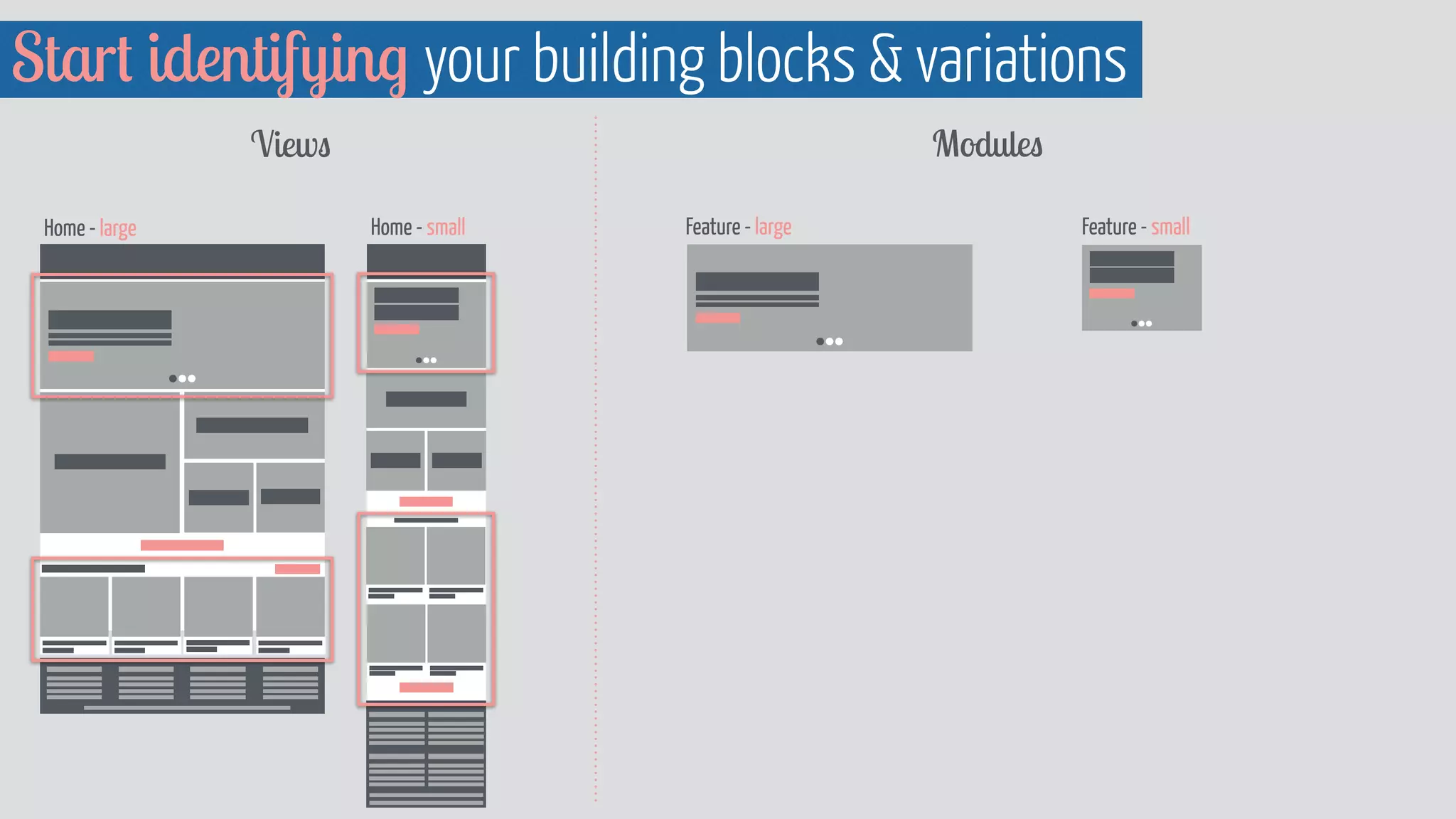
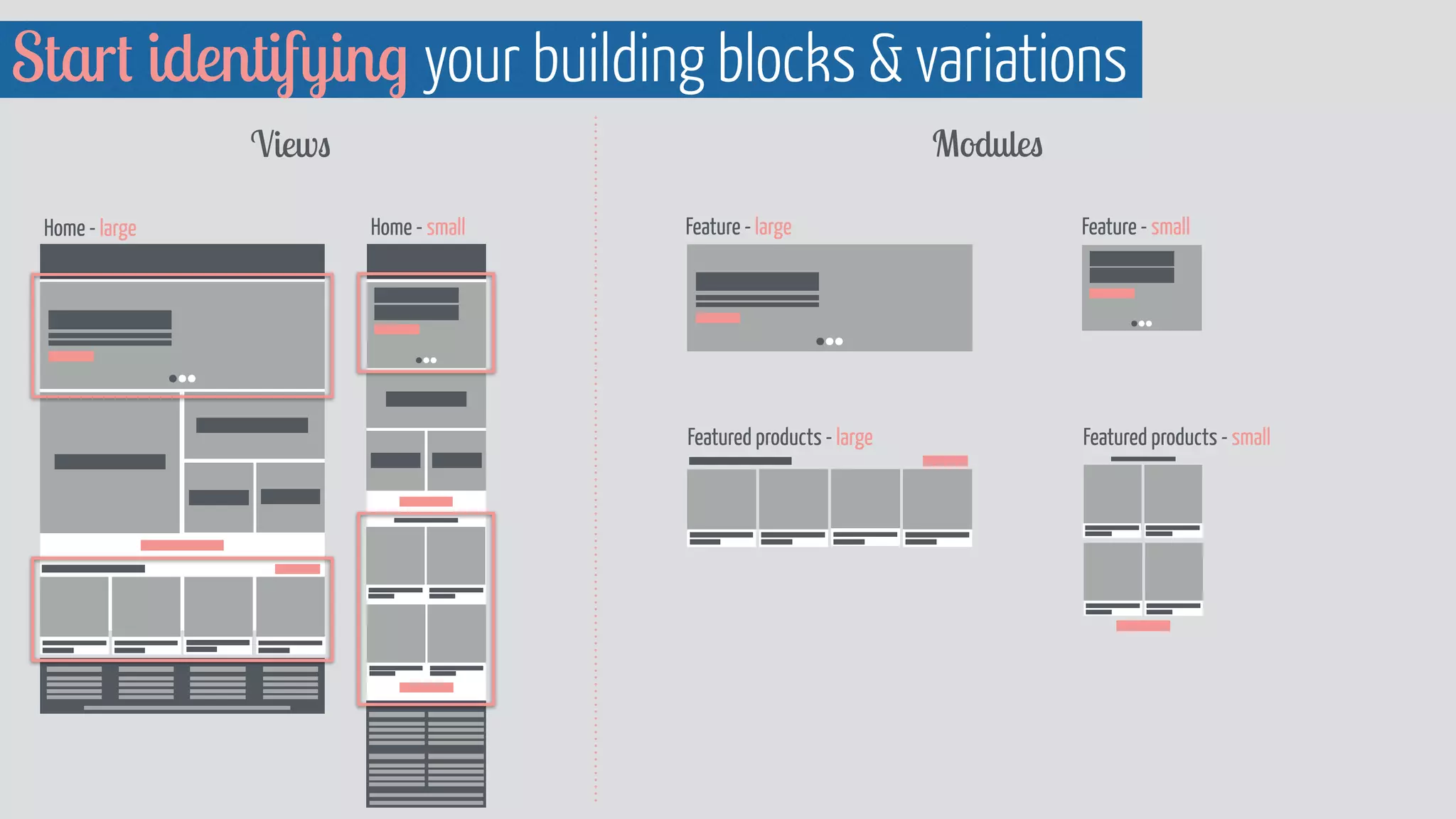


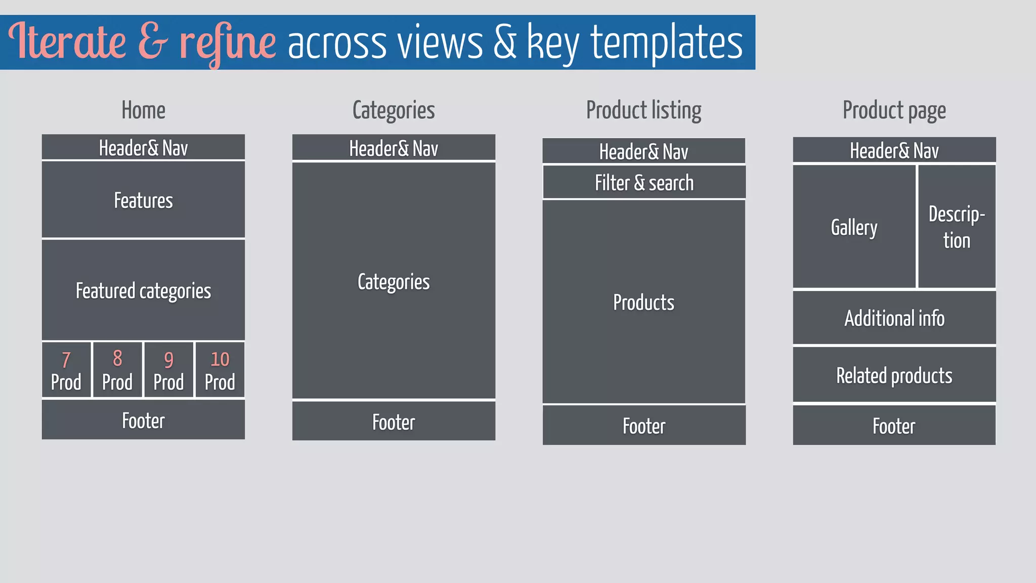
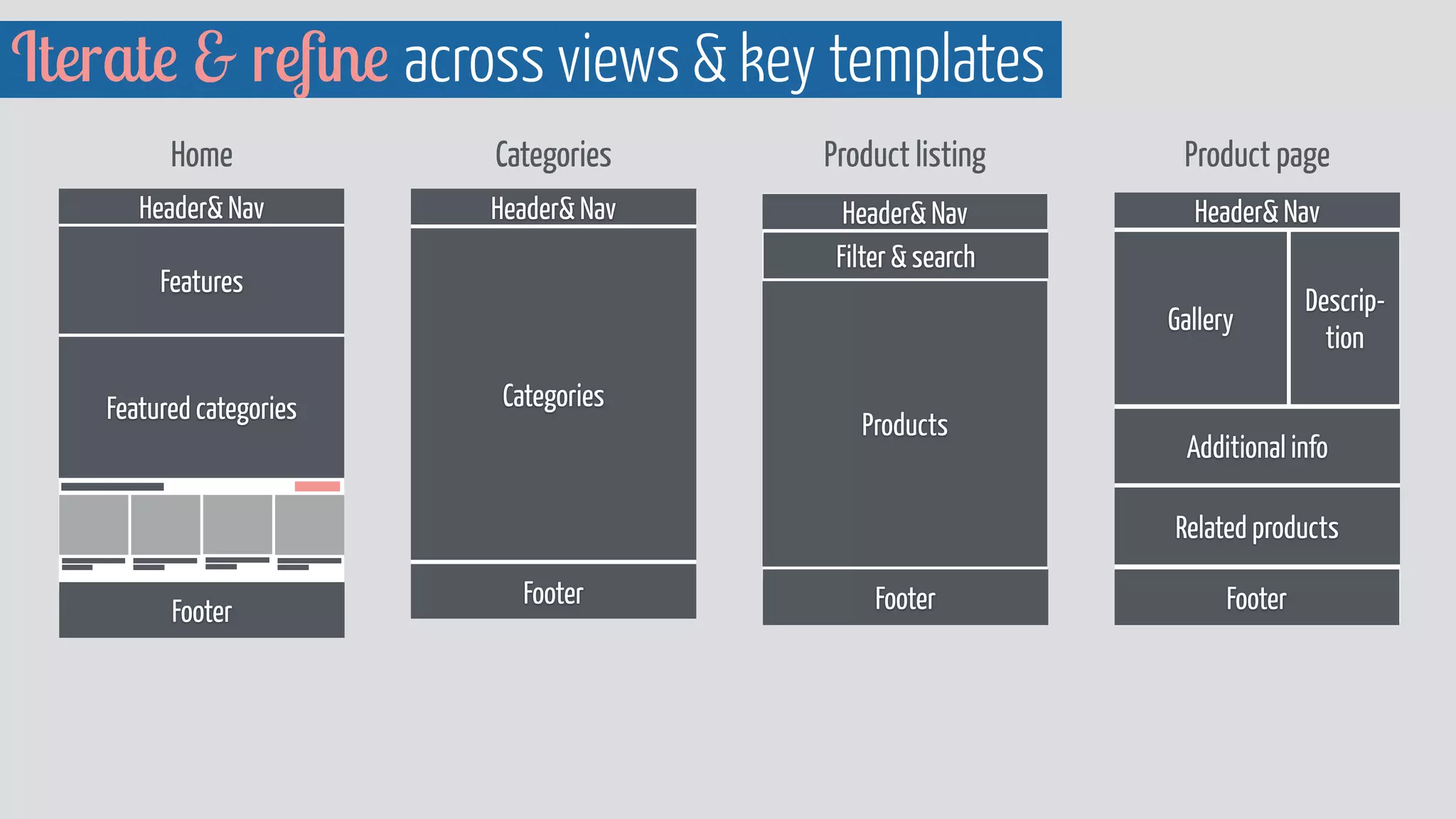
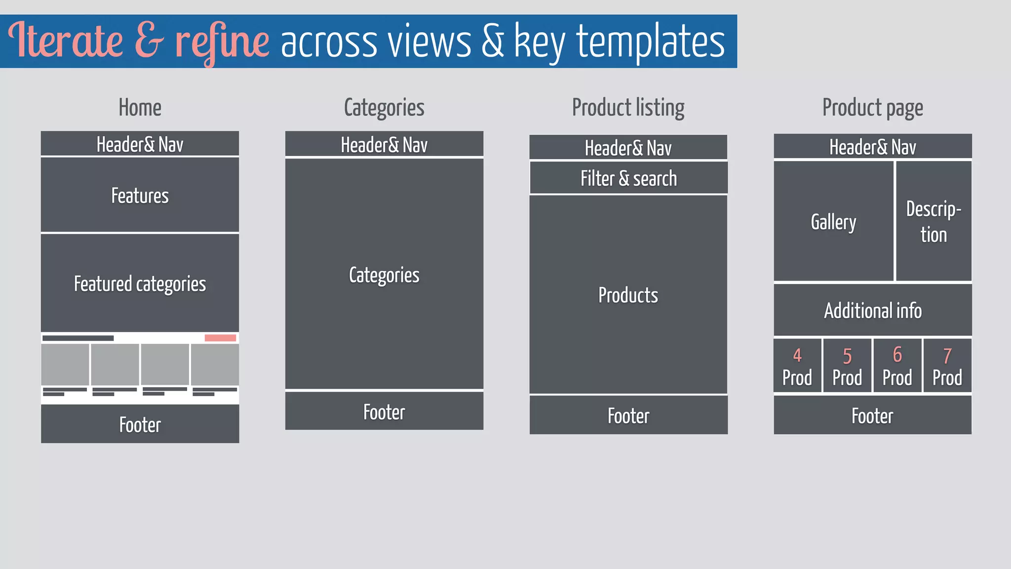
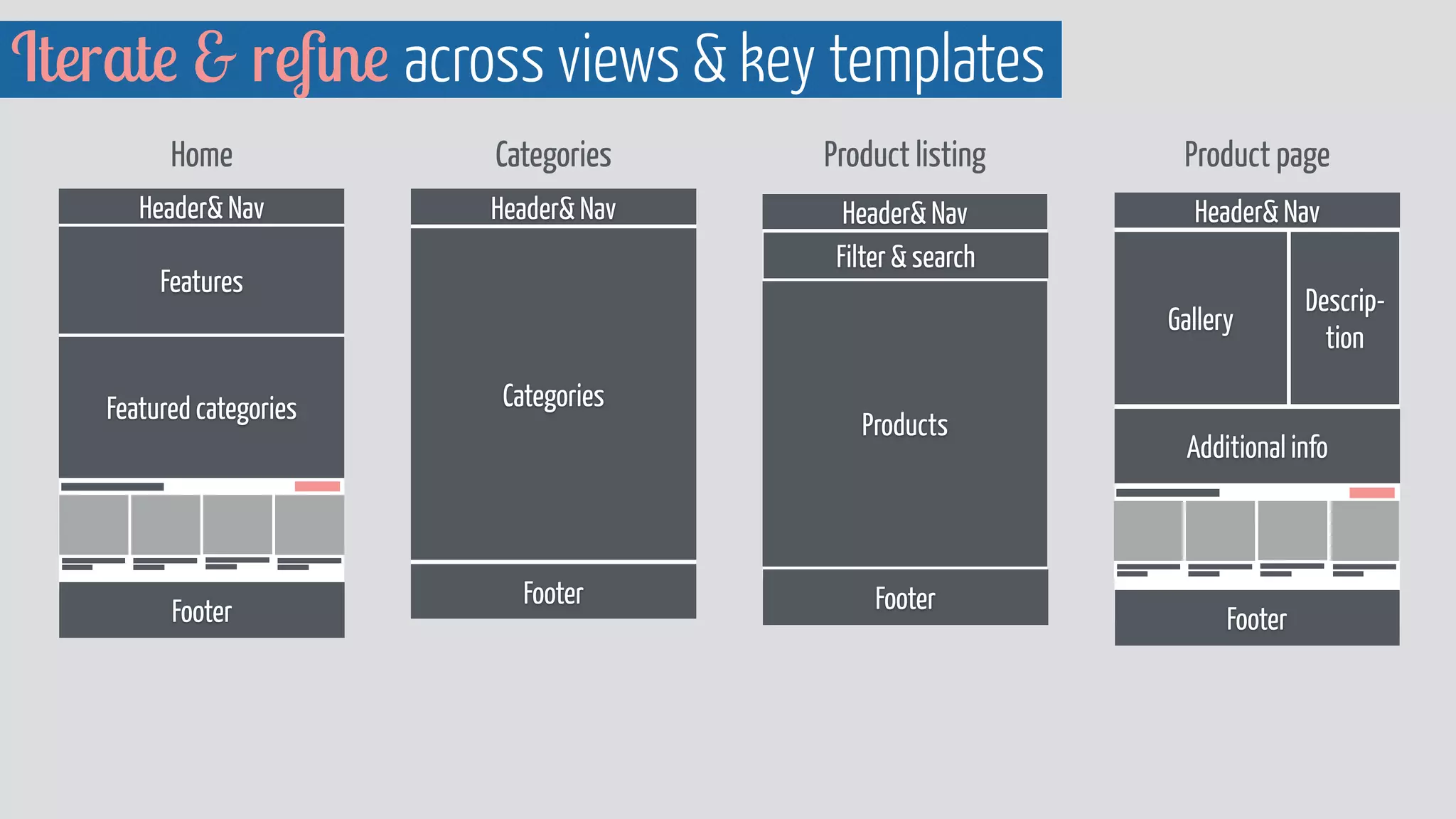
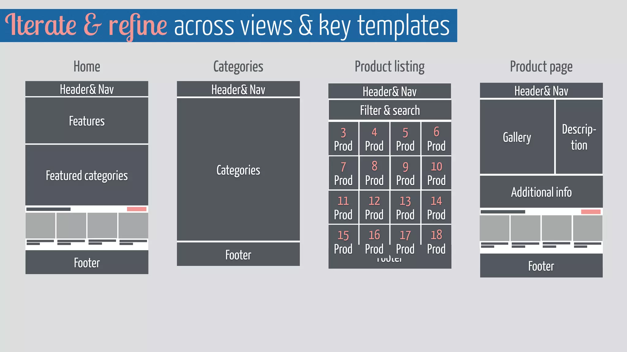
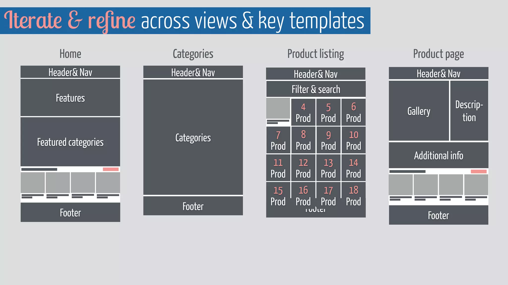
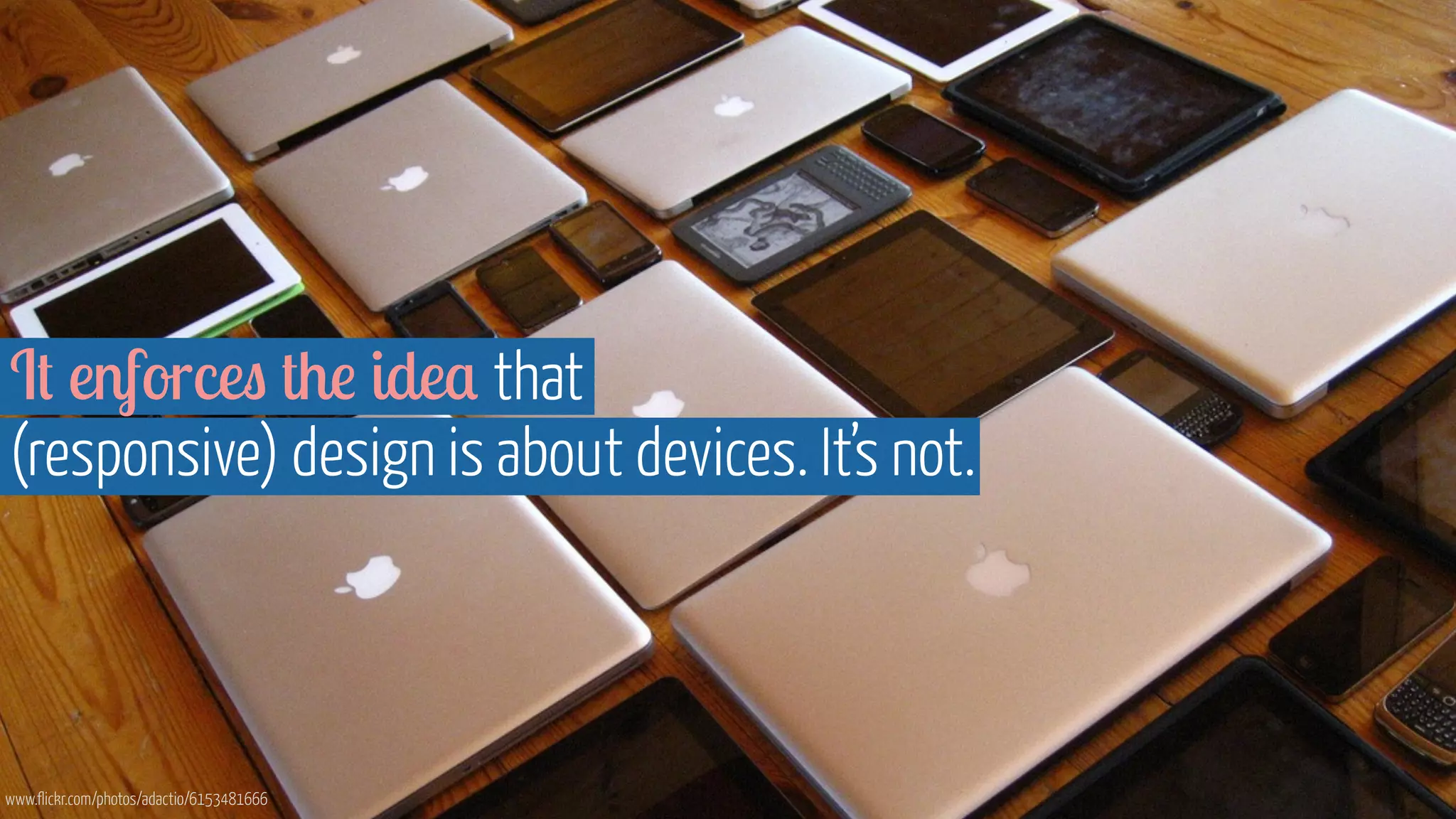

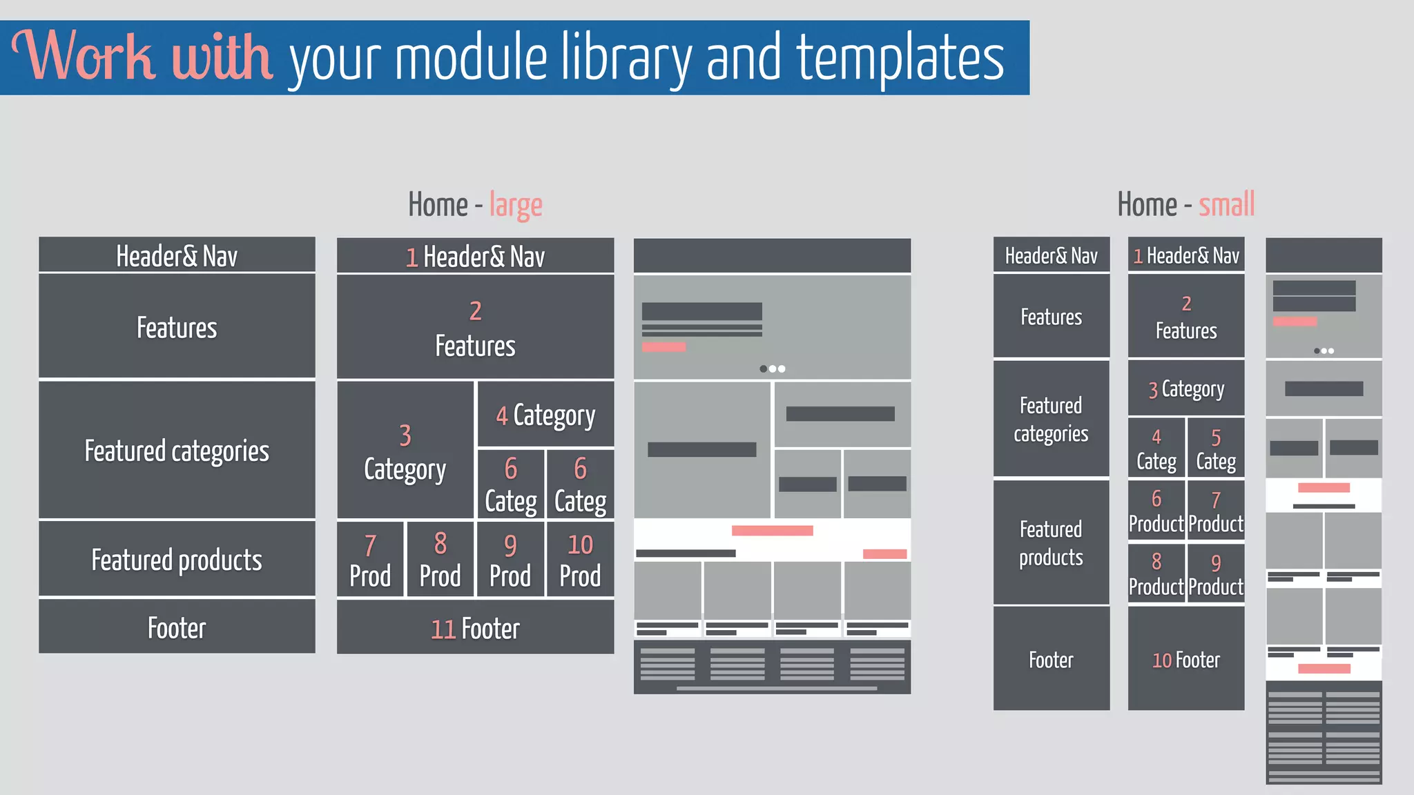


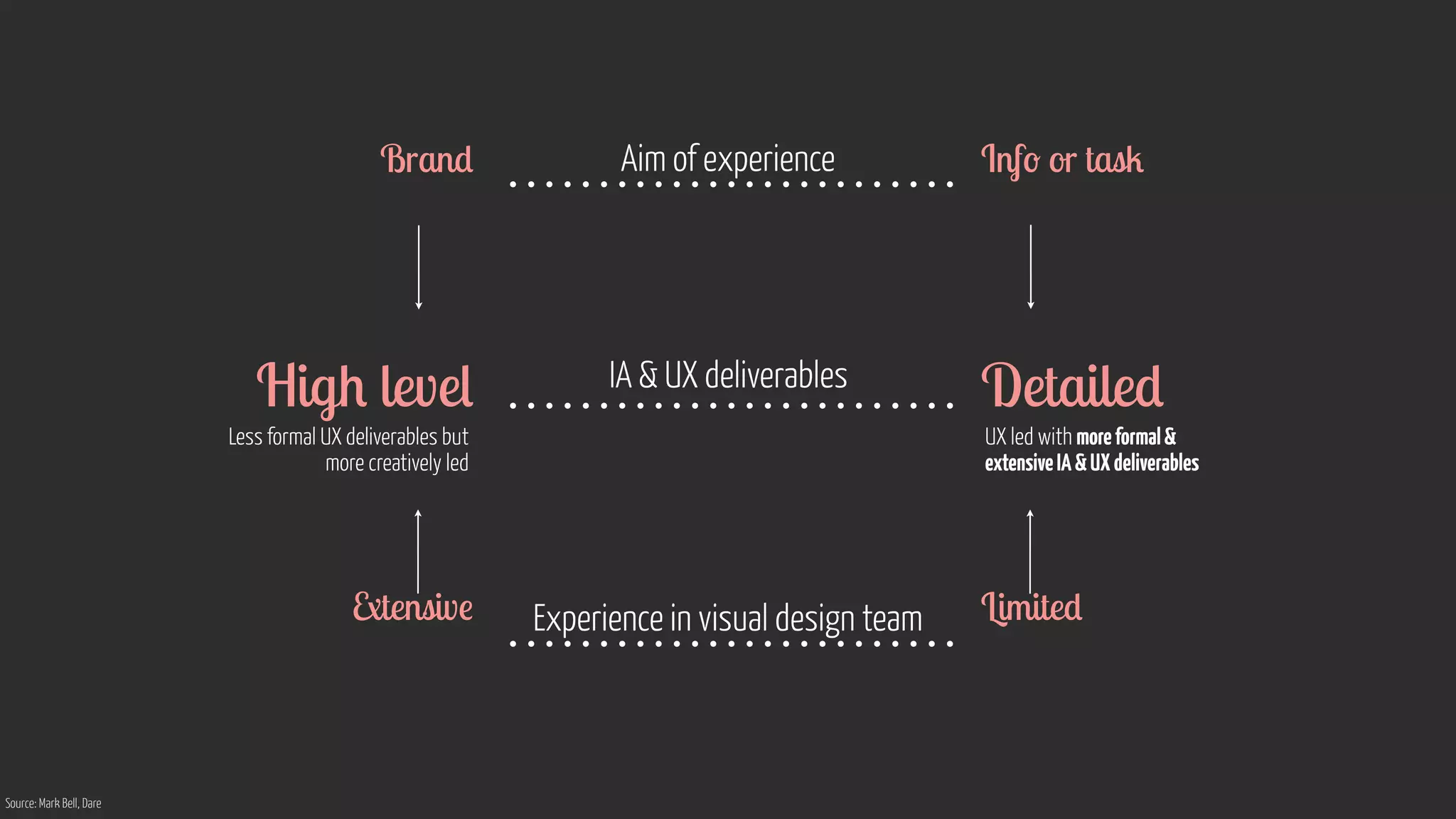


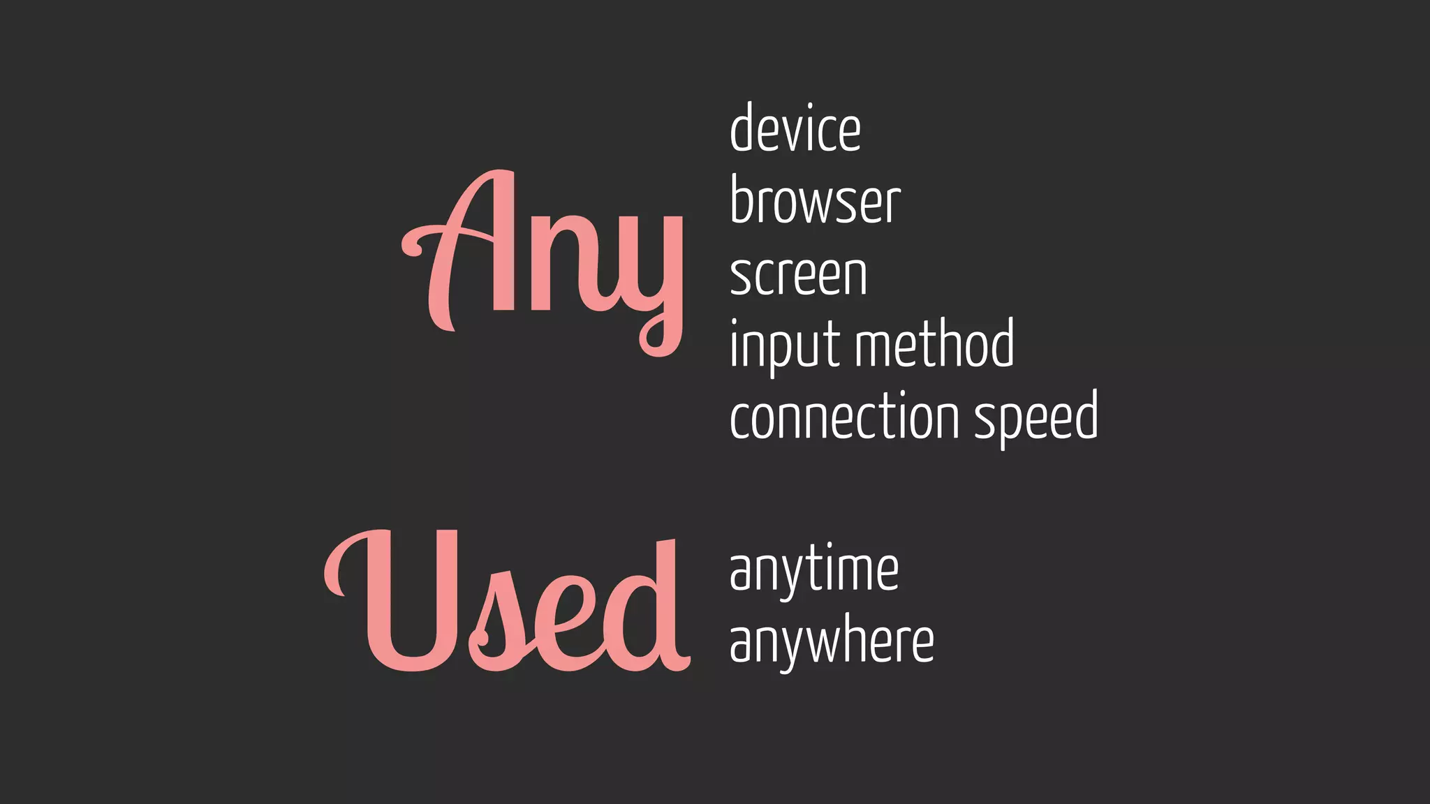


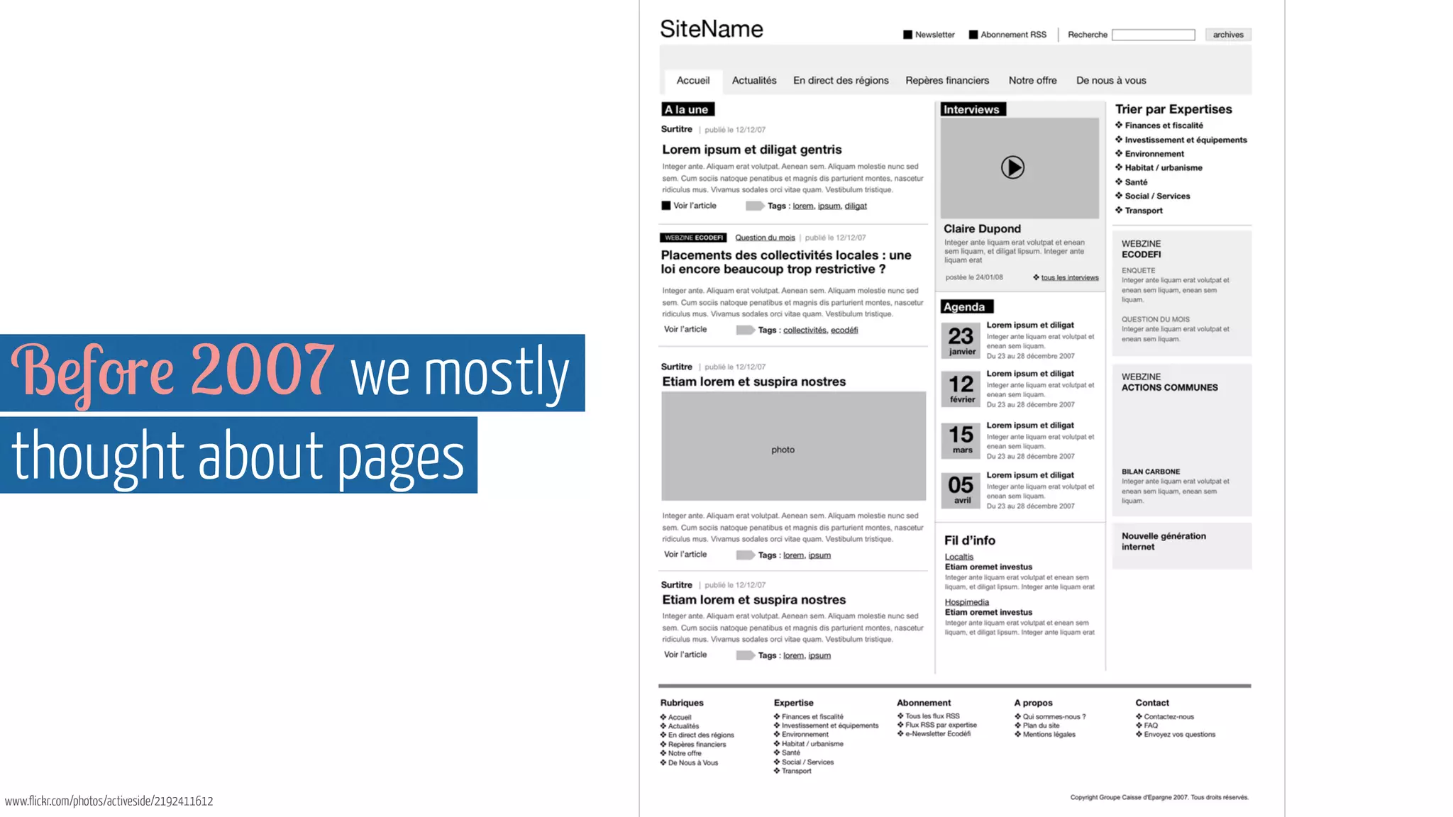
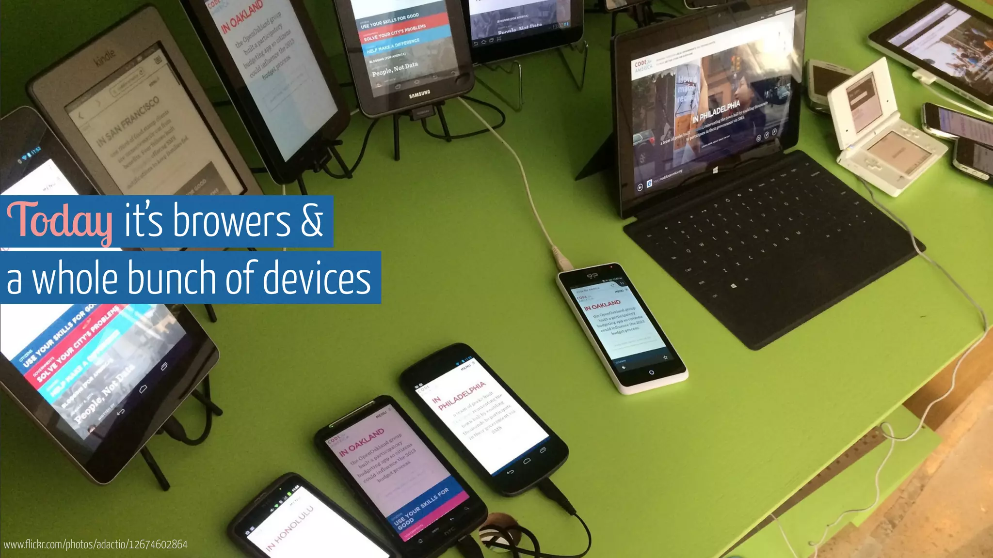
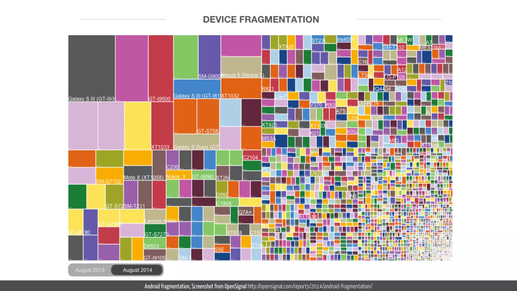
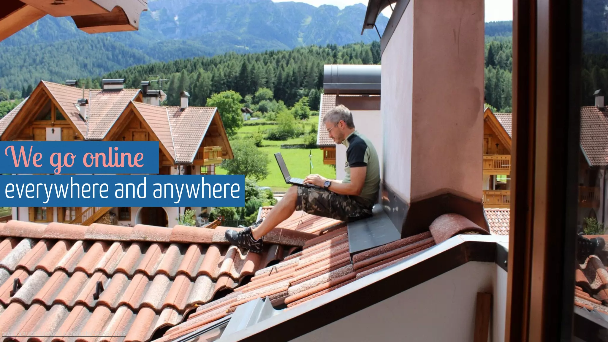
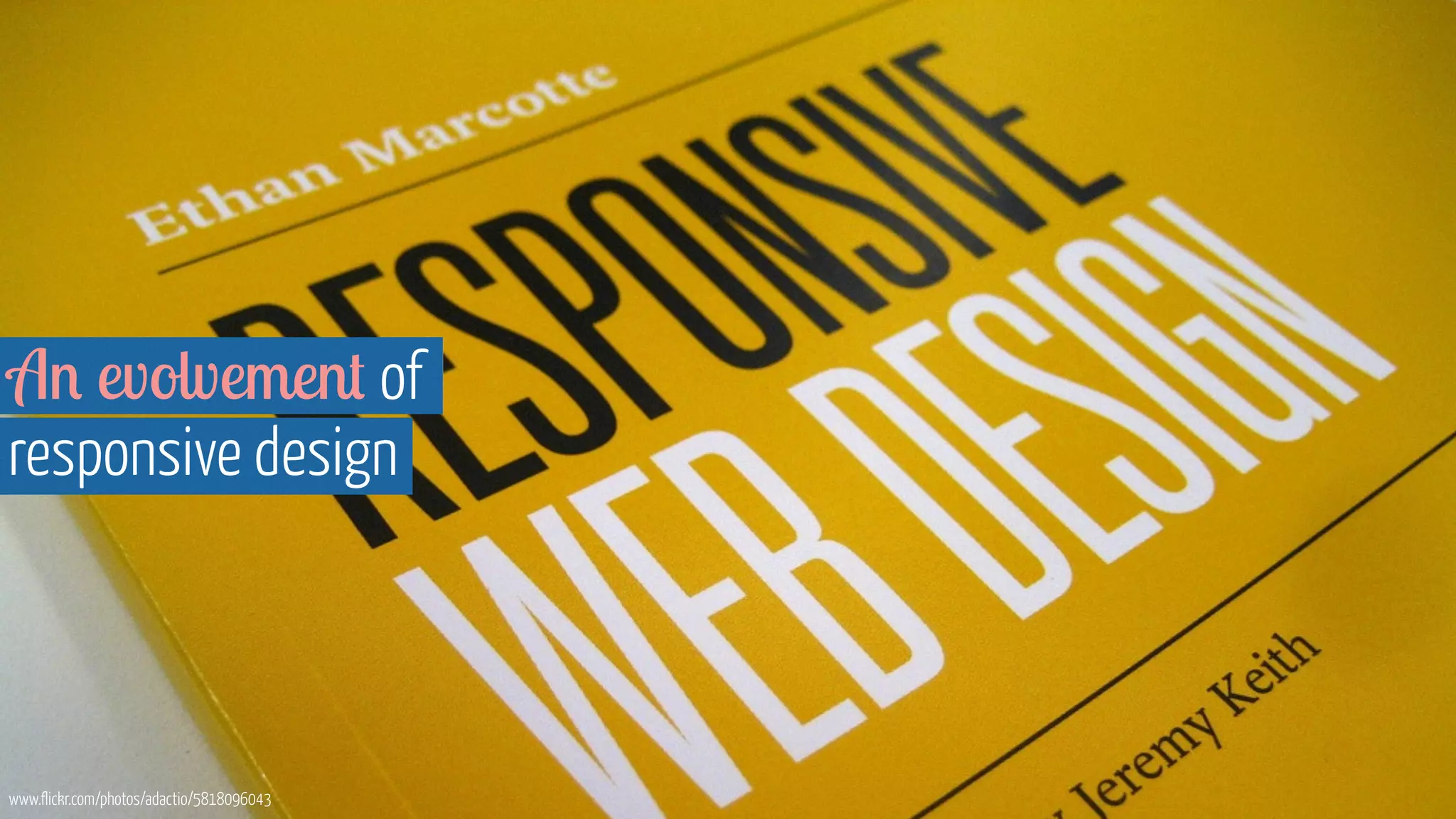
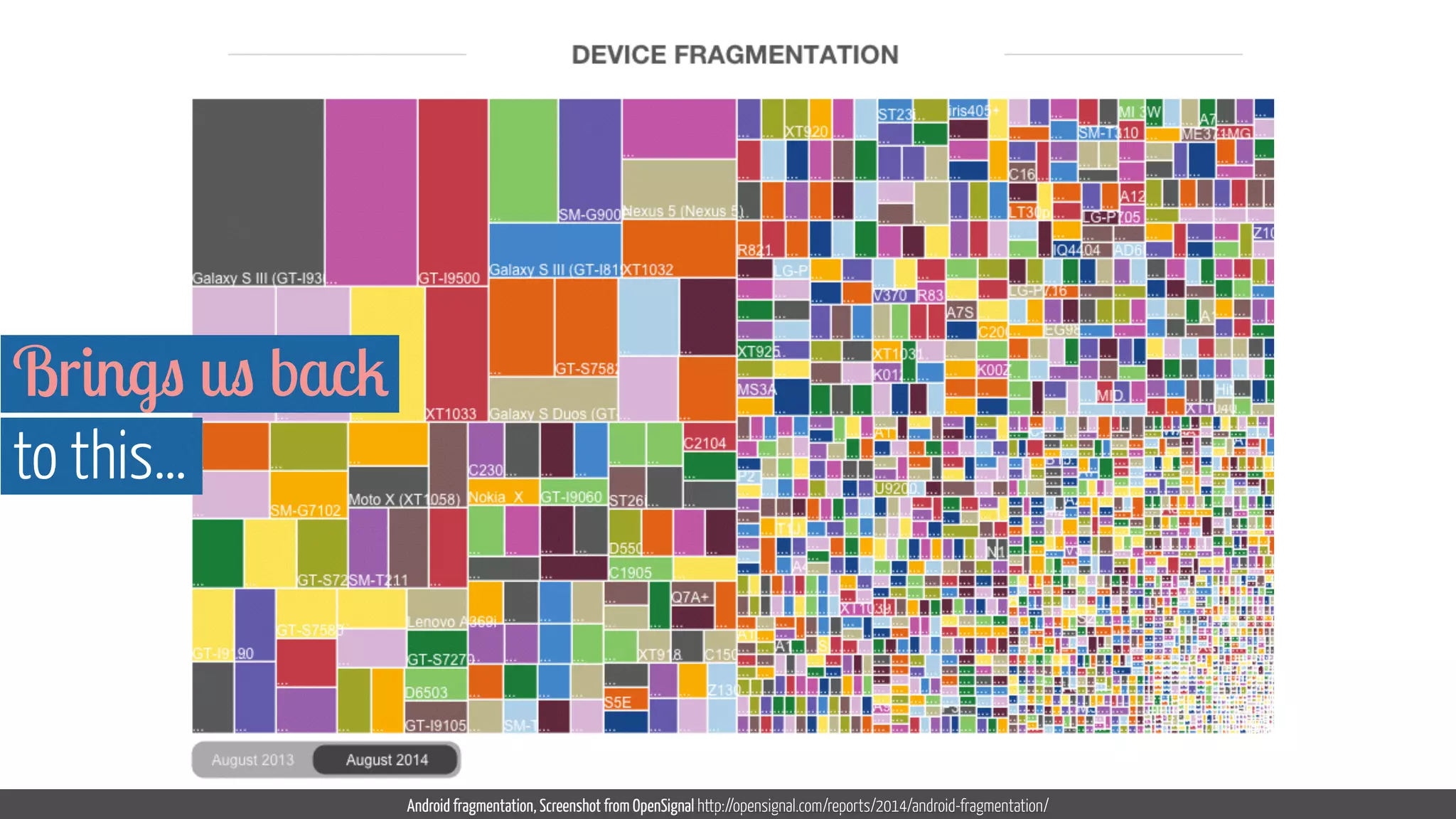
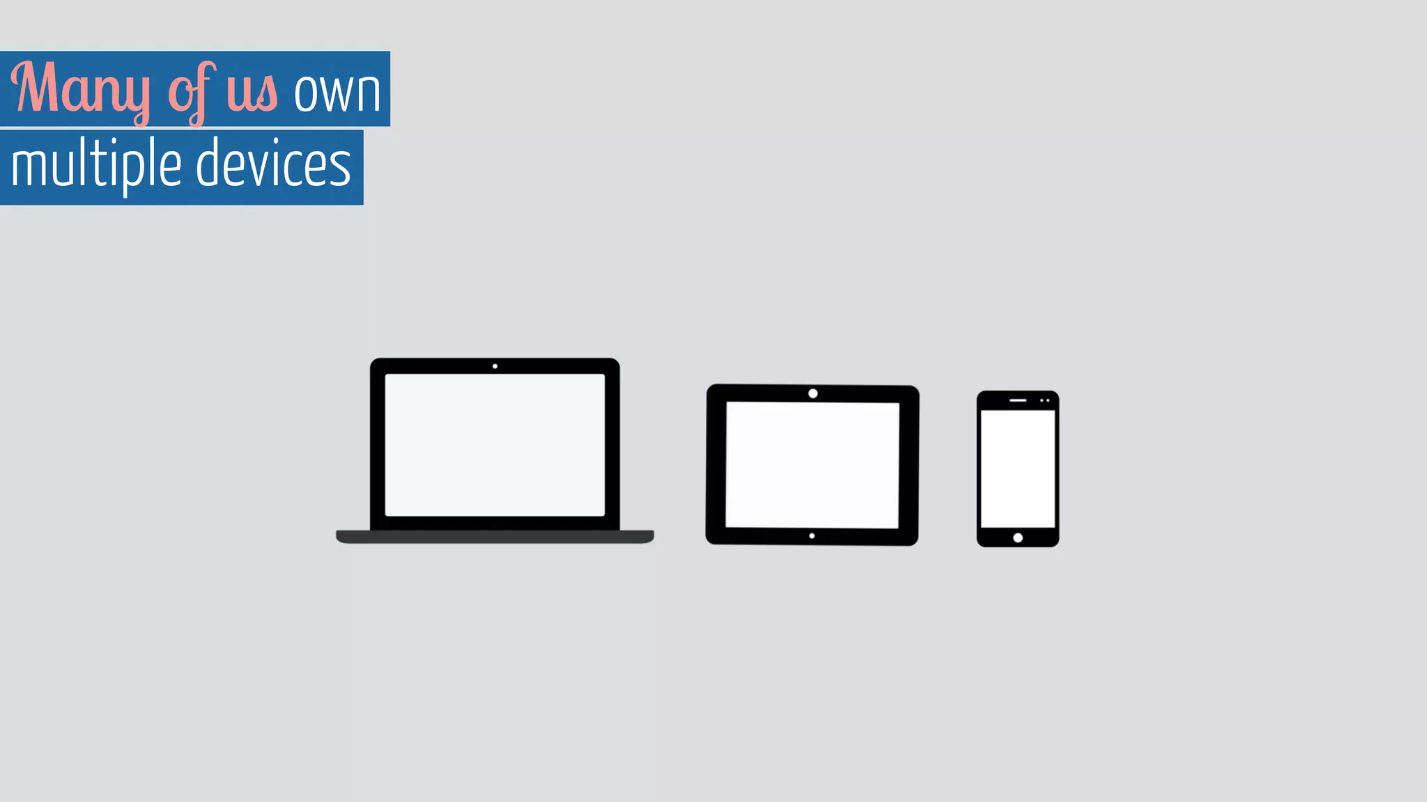
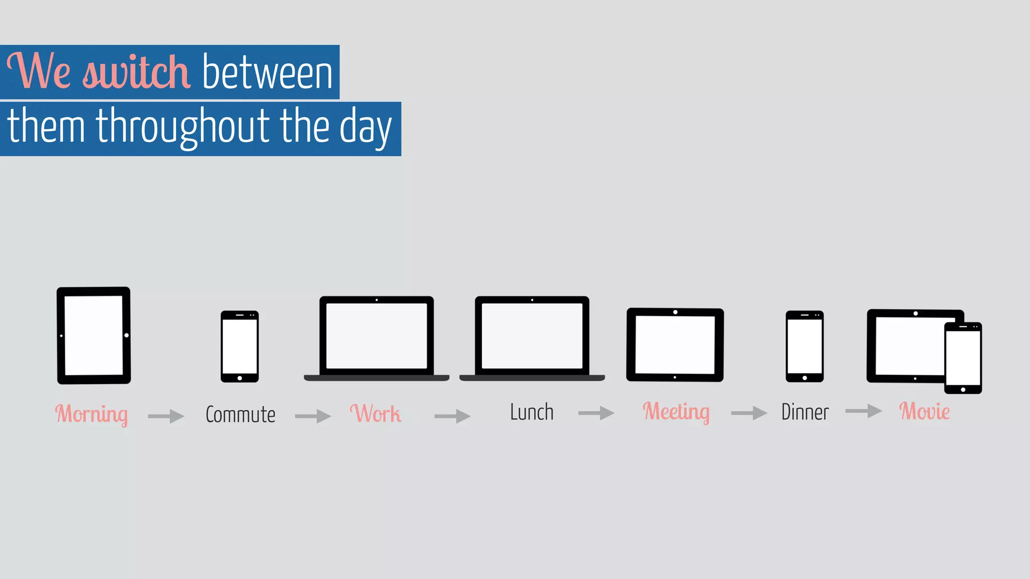
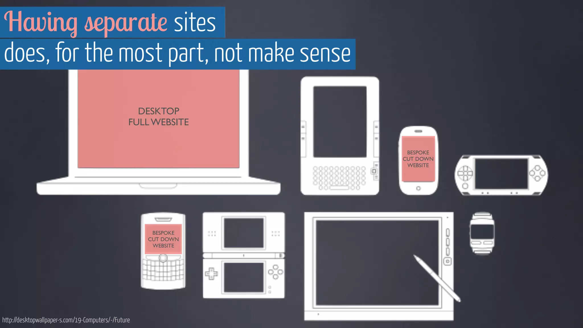
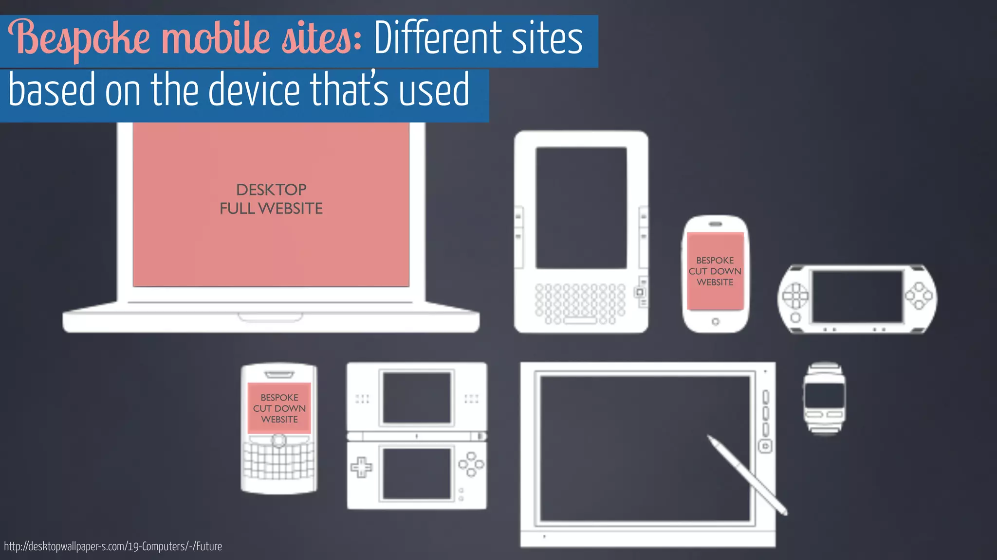
The document discusses the importance of device agnostic design, which allows content to be accessible across various devices without being tailored for specific ones. It emphasizes that a consistent user experience is essential as people increasingly switch between devices throughout the day. The content should focus on modular design and flexibility rather than relying on fixed layouts for individual device types.


![[BROCHURE] Italy Tour Project | @SlideON](https://cdn.slidesharecdn.com/ss_thumbnails/brochure8-251215152319-2805af68-thumbnail.jpg?width=640&height=640&fit=bounds)


