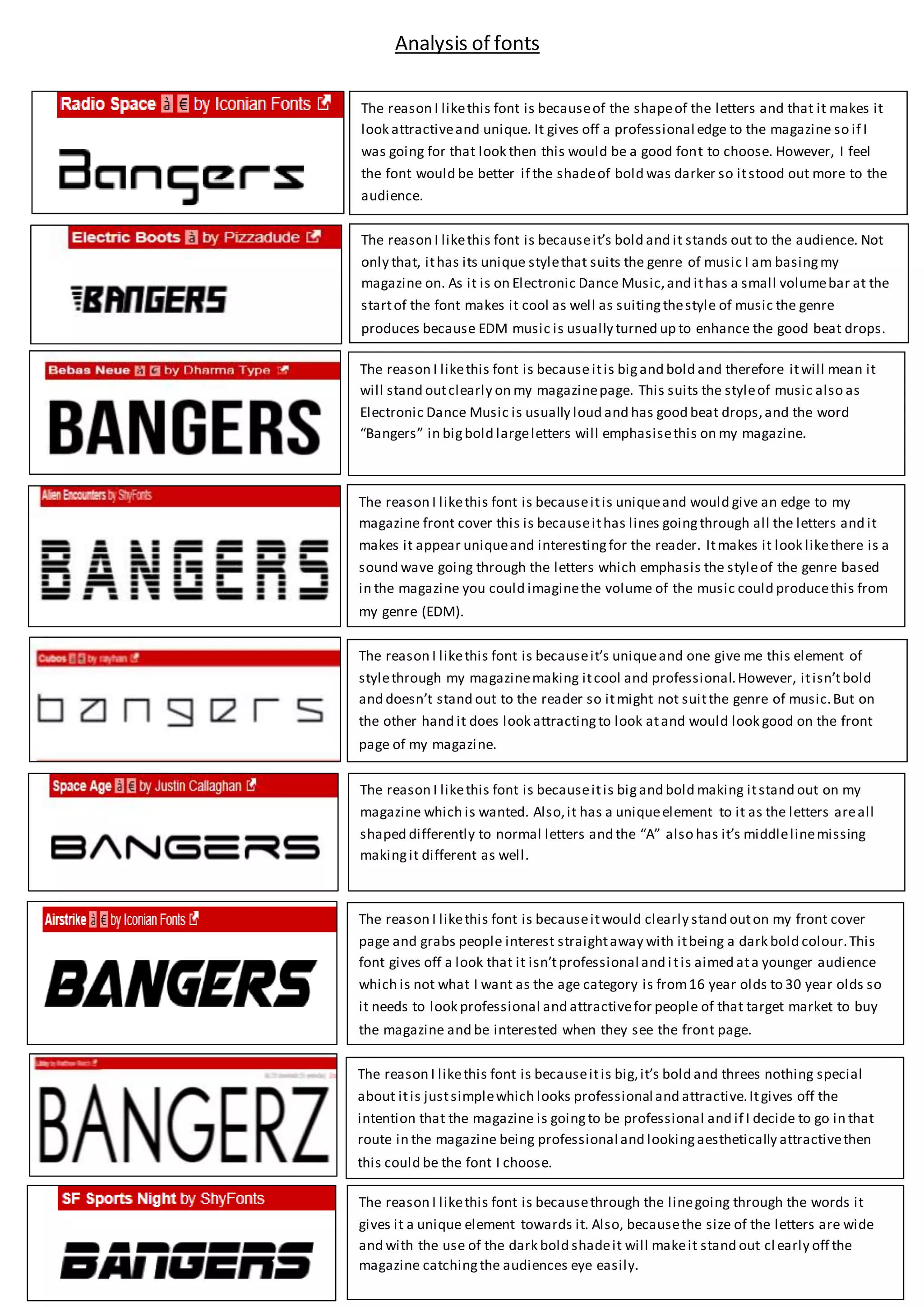
Lucknow 💋 Call Girls in Lucknow ₹7.5k Pick Up & Drop With Cash Payment 892311...
Analysis of fonts
1. The reason I likethis font is becauseit’s bold and it stands out to the audience. Not
only that, ithas its unique stylethat suits the genre of music I am basingmy
magazine on. As it is on Electronic Dance Music,and ithas a small volumebar at the
startof the font makes it cool as well as suitingthestyle of music the genre
produces because EDM music is usually turned up to enhance the good beat drops.
The reason I likethis font is because itis bigand bold and therefore itwill mean it
will stand outclearly on my magazinepage. This suits the styleof music also as
Electronic Dance Music is usually loud and has good beat drops,and the word
“Bangers” in bigbold largeletters will emphasisethis on my magazine.
The reason I likethis font is becauseitis uniqueand would give an edge to my
magazine front cover this is becauseithas lines goingthrough all the letters and it
makes it appear uniqueand interestingfor the reader. Itmakes it look likethere is a
sound wave going through the letters which emphasis the styleof the genre based
in the magazine you could imaginethe volume of the music could producethis from
my genre (EDM).
The reason I likethis font is becauseit’s uniqueand one give me this element of
stylethrough my magazinemaking itcool and professional.However, itisn’tbold
and doesn’t stand out to the reader so itmight not suitthe genre of music.But on
the other hand it does look attractingto look atand would look good on the front
page of my magazine.
The reason I likethis font is becauseitis bigand bold making itstand out on my
magazine which is wanted. Also,it has a uniqueelement to it as the letters areall
shaped differently to normal letters and the “A” also has it’s middlelinemissing
makingit different as well.
The reason I likethis font is becauseitwould clearly stand outon my front cover
page and grabs people interest straightaway with itbeing a dark bold colour.This
font gives off a look that it isn’tprofessional and itis aimed ata younger audience
which is not what I want as the age category is from16 year olds to 30 year olds so
it needs to look professional and attractivefor people of that target market to buy
the magazine and be interested when they see the front page.
The reason I likethis font is becauseitis big,it’s bold and threes nothing special
about itis justsimplewhich looks professional and attractive.Itgives off the
intention that the magazine is goingto be professional and if I decide to go in that
route in the magazine being professional and lookingaesthetically attractivethen
this could be the font I choose.
The reason I likethis font is becauseof the shapeof the letters and that it makes it
look attractiveand unique. It gives off a professional edge to the magazine so if I
was going for that look then this would be a good font to choose. However, I feel
the font would be better if the shadeof bold was darker so itstood out more to the
audience.
The reason I likethis font is becausethrough the linegoing through the words it
gives it a unique element towards it. Also, becausethe size of the letters are wide
and with the use of the dark bold shadeit will makeit stand out cl early off the
magazine catchingthe audiences eye easily.
Analysis of fonts