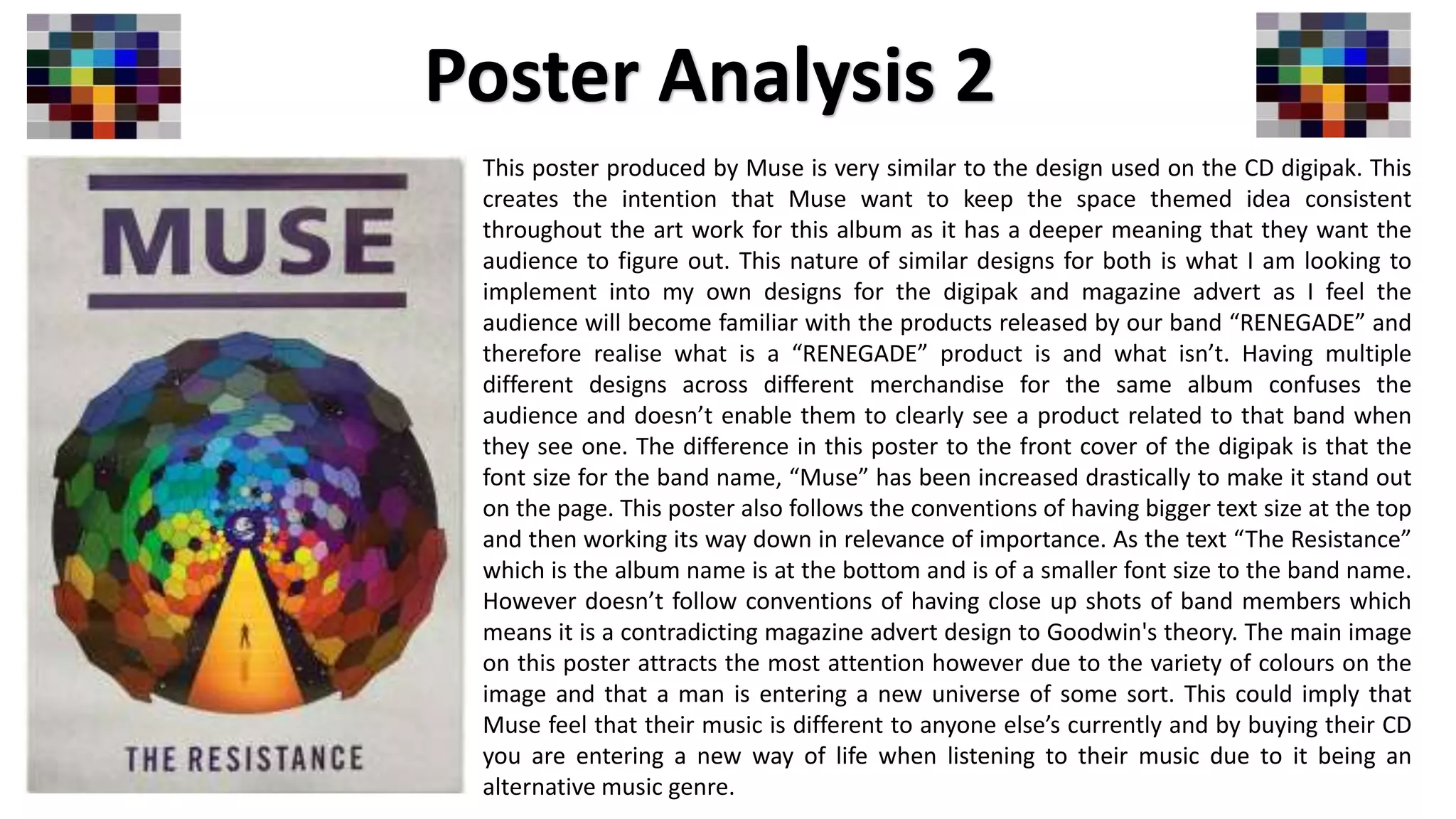
This poster produced by Muse is very similar to the design used on the CD digipak. This
creates the intention that Muse want to keep the space themed idea consistent
throughout the art work for this album as it has a deeper meaning that they want the
audience to figure out. This nature of similar designs for both is what I am looking to
implement into my own designs for the digipak and magazine advert as I feel the
audience will become familiar with the products released by our band “RENEGADE” and
therefore realise what is a “RENEGADE” product is and what isn’t. Having multiple
different designs across different merchandise for the same album confuses the
audience and doesn’t enable them to clearly see a product related to that band when
they see one. The difference in this poster to the front cover of the digipak is that the
font size for the band name, “Muse” has been increased drastically to make it stand out
on the page. This poster also follows the conventions of having bigger text size at the top
and then working its way down in relevance of importance. As the text “The Resistance”
which is the album name is at the bottom and is of a smaller font size to the band name.
However doesn’t follow conventions of having close up shots of band members which
means it is a contradicting magazine advert design to Goodwin's theory. The main image
on this poster attracts the most attention however due to the variety of colours on the
image and that a man is entering a new universe of some sort. This could imply that
Muse feel that their music is different to anyone else’s currently and by buying their CD
you are entering a new way of life when listening to their music due to it being an
alternative music genre.
Poster Analysis 2

Poster analysis 2

  • 1.
    This poster producedby Muse is very similar to the design used on the CD digipak. This creates the intention that Muse want to keep the space themed idea consistent throughout the art work for this album as it has a deeper meaning that they want the audience to figure out. This nature of similar designs for both is what I am looking to implement into my own designs for the digipak and magazine advert as I feel the audience will become familiar with the products released by our band “RENEGADE” and therefore realise what is a “RENEGADE” product is and what isn’t. Having multiple different designs across different merchandise for the same album confuses the audience and doesn’t enable them to clearly see a product related to that band when they see one. The difference in this poster to the front cover of the digipak is that the font size for the band name, “Muse” has been increased drastically to make it stand out on the page. This poster also follows the conventions of having bigger text size at the top and then working its way down in relevance of importance. As the text “The Resistance” which is the album name is at the bottom and is of a smaller font size to the band name. However doesn’t follow conventions of having close up shots of band members which means it is a contradicting magazine advert design to Goodwin's theory. The main image on this poster attracts the most attention however due to the variety of colours on the image and that a man is entering a new universe of some sort. This could imply that Muse feel that their music is different to anyone else’s currently and by buying their CD you are entering a new way of life when listening to their music due to it being an alternative music genre. Poster Analysis 2