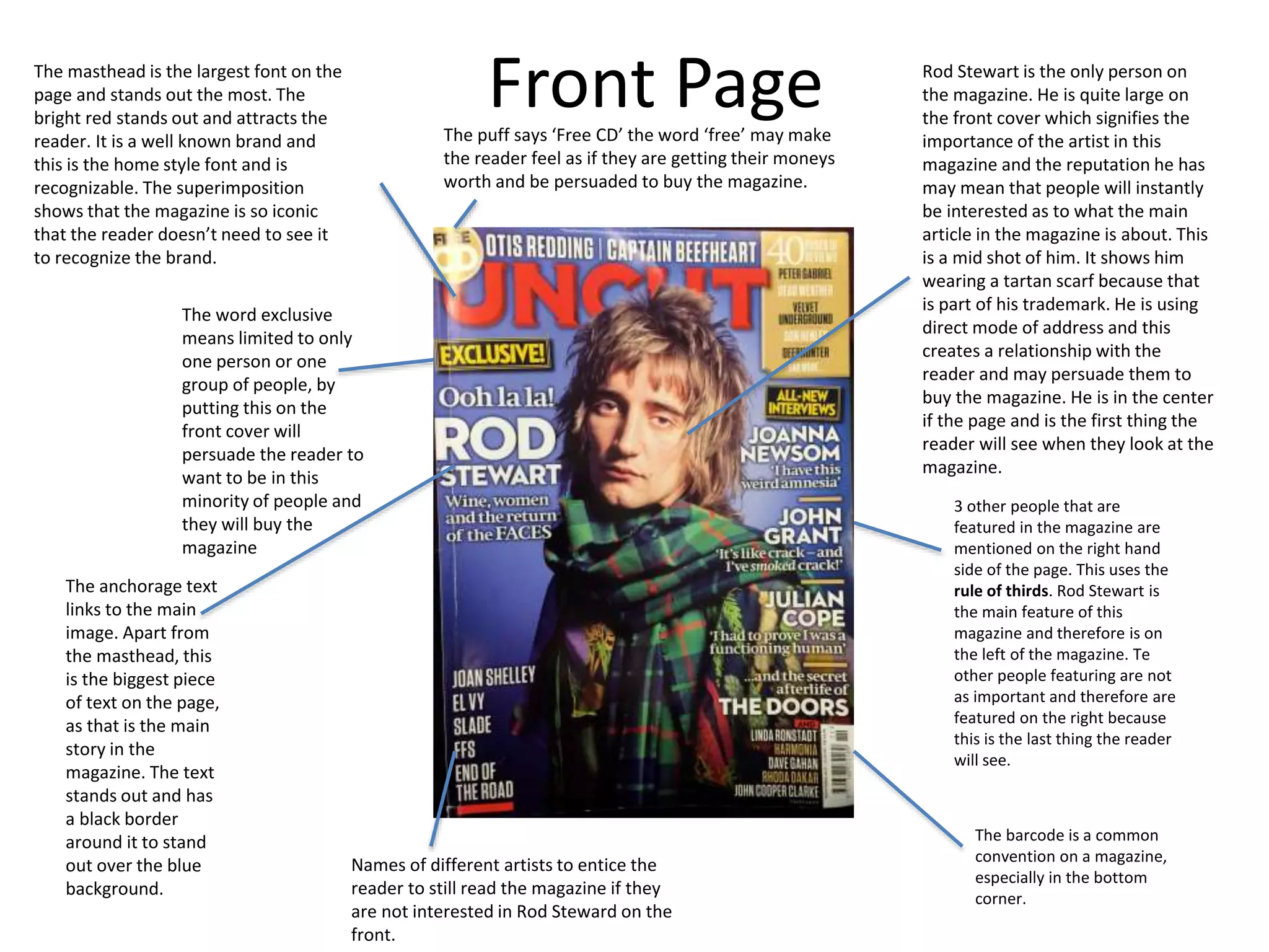
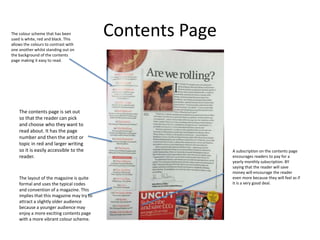
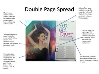
Front PageThe masthead is the largest font on the
page and stands out the most. The
bright red stands out and attracts the
reader. It is a well known brand and
this is the home style font and is
recognizable. The superimposition
shows that the magazine is so iconic
that the reader doesn’t need to see it
to recognize the brand.
The word exclusive
means limited to only
one person or one
group of people, by
putting this on the
front cover will
persuade the reader to
want to be in this
minority of people and
they will buy the
magazine
The puff says ‘Free CD’ the word ‘free’ may make
the reader feel as if they are getting their moneys
worth and be persuaded to buy the magazine.
The anchorage text
links to the main
image. Apart from
the masthead, this
is the biggest piece
of text on the page,
as that is the main
story in the
magazine. The text
stands out and has
a black border
around it to stand
out over the blue
background.
Rod Stewart is the only person on
the magazine. He is quite large on
the front cover which signifies the
importance of the artist in this
magazine and the reputation he has
may mean that people will instantly
be interested as to what the main
article in the magazine is about. This
is a mid shot of him. It shows him
wearing a tartan scarf because that
is part of his trademark. He is using
direct mode of address and this
creates a relationship with the
reader and may persuade them to
buy the magazine. He is in the center
if the page and is the first thing the
reader will see when they look at the
magazine.
3 other people that are
featured in the magazine are
mentioned on the right hand
side of the page. This uses the
rule of thirds. Rod Stewart is
the main feature of this
magazine and therefore is on
the left of the magazine. Te
other people featuring are not
as important and therefore are
featured on the right because
this is the last thing the reader
will see.
The barcode is a common
convention on a magazine,
especially in the bottom
corner.
Names of different artists to entice the
reader to still read the magazine if they
are not interested in Rod Steward on the
front.
Contents Page
A subscription on the contents page
encourages readers to pay for a
yearly monthly subscription. BY
saying that the reader will save
money will encourage the reader
even more because they will feel as if
it is a very good deal.
The colour scheme that has been
used is white, red and black. This
allows the colours to contrast with
one another whilst standing out on
the background of the contents
page making it easy to read.
The contents page is set out
so that the reader can pick
and choose who they want to
read about. It has the page
number and then the artist or
topic in red and larger writing
so it is easily accessible to the
reader.
The layout of the magazine is quite
formal and uses the typical codes
and convention of a magazine. This
implies that this magazine may try to
attract a slightly older audience
because a younger audience may
enjoy a more exciting contents page
with a more vibrant colour scheme.
Double Page SpreadModel makes
direct mode of
address to engage
the reader to read
this article and
form a relationship
with the reader.
Colour of the water
has been changed to
match the colour of
the text, this shows
continuity between
the two pages
The drop cap at the
beginning of this
article is a common
code and convention
of a magazine article
and makes the
magazine look
professional.
The word diver connotes
water which links with the
picture because she is laying
in water
The magazine uses the
rule of thirds. The
model is the first thing
you see. She is
attractive so may
persuade male viewers
to read the article
The models dress
could be classed as
inappropriate. This
attract the male
audience (the male
gaze theory)
because she is
wearing a lack of
clothing

Analysis of magazine 3

  • 1.
    Front PageThe mastheadis the largest font on the page and stands out the most. The bright red stands out and attracts the reader. It is a well known brand and this is the home style font and is recognizable. The superimposition shows that the magazine is so iconic that the reader doesn’t need to see it to recognize the brand. The word exclusive means limited to only one person or one group of people, by putting this on the front cover will persuade the reader to want to be in this minority of people and they will buy the magazine The puff says ‘Free CD’ the word ‘free’ may make the reader feel as if they are getting their moneys worth and be persuaded to buy the magazine. The anchorage text links to the main image. Apart from the masthead, this is the biggest piece of text on the page, as that is the main story in the magazine. The text stands out and has a black border around it to stand out over the blue background. Rod Stewart is the only person on the magazine. He is quite large on the front cover which signifies the importance of the artist in this magazine and the reputation he has may mean that people will instantly be interested as to what the main article in the magazine is about. This is a mid shot of him. It shows him wearing a tartan scarf because that is part of his trademark. He is using direct mode of address and this creates a relationship with the reader and may persuade them to buy the magazine. He is in the center if the page and is the first thing the reader will see when they look at the magazine. 3 other people that are featured in the magazine are mentioned on the right hand side of the page. This uses the rule of thirds. Rod Stewart is the main feature of this magazine and therefore is on the left of the magazine. Te other people featuring are not as important and therefore are featured on the right because this is the last thing the reader will see. The barcode is a common convention on a magazine, especially in the bottom corner. Names of different artists to entice the reader to still read the magazine if they are not interested in Rod Steward on the front.
  • 2.
    Contents Page A subscriptionon the contents page encourages readers to pay for a yearly monthly subscription. BY saying that the reader will save money will encourage the reader even more because they will feel as if it is a very good deal. The colour scheme that has been used is white, red and black. This allows the colours to contrast with one another whilst standing out on the background of the contents page making it easy to read. The contents page is set out so that the reader can pick and choose who they want to read about. It has the page number and then the artist or topic in red and larger writing so it is easily accessible to the reader. The layout of the magazine is quite formal and uses the typical codes and convention of a magazine. This implies that this magazine may try to attract a slightly older audience because a younger audience may enjoy a more exciting contents page with a more vibrant colour scheme.
  • 3.
    Double Page SpreadModelmakes direct mode of address to engage the reader to read this article and form a relationship with the reader. Colour of the water has been changed to match the colour of the text, this shows continuity between the two pages The drop cap at the beginning of this article is a common code and convention of a magazine article and makes the magazine look professional. The word diver connotes water which links with the picture because she is laying in water The magazine uses the rule of thirds. The model is the first thing you see. She is attractive so may persuade male viewers to read the article The models dress could be classed as inappropriate. This attract the male audience (the male gaze theory) because she is wearing a lack of clothing