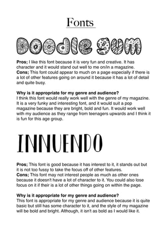
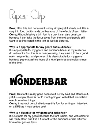
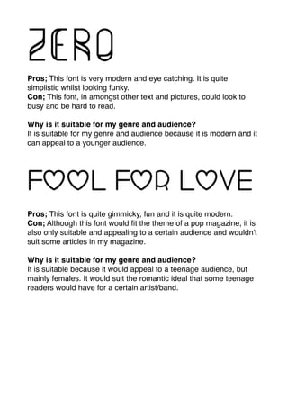
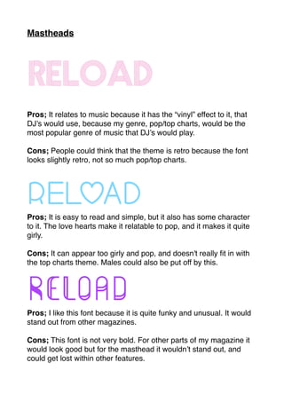
This document discusses several fonts and mastheads and evaluates their suitability for a pop magazine. For the fonts, pros and cons are provided for each one. Some fonts are described as fun, bold, or eye-catching making them suitable for a pop magazine audience. However, other fonts are said to be too busy, lack character, or wouldn't suit all articles. For the mastheads, pros and cons again evaluate suitability for a pop/top charts music genre magazine in terms of relating to music, being eye-catching but not too girly. Overall the document considers different design options and how well they may work for the intended magazine genre and audience.