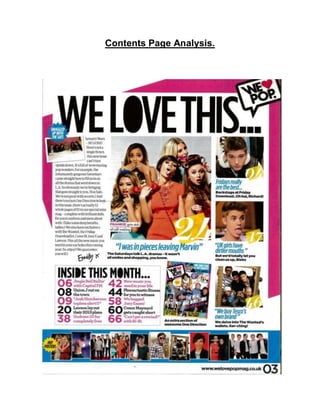
Contents Page Analysis.
This contents page is from an issue of We Love Pop. It shows many of the typical
conventions in contents pages. For example, the colours used in the front cover are
used in the contents page. Also, the images that are used relate to the articles inside
the magazine.
The name of the magazine is in the top right corner. In this position, it can still be seen,
but the audience will not focus on it.
The title of the contents page is ‘We Love This’. This is a play on words, and reminds us
of the name of the magazine. The text is in black so it matches the magazine name,
while maintaining a professional feel. It is in a display font, which will grab the
audience’s attention. Some of the letters look like they have they been filed in, for
example, the letter ‘o’. This gives the magazine a more fun and light-hearted feel, and
also reminds the audience of doodling, which the young teenage audience would be
able to relate to.
We then see a small image of The Saturdays and a lady who is possibly the editor, with
a small puff saying, “Snuggled up with The Sats.” This gives the magazine a relaxed
tone, and makes the audience feel relaxed too. ‘Snuggled up with the Sats’ is a
significant statement, as it indicates that the magazine have a close relationship with the
band, like they are friends that are completely comfortable with each other. This is
emphasised by how they address the band: ‘the Sats’.
The blue background matches the blue used at the the bottom of the page. The
audience would then read the letter from the editor. Letters are a convention of music
magazine contents pages. The letter is placed on the left hand side of the page. This is
in the left hand third, which means this is one of the first things the audience see. The
letter uses informal words and phrases like “wowmazing”, “bringing that goss” and “Soz
Sats”. The magazine’s teenage target audience would be able to understand and relate
to this language, so this makes them feel more comfortable and happy to read the
magazine. The letter is signed off with “Emily x”. This is in a font that looks like it has
been handwritten. This gives the letter a more personal atmosphere, and makes the
audience feel closer to the magazine. The mode of address and sign off from the letter
makes the magazine seem like the TA’s friend.
The main image is a medium shot and shows The Saturdays, posing and doing different
things, for example, Mollie has put lipstick all around her mouth. The Saturdays are
wearing bright, colourful and feminine clothing, which reinforces their star image as a
fun pop band. They all have different facial expressions, for example, Rochelle looks
shocked, while Frankie is sticking her tongue out. This helps to remind us that even
though they are united as a band, they are all different and unique. This also shows the
fun and cheerful feel of the magazine. The pull quote underneath says “I was in pieces
leaving Marvin”. This pull quote would interest the audience as they will be interested to
find out more about the relationship between Marvin and Rochelle. The pull quote is
direct from Rochelle, so the audience know they will be reading truthful information.
Also, if any of the audience members are going through a breakup, they will want to
read the article to see if they can relate to Rochelle. The page number is also shown in
big, bold, white numbers. There is also a smaller piece of information underneath the
pull quote which gives you a bit more information on the article. This will make the
readers curious to know what happened, so they will carry on reading.
The contents of the magazine is in a small box. The page numbers of the magazine are
in bold so it stands out. The page numbers are large so that the audience can easily
read see what page the article they want to read is on. The colours of the text are black
and pink, and this creates a link to the colours used on the masthead of the magazine.
The colours also alternate, which allow the audience to clearly differentiate between the
pages. The colours also help to remind the audience that is a magazine aimed at
females. Beside the page numbers, there is small piece of information that says what
the article will be about, for example, ‘New music you need in your life’. This entices the
audience by giving them a brief outline of the article, without giving away too much. This
is also an example of direct address. Furthermore, the use of linguistic devices such as
direct address and alliteration make the articles seem more interesting. The smaller,
related images are also pages from the magazine. All of the images are of celebrities,
such as Justin Bieber, The Wanted and One Direction. The three larger images are of
Richard Wisker, Justin Bieber and One Direction. Richard and One Direction are looking
at the camera which creates direct address. Justin Bieber is sticking his tongue out, and
this relates to the information underneath his picture, as the article mentions the word
mouth. As the page number is shown next to the image in white, with a yellow
background. This reduces the amount of text that is shown in the article, and makes it
less boring. One of the images is of the front cover of another issue of We Love Pop.
One Direction is featured on the cover, they are a popular band, and so this will attract
the audience to buy the next issue, or subscribe. The smaller images at the bottom
show the posters included in the magazine. The smaller puff stands out and adds fun
and liveliness to the magazine. The layout of the magazine is very lively and fun, while
still maintain a professional feel, and sticking to conventions.

Contents page analysis.

  • 1.
  • 2.
    This contents pageis from an issue of We Love Pop. It shows many of the typical conventions in contents pages. For example, the colours used in the front cover are used in the contents page. Also, the images that are used relate to the articles inside the magazine. The name of the magazine is in the top right corner. In this position, it can still be seen, but the audience will not focus on it. The title of the contents page is ‘We Love This’. This is a play on words, and reminds us of the name of the magazine. The text is in black so it matches the magazine name, while maintaining a professional feel. It is in a display font, which will grab the audience’s attention. Some of the letters look like they have they been filed in, for example, the letter ‘o’. This gives the magazine a more fun and light-hearted feel, and also reminds the audience of doodling, which the young teenage audience would be able to relate to. We then see a small image of The Saturdays and a lady who is possibly the editor, with a small puff saying, “Snuggled up with The Sats.” This gives the magazine a relaxed tone, and makes the audience feel relaxed too. ‘Snuggled up with the Sats’ is a significant statement, as it indicates that the magazine have a close relationship with the band, like they are friends that are completely comfortable with each other. This is emphasised by how they address the band: ‘the Sats’. The blue background matches the blue used at the the bottom of the page. The audience would then read the letter from the editor. Letters are a convention of music magazine contents pages. The letter is placed on the left hand side of the page. This is in the left hand third, which means this is one of the first things the audience see. The letter uses informal words and phrases like “wowmazing”, “bringing that goss” and “Soz Sats”. The magazine’s teenage target audience would be able to understand and relate to this language, so this makes them feel more comfortable and happy to read the magazine. The letter is signed off with “Emily x”. This is in a font that looks like it has been handwritten. This gives the letter a more personal atmosphere, and makes the audience feel closer to the magazine. The mode of address and sign off from the letter makes the magazine seem like the TA’s friend. The main image is a medium shot and shows The Saturdays, posing and doing different things, for example, Mollie has put lipstick all around her mouth. The Saturdays are wearing bright, colourful and feminine clothing, which reinforces their star image as a fun pop band. They all have different facial expressions, for example, Rochelle looks shocked, while Frankie is sticking her tongue out. This helps to remind us that even
  • 3.
    though they areunited as a band, they are all different and unique. This also shows the fun and cheerful feel of the magazine. The pull quote underneath says “I was in pieces leaving Marvin”. This pull quote would interest the audience as they will be interested to find out more about the relationship between Marvin and Rochelle. The pull quote is direct from Rochelle, so the audience know they will be reading truthful information. Also, if any of the audience members are going through a breakup, they will want to read the article to see if they can relate to Rochelle. The page number is also shown in big, bold, white numbers. There is also a smaller piece of information underneath the pull quote which gives you a bit more information on the article. This will make the readers curious to know what happened, so they will carry on reading. The contents of the magazine is in a small box. The page numbers of the magazine are in bold so it stands out. The page numbers are large so that the audience can easily read see what page the article they want to read is on. The colours of the text are black and pink, and this creates a link to the colours used on the masthead of the magazine. The colours also alternate, which allow the audience to clearly differentiate between the pages. The colours also help to remind the audience that is a magazine aimed at females. Beside the page numbers, there is small piece of information that says what the article will be about, for example, ‘New music you need in your life’. This entices the audience by giving them a brief outline of the article, without giving away too much. This is also an example of direct address. Furthermore, the use of linguistic devices such as direct address and alliteration make the articles seem more interesting. The smaller, related images are also pages from the magazine. All of the images are of celebrities, such as Justin Bieber, The Wanted and One Direction. The three larger images are of Richard Wisker, Justin Bieber and One Direction. Richard and One Direction are looking at the camera which creates direct address. Justin Bieber is sticking his tongue out, and this relates to the information underneath his picture, as the article mentions the word mouth. As the page number is shown next to the image in white, with a yellow background. This reduces the amount of text that is shown in the article, and makes it less boring. One of the images is of the front cover of another issue of We Love Pop. One Direction is featured on the cover, they are a popular band, and so this will attract the audience to buy the next issue, or subscribe. The smaller images at the bottom show the posters included in the magazine. The smaller puff stands out and adds fun and liveliness to the magazine. The layout of the magazine is very lively and fun, while still maintain a professional feel, and sticking to conventions.