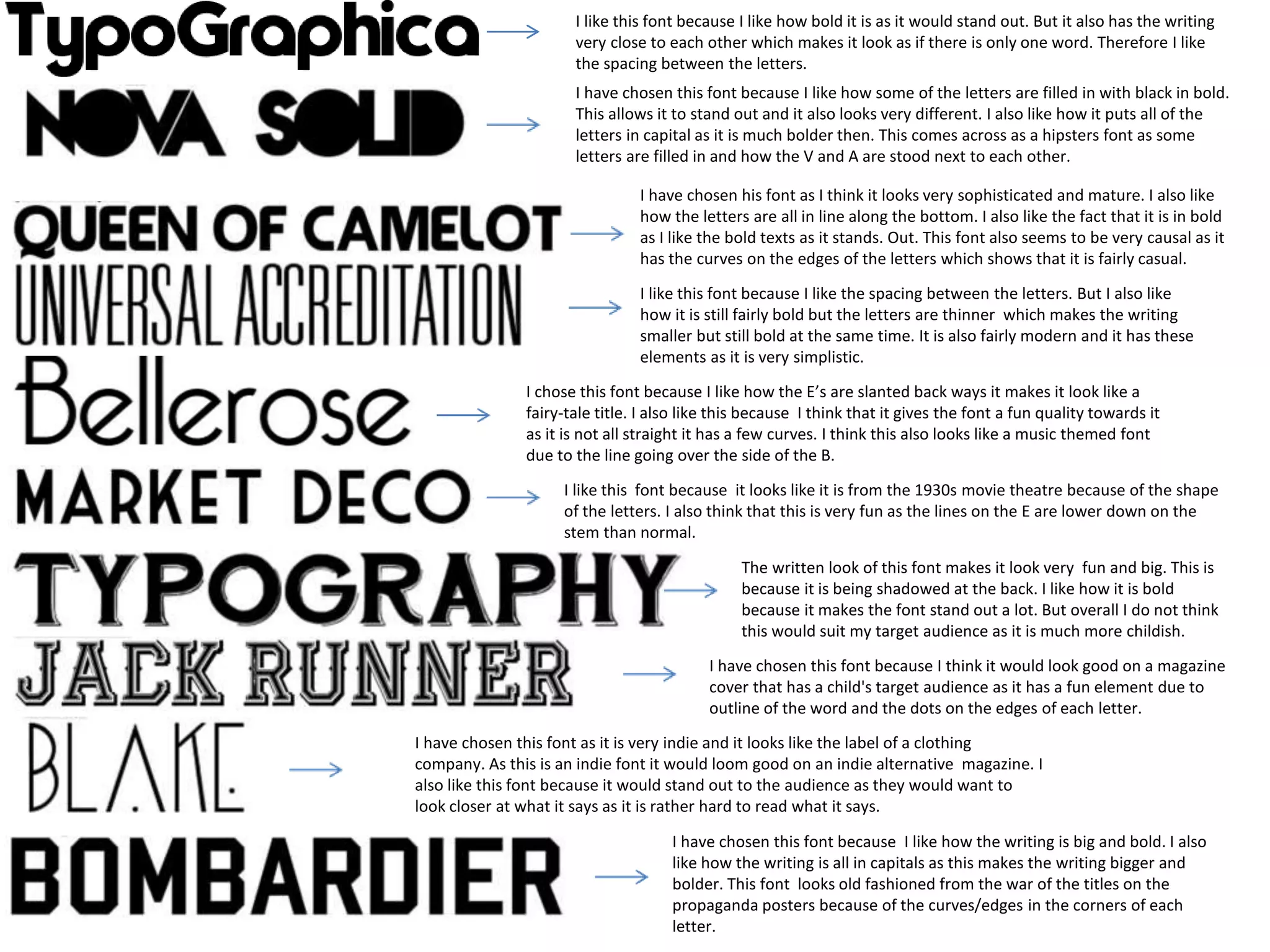
1. I like this font because I like how bold it is as it would stand out. But it also has the writing
very close to each other which makes it look as if there is only one word. Therefore I like
the spacing between the letters.
I have chosen this font because I like how some of the letters are filled in with black in bold.
This allows it to stand out and it also looks very different. I also like how it puts all of the
letters in capital as it is much bolder then. This comes across as a hipsters font as some
letters are filled in and how the V and A are stood next to each other.
I have chosen his font as I think it looks very sophisticated and mature. I also like
how the letters are all in line along the bottom. I also like the fact that it is in bold
as I like the bold texts as it stands. Out. This font also seems to be very causal as it
has the curves on the edges of the letters which shows that it is fairly casual.
I like this font because I like the spacing between the letters. But I also like
how it is still fairly bold but the letters are thinner which makes the writing
smaller but still bold at the same time. It is also fairly modern and it has these
elements as it is very simplistic.
I chose this font because I like how the E’s are slanted back ways it makes it look like a
fairy-tale title. I also like this because I think that it gives the font a fun quality towards it
as it is not all straight it has a few curves. I think this also looks like a music themed font
due to the line going over the side of the B.
I like this font because it looks like it is from the 1930s movie theatre because of the shape
of the letters. I also think that this is very fun as the lines on the E are lower down on the
stem than normal.
The written look of this font makes it look very fun and big. This is
because it is being shadowed at the back. I like how it is bold
because it makes the font stand out a lot. But overall I do not think
this would suit my target audience as it is much more childish.
I have chosen this font because I think it would look good on a magazine
cover that has a child's target audience as it has a fun element due to
outline of the word and the dots on the edges of each letter.
I have chosen this font as it is very indie and it looks like the label of a clothing
company. As this is an indie font it would loom good on an indie alternative magazine. I
also like this font because it would stand out to the audience as they would want to
look closer at what it says as it is rather hard to read what it says.
I have chosen this font because I like how the writing is big and bold. I also
like how the writing is all in capitals as this makes the writing bigger and
bolder. This font looks old fashioned from the war of the titles on the
propaganda posters because of the curves/edges in the corners of each
letter.