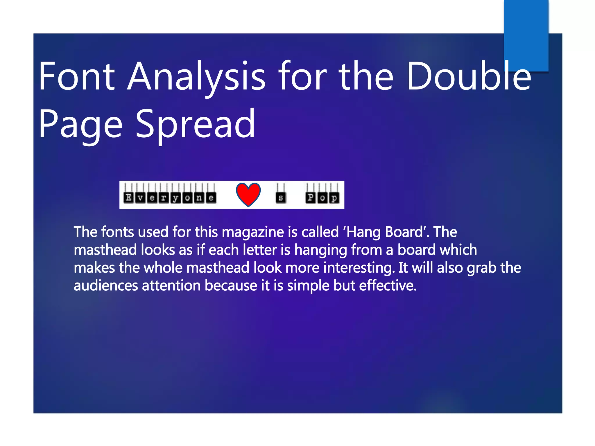
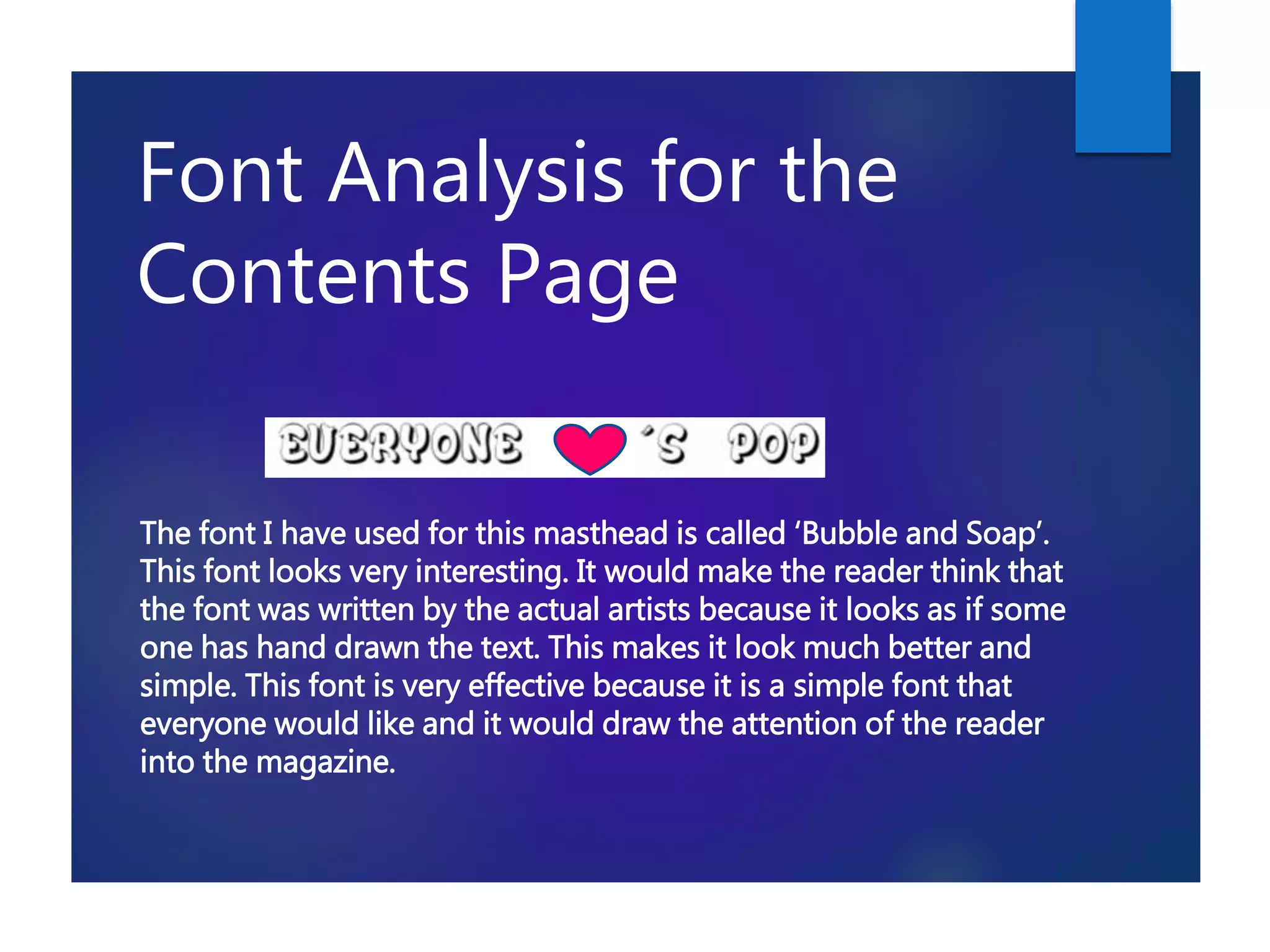
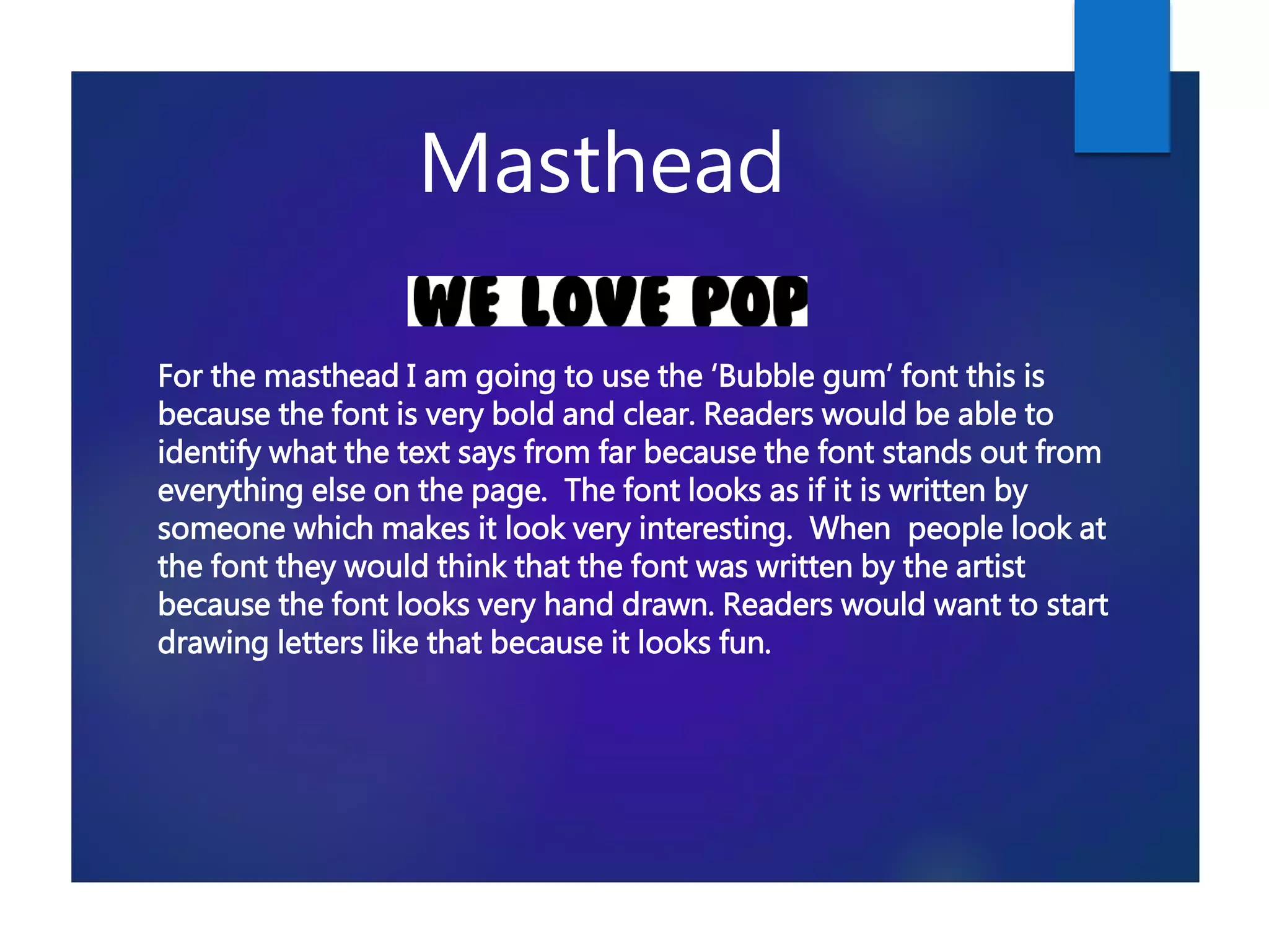
This document analyzes and summarizes the different fonts used for various sections of a magazine, including the masthead, double page spread, contents page, sell lines, main body text, and editor's letter. For each section, 3-4 different font options are presented and their suitability is discussed based on readability, attractiveness, ability to stand out, and suitability for the target teenage audience. Fonts like 'Monotype Corsiva', 'Liberty Legion', 'Minnie', 'Habbo', and 'Hang Board' are suggested for headings due their eye-catching styles, while fonts like 'Century Gothic' and 'TypoGraphica' are proposed for the main content areas to ensure