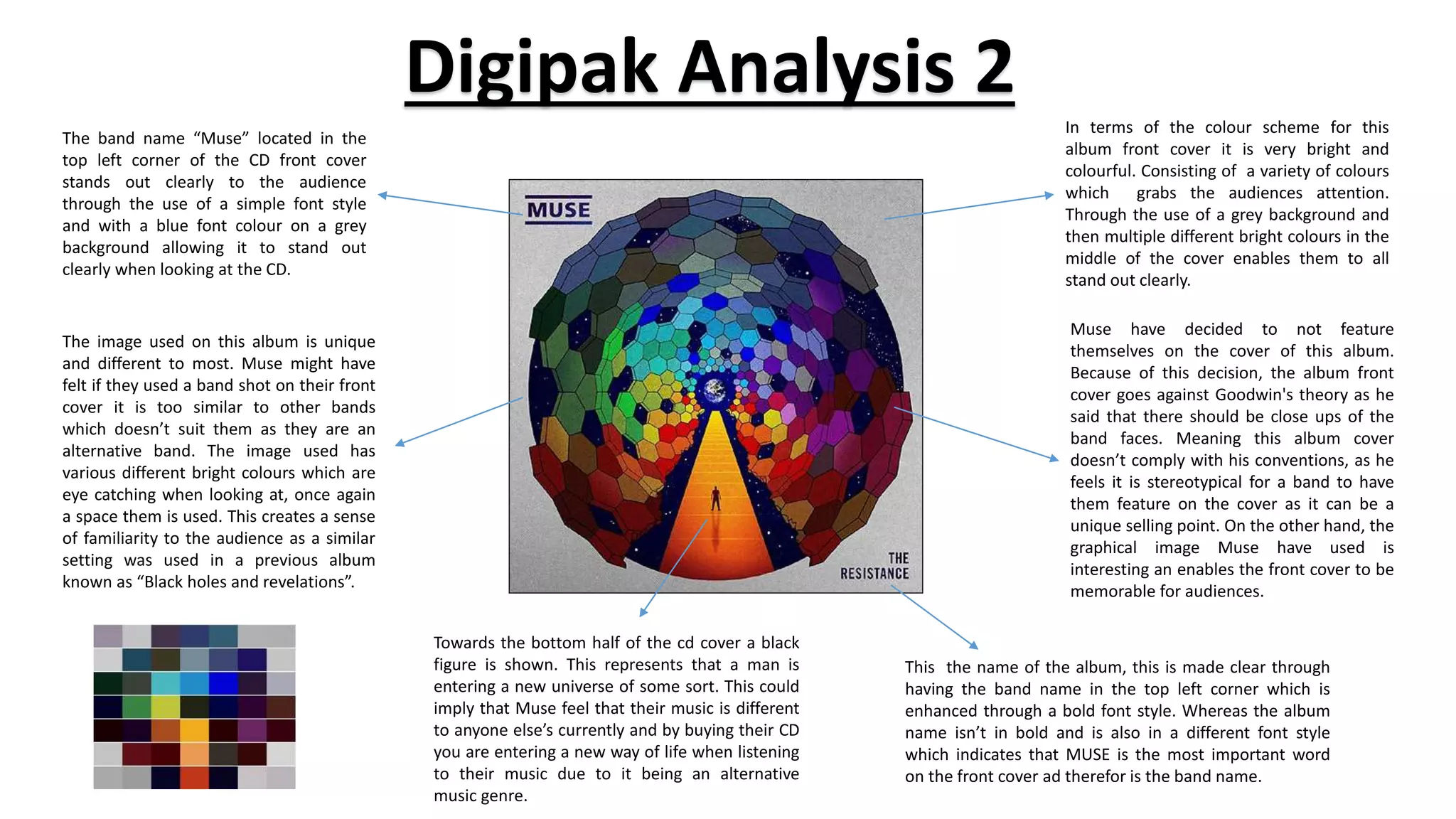
Digipak Analysis 2
The band name “Muse” located in the
top left corner of the CD front cover
stands out clearly to the audience
through the use of a simple font style
and with a blue font colour on a grey
background allowing it to stand out
clearly when looking at the CD.
Muse have decided to not feature
themselves on the cover of this album.
Because of this decision, the album front
cover goes against Goodwin's theory as he
said that there should be close ups of the
band faces. Meaning this album cover
doesn’t comply with his conventions, as he
feels it is stereotypical for a band to have
them feature on the cover as it can be a
unique selling point. On the other hand, the
graphical image Muse have used is
interesting an enables the front cover to be
memorable for audiences.
The image used on this album is unique
and different to most. Muse might have
felt if they used a band shot on their front
cover it is too similar to other bands
which doesn’t suit them as they are an
alternative band. The image used has
various different bright colours which are
eye catching when looking at, once again
a space them is used. This creates a sense
of familiarity to the audience as a similar
setting was used in a previous album
known as “Black holes and revelations”.
Towards the bottom half of the cd cover a black
figure is shown. This represents that a man is
entering a new universe of some sort. This could
imply that Muse feel that their music is different
to anyone else’s currently and by buying their CD
you are entering a new way of life when listening
to their music due to it being an alternative
music genre.
This the name of the album, this is made clear through
having the band name in the top left corner which is
enhanced through a bold font style. Whereas the album
name isn’t in bold and is also in a different font style
which indicates that MUSE is the most important word
on the front cover ad therefor is the band name.
In terms of the colour scheme for this
album front cover it is very bright and
colourful. Consisting of a variety of colours
which grabs the audiences attention.
Through the use of a grey background and
then multiple different bright colours in the
middle of the cover enables them to all
stand out clearly.
This is a barcode which
enables the sale of the
product.
Here is the website for the band
Muse, resulting in people knowing
where to look for further information
and products. Meaning they are using
a good promotional feature here.
Record companies, producers and
distributors are shown here which is
a legal requirement to credit those
who allowed the development of a
product.
Information about CD is in a small font size as it
isn’t the most important part on the back cover
therefore wants to be out of the readers
attention so they focus on the more important
elements such as the track list and the interesting
picture.
Muse use a band shot however on the back
cover of the cd cover. This could indicate they
feel as a band they are not the selling point
of their songs and that the actual music they
produce is and hat is why they take up the
less important role o featuring on the back
cover instead of on the front cover of the CD.
They have also added a blurred effect to the
picture which portrays the ideas that they
want to hide their identity and just want
people to focus on their music as that is what
they should be known for. The image itself
take sup the largest proportion of space on
the back of the cd just to highlight who the
bad members are as they didn’t feature on
the front cover.
The colour scheme for this back cover of the CD
relates to the front cover. The background is again of
a similar grey tone to the front cover producing
similarity within the CD and allowing it to link. As
well as this the track list has incorporated a variety of
colours mixing all together which are similar colours
use on the front cover also on the universe picture
which again makes the Cd all link together which
makes it look more professional as it isn’t disjointed.
Again, the monotone background and the bright on
colours used on the track list allow this element of
the cd to stand out which is needed as it is the most
important information on the back of the cd as the
audience want to know what songs the band have
released as it is a pivotal factor in whether or not the
CD is bought.
This is the track list of the album, this is a list of all the songs that are going to
be available o the cd within the album. Therefore it needs to be clearly visible
which is the case as mentioned due to colour schemes but also that it is fairly
big in size and will stand out to the audience.
The spine of the album features the
name of the band and the name of
the album. Stereotypical conventions
followed to allow people to see
whose album it is when stacked in a
shop.
Band name and album name are shown
here. The band name is of a larger font
size than the album name as it is of a
higher relevance and therefore wants to
stand out to the audience more and
highlight hat it is their product.
The design of the actual cd disk is really
aesthetically pleasing. The cleanness of
black and white colour scheme is great.
They have replicated the universe design
on the front cover of the album ad
manipulated slightly and applied a pure
black and white colour scheme to this
design. Through this the idea behind the
design is reinforced and really makes the
audience think what it actually is making
it memorable.
These are record companies,
producers and distributors logos.
These must be credited as they
helped the album be developed
and published therefore need to
feature on the album cover.

Digipak analysis 2

  • 1.
    Digipak Analysis 2 Theband name “Muse” located in the top left corner of the CD front cover stands out clearly to the audience through the use of a simple font style and with a blue font colour on a grey background allowing it to stand out clearly when looking at the CD. Muse have decided to not feature themselves on the cover of this album. Because of this decision, the album front cover goes against Goodwin's theory as he said that there should be close ups of the band faces. Meaning this album cover doesn’t comply with his conventions, as he feels it is stereotypical for a band to have them feature on the cover as it can be a unique selling point. On the other hand, the graphical image Muse have used is interesting an enables the front cover to be memorable for audiences. The image used on this album is unique and different to most. Muse might have felt if they used a band shot on their front cover it is too similar to other bands which doesn’t suit them as they are an alternative band. The image used has various different bright colours which are eye catching when looking at, once again a space them is used. This creates a sense of familiarity to the audience as a similar setting was used in a previous album known as “Black holes and revelations”. Towards the bottom half of the cd cover a black figure is shown. This represents that a man is entering a new universe of some sort. This could imply that Muse feel that their music is different to anyone else’s currently and by buying their CD you are entering a new way of life when listening to their music due to it being an alternative music genre. This the name of the album, this is made clear through having the band name in the top left corner which is enhanced through a bold font style. Whereas the album name isn’t in bold and is also in a different font style which indicates that MUSE is the most important word on the front cover ad therefor is the band name. In terms of the colour scheme for this album front cover it is very bright and colourful. Consisting of a variety of colours which grabs the audiences attention. Through the use of a grey background and then multiple different bright colours in the middle of the cover enables them to all stand out clearly.
  • 2.
    This is abarcode which enables the sale of the product. Here is the website for the band Muse, resulting in people knowing where to look for further information and products. Meaning they are using a good promotional feature here. Record companies, producers and distributors are shown here which is a legal requirement to credit those who allowed the development of a product. Information about CD is in a small font size as it isn’t the most important part on the back cover therefore wants to be out of the readers attention so they focus on the more important elements such as the track list and the interesting picture. Muse use a band shot however on the back cover of the cd cover. This could indicate they feel as a band they are not the selling point of their songs and that the actual music they produce is and hat is why they take up the less important role o featuring on the back cover instead of on the front cover of the CD. They have also added a blurred effect to the picture which portrays the ideas that they want to hide their identity and just want people to focus on their music as that is what they should be known for. The image itself take sup the largest proportion of space on the back of the cd just to highlight who the bad members are as they didn’t feature on the front cover. The colour scheme for this back cover of the CD relates to the front cover. The background is again of a similar grey tone to the front cover producing similarity within the CD and allowing it to link. As well as this the track list has incorporated a variety of colours mixing all together which are similar colours use on the front cover also on the universe picture which again makes the Cd all link together which makes it look more professional as it isn’t disjointed. Again, the monotone background and the bright on colours used on the track list allow this element of the cd to stand out which is needed as it is the most important information on the back of the cd as the audience want to know what songs the band have released as it is a pivotal factor in whether or not the CD is bought. This is the track list of the album, this is a list of all the songs that are going to be available o the cd within the album. Therefore it needs to be clearly visible which is the case as mentioned due to colour schemes but also that it is fairly big in size and will stand out to the audience. The spine of the album features the name of the band and the name of the album. Stereotypical conventions followed to allow people to see whose album it is when stacked in a shop.
  • 3.
    Band name andalbum name are shown here. The band name is of a larger font size than the album name as it is of a higher relevance and therefore wants to stand out to the audience more and highlight hat it is their product. The design of the actual cd disk is really aesthetically pleasing. The cleanness of black and white colour scheme is great. They have replicated the universe design on the front cover of the album ad manipulated slightly and applied a pure black and white colour scheme to this design. Through this the idea behind the design is reinforced and really makes the audience think what it actually is making it memorable. These are record companies, producers and distributors logos. These must be credited as they helped the album be developed and published therefore need to feature on the album cover.