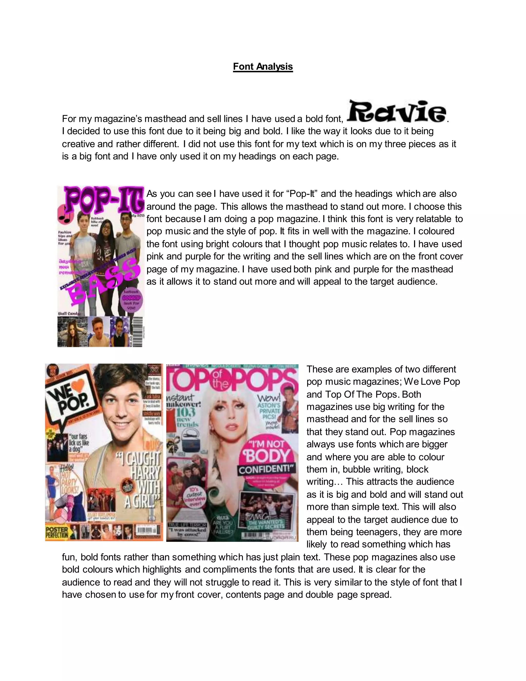
1. Font Analysis
For my magazine’s masthead and sell lines I have used a bold font, .
I decided to use this font due to it being big and bold. I like the way it looks due to it being
creative and rather different. I did not use this font for my text which is on my three pieces as it
is a big font and I have only used it on my headings on each page.
As you can see I have used it for “Pop-It” and the headings which are also
around the page. This allows the masthead to stand out more. I choose this
font because I am doing a pop magazine. I think this font is very relatable to
pop music and the style of pop. It fits in well with the magazine. I coloured
the font using bright colours that I thought pop music relates to. I have used
pink and purple for the writing and the sell lines which are on the front cover
page of my magazine. I have used both pink and purple for the masthead
as it allows it to stand out more and will appeal to the target audience.
These are examples of two different
pop music magazines; We Love Pop
and Top Of The Pops. Both
magazines use big writing for the
masthead and for the sell lines so
that they stand out. Pop magazines
always use fonts which are bigger
and where you are able to colour
them in, bubble writing, block
writing… This attracts the audience
as it is big and bold and will stand out
more than simple text. This will also
appeal to the target audience due to
them being teenagers, they are more
likely to read something which has
fun, bold fonts rather than something which has just plain text. These pop magazines also use
bold colours which highlights and compliments the fonts that are used. It is clear for the
audience to read and they will not struggle to read it. This is very similar to the style of font that I
have chosen to use for my front cover, contents page and double page spread.