The document discusses various fonts and design elements being considered for use in a magazine. For the masthead, the Laranjha Pro Fraco font is liked as it is simple and easy to read. For the main text, Calibri is liked as it is easy to read and professional looking. For the cover line, the Vanadine font is preferred as it is simplistic and sophisticated. Inspiration is taken from magazine covers showing medium close-up shots of models for the cover image. Poses using hands and busy backgrounds are noted. Double page spreads with articles and full images are preferred. Low angle informal shots and props like guitars are liked for content pages.
Good graphic design doesn’t happen by mistake, and neither does clever font marriage. With this Ultimate Guide to Font Pairing we show you how to make your designs beautiful, with simple and effective type applications
Read more at http://blog.canva.com/the-ultimate-guide-to-font-pairing/#Q3yEZPx6iwbBkRME.99
Download and watch on your computer for best view!
This deck covers five tips on how to improve the typography on your presentation slides.
This presentation was created 100% in PowerPoint by my presentation design agency Slides. We are based in Spain (Europe) but have clients worldwide.
Drop me an email and we will discuss your project.
Goodbye boring old presentation fonts! Typography is one of the most important components of great PowerPoint design, and in 2015 rich typography will continue to be a dominating design element. Given that high quality fonts are more accessible and more affordable (often times FREE), be prepared to see some new, exciting and interesting trends in fonts within PowerPoint presentations. Interested in knowing more about presentation font trends in the upcoming year? Then, check out this presentation!
This part of the planning includes the mood board (colour scheme, mast head designs, flashes, camera shots, mode of address and images used). It also includes the flat plan of my magazine.
JMeter webinar - integration with InfluxDB and GrafanaRTTS
Watch this recorded webinar about real-time monitoring of application performance. See how to integrate Apache JMeter, the open-source leader in performance testing, with InfluxDB, the open-source time-series database, and Grafana, the open-source analytics and visualization application.
In this webinar, we will review the benefits of leveraging InfluxDB and Grafana when executing load tests and demonstrate how these tools are used to visualize performance metrics.
Length: 30 minutes
Session Overview
-------------------------------------------
During this webinar, we will cover the following topics while demonstrating the integrations of JMeter, InfluxDB and Grafana:
- What out-of-the-box solutions are available for real-time monitoring JMeter tests?
- What are the benefits of integrating InfluxDB and Grafana into the load testing stack?
- Which features are provided by Grafana?
- Demonstration of InfluxDB and Grafana using a practice web application
To view the webinar recording, go to:
https://www.rttsweb.com/jmeter-integration-webinar
GraphRAG is All You need? LLM & Knowledge GraphGuy Korland
Guy Korland, CEO and Co-founder of FalkorDB, will review two articles on the integration of language models with knowledge graphs.
1. Unifying Large Language Models and Knowledge Graphs: A Roadmap.
https://arxiv.org/abs/2306.08302
2. Microsoft Research's GraphRAG paper and a review paper on various uses of knowledge graphs:
https://www.microsoft.com/en-us/research/blog/graphrag-unlocking-llm-discovery-on-narrative-private-data/
Search and Society: Reimagining Information Access for Radical FuturesBhaskar Mitra
The field of Information retrieval (IR) is currently undergoing a transformative shift, at least partly due to the emerging applications of generative AI to information access. In this talk, we will deliberate on the sociotechnical implications of generative AI for information access. We will argue that there is both a critical necessity and an exciting opportunity for the IR community to re-center our research agendas on societal needs while dismantling the artificial separation between the work on fairness, accountability, transparency, and ethics in IR and the rest of IR research. Instead of adopting a reactionary strategy of trying to mitigate potential social harms from emerging technologies, the community should aim to proactively set the research agenda for the kinds of systems we should build inspired by diverse explicitly stated sociotechnical imaginaries. The sociotechnical imaginaries that underpin the design and development of information access technologies needs to be explicitly articulated, and we need to develop theories of change in context of these diverse perspectives. Our guiding future imaginaries must be informed by other academic fields, such as democratic theory and critical theory, and should be co-developed with social science scholars, legal scholars, civil rights and social justice activists, and artists, among others.
Builder.ai Founder Sachin Dev Duggal's Strategic Approach to Create an Innova...Ramesh Iyer
In today's fast-changing business world, Companies that adapt and embrace new ideas often need help to keep up with the competition. However, fostering a culture of innovation takes much work. It takes vision, leadership and willingness to take risks in the right proportion. Sachin Dev Duggal, co-founder of Builder.ai, has perfected the art of this balance, creating a company culture where creativity and growth are nurtured at each stage.
DevOps and Testing slides at DASA ConnectKari Kakkonen
My and Rik Marselis slides at 30.5.2024 DASA Connect conference. We discuss about what is testing, then what is agile testing and finally what is Testing in DevOps. Finally we had lovely workshop with the participants trying to find out different ways to think about quality and testing in different parts of the DevOps infinity loop.
Kubernetes & AI - Beauty and the Beast !?! @KCD Istanbul 2024Tobias Schneck
As AI technology is pushing into IT I was wondering myself, as an “infrastructure container kubernetes guy”, how get this fancy AI technology get managed from an infrastructure operational view? Is it possible to apply our lovely cloud native principals as well? What benefit’s both technologies could bring to each other?
Let me take this questions and provide you a short journey through existing deployment models and use cases for AI software. On practical examples, we discuss what cloud/on-premise strategy we may need for applying it to our own infrastructure to get it to work from an enterprise perspective. I want to give an overview about infrastructure requirements and technologies, what could be beneficial or limiting your AI use cases in an enterprise environment. An interactive Demo will give you some insides, what approaches I got already working for real.
"Impact of front-end architecture on development cost", Viktor TurskyiFwdays
I have heard many times that architecture is not important for the front-end. Also, many times I have seen how developers implement features on the front-end just following the standard rules for a framework and think that this is enough to successfully launch the project, and then the project fails. How to prevent this and what approach to choose? I have launched dozens of complex projects and during the talk we will analyze which approaches have worked for me and which have not.
GDG Cloud Southlake #33: Boule & Rebala: Effective AppSec in SDLC using Deplo...James Anderson
Effective Application Security in Software Delivery lifecycle using Deployment Firewall and DBOM
The modern software delivery process (or the CI/CD process) includes many tools, distributed teams, open-source code, and cloud platforms. Constant focus on speed to release software to market, along with the traditional slow and manual security checks has caused gaps in continuous security as an important piece in the software supply chain. Today organizations feel more susceptible to external and internal cyber threats due to the vast attack surface in their applications supply chain and the lack of end-to-end governance and risk management.
The software team must secure its software delivery process to avoid vulnerability and security breaches. This needs to be achieved with existing tool chains and without extensive rework of the delivery processes. This talk will present strategies and techniques for providing visibility into the true risk of the existing vulnerabilities, preventing the introduction of security issues in the software, resolving vulnerabilities in production environments quickly, and capturing the deployment bill of materials (DBOM).
Speakers:
Bob Boule
Robert Boule is a technology enthusiast with PASSION for technology and making things work along with a knack for helping others understand how things work. He comes with around 20 years of solution engineering experience in application security, software continuous delivery, and SaaS platforms. He is known for his dynamic presentations in CI/CD and application security integrated in software delivery lifecycle.
Gopinath Rebala
Gopinath Rebala is the CTO of OpsMx, where he has overall responsibility for the machine learning and data processing architectures for Secure Software Delivery. Gopi also has a strong connection with our customers, leading design and architecture for strategic implementations. Gopi is a frequent speaker and well-known leader in continuous delivery and integrating security into software delivery.
Dev Dives: Train smarter, not harder – active learning and UiPath LLMs for do...UiPathCommunity
💥 Speed, accuracy, and scaling – discover the superpowers of GenAI in action with UiPath Document Understanding and Communications Mining™:
See how to accelerate model training and optimize model performance with active learning
Learn about the latest enhancements to out-of-the-box document processing – with little to no training required
Get an exclusive demo of the new family of UiPath LLMs – GenAI models specialized for processing different types of documents and messages
This is a hands-on session specifically designed for automation developers and AI enthusiasts seeking to enhance their knowledge in leveraging the latest intelligent document processing capabilities offered by UiPath.
Speakers:
👨🏫 Andras Palfi, Senior Product Manager, UiPath
👩🏫 Lenka Dulovicova, Product Program Manager, UiPath
UiPath Test Automation using UiPath Test Suite series, part 3DianaGray10
Welcome to UiPath Test Automation using UiPath Test Suite series part 3. In this session, we will cover desktop automation along with UI automation.
Topics covered:
UI automation Introduction,
UI automation Sample
Desktop automation flow
Pradeep Chinnala, Senior Consultant Automation Developer @WonderBotz and UiPath MVP
Deepak Rai, Automation Practice Lead, Boundaryless Group and UiPath MVP
Accelerate your Kubernetes clusters with Varnish CachingThijs Feryn
A presentation about the usage and availability of Varnish on Kubernetes. This talk explores the capabilities of Varnish caching and shows how to use the Varnish Helm chart to deploy it to Kubernetes.
This presentation was delivered at K8SUG Singapore. See https://feryn.eu/presentations/accelerate-your-kubernetes-clusters-with-varnish-caching-k8sug-singapore-28-2024 for more details.
Empowering NextGen Mobility via Large Action Model Infrastructure (LAMI): pav...
Style Sheet
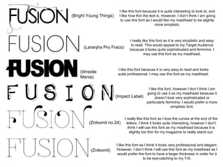
1. (Bright Young Things)
I like this font because it is quite interesting to look at, and
I like how thin the text is. However, I don’t think I am going
to use this font as I would like my masthead to be slightly
more simplistic.
(Laranjha Pro Fraco)
(Wrestle
Mania)
I really like this font as it is very simplistic and easy
to read. This would appeal to my Target Audience
because it looks quite sophisticated and feminine. I
may use this font as my masthead.
I like this font because it is very easy to read and looks
quite professional. I may use this font as my masthead.
I like this font, however I don’t think I am
going to use it as my masthead because it
(Impact Label)
doesn’t look very sophisticated or
particularly feminine. I would prefer a more
simplistic font.
(Znikomit no.24)
(Znikomit)
I really like this font as I love the curves at the end of the
letters. I think it looks quite interesting, however I don’t
think I will use this font as my masthead because it is
slightly too thin for my magazine to really stand out.
I like this font as I think it looks very professional and elegant.
However, I don’t think I will use this font as my masthead as I
would prefer the font to have a larger thickness in order for it
to be eye-catching to my T/A.
2. These are the example
fonts for my main text:
I quite like this font because it is easy to read and looks quite sophisticated.
However, I don’t think I am going to use this font as it doesn’t look very modern.
I like this font as it is easy to read and is quite professional looking. I may use this
as the font for my main text as I think it looks appealing and would attract the
Target Audience.
I like this colour scheme because the colour purple
will appeal to my target audience (women) and the I like this font, but I don’t think I will use it for my main text as it doesn’t look very
colours blend well together. However, I don’t think I
professional.
will use this colour scheme as I think there needs to
be a greater contrast of colours.
I really like this font because it looks quite modern and curvy, which may
appeal to my female Target Audience. I may use this as the font for my main
text.
I like this colour scheme as pink and purple are stereotypically
feminine colours and look appealing together. This provides a
stark contrast to the monochromatic colours of black and
white. The black will be used on the main text and enable the
text to be easily readable. However, I don’t think I will use this
colour scheme as I would prefer variations of purple to the use
of pink.
I really like this colour scheme because I think the colours all
work really well together. Purple will appeal to my Target
Audience, and the combination of black and white will provide a
slightly aged feel to the magazine. This is important as my
magazine is a fusion of different sounds and styles.
Book Antiqua
Adobe
Devanaga
Calibri
Californian FB
I like this font for my headline as I think
it is quite girly and looks similar to fonts
I have previously seen on double page
spreads. However, I don’t think I will use
this font as I would prefer a slightly
thinner font to match my masthead font.
I really like this font as I think it is
very eye-catching and appealing. I
like the fact that it looks like
handwriting and it is very girly. I
may use this as the font for my
headline on my double page spread
because I think it will appeal to my
Target Audience.
I like this font as it looks very
sophisticated and would appeal to
a female audience as it is quite
girly. However, I think it may be a
bit too formal for the audience
and presentation of my magazine.
3. Artist Name Fonts
I really like this font because it is girly and appealing to the eye, it
would also appeal to my Target Audience (women) as it is very
feminine.
I may use this font on my front cover as I love how pretty and elegant it
looks. This font would appeal to my Target Audience because it is
feminine and easy to read.
I may use this font on my front cover as when it is
coloured to fit in with my colour scheme (a shade of
purple) it will look like lipstick. This is stereotypically
feminine and will appeal to my Target Audience, young
women who have an interest in fashion and beauty.
Cover Line Fonts
I really like this font because it is quite simplistic and sophisticated. I
will use this font for my cover lines as it will be easy to read and will
capture the attention of my Target Audience.
I like this font as it is quite modest and simple. However, I don’t think I
will use this font on my front cover as it isn’t as eye-catching as the
‘vanadine’ font.
4. I really like all of these images, particularly as they are all medium
close-up shots. I would like to use this type of shot for my front
cover and have been particularly inspired by splash image used
on the front cover of ‘Billboard’ magazine. Most of the images
used show the models unsmiling, and I may replicate this on my
own magazine. I also really like the way Katy Perry’s hands are
positioned (shown at the bottom left hand side of the page). I may
ask my cover model to replicate this pose on the splash image or
image used on my double page spread.
5. These images are my inspiration for my double page spread. I
really like the composition of the double page spread shown above.
On my own magazine, I will have the article on one side and a full
sized image on the other. For this image, I would like to use a long
shot or a medium shot of the same model as used on my splash
image. I really like the poses shown on these images, particularly
the monochrome image on the top left. The positioning of hands is
similar to the Katy Perry image shown on the previous page and so
my model may also use this pose. I also really like the mise-enscene of the image to the bottom right of the page. It looks very
busy and interesting, and immediately captures the attention of the
reader. I will try to replicate this in my own image.
6. These images are my inspiration for the images used on my
contents page. I really like the picture on the left because it looks
inviting and colourful. The image is very informal as it is low angle
shot. I may try to replicate this camera angle on one of my own
images. I also like the image on the right as I like the use of a guitar
in the image – when I take my own pictures, I will use a guitar as a
prop.
7. These images are my inspiration for the images used on my
contents page. I really like the picture on the left because it looks
inviting and colourful. The image is very informal as it is low angle
shot. I may try to replicate this camera angle on one of my own
images. I also like the image on the right as I like the use of a guitar
in the image – when I take my own pictures, I will use a guitar as a
prop.