
Recommended
More Related Content
What's hot
What's hot (17)
Similar to Contents page analysis
Similar to Contents page analysis (20)
More from djardine94
More from djardine94 (15)
Recently uploaded
Recently uploaded (20)
Contents page analysis
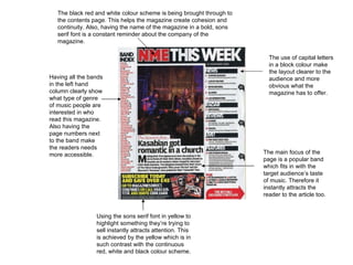
- 1. The black red and white colour scheme is being brought through to the contents page. This helps the magazine create cohesion and continuity. Also, having the name of the magazine in a bold, sons serif font is a constant reminder about the company of the magazine. The main focus of the page is a popular band which fits in with the target audience’s taste of music. Therefore it instantly attracts the reader to the article too. The use of capital letters in a block colour make the layout clearer to the audience and more obvious what the magazine has to offer. Having all the bands in the left hand column clearly show what type of genre of music people are interested in who read this magazine. Also having the page numbers next to the band make the readers needs more accessible. Using the sons serif font in yellow to highlight something they’re trying to sell instantly attracts attention. This is achieved by the yellow which is in such contrast with the continuous red, white and black colour scheme.
- 2. Unusually, the magazine name is not placed anywhere on the contents. All the text is very small apart from main features of the contents page. This contents is from the Rolling Stone magazine, which explains the retro look of it. The black and white colour scheme fits in with the look of it, however the random flash of colour updates the page and makes the overall appearance more interesting. The serif font is another thing that adds to the retro feel of the magazine. Showing a black and white image with this font has an effect on the magazine which makes it fit in with the music genre of being original. The coloured image is a lot different to the image that is placed next to it. As well as the minimal use of colour, this also updates the magazine. The overall appearance of this contents page represents the magazine as being original. Very minimal colour is used of the contents of this magazine. It makes the page seem vintage
- 3. Having the celebrities and bands featured on the contents page instantly draws the audience in. It also gives an insight about who the magazine aims at with the genre of music they have to offer. Offers such as Kerrang trying to entice their readers to subscribe to a agreement; selling point, are commonly put in a bold colour in comparison to the colour scheme through out the magazine is used to catch attention. Especially seeing as it’s been placed in the bottom right hand corner which is what you’d normally read last. A brief explanation is usually put on a magazine to inform the reader what they can expect from the magazine. It usually consists of a few jokes from the editor which could then make you want to read on. Just like in most magazines, Kerrang have used the same colour scheme and layout as most magazines in how the give the references in a bold light contrasting colour. This makes it clear to the reader and makes their needs more accessible. Another thing they’ve devised is putting pictures with the contents. Pictures are key as most people with immediately be attracted to pictures which involve something or someone that they’re highly interested in. The large image hints to the reader what the magazine includes. The image suggests that the magazine is for people into grunge.