Explore beautiful and ugly buildings. Mathematics helps us create beautiful d...
Magazine font analysis
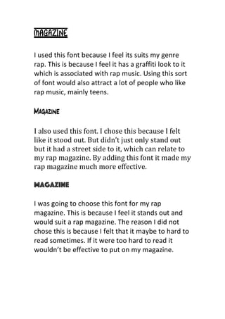
1. Magazine
I
used
this
font
because
I
feel
its
suits
my
genre
rap.
This
is
because
I
feel
it
has
a
graffiti
look
to
it
which
is
associated
with
rap
music.
Using
this
sort
of
font
would
also
attract
a
lot
of
people
who
like
rap
music,
mainly
teens.
Magazine
I
also
used
this
font.
I
chose
this
because
I
felt
like
it
stood
out.
But
didn’t
just
only
stand
out
but
it
had
a
street
side
to
it,
which
can
relate
to
my
rap
magazine.
By
adding
this
font
it
made
my
rap
magazine
much
more
effective.
Magazine
I
was
going
to
choose
this
font
for
my
rap
magazine.
This
is
because
I
feel
it
stands
out
and
would
suit
a
rap
magazine.
The
reason
I
did
not
chose
this
is
because
I
felt
that
it
maybe
to
hard
to
read
sometimes.
If
it
were
too
hard
to
read
it
wouldn’t
be
effective
to
put
on
my
magazine.
2. Magazine
I
was
also
going
to
choose
this
font
for
my
rap
magazine.
This
is
because
again
I
feel
it
would
stand
out
and
catch
peoples
eye.
But
the
reason
I
did
not
choose
it
is
because
I
feel
it
would
attract
people
but
it
wouldn’t
attract
the
right
people
for
a
rap
magazine.
This
is
because
I
feel
the
font
does
not
suit
the
genre
rap.
Magazine
I
did
not
choose
this
font
in
the
end
for
my
rap
magazine.
This
is
because
when
I
got
feedback
a
lot
of
people
said
it’s
a
nice
font
and
it
does
look
good
but
it
is
a
bit
hard
to
read
and
wouldn’t
be
very
effective
if
used.
Magazine
I
choose
this
font
for
my
final
magazine.
This
was
because
I
used
it
as
some
bold
writing.
For
example
to
say
what
acts
are
also
there
so
that
it
would
stand
out
as
this
font
is
quite
bold.
The
con
for
this
font
is
that
it
is
quite
hard
to
read
but
when
I
got
my
feedback
from
other
people
they
3. said
it
is
an
effective
font
to
use.
This
font
I
feel
could
suit
most
genres,
as
it
is
used
for
bold
text.