The document discusses how the media product uses, develops, and challenges conventions of real media products.
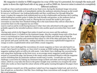
It summarizes that the magazine's front cover uses conventions well by having the main image in the center to catch attention, and connecting the color of the guitar to other elements.
However, it also challenges some conventions by only including three "anchorage" points rather than the typical 4-5, making the main image black and white with color only on the guitar, and merging music with fashion genres.
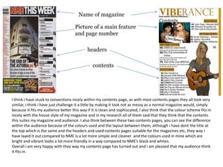
The contents page also aims to challenge conventions by having a cleaner, simpler layout suited to the target audience, while still including typical elements like headers and page numbers.
Overall, audience testing found the magazine


![Evaluation[1]](https://cdn.slidesharecdn.com/ss_thumbnails/evaluation1-140509042735-phpapp02-thumbnail.jpg?width=640&height=640&fit=bounds)


