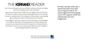
Market Research
Media Studies Coursework
Music Magazines available in the UK:
• Kerrang magazine is published by Bauer Media.
Other things they produce are:
Magazines:
Radio:
Television:
Kerrang’s average reader age is
significantly lower than other
music magazines like Q. This
would suggest that the language
used in the magazine will be less
sophisticated and more
exaggerated.
Q magazine is also published by Bauer Media.
Because Q’s average
reader age is 34, this
will be reflected in
the magazine in
what language they
use. We would
assume that it will
be more
sophisticated
language.
Circulation = 52,781
It is Britain’s leading publisher of print and digital magazine
content. With more than 60 iconic bands, it creates content
on multiple platforms across print, online and mobiles.
Some Magazines they publish:
Circulation = 56,223
Textual Analysis
Of Magazines
The layout of Kerrangs front cover is a
lot more chaotic as their average
reader age in a lot lower than other
magazines like Q. This also indicates
that the magazine is aimed at a
different style of music because of the
style in which it is presented.
Their colour schemes are a lot more
vibrant because of their younger
audience. This appeals to the reader
as it catches their eye easily, drawing
them it and making them interested
in what on the inside.
Kerrang have a banner along the top of the
cover informing the reader of what’s
inside. This intrigues the reader as it’s at
top so will be one of the first things they
look at. Also it is offering a freebie (the
posters), so it makes the reader feel like
they are gaining something from buying
the magazine. The use of the word ‘killer’
also links in with the image of the
magazine and the posters are also of the
joker and the harlequin who are killers.
Headline of the people featured
on the magazine is there to grab
the readers attention. By having
such a large heading, it makes it
easy for the reader to see and it is
normally the first thing they see,
giving the reader a quick snap as
to watch they can expect inside.
As well as making the readers feel
as if they are getting exclusive
access to celebrities/music news.
The different sizes of text
gives the magazine more
variety and also the use of
a variety of fonts on the
font cover gives it more of
a feeling of madness which
links in with the magazines
reputation.
The position of everything on the
page makes sure that there is no
space left for anything else to be
added, indicating that the
magazine is packed full of up to
date, interesting music news.
The design of the magazine cover also uses rips as if
it has been torn which also fits with the magazines
reputation.
The main contents is down the right third of
the page, all in one area to draw attention to
the image down the left and centre third of
the page. Also, the section headers are
enlarged and highlighted to grab the reader.
Making them intrigued as to what is in the
magazine, and making them want to read it
instead of skipping straight in the magazine.
Band names in the contents are in bold to
make them stand out to the reader. This
fits in with the magazines promise to
deliver a balance of bands in the issue.
The image down the left and
centre third shows someone
shouting/screaming which links in
with the magazines reputation of
madness.
The colour theme of red and
black continues into the
contents page, with the
background around the person
being mainly red which draw
attention to the guy who is in
black making him stand out.
There is also a message from the editor
in the top right third of the magazine,
this allows the reader to feel
connected to the magazine and
personalises it.
The colour scheme is yellow and
back consistently over the double
page spread, this is a toxic colour
theme which links in with Kerrangs
aggressive and rock reputation.
The layout of the pages are in three
columns which shows professionalism
and that it is a well respected
magazine.
The images are fitted to the columns,
either being across 2 or more columns
or in one column.
The main image spans across 4 columns
and spread across 2 pages, this draws
attention to the artists and
immediately lets you know what the
article is about.
The artists in the image are playing keyboard
and the girl is singing which shows off the fact
that they are musicians and they take music
seriously.
Q magazine use lots of medium close
up shots on the covers of their
magazines for their feature photos.
They do this because they are all
about the inside access they get with
celebrities, so these close up shots
reflects this and can also make the
readers feel closer to the celebrities
as they are directly addressing the
reader.
Q also use a theme of black, white and
red for their fonts. This is because they
have a higher average viewer age and
so it looks more sophisticated.
There are lots of sub-heading on the
cover that are names of famous
bands/artists. This grabs the readers
attention and engages them into the
magazine. Making them believe that
the magazine has lots of information
to read.
This magazine only uses a
small variety of fonts and
generally sticks to the same
size of text for all of the sub-
headings, this links in with the
magazines reputation of it
being more sophisticated.
The picture: text ratio is a lot
more favourably towards text.
This is because Q’s target
audience is a lot older and so it
is targeted for high level
intelligence readers.
The use of the word queen on the
cover links in with the name of the
magazine, drawing reader
attention. It also tells use that it is
exclusive, showing us further, how
close they can get to celebrities to
bring you news.
The master head “Liam's beady eye kick
off” catches the readers attention quickly
as it involves a singer from one of the
most famous bands around. Plus it is right
across the bottom of the magazine which
is a strange place to have it but it is eye
catching and you see it straight away.
Q’s contents page has
a very quirky layout
and fits in with the
theme of their
magazine. It is also
very attractive and
interesting to look at,
making the reader
want to read the
contents page.
The contents is also covered in
pictures of celebrities and
artists, further giving readers
the exclusive access promised
by Q.
Q’s colour theme is
carried on through to
the contents page.
With the bright red
plug down the centre
third of the page.
This draws a lot of
attention as it is the
first thing you se
when you turn onto
the page because of
the bright colour.
The bottom third of the right
page includes a review section
showing the world finest music
guide. This appeals to the
reader as Q promises exclusive
information and inside access
which it is providing here. It is
also highlighted in a box to
make sure he readers don’t
miss it.
All artists names and
titles are in bold and
capitals to draw attention
to them and make them
stand out to the reader
and show all the diverse
artists include in the mag.
The colour scheme follows throughout
the magazine keeping things
consistent. Also, the colour scheme is
kept the same throughout to shows
professionalism and to make it
recognisable as a Q magazine.
The layout is in 3 columns so that it
looks sophisticated and simple to read.
This also is a typical layout of a article
and most magazines use it.
The main image across the double page
spread features a band which the article
is about and also they are all looking into
the camera as if they were looking at the
reader. Giving the reader a feeling of
exclusive access.
There is also a strip down the right
third of the second page giving extra
information and it features different
artists and a little bit about them.
Making the reader feel like they are
getting to know new and unique
information.
There is a plug in between the
centre and right third of the
first page, giving the reader
‘must know’ information about
the artist featured.
There is information/
interviews with bands
giving viewers access to the
stars as well as keeping
readers up to date with new
music like they said they
would.
NME also use the same colour
scheme as their logo on the
cover of their magazine of reds
and whites to make it
recognisable but also making it
appealing to look at.
They also use the same
fonts on the cover, keeping
it consistent and
recognisable.
42% of NMEs readers are
students which is why
they choose relevant
artists to include on the
magazine to make sure
that they will keep
reading it.
NMEs average reader age is 23,
therefore they design the magazine
to suit this by adding appropriate
pictures and by not crowding the
layout too much as because there
reader age is low, they may not be
sophisticated enough to understand
the complexity of a magazine too
hectic.
Readers have a very strong relationship with
NME and trust the brand to bring them
exclusives and lots of new music information
as soon as it happens.
All of the important
information and catchy
cover lines are located on
the left third of the page.
This is because when on a
shelf, the left third on the
magazine is on show. Also
people read left to right so
this is the first part they
read.
The splash image spreads across the entire cover
from left to right and top to bottom. This makes
sure they there is enough to draw peoples attention
but not so much to make it look crowded.
NME’s colour theme
continues into the contents
page, it is vey basic but
makes sure you attention is
raw to the most important
information.
There is a band list down the right
third of the page, showing the
reader all of the artists and bands
included in the magazine, proving
to them that they can provide lots
of exclusive information on a huge
variety of artists.
Down the centre third of the page,
there is only one picture. There is no
other pictures on the page, this is to
pick out this artist as they may be the
main focus of this issue.
The washed-out look to
the magazine carries on
throughout the magazine,
this ties in with the image
of the magazine as their
average reader age is 23.
So it is suited to attract this
age range.
The layout of the contents page in in
3 traditional columns. There is no
overlapping of images over columns
or writing going across more than
one column. This presents a very
clean cut image to the reader and
makes it simple to read and navigate
through the magazine.
The majority of NME’s double page
spreads are dominated by a main image
which the article is about. This makes
the article stand out to the reader so
that they want to read it.
The artists featured in the image are also
looking at the camera, making the reader
feel as if they are looking at them, giving a
personal feeling to the reader.
The first page is laid out into 4 columns
which is strange as most are in 3
columns. This reflects NME’s alternative
appearance.
There is a quote across the centre
third/middle columns on the first
page from an artists which draws the
readers attention making them want
to read the article.
The colour scheme(washed out)
of NME continues onto the
double page spread, keeping the
image of NME magazines in tact.
The heading of the article is very large and
bold, taking up the entire top half of the first
page. This is to make the article stand out
(pop) to the reader and also reflect the artist.

Market research1

  • 1.
  • 2.
  • 3.
    • Kerrang magazineis published by Bauer Media. Other things they produce are: Magazines: Radio: Television:
  • 5.
    Kerrang’s average readerage is significantly lower than other music magazines like Q. This would suggest that the language used in the magazine will be less sophisticated and more exaggerated.
  • 6.
    Q magazine isalso published by Bauer Media. Because Q’s average reader age is 34, this will be reflected in the magazine in what language they use. We would assume that it will be more sophisticated language. Circulation = 52,781
  • 7.
    It is Britain’sleading publisher of print and digital magazine content. With more than 60 iconic bands, it creates content on multiple platforms across print, online and mobiles. Some Magazines they publish:
  • 9.
  • 10.
  • 11.
    The layout ofKerrangs front cover is a lot more chaotic as their average reader age in a lot lower than other magazines like Q. This also indicates that the magazine is aimed at a different style of music because of the style in which it is presented. Their colour schemes are a lot more vibrant because of their younger audience. This appeals to the reader as it catches their eye easily, drawing them it and making them interested in what on the inside. Kerrang have a banner along the top of the cover informing the reader of what’s inside. This intrigues the reader as it’s at top so will be one of the first things they look at. Also it is offering a freebie (the posters), so it makes the reader feel like they are gaining something from buying the magazine. The use of the word ‘killer’ also links in with the image of the magazine and the posters are also of the joker and the harlequin who are killers. Headline of the people featured on the magazine is there to grab the readers attention. By having such a large heading, it makes it easy for the reader to see and it is normally the first thing they see, giving the reader a quick snap as to watch they can expect inside. As well as making the readers feel as if they are getting exclusive access to celebrities/music news. The different sizes of text gives the magazine more variety and also the use of a variety of fonts on the font cover gives it more of a feeling of madness which links in with the magazines reputation. The position of everything on the page makes sure that there is no space left for anything else to be added, indicating that the magazine is packed full of up to date, interesting music news. The design of the magazine cover also uses rips as if it has been torn which also fits with the magazines reputation.
  • 12.
    The main contentsis down the right third of the page, all in one area to draw attention to the image down the left and centre third of the page. Also, the section headers are enlarged and highlighted to grab the reader. Making them intrigued as to what is in the magazine, and making them want to read it instead of skipping straight in the magazine. Band names in the contents are in bold to make them stand out to the reader. This fits in with the magazines promise to deliver a balance of bands in the issue. The image down the left and centre third shows someone shouting/screaming which links in with the magazines reputation of madness. The colour theme of red and black continues into the contents page, with the background around the person being mainly red which draw attention to the guy who is in black making him stand out. There is also a message from the editor in the top right third of the magazine, this allows the reader to feel connected to the magazine and personalises it.
  • 13.
    The colour schemeis yellow and back consistently over the double page spread, this is a toxic colour theme which links in with Kerrangs aggressive and rock reputation. The layout of the pages are in three columns which shows professionalism and that it is a well respected magazine. The images are fitted to the columns, either being across 2 or more columns or in one column. The main image spans across 4 columns and spread across 2 pages, this draws attention to the artists and immediately lets you know what the article is about. The artists in the image are playing keyboard and the girl is singing which shows off the fact that they are musicians and they take music seriously.
  • 14.
    Q magazine uselots of medium close up shots on the covers of their magazines for their feature photos. They do this because they are all about the inside access they get with celebrities, so these close up shots reflects this and can also make the readers feel closer to the celebrities as they are directly addressing the reader. Q also use a theme of black, white and red for their fonts. This is because they have a higher average viewer age and so it looks more sophisticated. There are lots of sub-heading on the cover that are names of famous bands/artists. This grabs the readers attention and engages them into the magazine. Making them believe that the magazine has lots of information to read. This magazine only uses a small variety of fonts and generally sticks to the same size of text for all of the sub- headings, this links in with the magazines reputation of it being more sophisticated. The picture: text ratio is a lot more favourably towards text. This is because Q’s target audience is a lot older and so it is targeted for high level intelligence readers. The use of the word queen on the cover links in with the name of the magazine, drawing reader attention. It also tells use that it is exclusive, showing us further, how close they can get to celebrities to bring you news. The master head “Liam's beady eye kick off” catches the readers attention quickly as it involves a singer from one of the most famous bands around. Plus it is right across the bottom of the magazine which is a strange place to have it but it is eye catching and you see it straight away.
  • 15.
    Q’s contents pagehas a very quirky layout and fits in with the theme of their magazine. It is also very attractive and interesting to look at, making the reader want to read the contents page. The contents is also covered in pictures of celebrities and artists, further giving readers the exclusive access promised by Q. Q’s colour theme is carried on through to the contents page. With the bright red plug down the centre third of the page. This draws a lot of attention as it is the first thing you se when you turn onto the page because of the bright colour. The bottom third of the right page includes a review section showing the world finest music guide. This appeals to the reader as Q promises exclusive information and inside access which it is providing here. It is also highlighted in a box to make sure he readers don’t miss it. All artists names and titles are in bold and capitals to draw attention to them and make them stand out to the reader and show all the diverse artists include in the mag.
  • 16.
    The colour schemefollows throughout the magazine keeping things consistent. Also, the colour scheme is kept the same throughout to shows professionalism and to make it recognisable as a Q magazine. The layout is in 3 columns so that it looks sophisticated and simple to read. This also is a typical layout of a article and most magazines use it. The main image across the double page spread features a band which the article is about and also they are all looking into the camera as if they were looking at the reader. Giving the reader a feeling of exclusive access. There is also a strip down the right third of the second page giving extra information and it features different artists and a little bit about them. Making the reader feel like they are getting to know new and unique information. There is a plug in between the centre and right third of the first page, giving the reader ‘must know’ information about the artist featured.
  • 17.
    There is information/ interviewswith bands giving viewers access to the stars as well as keeping readers up to date with new music like they said they would. NME also use the same colour scheme as their logo on the cover of their magazine of reds and whites to make it recognisable but also making it appealing to look at. They also use the same fonts on the cover, keeping it consistent and recognisable. 42% of NMEs readers are students which is why they choose relevant artists to include on the magazine to make sure that they will keep reading it. NMEs average reader age is 23, therefore they design the magazine to suit this by adding appropriate pictures and by not crowding the layout too much as because there reader age is low, they may not be sophisticated enough to understand the complexity of a magazine too hectic. Readers have a very strong relationship with NME and trust the brand to bring them exclusives and lots of new music information as soon as it happens. All of the important information and catchy cover lines are located on the left third of the page. This is because when on a shelf, the left third on the magazine is on show. Also people read left to right so this is the first part they read. The splash image spreads across the entire cover from left to right and top to bottom. This makes sure they there is enough to draw peoples attention but not so much to make it look crowded.
  • 18.
    NME’s colour theme continuesinto the contents page, it is vey basic but makes sure you attention is raw to the most important information. There is a band list down the right third of the page, showing the reader all of the artists and bands included in the magazine, proving to them that they can provide lots of exclusive information on a huge variety of artists. Down the centre third of the page, there is only one picture. There is no other pictures on the page, this is to pick out this artist as they may be the main focus of this issue. The washed-out look to the magazine carries on throughout the magazine, this ties in with the image of the magazine as their average reader age is 23. So it is suited to attract this age range. The layout of the contents page in in 3 traditional columns. There is no overlapping of images over columns or writing going across more than one column. This presents a very clean cut image to the reader and makes it simple to read and navigate through the magazine.
  • 19.
    The majority ofNME’s double page spreads are dominated by a main image which the article is about. This makes the article stand out to the reader so that they want to read it. The artists featured in the image are also looking at the camera, making the reader feel as if they are looking at them, giving a personal feeling to the reader. The first page is laid out into 4 columns which is strange as most are in 3 columns. This reflects NME’s alternative appearance. There is a quote across the centre third/middle columns on the first page from an artists which draws the readers attention making them want to read the article. The colour scheme(washed out) of NME continues onto the double page spread, keeping the image of NME magazines in tact. The heading of the article is very large and bold, taking up the entire top half of the first page. This is to make the article stand out (pop) to the reader and also reflect the artist.