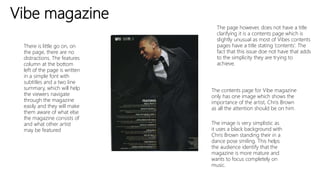
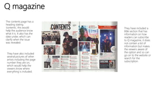
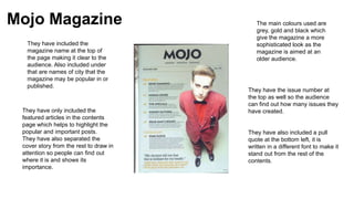
Contents page analysis
Vibe magazine
The contents page for Vibe magazine
only has one image which shows the
importance of the artist, Chris Brown
as all the attention should be on him.
The image is very simplistic as
it uses a black background with
Chris Brown standing their in a
dance pose smiling. This helps
the audience identify that the
magazine is more mature and
wants to focus completely on
music.
There is little go on, on
the page, there are no
distractions. The features
column at the bottom
left of the page is written
in a simple font with
subtitles and a two line
summary, which will help
the viewers navigate
through the magazine
easily and they will make
them aware of what else
the magazine consists of
and what other artist
may be featured
The page however, does not have a title
clarifying it is a contents page which is
slightly unusual as most of Vibes contents
pages have a title stating ‘contents’. The
fact that this issue doe not have that adds
to the simplicity they are trying to
achieve.
Q magazine
The contents page has a
heading stating
‘contents’, this would
help the audience know
what it is. It also has the
date under, which can
clarify when the issue
was revealed.
They have also included
several pictures of other
artists including the page
number they are on,
which would help the
viewers know where
everything is included.
They have included a
little section that has
information on how
readers can subscribe
to Q magazine, it does
not contain a lot of
information but makes
the viewers aware of
the option and so can
go on to the website or
search for the
subscription.
Mojo Magazine
They have included the
magazine name at the top of
the page making it clear to the
audience. Also included under
that are names of city that the
magazine may be popular in or
published.
They have only included the
featured articles in the contents
page which helps to highlight the
popular and important posts.
They have also separated the
cover story from the rest to draw in
attention so people can find out
where it is and shows its
importance.
The main colours used are
grey, gold and black which
give the magazine a more
sophisticated look as the
magazine is aimed at an
older audience.
They have the issue number at
the top as well so the audience
can find out how many issues they
have created.
They have also included a pull
quote at the bottom left, it is
written in a different font to make it
stand out from the rest of the
contents.

Contents page analysis

  • 1.
  • 2.
    Vibe magazine The contentspage for Vibe magazine only has one image which shows the importance of the artist, Chris Brown as all the attention should be on him. The image is very simplistic as it uses a black background with Chris Brown standing their in a dance pose smiling. This helps the audience identify that the magazine is more mature and wants to focus completely on music. There is little go on, on the page, there are no distractions. The features column at the bottom left of the page is written in a simple font with subtitles and a two line summary, which will help the viewers navigate through the magazine easily and they will make them aware of what else the magazine consists of and what other artist may be featured The page however, does not have a title clarifying it is a contents page which is slightly unusual as most of Vibes contents pages have a title stating ‘contents’. The fact that this issue doe not have that adds to the simplicity they are trying to achieve.
  • 3.
    Q magazine The contentspage has a heading stating ‘contents’, this would help the audience know what it is. It also has the date under, which can clarify when the issue was revealed. They have also included several pictures of other artists including the page number they are on, which would help the viewers know where everything is included. They have included a little section that has information on how readers can subscribe to Q magazine, it does not contain a lot of information but makes the viewers aware of the option and so can go on to the website or search for the subscription.
  • 4.
    Mojo Magazine They haveincluded the magazine name at the top of the page making it clear to the audience. Also included under that are names of city that the magazine may be popular in or published. They have only included the featured articles in the contents page which helps to highlight the popular and important posts. They have also separated the cover story from the rest to draw in attention so people can find out where it is and shows its importance. The main colours used are grey, gold and black which give the magazine a more sophisticated look as the magazine is aimed at an older audience. They have the issue number at the top as well so the audience can find out how many issues they have created. They have also included a pull quote at the bottom left, it is written in a different font to make it stand out from the rest of the contents.