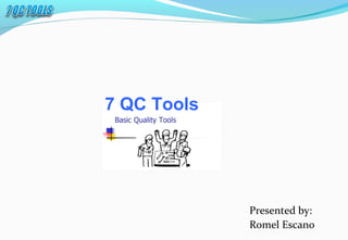
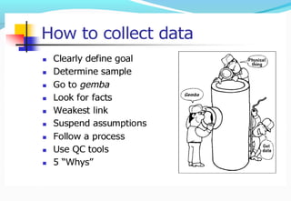
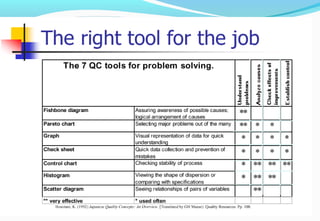
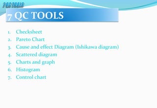
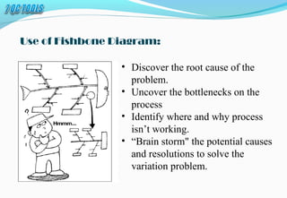
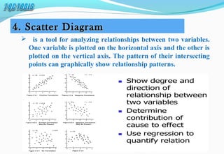
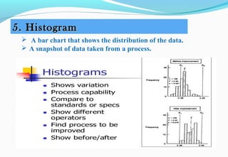
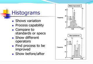
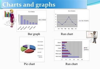
1. The document discusses 7 quantitative quality control tools and techniques for decision making: checksheets, Pareto charts, cause-and-effect diagrams, scatter diagrams, histograms, control charts, and stratification.
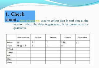
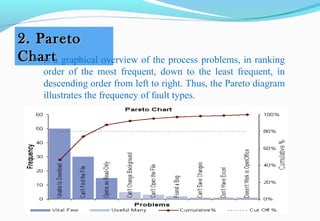
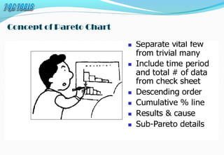
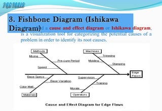
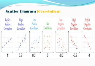
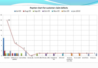
2. It provides examples and explanations of how each tool is used, such as using checksheets to track defects over time, Pareto charts to identify the most common issues, and scatter diagrams to analyze relationships between variables.
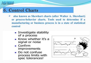
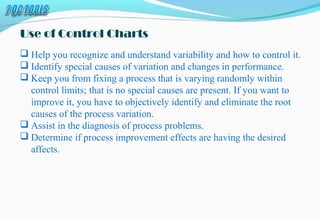
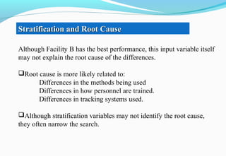
3. The tools help identify sources of variation, recognize changes in processes, and determine if quality improvements are effective. Strategic use of these techniques aids in problem diagnosis and driving processes toward statistical control.


![7 qc tools training material[1]](https://cdn.slidesharecdn.com/ss_thumbnails/7qctoolstrainingmaterial1-120925054558-phpapp02-thumbnail.jpg?width=640&height=640&fit=bounds)


![7 Quality Control Tools (SQC Model) [MARCH 2009]](https://cdn.slidesharecdn.com/ss_thumbnails/cfakepath7qctools-100630225608-phpapp01-thumbnail.jpg?width=640&height=640&fit=bounds)


![[DSC Europe 25] Andrzej Kowalczyk - AI - how to start small and grow in the f...](https://cdn.slidesharecdn.com/ss_thumbnails/oy1zmo94qv6vpcqjvno2-andrzej-kowalczyk-ai-how-to-start-small-and-grow-in-the-future-1-260119121559-cf093b23-thumbnail.jpg?width=640&height=640&fit=bounds)


