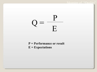
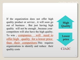
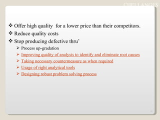
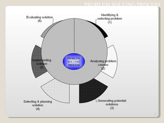
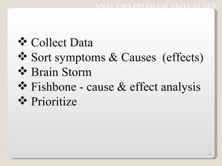
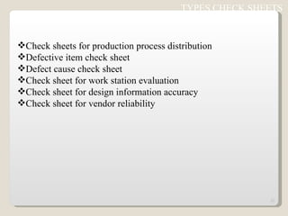
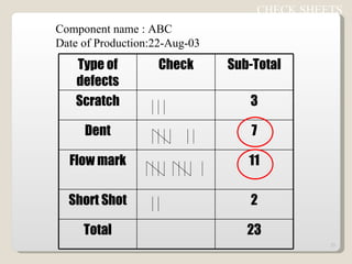
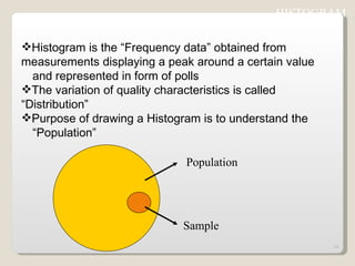
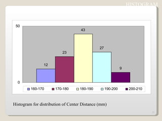
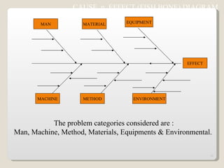
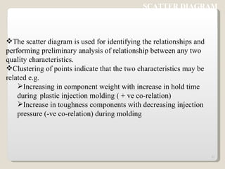
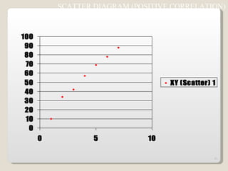
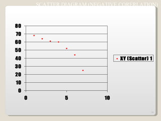
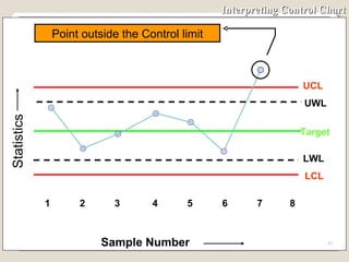
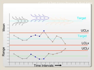
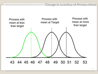
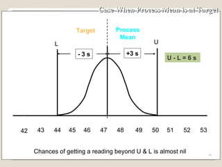
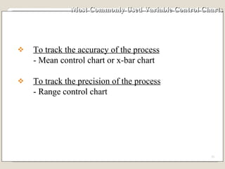
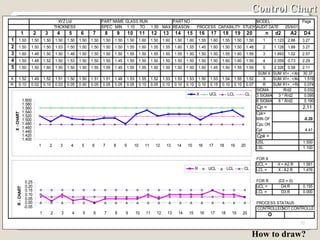
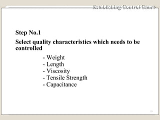
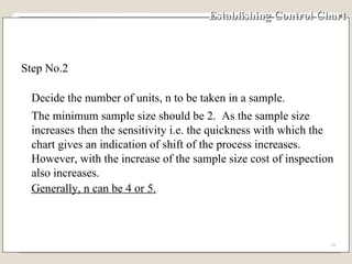
7 QC TOOLS
Quality A  subjective term  for which each person has his or her own definition. In technical usage, quality can have two meanings:  1. The characteristics of a product or service that bear on its ability to satisfy stated or implied needs.  2. A product or service free from deficiencies. Note:  ISO 9000 : 2000 version defines Quality  as “Degree to which a set of inherent characteristics fulfils requirements.
Can also be termed as ‘A measure of excellence’  Quality
Quality - an essential and distinguishing attribute of something.  Attribute  - an abstraction belonging to or characteristic of an entity  Appearance ,  visual aspect  - outward or visible aspect of a  thing  Attractiveness ,  attraction  - the quality of arousing interest; being attractive or something  that attracts;  Uncloudedness ,  clarity ,  clearness  - the quality of clear water;  Ease ,  easiness ,  simplicity  - freedom from difficulty or hardship or effort.  Suitability ,  suitableness  - the quality of having the properties that are right for a specific  purpose.  Excellence  - the quality of excelling.  Characteristic  - a distinguishing quality  Simpleness ,  simplicity  - the quality of being simple or uncompounded  Meaning of  “Quality”
Meaning of  “Quality” P = Performance or result E = Expectations Q =  P E
Many people think that quality costs money and adversely effects profits. But these costs are the costs of doing it wrong first time . Quality in the long run results in increased profitability . Quality, Cost  & Profit relationship   Cost
Cost Quality and Profit : Traditional thinking
Quality and Profit : Paradigm shift Cost
1.Higher production due to improved cycle time and reduced errors and defects  2.Increased use of machine and resources. 3.Improved material use from reduced scrap and rejects  4.Increased use of personnel resources 5.Lower  level  of asset investments required to support operations.  6.Lower service and support costs for eliminated waste, rework and non value added activities. QUALITY Higher  productivity Increased   profitability due to : Larger sales Lower production costs Faster turnover Quality and Profit
Quality and Profit If the organization does not offer high quality product or service , it will soon go out of business . But just having high quality  will not be enough , because your  competitors will also have the high quality. To win ,  companies  will  need to offer high  quality  for a lower price  than their competitors .This requires organizations to identify and reduce  their quality costs C2A2C High Quality Lower price
Offer high quality  for a lower price than their competitors. Reduce quality costs Stop producing defective thru’ Process up-gradation Improving quality of analysis to identify and eliminate root causes Taking necessary countermeasure as when required Usage of right analytical tools Designing robust problem solving process CHELLANGES
PROBLEM SOLVING PROCESS  PROBLEM  SOLVING PROCESS
IDENTIFYING AND SELCTING PROBLEM Write Statement of the problem(s) Define Gap Between Actual & target Prioritize
ANALYSIS PROBLEM AND CAUSES Collect Data Sort symptoms & Causes  (effects)  Brain Storm Fishbone - cause & effect analysis Prioritize
GENERATING POTENTIAL SOLUTIONS Brainstorm Build on each other’s ideas Analysis potential helps & hinders
SELECTING AND PLANNING SOLUTION Prioritize solutions Clarify tasks / Action plan Resource / Costs Present proposals
IMPLEMENTING SOLUTION Establish controls Maintain Commitments Plan Contingencies
EVALUATING SOLUTION Monitor results Restart Process if necessary
7 QC TOOLS Used to identify,analyze and resolve problems Simple but very powerful tools to solve day to day work related problems Find solutions in a systematic manner Widely used by Quality Circle members world over
Check sheets Histograms Pareto charts Cause & effect diagram (Ishikawa diagram) Scatter plot Defect concentration diagram Control charts 7  QC  TOOLS
Check sheets are formats used to collect and organize  data  Data can be collected easily and concisely Data  data is collected on the characteristic of  interest. The right data could be captured with all necessary facts  included e.g. as when it happened ? how many ? what customer ? CHECK SHEETS
Check sheets for production process distribution Defective item check sheet Defect cause check sheet Check sheet for work station evaluation Check sheet for design information accuracy Check sheet for vendor reliability TYPES CHECK SHEETS
CHECK SHEETS  Component name : ABC Date of Production:22-Aug-03 Type of defects Check Sub-Total Scratch 3 Dent 7 Flow mark 11 Short Shot 2 Total 23
Histogram is the “Frequency data” obtained from  measurements displaying a peak around a certain value  and represented in form of polls The variation of quality characteristics is called  “Distribution” Purpose of drawing a Histogram is to understand the  “Population” HISTOGRAM  Population Sample
Histogram for distribution of Center Distance (mm) HISTOGRAM
HISTOGRAM A HISTORY OF PROCESS OUT PUT 0 2 4 8 10 12 14 16 6 Frequency 47 48 49 50 51 52 53 54 kg Distribution
Based on “ 80/20” rule  (or ABC analysis)  Pareto(V.Pareto,an Italian economist) discovered this universal law-80% of anything is attributed to 20% of its causes 80% of the wealth is held by 20% of the population. 80% of our income goes into 20% of our needs. 80% of road accidents occur on 20% of the road. 80% of the absenteeism in a company is due to 20% of  workmen  “ Significant few & in-significant many” PARETO CHART
PARETO CHART  Pareto analysis begins by ranking problems from highest to  lowest in order to fix priority The cumulative number of problems is plotted on the vertical  axis of the graph against the cause/phenomenon Pareto by Causes e.g. Man,Machine,Method etc Pareto by Phenomenon e.g.Quality,Cost,Delivery Tells about the relative sizes of problems indicates an  important message about biggest few problems, if corrected,  a large % of total problems will be solved
PARETO ANALYSIS
CAUSE  n  EFFECT (FISH BONE) DIAGRAM  This diagram (resembles skeleton of a fish) helps to separate out  causes from effects and to see problem in its totality It’s a systematic arrangement of all possible causes,generated  thru’ brain storming This can be used to : Assist individual / group to see full picture. Serve as a recording device for ideas generated. Reveal undetected relationships between causes. Discover the origin/root cause of a problem Create a document or a map of a problem which can be posted in the work  area.
The problem categories considered are : Man, Machine, Method, Materials, Equipments & Environmental.  EFFECT MACHINE METHOD ENVIRONMENT MAN MATERIAL EQUIPMENT CAUSE  n  EFFECT (FISH BONE) DIAGRAM
SCATTER DIAGRAM The scatter diagram is used for identifying the relationships and  performing preliminary analysis of relationship between any two  quality characteristics.  Clustering of points indicate that the two characteristics may be  related e.g. Increasing in component weight with increase in hold time during  plastic injection molding ( + ve co-relation) Increase in toughness components with decreasing injection  pressure (-ve co-relation) during molding
SCATTER DIAGRAM (POSITIVE CORRELATION)
SCATTER DIAGRAM (NEGATIVE CORERLATION)
SCATTER DIAGRAM (NO CORERLATION)
DEFECT CONCENTRATION DIAGRAM This is used to understand the potential defect prone area of the parts produced The “Concentration Diagram” check sheet carries the diagram of the problematic part,defects whenever observed to be updated in the same using tally marks Based on the distribution of defects countermeasures are taken at process/system level This tool is very useful to solve problems like Scratch, Dent,Breakage thru’ handling improvement For plastic molded parts this tool is used to identify stress points,weak joints,effect of gate shape/position on the quality of parts etc.
DEFECT CONCENTRATION DIAGRAM Component name : XYZ Concentration diagram for Scratches produced ion 21-Aug-03 Total no of defective produced is 11 Nos Area of concern
Control Chart Quality control charts, are graphs on which the quality of the product is plotted as manufacturing or servicing is actually proceeding. It graphically, represents the output of the process and uses statistical limits and patterns of plot, for decision making Enables corrective actions to be taken at the earliest possible moment and avoiding unnecessary corrections. The charts help to ensure the manufacture of uniform product or providing consistent services which complies with the specification.
Elements of Typical Control Chart 1. Horizontal axis for sample number 2. Vertical axis for sample statistics e.g. mean, range, standard deviation of sample. 3. Target Line 4. Upper control line 5. Upper warning line 6. Lower control line 7. Lower warning line 8. Plotting of sample statistics 9. Line connecting the plotted statistics
Elements of Typical Control Chart Target Lower control line Upper warning line Lower warning line Upper control line Lower control line 1 2 3 4 5 Sample Number Sample Statistics
Interpreting Control Chart The control chart gets divided in three zones. Zone - 1  If the plotted point falls in this zone, do not make any adjustment, continue with the process. Zone - 2   If the plotted point falls in this zone then special cause may be present.  Be careful watch for plotting of another sample(s). Zone - 3   If the plotted point falls in this zone then special cause has crept into the system, and corrective action is required.
Zones for Mean Control Chart 1 2 3 4 5 6 7 Sample Number UCL Target LCL UWL LWL Zone - 3 Sample Mean Zone - 2 Zone - 3 Zone - 2 Zone - 1 Action Action Warning Warning Continue Continue Zone - 1
Interpreting Control Chart UCL 1 2 3 4 5 6 7 8 Sample Number Statistics UWL LCL Target LWL Point outside the Control limit
Control Chart Views Process in Real Time Time Intervals Range Mean LCLx Output of the process in real time Target Target UCLx UCLr
Change in Location of Process Mean 43 48 49 50 51 52 53 44 45 46 47 Process with  mean at Target Process with mean at more than target Process with  mean at less  than target
Case When Process Mean is at Target 48 49 50 51 52 53 44 45 46 47 Target Process Mean Chances of getting a reading beyond U & L is almost nil 42 U L - 3 s +3 s U - L = 6  s  43
Case - Small Shift of the Process Mean 43 48 49 50 51 52 53 44 45 46 47 Target Process Mean Chances of getting a reading outside U is small Small shift in process 42 Shaded area shows the probability of  getting  a reading  beyond U U L U-L = 6  s
Case - Large Shift of the Process Mean Process Mean 43 48 49 50 51 52 53 44 45 46 47 Target Chances of getting a reading outside U is large Large shift in process 42 Shaded area shows the probability of  getting  a reading  beyond U U L U-L = 6  s
Change in Spread of Process 43 48 49 50 51 52 53 44 45 46 47 Larger spread due to special causes Spread due to common causes
Special cause & Common cause Special  /  Assignable cause  : Causes due to negligence in  following work instructions, problem in machines  etc.This types of causes are avoidable and cannot  be neglected. Common cause  : Causes which are unavoidable and in-evitable in a process.It is not practical to eliminate the Chance cause technically and economically.
Most Commonly Used Variable Control Charts To track the accuracy of the process - Mean control chart or x-bar chart To track the precision of the process - Range control chart
Control Chart How to draw?
Establishing Control Chart  Step No.1 Select quality characteristics which needs to be controlled - Weight - Length - Viscosity - Tensile Strength - Capacitance
Establishing Control Chart  Step No.2  Decide the number of units, n to be taken in a sample.  The minimum sample size should be 2.  As the sample size increases then the sensitivity i.e. the quickness with which the chart gives an indication of shift of the process increases.  However, with the increase of the sample size cost of inspection also increases.  Generally, n can be 4 or 5.
Establishing Control Chart Step No. 3 Decide the frequency of picking up of sample If the shift in the process average causes more loss, then take smaller samples more frequently. If  the cost of inspection is high then take smaller samples  at large interval.
Establishing Control Chart As and general guidance, for deciding the frequency of taking a sample, we can use the table given in the next slide.  If our lot size in a shift is say 3000, then in a shift we require 50 units.  If the sample size n, is say 4 then  Number of visits to the process is = 50÷4 = 12 The time of an 8-hour shift, be divided in 12 equal parts.  Samples should be taken round about every 45 minutes.
Establishing Control Chart
Establishing Control Chart Step No. 4 Collect data on a special control chart data collection sheet. ( Minimum 100 observations) The data collection sheet has following main portions: 1. General details for part, department etc. 2. Columns for date and time sample taken 3. Columns for measurements of sample 4. Column for mean of sample 5. Column for range of sample
Typical Data Collection Sheet
Establishing Control Chart Step No. 5 Fill up the control chart data sheet 1)  As per the plan, visit the process and  collect a sample of required number of units. 2)  Measure the units and record. 3)  Take requisite number of samples ( 20-25). 4)  Calculate the mean of each of the sample. 5)  Calculate the range of each of the sample.
Example - Establishing Trial Control Limits A supervisor decided to put his process under statistical control.  For the purpose of establishing control chart he collected 10 samples (Normally it should be 20 samples)  containing 5 units.  The samples were measured and the same is shown in the next slide.  The desired target of the process, T is 50.  Establish control chart for monitoring the process.
Example - Data Collection
Example - Calculation of Subgroup No.1  Measurements are 47, 45, 48, 52 & 51 Mean of measurements of subgroup No. 1 = (47 + 45 + 48 + 52 + 51)/5 = 48.6 Range of measurements of subgroup No. 1 = ( largest reading - smallest reading ) = ( 52 - 45 ) = 7
Example - Calculation of subgroup Mean & Range
Establishing Control Chart In our case Calculate Mean Range, R R =  Sum of ranges of subgroups Total number of subgroups R =  (7 + 5 +4 3 + 5 + 4 + 6 + 4 + 3 + 3 ) Total number of subgroups
Step No. 7 Using following table of constants find trial control limit for mean and range control chart’ Establishing Control Chart
Establishing Control Chart Step No. 8 Calculate Trial control Limits with target value, T Trial control limits for mean control chart Upper Control Limit, UCLx = T + A 2  x R Lower Control Limit, LCLx = T  - A 2  x R Trial control limits for range control chart Upper Control Limit, UCLr = D 4  x R Lower Control Limit, LCLr  = D 3  x R
Calculation of Trial Control Limits Size of Subgroup, n = 5 Factor A 2 , when n is 5 = 0.577 Factor D 4 , when n is 5 = 2.115 Factor D 3 , when n is 5 = 0 Target value, T = 50 Mean Range, R = 4.4
Establishing Control Chart Step No. 8 Trial control Limits in our case For mean control chart Upper Control Limit, UCLx = 50 + 0.577 x 4.4=52.5 Lower Control Limit, LCLx = 50 - 0.577 x 4.4=47.5 For range control chart Upper Control Limit, UCLr = 2.115 x 4.4 = 9.3 Lower Control Limit, LCLr  = 0 x 4.4 = 0
Establishing Control Chart Step No. 9 Discard the outliers Outliers are those observations which do not belong to normal population.  If Outliers are included in the calculation, then the information is distorted.
Checking  for Outliers Checking for mean outliers Scan column of sample means. If any mean of sample is more than UCLx or less than LCLx then drop that sample. Checking for range outliers Scan column of sample range. If any range is more than UCLr then drop that sample.
Checking for Outliers  If any sample(s) is dropped then  recalculate the trial control limits using remaining sample(s). Continue this exercise till there is no further droppings.  When there is no further dropping trial control limits becomes control limits for control chart. In all we can drop up to 25% of the samples
Checking for Outliers In our case  - None of the subgroup mean is more than 52.5 - None of the subgroup mean is less than 47.5 - None of the range is more than 9.3 - None of the range is less than 0  Hence there is no revision of trial control limits is required.  These limits can be used for maintaining the control charts.
Calculation of Control Limits for Mean Control Chart Step No. 10 Compute warning limits for mean control chart Upper warning limit, UWLx = T + 2 x A 2  x R 3 Lower warning limit, LWLx = T - 2 x A 2  x R 3
Calculation of Control Limits for Mean Control Chart Warning limits for mean control chart in our example Lwlx = 50  - 2 x 0.577 x 4.4 3 = 48.3 Uwlx = 50 + 2 x 0.577 x 4.4 3 = 51.7
Action and Warning Limits for Mean Control chart  1 2 3 4 5 6 7 Sample Number Mean UCLx  LCLx UWLx  LWLx  Target
Action and Warning Limits for Mean Control Chart for Example 1 2 3 4 5 6 7 Sample Number Mean UCLx=52.5  LCLx= 47.5 UWLx=51.7  LWLx=48.3  Target=50
Constants for Range Control chart
Calculation of Control Limits for Range Control Chart Step No. 11 Compute warning limits for range control chart Upper Warning Limit, UWLr =  DWUR x R Lower Warning Limit, LWLr = DWLR x R
Calculation of Warning Limits for Range Control Chart In our case Size of sub group, n = 5 Mean range R = 4.4 DWUR when n is 5 = 1.81 DWLR when n is 5 =  0.37
Calculation of Warning Limits for Range Control Chart In our case warning limits for range control chart Upper Warning Limit, UWLr =  DWUR x R   = 1.81 x 4.4   = 8 Lower Warning Limit, LWLr = DWLR x R   = 0.37 x 4.4   = 1.6
Action and Warning Limits for Control Chart   1 2 3 4 5 6 7 Mean UCLx = 52.5  LCLx  = 47.5 UCLr = 9.3 Range UWLr = 8 LWLr = 1.6 Target = 50 R = 4.4 Sample Number LWLx = 48.3  UWLx = 51.7
Flow Chart for Establishing Control Chart Decide subgroup size Record observations Find mean and range of  each subgroup Start Calculate mean range, R
Is any  sub-group mean or  range out side the control limit ? Drop that Group Yes No Flow Chart for Establishing Control Chart UCLx = T + A2 x R LCLx = T - A2 x R UCLr = D4 x R LCLr = D3 x R
Select suitable scale for mean control chart and range control chart Draw Lines for Target, UCL, UWL, LCL & LWL for mean Mean range, UCL , UWL, LCL & LWL for range Stop Flow Chart for Establishing Control Chart
Summary of Effect of Process Shift When there is no shift in the process nearly all the  observations fall within -3 s and + 3 s. When there is small shift in the mean of process some  observations fall outside  original -3 s and +3 s zone. Chances of an observation falling outside  original  -3  s  and + 3 s zone increases with the increase in the shift of  process mean.
Our Conclusion from Normal Distribution When an observation falls within original +3 s and  -3 s  zone of mean of a process, we conclude that there is no shift  in  the mean of process.  This is so because falling of an  observation between these limits is a chance. When an observation falls beyond original  +3 s and  -3 s  zone of process mean, we conclude that there is shift in  location of the process
Interpreting Control Chart Because the basis for control chart theory follows the normal distribution, the same rules that governs the normal distribution are used to interpret the control charts.  These rules include: Randomness. Symmetry about the centre of the distribution. - 99.73% of the population lies between - 3 s of and + 3 s the centre line. - 95.4% population lies between -2 s and + 2 s of the centre line.
Interpreting Control Chart If the process output follows these rules, the process is said to be stable or in control with only common causes of variation present.  If it fails to follow these rules, it may be out of control with special causes of variation present.  These special causes must be found and corrected.
Interpreting Control Chart UCL 1 2 3 4 5 6 7 8 Sample Number Statistics UWL LCL LWL One point outside control limit
Interpreting Control Chart UCL 1 2 3 4 5 6 7 8 Sample Number Statistics UWL LCL LWL Two points out of three consecutive points between warning limit and corresponding control limit
Interpreting Control Chart UCL 1 2 3 4 5 6 7 8 Sample Number Statistics UWL LCL LWL Two consecutive points between warning limit and corresponding control limit
Interpreting Control Chart UCL 1 2 3 4 5 6 7 8 UWL LCL LWL Seven consecutive points on one side of the centre line Sample Number Statistics
Interpreting Control Chart UCL 1 2 3 4 5 6 7 8 Sample Number Statistics UWL LCL LWL Seven consecutive points having  upward trend
Interpreting Control Chart UCL 1 2 3 4 5 6 7 8 Sample Number Statistics UWL LCL LWL Seven consecutive points having  downward trend
Learning Concept and definition of “Quality” Importance of improving Quality as a tool for cost reduction Importance of proper analysis of Quality problems Usage of  7 QC tools to ensure “Defect free production”
Thank You

7qc Tools 173

  • 1.
  • 2.
    Quality A subjective term for which each person has his or her own definition. In technical usage, quality can have two meanings: 1. The characteristics of a product or service that bear on its ability to satisfy stated or implied needs. 2. A product or service free from deficiencies. Note: ISO 9000 : 2000 version defines Quality as “Degree to which a set of inherent characteristics fulfils requirements.
  • 3.
    Can also betermed as ‘A measure of excellence’ Quality
  • 4.
    Quality - anessential and distinguishing attribute of something. Attribute - an abstraction belonging to or characteristic of an entity Appearance , visual aspect - outward or visible aspect of a thing Attractiveness , attraction - the quality of arousing interest; being attractive or something that attracts; Uncloudedness , clarity , clearness - the quality of clear water; Ease , easiness , simplicity - freedom from difficulty or hardship or effort. Suitability , suitableness - the quality of having the properties that are right for a specific purpose. Excellence - the quality of excelling. Characteristic - a distinguishing quality Simpleness , simplicity - the quality of being simple or uncompounded Meaning of “Quality”
  • 5.
    Meaning of “Quality” P = Performance or result E = Expectations Q = P E
  • 6.
    Many people thinkthat quality costs money and adversely effects profits. But these costs are the costs of doing it wrong first time . Quality in the long run results in increased profitability . Quality, Cost & Profit relationship Cost
  • 7.
    Cost Quality andProfit : Traditional thinking
  • 8.
    Quality and Profit: Paradigm shift Cost
  • 9.
    1.Higher production dueto improved cycle time and reduced errors and defects 2.Increased use of machine and resources. 3.Improved material use from reduced scrap and rejects 4.Increased use of personnel resources 5.Lower level of asset investments required to support operations. 6.Lower service and support costs for eliminated waste, rework and non value added activities. QUALITY Higher productivity Increased profitability due to : Larger sales Lower production costs Faster turnover Quality and Profit
  • 10.
    Quality and ProfitIf the organization does not offer high quality product or service , it will soon go out of business . But just having high quality will not be enough , because your competitors will also have the high quality. To win , companies will need to offer high quality for a lower price than their competitors .This requires organizations to identify and reduce their quality costs C2A2C High Quality Lower price
  • 11.
    Offer high quality for a lower price than their competitors. Reduce quality costs Stop producing defective thru’ Process up-gradation Improving quality of analysis to identify and eliminate root causes Taking necessary countermeasure as when required Usage of right analytical tools Designing robust problem solving process CHELLANGES
  • 12.
    PROBLEM SOLVING PROCESS PROBLEM SOLVING PROCESS
  • 13.
    IDENTIFYING AND SELCTINGPROBLEM Write Statement of the problem(s) Define Gap Between Actual & target Prioritize
  • 14.
    ANALYSIS PROBLEM ANDCAUSES Collect Data Sort symptoms & Causes (effects) Brain Storm Fishbone - cause & effect analysis Prioritize
  • 15.
    GENERATING POTENTIAL SOLUTIONSBrainstorm Build on each other’s ideas Analysis potential helps & hinders
  • 16.
    SELECTING AND PLANNINGSOLUTION Prioritize solutions Clarify tasks / Action plan Resource / Costs Present proposals
  • 17.
    IMPLEMENTING SOLUTION Establishcontrols Maintain Commitments Plan Contingencies
  • 18.
    EVALUATING SOLUTION Monitorresults Restart Process if necessary
  • 19.
    7 QC TOOLSUsed to identify,analyze and resolve problems Simple but very powerful tools to solve day to day work related problems Find solutions in a systematic manner Widely used by Quality Circle members world over
  • 20.
    Check sheets HistogramsPareto charts Cause & effect diagram (Ishikawa diagram) Scatter plot Defect concentration diagram Control charts 7 QC TOOLS
  • 21.
    Check sheets areformats used to collect and organize data Data can be collected easily and concisely Data data is collected on the characteristic of interest. The right data could be captured with all necessary facts included e.g. as when it happened ? how many ? what customer ? CHECK SHEETS
  • 22.
    Check sheets forproduction process distribution Defective item check sheet Defect cause check sheet Check sheet for work station evaluation Check sheet for design information accuracy Check sheet for vendor reliability TYPES CHECK SHEETS
  • 23.
    CHECK SHEETS Component name : ABC Date of Production:22-Aug-03 Type of defects Check Sub-Total Scratch 3 Dent 7 Flow mark 11 Short Shot 2 Total 23
  • 24.
    Histogram is the“Frequency data” obtained from measurements displaying a peak around a certain value and represented in form of polls The variation of quality characteristics is called “Distribution” Purpose of drawing a Histogram is to understand the “Population” HISTOGRAM Population Sample
  • 25.
    Histogram for distributionof Center Distance (mm) HISTOGRAM
  • 26.
    HISTOGRAM A HISTORYOF PROCESS OUT PUT 0 2 4 8 10 12 14 16 6 Frequency 47 48 49 50 51 52 53 54 kg Distribution
  • 27.
    Based on “80/20” rule (or ABC analysis) Pareto(V.Pareto,an Italian economist) discovered this universal law-80% of anything is attributed to 20% of its causes 80% of the wealth is held by 20% of the population. 80% of our income goes into 20% of our needs. 80% of road accidents occur on 20% of the road. 80% of the absenteeism in a company is due to 20% of workmen “ Significant few & in-significant many” PARETO CHART
  • 28.
    PARETO CHART Pareto analysis begins by ranking problems from highest to lowest in order to fix priority The cumulative number of problems is plotted on the vertical axis of the graph against the cause/phenomenon Pareto by Causes e.g. Man,Machine,Method etc Pareto by Phenomenon e.g.Quality,Cost,Delivery Tells about the relative sizes of problems indicates an important message about biggest few problems, if corrected, a large % of total problems will be solved
  • 29.
  • 30.
    CAUSE n EFFECT (FISH BONE) DIAGRAM This diagram (resembles skeleton of a fish) helps to separate out causes from effects and to see problem in its totality It’s a systematic arrangement of all possible causes,generated thru’ brain storming This can be used to : Assist individual / group to see full picture. Serve as a recording device for ideas generated. Reveal undetected relationships between causes. Discover the origin/root cause of a problem Create a document or a map of a problem which can be posted in the work area.
  • 31.
    The problem categoriesconsidered are : Man, Machine, Method, Materials, Equipments & Environmental. EFFECT MACHINE METHOD ENVIRONMENT MAN MATERIAL EQUIPMENT CAUSE n EFFECT (FISH BONE) DIAGRAM
  • 32.
    SCATTER DIAGRAM Thescatter diagram is used for identifying the relationships and performing preliminary analysis of relationship between any two quality characteristics. Clustering of points indicate that the two characteristics may be related e.g. Increasing in component weight with increase in hold time during plastic injection molding ( + ve co-relation) Increase in toughness components with decreasing injection pressure (-ve co-relation) during molding
  • 33.
  • 34.
  • 35.
    SCATTER DIAGRAM (NOCORERLATION)
  • 36.
    DEFECT CONCENTRATION DIAGRAMThis is used to understand the potential defect prone area of the parts produced The “Concentration Diagram” check sheet carries the diagram of the problematic part,defects whenever observed to be updated in the same using tally marks Based on the distribution of defects countermeasures are taken at process/system level This tool is very useful to solve problems like Scratch, Dent,Breakage thru’ handling improvement For plastic molded parts this tool is used to identify stress points,weak joints,effect of gate shape/position on the quality of parts etc.
  • 37.
    DEFECT CONCENTRATION DIAGRAMComponent name : XYZ Concentration diagram for Scratches produced ion 21-Aug-03 Total no of defective produced is 11 Nos Area of concern
  • 38.
    Control Chart Qualitycontrol charts, are graphs on which the quality of the product is plotted as manufacturing or servicing is actually proceeding. It graphically, represents the output of the process and uses statistical limits and patterns of plot, for decision making Enables corrective actions to be taken at the earliest possible moment and avoiding unnecessary corrections. The charts help to ensure the manufacture of uniform product or providing consistent services which complies with the specification.
  • 39.
    Elements of TypicalControl Chart 1. Horizontal axis for sample number 2. Vertical axis for sample statistics e.g. mean, range, standard deviation of sample. 3. Target Line 4. Upper control line 5. Upper warning line 6. Lower control line 7. Lower warning line 8. Plotting of sample statistics 9. Line connecting the plotted statistics
  • 40.
    Elements of TypicalControl Chart Target Lower control line Upper warning line Lower warning line Upper control line Lower control line 1 2 3 4 5 Sample Number Sample Statistics
  • 41.
    Interpreting Control ChartThe control chart gets divided in three zones. Zone - 1 If the plotted point falls in this zone, do not make any adjustment, continue with the process. Zone - 2 If the plotted point falls in this zone then special cause may be present. Be careful watch for plotting of another sample(s). Zone - 3 If the plotted point falls in this zone then special cause has crept into the system, and corrective action is required.
  • 42.
    Zones for MeanControl Chart 1 2 3 4 5 6 7 Sample Number UCL Target LCL UWL LWL Zone - 3 Sample Mean Zone - 2 Zone - 3 Zone - 2 Zone - 1 Action Action Warning Warning Continue Continue Zone - 1
  • 43.
    Interpreting Control ChartUCL 1 2 3 4 5 6 7 8 Sample Number Statistics UWL LCL Target LWL Point outside the Control limit
  • 44.
    Control Chart ViewsProcess in Real Time Time Intervals Range Mean LCLx Output of the process in real time Target Target UCLx UCLr
  • 45.
    Change in Locationof Process Mean 43 48 49 50 51 52 53 44 45 46 47 Process with mean at Target Process with mean at more than target Process with mean at less than target
  • 46.
    Case When ProcessMean is at Target 48 49 50 51 52 53 44 45 46 47 Target Process Mean Chances of getting a reading beyond U & L is almost nil 42 U L - 3 s +3 s U - L = 6 s 43
  • 47.
    Case - SmallShift of the Process Mean 43 48 49 50 51 52 53 44 45 46 47 Target Process Mean Chances of getting a reading outside U is small Small shift in process 42 Shaded area shows the probability of getting a reading beyond U U L U-L = 6 s
  • 48.
    Case - LargeShift of the Process Mean Process Mean 43 48 49 50 51 52 53 44 45 46 47 Target Chances of getting a reading outside U is large Large shift in process 42 Shaded area shows the probability of getting a reading beyond U U L U-L = 6 s
  • 49.
    Change in Spreadof Process 43 48 49 50 51 52 53 44 45 46 47 Larger spread due to special causes Spread due to common causes
  • 50.
    Special cause &Common cause Special / Assignable cause : Causes due to negligence in following work instructions, problem in machines etc.This types of causes are avoidable and cannot be neglected. Common cause : Causes which are unavoidable and in-evitable in a process.It is not practical to eliminate the Chance cause technically and economically.
  • 51.
    Most Commonly UsedVariable Control Charts To track the accuracy of the process - Mean control chart or x-bar chart To track the precision of the process - Range control chart
  • 52.
  • 53.
    Establishing Control Chart Step No.1 Select quality characteristics which needs to be controlled - Weight - Length - Viscosity - Tensile Strength - Capacitance
  • 54.
    Establishing Control Chart Step No.2 Decide the number of units, n to be taken in a sample. The minimum sample size should be 2. As the sample size increases then the sensitivity i.e. the quickness with which the chart gives an indication of shift of the process increases. However, with the increase of the sample size cost of inspection also increases. Generally, n can be 4 or 5.
  • 55.
    Establishing Control ChartStep No. 3 Decide the frequency of picking up of sample If the shift in the process average causes more loss, then take smaller samples more frequently. If the cost of inspection is high then take smaller samples at large interval.
  • 56.
    Establishing Control ChartAs and general guidance, for deciding the frequency of taking a sample, we can use the table given in the next slide. If our lot size in a shift is say 3000, then in a shift we require 50 units. If the sample size n, is say 4 then Number of visits to the process is = 50÷4 = 12 The time of an 8-hour shift, be divided in 12 equal parts. Samples should be taken round about every 45 minutes.
  • 57.
  • 58.
    Establishing Control ChartStep No. 4 Collect data on a special control chart data collection sheet. ( Minimum 100 observations) The data collection sheet has following main portions: 1. General details for part, department etc. 2. Columns for date and time sample taken 3. Columns for measurements of sample 4. Column for mean of sample 5. Column for range of sample
  • 59.
  • 60.
    Establishing Control ChartStep No. 5 Fill up the control chart data sheet 1) As per the plan, visit the process and collect a sample of required number of units. 2) Measure the units and record. 3) Take requisite number of samples ( 20-25). 4) Calculate the mean of each of the sample. 5) Calculate the range of each of the sample.
  • 61.
    Example - EstablishingTrial Control Limits A supervisor decided to put his process under statistical control. For the purpose of establishing control chart he collected 10 samples (Normally it should be 20 samples) containing 5 units. The samples were measured and the same is shown in the next slide. The desired target of the process, T is 50. Establish control chart for monitoring the process.
  • 62.
    Example - DataCollection
  • 63.
    Example - Calculationof Subgroup No.1 Measurements are 47, 45, 48, 52 & 51 Mean of measurements of subgroup No. 1 = (47 + 45 + 48 + 52 + 51)/5 = 48.6 Range of measurements of subgroup No. 1 = ( largest reading - smallest reading ) = ( 52 - 45 ) = 7
  • 64.
    Example - Calculationof subgroup Mean & Range
  • 65.
    Establishing Control ChartIn our case Calculate Mean Range, R R = Sum of ranges of subgroups Total number of subgroups R = (7 + 5 +4 3 + 5 + 4 + 6 + 4 + 3 + 3 ) Total number of subgroups
  • 66.
    Step No. 7Using following table of constants find trial control limit for mean and range control chart’ Establishing Control Chart
  • 67.
    Establishing Control ChartStep No. 8 Calculate Trial control Limits with target value, T Trial control limits for mean control chart Upper Control Limit, UCLx = T + A 2 x R Lower Control Limit, LCLx = T - A 2 x R Trial control limits for range control chart Upper Control Limit, UCLr = D 4 x R Lower Control Limit, LCLr = D 3 x R
  • 68.
    Calculation of TrialControl Limits Size of Subgroup, n = 5 Factor A 2 , when n is 5 = 0.577 Factor D 4 , when n is 5 = 2.115 Factor D 3 , when n is 5 = 0 Target value, T = 50 Mean Range, R = 4.4
  • 69.
    Establishing Control ChartStep No. 8 Trial control Limits in our case For mean control chart Upper Control Limit, UCLx = 50 + 0.577 x 4.4=52.5 Lower Control Limit, LCLx = 50 - 0.577 x 4.4=47.5 For range control chart Upper Control Limit, UCLr = 2.115 x 4.4 = 9.3 Lower Control Limit, LCLr = 0 x 4.4 = 0
  • 70.
    Establishing Control ChartStep No. 9 Discard the outliers Outliers are those observations which do not belong to normal population. If Outliers are included in the calculation, then the information is distorted.
  • 71.
    Checking forOutliers Checking for mean outliers Scan column of sample means. If any mean of sample is more than UCLx or less than LCLx then drop that sample. Checking for range outliers Scan column of sample range. If any range is more than UCLr then drop that sample.
  • 72.
    Checking for Outliers If any sample(s) is dropped then recalculate the trial control limits using remaining sample(s). Continue this exercise till there is no further droppings. When there is no further dropping trial control limits becomes control limits for control chart. In all we can drop up to 25% of the samples
  • 73.
    Checking for OutliersIn our case - None of the subgroup mean is more than 52.5 - None of the subgroup mean is less than 47.5 - None of the range is more than 9.3 - None of the range is less than 0 Hence there is no revision of trial control limits is required. These limits can be used for maintaining the control charts.
  • 74.
    Calculation of ControlLimits for Mean Control Chart Step No. 10 Compute warning limits for mean control chart Upper warning limit, UWLx = T + 2 x A 2 x R 3 Lower warning limit, LWLx = T - 2 x A 2 x R 3
  • 75.
    Calculation of ControlLimits for Mean Control Chart Warning limits for mean control chart in our example Lwlx = 50 - 2 x 0.577 x 4.4 3 = 48.3 Uwlx = 50 + 2 x 0.577 x 4.4 3 = 51.7
  • 76.
    Action and WarningLimits for Mean Control chart 1 2 3 4 5 6 7 Sample Number Mean UCLx LCLx UWLx LWLx Target
  • 77.
    Action and WarningLimits for Mean Control Chart for Example 1 2 3 4 5 6 7 Sample Number Mean UCLx=52.5 LCLx= 47.5 UWLx=51.7 LWLx=48.3 Target=50
  • 78.
    Constants for RangeControl chart
  • 79.
    Calculation of ControlLimits for Range Control Chart Step No. 11 Compute warning limits for range control chart Upper Warning Limit, UWLr = DWUR x R Lower Warning Limit, LWLr = DWLR x R
  • 80.
    Calculation of WarningLimits for Range Control Chart In our case Size of sub group, n = 5 Mean range R = 4.4 DWUR when n is 5 = 1.81 DWLR when n is 5 = 0.37
  • 81.
    Calculation of WarningLimits for Range Control Chart In our case warning limits for range control chart Upper Warning Limit, UWLr = DWUR x R = 1.81 x 4.4 = 8 Lower Warning Limit, LWLr = DWLR x R = 0.37 x 4.4 = 1.6
  • 82.
    Action and WarningLimits for Control Chart 1 2 3 4 5 6 7 Mean UCLx = 52.5 LCLx = 47.5 UCLr = 9.3 Range UWLr = 8 LWLr = 1.6 Target = 50 R = 4.4 Sample Number LWLx = 48.3 UWLx = 51.7
  • 83.
    Flow Chart forEstablishing Control Chart Decide subgroup size Record observations Find mean and range of each subgroup Start Calculate mean range, R
  • 84.
    Is any sub-group mean or range out side the control limit ? Drop that Group Yes No Flow Chart for Establishing Control Chart UCLx = T + A2 x R LCLx = T - A2 x R UCLr = D4 x R LCLr = D3 x R
  • 85.
    Select suitable scalefor mean control chart and range control chart Draw Lines for Target, UCL, UWL, LCL & LWL for mean Mean range, UCL , UWL, LCL & LWL for range Stop Flow Chart for Establishing Control Chart
  • 86.
    Summary of Effectof Process Shift When there is no shift in the process nearly all the observations fall within -3 s and + 3 s. When there is small shift in the mean of process some observations fall outside original -3 s and +3 s zone. Chances of an observation falling outside original -3 s and + 3 s zone increases with the increase in the shift of process mean.
  • 87.
    Our Conclusion fromNormal Distribution When an observation falls within original +3 s and -3 s zone of mean of a process, we conclude that there is no shift in the mean of process. This is so because falling of an observation between these limits is a chance. When an observation falls beyond original +3 s and -3 s zone of process mean, we conclude that there is shift in location of the process
  • 88.
    Interpreting Control ChartBecause the basis for control chart theory follows the normal distribution, the same rules that governs the normal distribution are used to interpret the control charts. These rules include: Randomness. Symmetry about the centre of the distribution. - 99.73% of the population lies between - 3 s of and + 3 s the centre line. - 95.4% population lies between -2 s and + 2 s of the centre line.
  • 89.
    Interpreting Control ChartIf the process output follows these rules, the process is said to be stable or in control with only common causes of variation present. If it fails to follow these rules, it may be out of control with special causes of variation present. These special causes must be found and corrected.
  • 90.
    Interpreting Control ChartUCL 1 2 3 4 5 6 7 8 Sample Number Statistics UWL LCL LWL One point outside control limit
  • 91.
    Interpreting Control ChartUCL 1 2 3 4 5 6 7 8 Sample Number Statistics UWL LCL LWL Two points out of three consecutive points between warning limit and corresponding control limit
  • 92.
    Interpreting Control ChartUCL 1 2 3 4 5 6 7 8 Sample Number Statistics UWL LCL LWL Two consecutive points between warning limit and corresponding control limit
  • 93.
    Interpreting Control ChartUCL 1 2 3 4 5 6 7 8 UWL LCL LWL Seven consecutive points on one side of the centre line Sample Number Statistics
  • 94.
    Interpreting Control ChartUCL 1 2 3 4 5 6 7 8 Sample Number Statistics UWL LCL LWL Seven consecutive points having upward trend
  • 95.
    Interpreting Control ChartUCL 1 2 3 4 5 6 7 8 Sample Number Statistics UWL LCL LWL Seven consecutive points having downward trend
  • 96.
    Learning Concept anddefinition of “Quality” Importance of improving Quality as a tool for cost reduction Importance of proper analysis of Quality problems Usage of 7 QC tools to ensure “Defect free production”
  • 97.