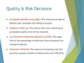
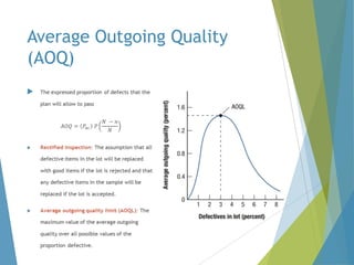
Downloaded 3,185 times


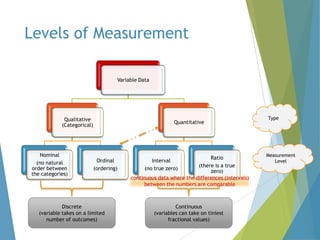


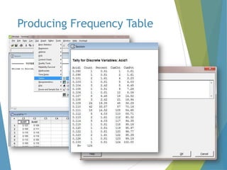
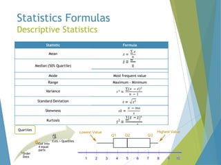
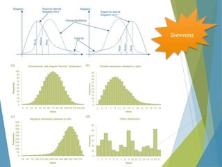

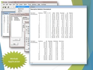

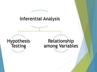

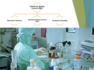
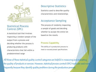
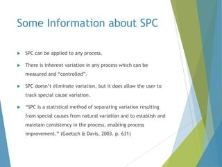
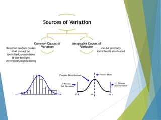
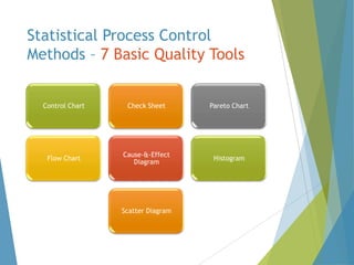
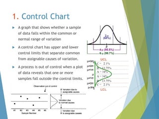
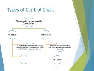
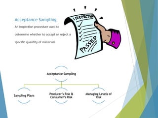


This document provides an overview of statistical process control and related quality control techniques. It discusses descriptive statistics, statistical process control methods including the seven basic quality tools, and acceptance sampling. Statistical process control is identified as the most important statistical quality control tool because it can identify changes or variations in quality during the production process using methods like control charts. Control charts, check sheets, Pareto charts, flow charts and other tools are explained as part of statistical process control. Acceptance sampling procedures and how they manage producer and consumer risks are also summarized.


![Control Charts[1]](https://cdn.slidesharecdn.com/ss_thumbnails/controlcharts1-1226081330857138-9-thumbnail.jpg?width=640&height=640&fit=bounds)