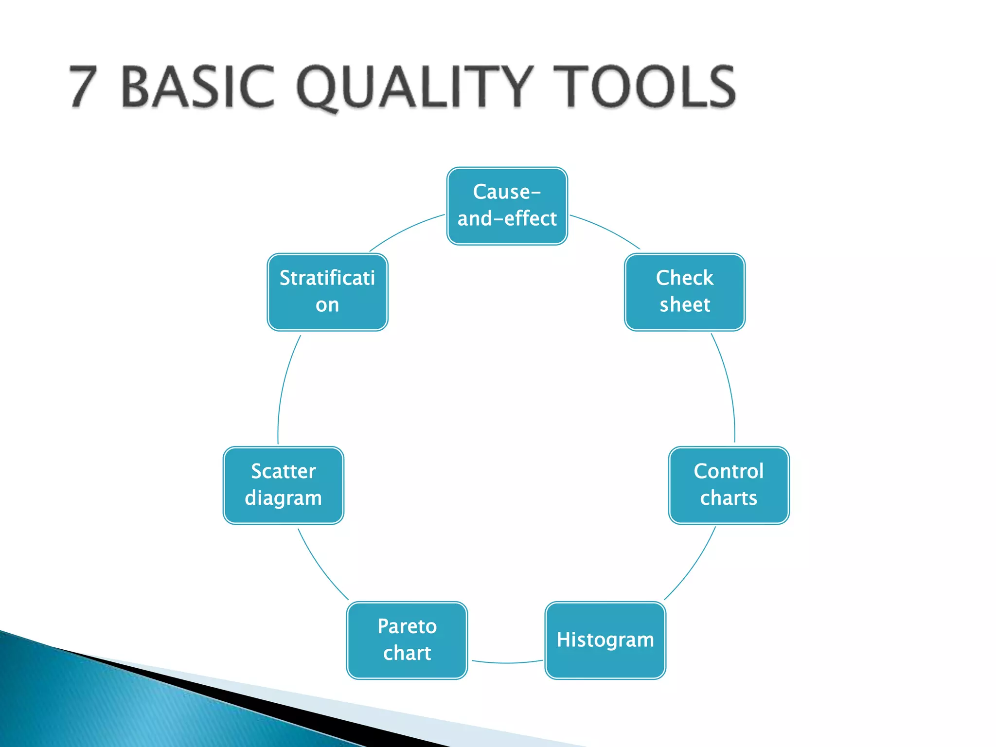
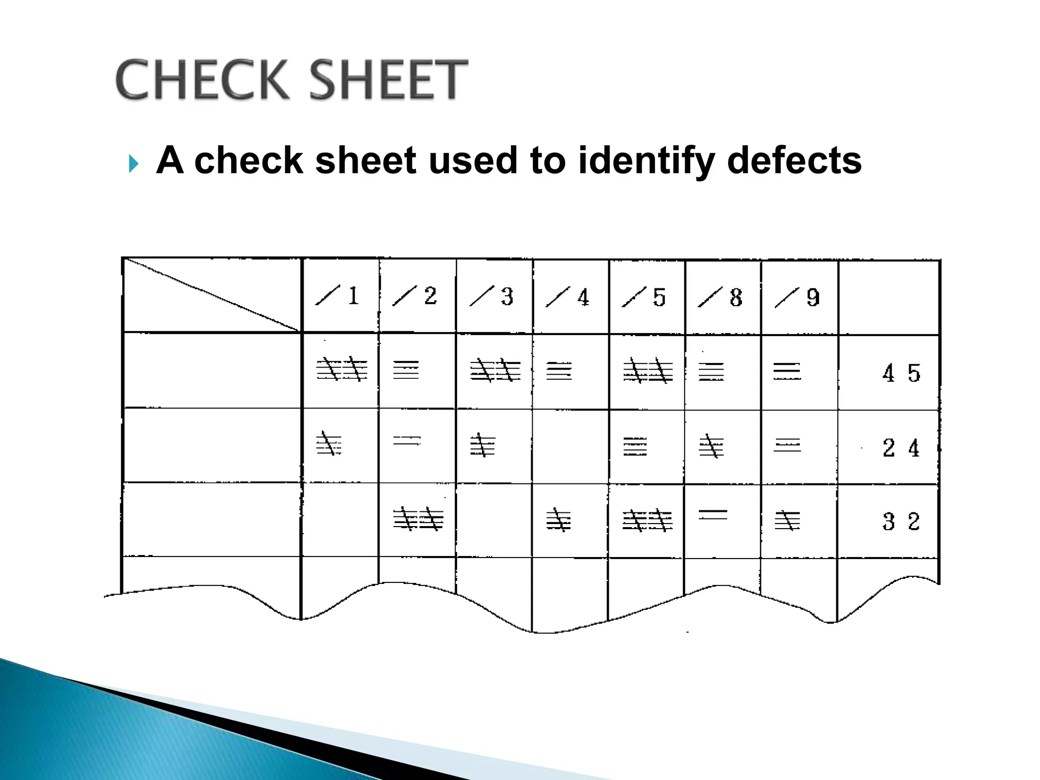
The document discusses 7 quality tools: cause-and-effect diagram, check sheet, control chart, histogram, Pareto chart, scatter diagram, and stratification. It provides descriptions of each tool and guidelines on when they should be used, such as for identifying causes of problems, collecting data, analyzing processes over time, determining if a process is stable, and separating data into categories for clearer analysis.
2. Quality tool are more specific, tools which
can be applied to solving problem in
improving quality in
organizations,manufacturing or even in
individual processes.
these seven basic tools of quality, first
emphasized by “KAORU ISHIKAWA” a
professor of engineering at Tokyo University
and the father of “quality circles.”
3. • Effective problem-solving is data driven. Data are
impersonal; opinions are not.
• Experience is gained quickest by collecting and analyzing
data.
• The tools provide common methods of analysis to help
problem solving teams operate effectively.
• Operations problems – usually may be solved by these
tools
– Note: product – process design problems often require
more advanced tools such as design of experiments,
FMEA, etc.
5. • It is also called Ishikawa or fishbone chart.
• Identifies many possible causes for an effector
problem and sorts ideas into useful categories.
• A cause and effect diagram is “a fish-bone
diagram that presents a systematic
representation of the relationship between the
effect (result) and affecting factors (causes).”
6. When To use
– When identifying possible causes for a problem.
– Especially when a team’s thinking tends to fall into ruts.
7.
8. A structured, prepared form for collecting and analyzing data;
a generic tool that can be adapted for a wide variety of
purposes.
A check sheet is “a sheet designed in advance to allow easy
collection and aggregation of data.” By just entering check
marks on a check sheet, data can be collected to extract
necessary information, or a thorough inspection can be
performed in an efficient manner, eliminating a possibility of
skipping any of the required inspection items.
9. When To use
– When data can be observed and collected repeatedly by
the same person or at the same location.
– When collecting data on the frequency or patterns of
events, problems, defects, defect location, defect causes,
etc.
– When collecting data from a production process
11. Graphs used to study how a process changes
over time.
A control chart is used to examine a process
to see if it is stable or to maintain the stability
of a process.
There are two types of control charts: one
used for managerial purposes and the other
for analytical purposes.
12. • Process variations can be one of two types:
– Random variations which are created by many minor
factors.
– Assignable variations whose main source can be
identified and corrected.
• There are four types of control charts:
– Control Charts for Variables. Variables are measured
such as length of time a certain item is out of stock.
Control charts can be:
• Mean Control Charts (central tendency of process)
• Range Control Charts (variability of process)
• Control Charts for Attributes. Attributes are counted such
as number of service calls and number of returns on an item.
• Control charts can be:
• p-charts (percent failure)
• c-Charts (number of defects)
13. • When To use
– When controlling ongoing processes by finding and
correcting problems as they occur.
– When predicting the expected range of outcomes from a
process.
– When determining whether a process is stable (in
statistical control).
– When analyzing patterns of process variation from
special causes (non-routine events)
or common causes (built into the process).
– When determining whether your quality improvement
project should aim to prevent specific problems or to
make fundamental changes to the process
14.
15. Description
– A frequency distribution shows how often each different value in
a set of data occurs. A histogram is the most commonly used
graph to show frequency distributions. It looks very much like a
bar chart, but there are important differences between them.
16. When to Use
– When the data are numerical.
– When you want to see the shape of the data’s
distribution, especially when determining whether the
output of a process is distributed approximately
normally.
– When analyzing whether a process can meet the customer’s
requirements.
– When analyzing what the output from a supplier’s process
looks like.
– When seeing whether a process change has occurred from
one time period to another.
– When determining whether the outputs of two or more
processes are different.
– When you wish to communicate the distribution of data
quickly and easily to others.
17.
18. Description
– A Pareto chart is a bar graph. The lengths of the bars
represent frequency or cost (time or money), and are
arranged with longest bars on the left and the shortest to
the right. In this way the chart visually depicts which
situations are more significant.
Often called the 80-20 Rule
– Principle is that quality problems are the result of only a
few problems e.g. 80% of the problems caused by 20% of
causes
19. • When to Use
– When analyzing data about the frequency of problems
or causes in a process.
– When there are many problems or causes and
you want to focus on the most significant.
– When analyzing broad causes by looking at their
specific components.
– When communicating with others about your data.
20.
21. Description
– The scatter diagram graphs pairs of numerical data, with one
variable on each axis, to look for a relationship between them.
If the variables are correlated, the points will fall along a line or
curve. The better the correlation, the tighter the points will hug
the line.
22. When to Use
– When you have paired numerical data.
– When your dependent variable may have
multiple values for each value of your
independent variable.
– When trying to determine whether the two variables
are related, such as…
• When trying to identify potential root causes of
problems.
• After brainstorming causes and effects using
a fishbone diagram, to determine objectively
whether a particular cause and effect are
related.
• When determining whether two effects that
appear to be related both occur with the same
cause.
• When testing for autocorrelation before
constructing a control chart
23.
24. • Description
– Stratification is a technique used in combination with
other data analysis tools. When data from a variety of
sources or categories have been lumped together, the
meaning of the data can be impossible to see. This
technique separates the data so that patterns can be
seen.
• When to Use
– Before collecting data.
– When data come from several sources or conditions,
such as shifts, days of the week, suppliers or population
groups.
– When data analysis may require separating different
sources or conditions.