Downloaded 631 times
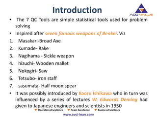
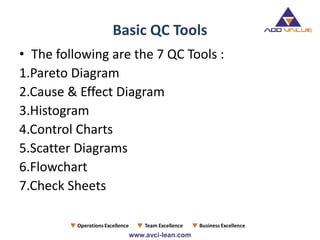
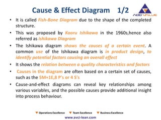
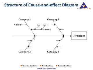
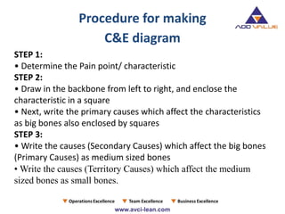
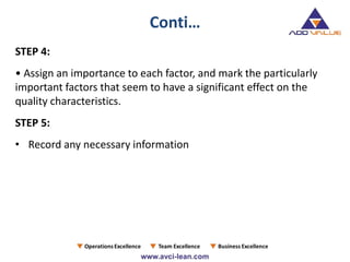
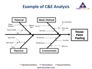
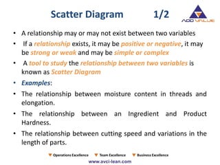
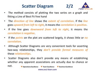
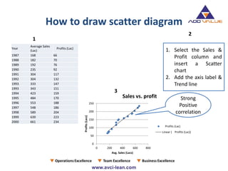
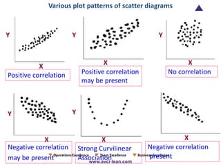
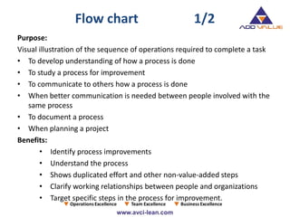
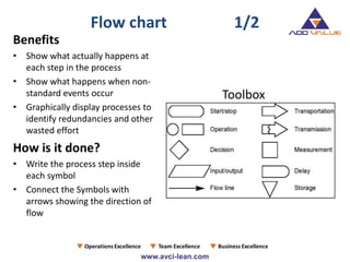
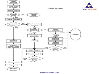
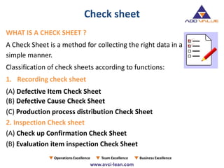
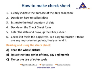
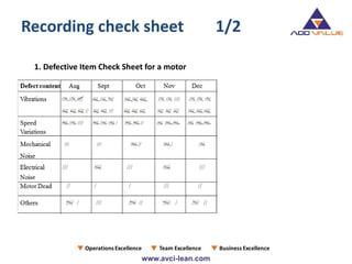
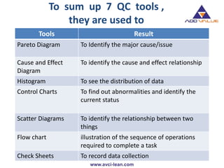


The document discusses the seven quality control (QC) tools which include Pareto diagrams, cause and effect diagrams, histograms, control charts, scatter diagrams, flowcharts, and check sheets, essential for effective problem-solving in consulting organizations. It elaborates on each tool's purpose, methodology, and practical applications, emphasizing their significance in enhancing industrial quality and productivity. The insights are rooted in the contributions of notable figures such as Kaoru Ishikawa and W. Edwards Deming in the context of Japan's post-war industrial resurgence.


![7 qc tools training material[1]](https://cdn.slidesharecdn.com/ss_thumbnails/7qctoolstrainingmaterial1-120925054558-phpapp02-thumbnail.jpg?width=640&height=640&fit=bounds)


![7 Quality Control Tools (SQC Model) [MARCH 2009]](https://cdn.slidesharecdn.com/ss_thumbnails/cfakepath7qctools-100630225608-phpapp01-thumbnail.jpg?width=640&height=640&fit=bounds)


