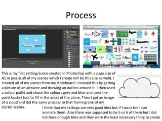
1) The document describes the process of creating scenes, enemies, a poster, game case, and menu for a video game project in Photoshop. Images were found online and outlines were drawn around them. Colors were filled in using the paint bucket tool.
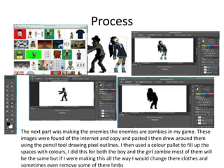
2) Enemies for the game were created by outlining zombie images found online. Colors were filled in using the color palette. Most enemies would be similar but some variations would be made.
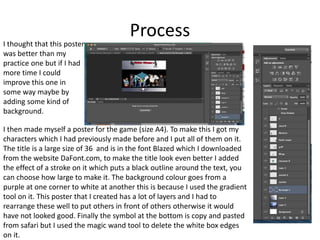
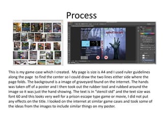
3) A poster was made with characters, a large title using a downloaded font, and a gradient background. Layers were rearranged and a symbol was copy and pasted.