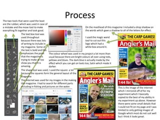
Experiments
Jay Birkin
Process
This is the image of the internet
which I mirrored off of for my
experiment which I basically
copied to the best of my ability in
my experiment up above. However
there were some small details that
I could not fit on my page and I was
limited to only getting images of
Google which most do not suit well
but I think it looks great.
The colour wheel was used in my project a lot more than
usual because there are bright colours all over using reds,
yellows and blues. The dark blue is actually made by the
effect which you can get on texts too, Satin which made it
darker.
The internet was used for my images in the making
this magazine. I had to search for different parts
including in fishing and pictures on the water.
The shape tool was used, I used the square a lot
because the squares form the general layout of the
magazine
The text box tool was
used throughout
because there was lots
of writing to include in
my magazine. Some of
the text is bold and this
emphasizes the point
that the magazine is
trying to make or too
show you that it is
amazing.
I used the magic wand
tool to cut out this
logo which had a
white box around it.
On the masthead of this magazine I included a drop shadow on
the words which gave a shadow to all of the letters for effect.
The two tools that were used the least
are the rubber, which was used in case of
a mistake and the move tool to make
everything fit together and look good.
Reflection
• What elements of your experiments will you
include in your final product?
– I am going to include a similar type of layout for my final product. The colour
scheme I will change though because I think this magazine is too bright and
colourful and mine needs to be more darker. The texts and fonts however are
great and I will include the same in my final product even some with the
effects on like boldness and drop shadows even with stroke as an effect.

3. production experiments(3)

  • 1.
  • 2.
    Process This is theimage of the internet which I mirrored off of for my experiment which I basically copied to the best of my ability in my experiment up above. However there were some small details that I could not fit on my page and I was limited to only getting images of Google which most do not suit well but I think it looks great. The colour wheel was used in my project a lot more than usual because there are bright colours all over using reds, yellows and blues. The dark blue is actually made by the effect which you can get on texts too, Satin which made it darker. The internet was used for my images in the making this magazine. I had to search for different parts including in fishing and pictures on the water. The shape tool was used, I used the square a lot because the squares form the general layout of the magazine The text box tool was used throughout because there was lots of writing to include in my magazine. Some of the text is bold and this emphasizes the point that the magazine is trying to make or too show you that it is amazing. I used the magic wand tool to cut out this logo which had a white box around it. On the masthead of this magazine I included a drop shadow on the words which gave a shadow to all of the letters for effect. The two tools that were used the least are the rubber, which was used in case of a mistake and the move tool to make everything fit together and look good.
  • 3.
    Reflection • What elementsof your experiments will you include in your final product? – I am going to include a similar type of layout for my final product. The colour scheme I will change though because I think this magazine is too bright and colourful and mine needs to be more darker. The texts and fonts however are great and I will include the same in my final product even some with the effects on like boldness and drop shadows even with stroke as an effect.

Editor's Notes

  • #3 Discuss the tools and processes used in your experiments