1. High focus records’ ticket annotation
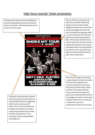
The use of colourusingredon the
label namesandthe underlining
marginsas alsored witha black
backgroundshowsthe eventasdark
and possiblyaggressivewithreds’
mainconnotationbeingangerwhich
isa commonfeature fromartistson
highfocusrecordsespeciallydirty
dike. These colourscontrastclearly
withthe white text,whichisusedto
amplifyandmake the artistsnames
noticeable whilstithasconnotations
of creativity.Thisisanaspectmany
highfocusartistspride themselves
upon,theirunique lyrics.
The choice of image isinteresting
usinga mopedto showthe concept
that the musicoriginatesand
remainsonthe streetwithartists
beingproudof theirorigin.Along
withthisisthe blackand white
colourscheme whichmakesthe
genre seemoldandauthenticwitha
low budgetand‘street’vibe butalso
a darker side toit too.In some way
it representsasense of
hopelessnessinthe eyesof society.
The props inthe picture are obscure
and unusual topresentthe artistsas
unpredictableandhecticsuggesting
that the venue andmusicwill
follow. Thisisuseful andallowsme
to followconventionsinmyvideo
usingconceptual featurestocreate
emotionandconfusion.Thisis
excitingasitseemsunpredictable
and dangerous.
The font usedisquite ordinaryanddefaultto
avoiddivertingattentionbutalsotoallowfor
clearerinformation.Withthatbeingthe prime
reasonfor a tour poster.