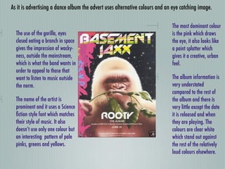
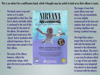
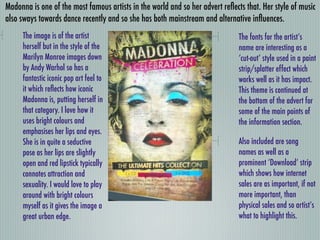
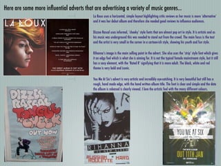
2. Album Advert Conventions
From the existing products I’ve looked out here are the
conventions I’ve noticed...
An eye-catching image
Clear fonts
The name of the artist is prominent
A unique style of font for the artist
A colour theme
3. As it is advertising a dance album the advert uses alternative colours and an eye catching image.
The most dominant colour
The use of the gorilla, eyes is the pink which draws
closed eating a branch in space the eye, it also looks like
gives the impression of wacky- a paint splatter which
ness, outside the mainstream, gives it a creative, urban
which is what the band wants in feel.
order to appeal to those that
want to listen to music outside The album information is
the norm. very understated
compared to the rest of
The name of the artist is the album and there is
prominent and it uses a Science very little except the date
fiction style font which matches it is released and when
their style of music. It also they are playing. The
doesn’t use only one colour but colours are clear white
an interesting pattern of pale which stand out against
pinks, greens and yellows. the rest of the relatively
loud colours elsewhere.
4. This is an advert for a well-known band, which I thought may be useful to look at as their album is iconic.
The image is from their
The bands name is top and iconic album cover and
centre so it is easily draws the eye immediately
recognisable to their fans. The as it was slightly
font is classic and bold, which controversial at the time and
is continued in the rest of the matches their style of music
text except for the name of as being rebellious and
the album. The advertisers having a political message.
would want to get across this
‘classic’ feel to symbolise their The bright blue colours
cultural importance, thus to meant that it cuts the ad in
encourage more people to buy half with the bottom half
their album. devoted to the information
about the album. The artist’s
The name of the album, website is included as well as
however, reflects the a scan icon for phones which
underwater image, which is a sign of how new media
gives the text an eye-catching technologies are integrated
edge. into adverts to draw people
to interact with the adverts.
5. Madonna is one of the most famous artists in the world and so her advert reflects that. Her style of music
also sways towards dance recently and so she has both mainstream and alternative influences.
The image is of the artist The fonts for the artist’s
herself but in the style of the name are interesting as a
Marilyn Monroe images down ‘cut-out’ style used in a paint
by Andy Warhol so has a strip/splatter effect which
fantastic iconic pop art feel to works well as it has impact.
it which reflects how iconic This theme is continued at
Madonna is, putting herself in the bottom of the advert for
that category. I love how it some of the main points of
uses bright colours and the information section.
emphasises her lips and eyes.
She is in quite a seductive Also included are song
pose as her lips are slightly names as well as a
open and red lipstick typically prominent ‘Download’ strip
connotes attraction and which shows how internet
sexuality. I would love to play sales are as important, if not
around with bright colours more important, than
myself as it gives the image a physical sales and so artist’s
great urban edge. what to highlight this.
6. Here are some more influential adverts that are advertising a variety of music genres...
La Roux uses a horizontal, simple layout highlighting critic reviews as her music is more ‘alternative’
and it was her debut album and therefore she needed good reviews to influence audiences.
Dizzee Rascal uses informal, ‘cheeky’ style fonts that are almost pop art in style. It is artistic and as
his music was underground this was needed to stand out from the crowd. The main focus is the text
and the artist is very small in the corner in a cartoon-ish style, showing his youth and fun style.
Rihanna’s image is the main selling point in the advert. She also uses the ‘strip’ style font which gives
it an edgy feel which is what she is aiming for. It is not the typical female mainstream style, but it still
has a sexy element, with the ‘Rated R’ signifying that it is more adult. The black, white and red
theme is very bold and iconic.
You Me At Six’s advert is very artistic and incredibly eye-catching. It is very beautiful but still has a
rough, hand made edge, with the hand written album title. The font is clear and simple and the date
the album is released is clearly viewed. I love the artistic feel with the many different colours.