1. How effective is the combination of your main
product and ancillary text?
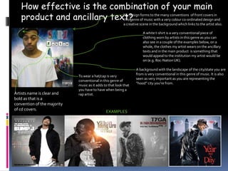
My design forms to the many conventions of front covers in
this genre of music with a very colour co-ordinated design and
a creative scene in the background which links to the artist also.
EXAMPLES
A white t-shirt is a very conventional piece of
clothing worn by artists in this genre as you can
also see in a couple of the examples below, on a
whole, the clothes my artist wears on the ancillary
texts and in the main product is something that
would appeal to the institution my artist would be
on (e.g. Roc-Nation UK).
A background with the landscape of the city/state you are
from is very conventional in this genre of music. It is also
seen as very important as you are representing the
“hood” city you’re from.
To wear a hat/cap is very
conventional in this genre of
music as it adds to that look that
you have to have when being a
rap artist.
Artists name is clear and
bold as that is a
convention of the majority
of cd covers.
2. Same theme/colour
scheme asCD cover
Same music
outlet adverts
as wretch 32
rap artist
Name near top of
advert in large font
CONVENTIONS
Background of
their city/state
Also shows CD cover on
the magazine advert
3. This may not look like a common inside cover , but as seen below in
my examples, this type of inside cover is quite conventional in the
genre of music my artist is in.
TheCD Booklet has the same theme as the rest of my ancillary texts
with only the picture differing. It also follows many conventions of
other Hip-Hop CD Booklets as seen below. For example the picture on
the CD booklet & the writing at the bottom.
However there’s a quote on my CD booklet which is not usually a
convention in this genre, this is because the artistsCD booklets seen
below are established and well known, as for my artist, he is up and
coming so his audience would like to see something else to help them
get to know more about him.
4. The colour scheme of my ancillary texts correlates
(Red, Blue,White), this is done so that every time the
audience see’s these colours, they will associate it with
my artist and remember these covers.The same font
is also used throughout my ancillary texts for the same
reason stated above.
This is a common convention of a magazine advert
to help promote an artist’s music, I also considered
the fact that the audience for my artist were
mostly active, and by adding feedback on there as
well they may see the quote “got this song on
repeat” and question it, therefore going to listen to
the song, which could lead to them buying it if
they like it.
There is also a subliminal message on the back cover,
“UNDERGROUND” is there to emphasis that he is from
London as this is a specific feature of London. However, he
is an “underground” artist also which is the subliminal
message here.
On the ancillary texts the artist is always
bigger than the scene behind him.This is
to show what he wants, he wants the
world to be his stage as seen in the
quote on the inside cover.
5. This is a combination of all the ancillary texts that our group thought suited our
main product best.