
Recommended
More Related Content
What's hot
What's hot (20)
Viewers also liked
Viewers also liked (20)
Similar to Folk music posters
Similar to Folk music posters (20)
More from sophiejvbell
More from sophiejvbell (12)
Recently uploaded
Recently uploaded (20)
Folk music posters
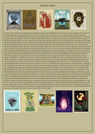
- 1. Folk Music Posters It is obvious from looking at these examples of various band/artists posters from the folk genre that the main theme running throughout them is nature. The main focus appears to be on trees and animals. I think this theme of nature relates back to the rural roots of the genre, and it is clear that the bands promotional material is promoting the genre itself and placing importance on its roots. Through this use of visuals, people recognise nature/a rural setting to be closely linked to the folk genre. The bare trees could be symbolic of the sombre and sad tone of a lot of the music, whereas the illustration of leaves and other foliage could be symbolic of the more upbeat folk music such as about new beginnings or love. The tone/message of folk music songs are usually happy, sad (about heartbreak) about love or other topics, but the message is usually one that is wholesome and pure, therefore the use of nature and animals on the posters could be symbolising this purity. This contrasts with the sometimes vulgar and crude messages behind hip hop or metal music. These posters also encompass Roland Barthes enigma code as the viewer cannot decipher exactly what the content of the music is , and the images are usually quite obscure and elusive, I think that this draws the audience in as they will want to listen to the music to find out in what way it links to the illustration. I think the fact that the posters are based on hand drawings also relates back to the idea of simplicity which is a theme of the folk genre, this probably comes from the fact that folk music was the first genre of music to originate and be passed down orally through generations and this simplicity and wholesome nature has been kept up to the present day. These illustrations place emphasis on the true meaning behind the music, and this is what differentiates the folk genre form other more commercialised genres such as pop or hip hop, it is obvious that in these genre the primary goal is to produce material that mass audiences will accept through use of idolization or objectification of women, money/wealth worshipping and materialism in order to gain the biggest profit poss ible. Whereas in contrast the folk genre, and the record labels which the bands/artists belong to, have more of a wholesome moral philosophy behind them which focuses more on selling the band or artist as they are to the niche audience, without use of objectification for promotion etc. This can be seen in their neutral and nature themed promotional material which constructs an element of innocence and simplicity. These posters seem to use a wide range of fonts, ranging from bold and simplistic print to more obscure italic font. These fonts are used accordingly to compliment the other visuals in the poster, but, all of them appear to be in relatively small font, when put in comparison with posters from other genres which display the artists name in enormous font. This could possibly be again relating back to the idea of the record labels not trying to push the band upon a mass audience but rather taking a more neutral promotional stance and placing importance rather on the actual music and messages rather than the band or artist as an image or object. No empha sis is placed upon the looks of the folk artists and the women involved are not promoted in any sexual manner whatsoever, and this is because it is a traditional genre of music therefore the idea of being wholesome and respectable is carried on. The audience who will be receiving can be identified using the Uses and Gratifications Model, they will be an active audience who will use the media text and not be used by it, the audience will use it for its own pleasure and gratification. The preferred audience will immediately recognise these posters as ones of the folk genre when they see them, and will appreciate the illustration and the obscurity of some of the images, and will enjoy looking at them. The negotiated audience will be slightly unsure as to what the images are actually symbolizing, and may be unsure as to what exact genre is being presented, similarly, the oppositional audience may feel like they dislike the illustrations for being obscure and will not like ambiguity that they create, therefore they will not receive the posters well. Dyers star theory cannot be recognised at all throughout the folk genre which, as I have previously mentioned, is what makes it a distinguished genre among others in the music industry, this is due to emphasis being placed on the actual music and the origins from which is comes and not the artist as idols or objects.
- 2. Another common theme that can also be recognised within the folk genre music posters is that of old or historical things. For example, in the first poster, various forms of old bicycles are illustrated, in the second one horse drawn carriages, the third one shows an old steam engine and an airplane, the fourth depicts a man in a top hate riding a horse wearing a monocle, the fifth shows an antique chair, the sixth shows an old sail boat and the seventh shows an example of a vintage book, similar to those that are of collectable value today. I think that the use of historical/antique illustrations in these posters is to make a reference to the fact that the folk music genre itself is historical and has a very traditional heritage and origin, therefore to show antique objects could be making reference to the fact that despite not being modern, the genre is still valued and popular. These illustrations could again be making a reference to the ethos of the genre as whole, which, as I have mentioned, stays true to its origins and places great importance upon the actual music. The font used in these posters could all be recognised as 'vintage' or old, and this fits in with the visuals to create an aesthetically pleasing poster which, at first, would probably not be recognised as a music poster but rather a piece of art work. In this sense, the folk genre defies general music poster conventions by not including images of the artist themselves as form of image promotion, not including social networking site thumbnails, barcodes or website links. By disregarding these conventions, the posters look a lot different from others and therefore stand out which could potentially make the genre more popular. However I think that these posters would generally only appeal to the preferred audience, people who are already familiar with the genre. Again the folk genre in this sense does not comply with theories such as Andrew Goodwin's 'visuals linking to or amplifying lyrics' idea, as it could be argued that none of the actual songs contain any lyrics about the images shown in the posters. This again creates ambiguity which relates to Roland Barthes's enigma code, this makes these posters fascinating to look at. In conclusion, the focus on origin and heritage of the genre itself is very much displayed through these kinds of visuals and font uses. Another main illustration that can be recognised throughout these posters is that of the musical instruments of the folk genre. The main instruments shown are the accordion, banjo, acoustic guitar and drums. This relates back to the idea of the genre being defined primarily on the musical instruments and musical techniques of the artists, and the lyrics of the songs. The importance placed upon this part of the artist overweighs the importance placed on aesthetic promotion. It is obvious that through using posters like these, the record labels are trying to promote the bands musical talent and the importance of the tradition behind the genre rather than the band as an image or 'fake representation' (as Dyer suggests that record labels do in his Star theory). This also fits in with the general themes of the genre itself, which can be related to the hippie festival culture, and this can be seen through use of these instruments. These instruments depicted, especially the banjo, are what define the folk genre therefore when the audience sees these posters they will immediately be able to tell what genre they are relating to.
- 3. Another convention that I recognised throughout the folk genre music posters was the illustration of obscure/ naive figures and faces. As you can see in the examples above, a lot of the people drawn are rather odd looking for different reasons. I think that this relates back to the idea of the folk genre being different from others in the way that it defies the usual codes and conventions in the music industry. Also, as folk music usually represents the 'indie' kind of audience, this could be appealing to them as they would enjoy seeing things that are outside of the norm. This could also be relating back to the 'hippie' culture which folk music can represent, this could appeal to them as they images are slightly strange and ambiguous. I think that the folk genre does the opposite of what the 'hypodermic model' theory suggests, as folk does not saturate or dominate the music industry that much, the promotional materials such as these posters are relatively neutral in the way that they are not aimed at mass audiences. I think that they are spec ifically designed to appeal to a specific audiences aesthetic tastes therefore it is more the audience that is active and the material that is passive. Conclusion of the codes and conventions: Folk music posters are (hand drawn?) illustrations that are generally quite obscure and artistic They do not contain the usual conventions such as social network thumbnails, web links or barcodes The font used are generally either bold and simplistic, or stylistic and artistic such as vintage style or italics The posters do not depict the artists themselves in any way, and not the lyrics directly They are illustrations there to be aesthetically pleasing to the audience and not to promote the bands image or link to their music in a direct or obvious way The band or artists name is however, the biggest text and is the most important thing on the poster, secondary to the main visual object Either bright psychedelic colours are used or very neutral and 'organic' colours. (relating to genre and 'hippie' culture)