1. Advertanalyses
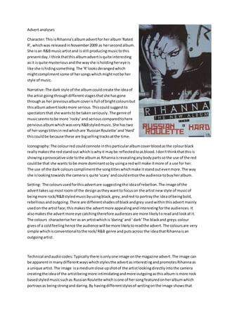
Character:This isRihanna'salbumadvertfor heralbum'Rated
R', whichwas releasedinNovember2009 as hersecondalbum.
She isan R&B musicartistand isstill producingmusictothis
presentday.I thinkthatthisalbumadvertisquite interesting
as it isquite mysteriousandthe wayshe isholdinghereye is
like she ishidingsomething.The 'R'looksderangedwhich
mightcomplimentsome of hersongswhichmightnotbe her
style of music.
Narrative:The dark style of the albumcouldcreate the ideaof
the artist goingthroughdifferent stagesthatshe hasgone
throughas her previousalbumcoveris full of brightcoloursbut
thisalbumadvertlooksmore serious.Thiscould suggestto
spectatorsthat she wantsto be takenseriously.The genre of
musicseemstobe more 'rocky' and serious comparedtohere
perviousalbumwhichwasveryR&Bstyledmusic.She hastwo
of hersongstitlesin redwhichare 'RussianRoulette'and'Hard'
thiscouldbe because these are bigsellingtracksatthe time.
Iconography:The colourred couldconnote inthisparticularalbumcoverbloodasthe colourblack
reallymakesthe redstandout whichiswhyit maybe reflectedtoasblood.Idon't thinkthatthisis
showingaprovocative side tothe albumas Rihannaisrevealinganybodypartssothe use of the red
couldbe that she wants tobe more dominantsoby usinga redwill make itmore of a use for her.
The use of the dark colourscomplimentthe songtitleswhichmake itstandoutevenmore.The way
she islookingtowardsthe camerais quite 'scary' andcouldentice the audience tobuyheralbum.
Setting: The coloursusedforthisadvertare suggestingthe ideaof rebellion.The image of the
adverttakesup mostroom of the designastheywantto focuson the artist new style of musicof
beingmore rock/R&Bstyledmusicbyusingblack,grey,andred to portraythe ideaof beingbold,
rebelliousandoutgoing.There are differentshadesof blackandgrey usedwithinthisadvert mainly
usedon the artistface;thismakesthe advertmore appealingandinterestingforthe audiences.It
alsomakesthe advertmore eye catchingtherefore audiencesare more likelytoreadandlookat it.
The colours characterise heras an artistwhichis'daring' and ' dark' The blackand greys colour
givesof a cold feelinghence the audience will be more likelytoreadthe advert.The coloursare very
simple whichisconventionaltothe rock/R&B genre andputsacross the ideathatRihannaisan
outgoingartist.
Technical andaudiocodes: Typicallythere isonlyone image onthe magazine advert.The image can
be apparentin manydifferentwayswhichstylesthe advertasinterestingandpromotes Rihannaas
a unique artist.The image isa mediumclose upshotof the artistlookingdirectlyintothe camera
creatingthe ideaof the artistbeingmore intimidatingandmore outgoingasthisalbumismore rock
basedstyledmusicsuchas RussianRoulette whichisone of hersongfeaturedonheralbumwhich
portraysas beingstrongand daring.By havingdifferentstylesof writingon the image showsthat
2. Rhiannawantedtocreate a rebelliouslookbyhavinggraffiti styletexttoportrayherself asstrong
and powerful woman.
Typography:The writingonthe magazine advertisall inthe different fonts.The fontsusedforthis
advertare very boldandeye catchingto the artiststargetaudience.The fontusedlinksbacktothe
mainimage makingthe advertseemmore appealing.The redcolouredfontcontrastswiththe
grey/blackbackground sothatthe writingstandsoutandthe informationcanbe seeingclearly.
"Rihanna"isthe largesttextand mostboldon the magazine advert.Ibelieve thisis done sothat
whenpeople turntothisadvertinthe magazine theywill see Rihanna’s name andwould wantto
readit. By havinghername as the boldesttextonthe magazine advertpromotesherself asanartist.
It alsoshowsherconfidence.The straightforwardnessof the magazine advertisconventional tothe
rock/R&B genre.