This poster advertises a new album through artistic design elements that represent the album's style. The largest decorative font at the top attracts the reader's eye and identifies the band. Below are the album name in bolder font and release details. Bright colors and a mosaic pattern draw the reader in, like artwork. Centered text at the bottom highlights it is a new album and single, telling readers what to expect. The overall design aims to represent contrasting music styles on the album through calm and fiery imagery, linking to the lead track "Human."
1. Different Music Adverts:
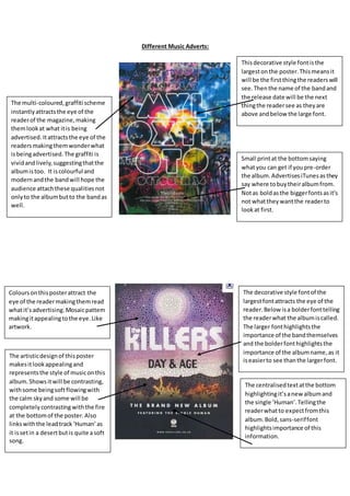
Thisdecorative style fontisthe
largestonthe poster.Thismeansit
will be the firstthingthe readerswill
see.Thenthe name of the bandand
the release date will be the next
thingthe readersee as theyare
above andbelow the large font.
The multi-coloured,graffiti scheme
instantlyattractsthe eye of the
readerof the magazine,making
themlookat what itis being
advertised. Itattractsthe eye of the
readersmakingthemwonderwhat
isbeingadvertised. The graffiti is
vividandlively,suggestingthatthe
albumistoo. It iscolourful and
modernandthe bandwill hope the
audience attachthese qualitiesnot
onlyto the albumbutto the bandas
well.
Small printat the bottomsaying
whatyou can get if youpre-order
the album.AdvertisesiTunesasthey
say where tobuytheiralbumfrom.
Notas boldasthe biggerfontsasit’s
not whatthey wantthe readerto
lookat first.
The decorative style fontof the
largestfontattracts the eye of the
reader.Below isa bolderfonttelling
the readerwhat the albumiscalled.
The larger fonthighlightsthe
importance of the bandthemselves
and the bolderfonthighlightsthe
importance of the albumname,as it
iseasierto see thanthe largerfont.
Coloursonthisposterattract the
eye of the readermakingthemread
whatit’sadvertising.Mosaicpattern
makingitappealingtothe eye.Like
artwork.
The centralisedtextatthe bottom
highlightingit’sanewalbumand
the single ‘Human’.Tellingthe
readerwhatto expectfromthis
album.Bold,sans-seriffont
highlightsimportance of this
information.
The artisticdesignof thisposter
makesitlookappealingand
representsthe style of musiconthis
album.Showsitwill be contrasting,
withsome beingsoftflowingwith
the calm skyand some will be
completelycontrasting withthe fire
at the bottomof the poster.Also
linkswiththe leadtrack‘Human’as
it issetin a desertbutis quite asoft
song.
2. The sans-serif fontinthe largest
font.Bold,redwriting.Highlights
importance of the artist.Linkswith
the picture of him onthe rightof
the poster.Showswhohe is andis
the firstthingthe readerswill see.
The bold,white writingshows what
the albumis called,standsoutto
the otherred text.Sans-seriffont.
Red/White theme of the textshows
parallelismwithin thisposter
makingitlookmore appealing.
Furthermore the overall lookof this
posterisveryseriousandformal,
suggestingthe musicwill be the
same.
Highangle on the camera. Mise-en-
scene of microphone which
connoteswithjazzmusic.Wearinga
suitand tie.Showshe isperforming
hismusic.Representshismusicto
be of a certainstyle,inthiscase it is
indie pop.
Multiple examplesof howgoodthe
albumis.Showshismusicto be
goodand the albumto good.
Artistlookingintothe camera.This
use of voyeurismmakesthe artist
seemveryseriousandpowerful. She
iscentralisedshowingher
importance. The redof her hairand
lipstickshowsaggressionandthat
she istough. The miserable and
melancholylookonherface
suggeststothe audience thatthisis
the style of her music,melancholy.
Thisgivesa clearunderstandingof
whatto expectfromthisalbum.
Stretchedsans-serif fontforthe
name of the artistand the name of
the album. The softwhite colourof
thistextcontradictshersternimage
as it representsshe is notastough
as she makesout to be.
The soft blue colour,centralisedin
the postershowsshe isnot what
she seems,justlike the softwhite.It
alsoshowsthe importance of the
textas itis inthe middle for
everyone tosee clearly.
The soft blurinthe background
makesherimage and the textstand
out more,makingthemseem
clearerand of higherimportance.