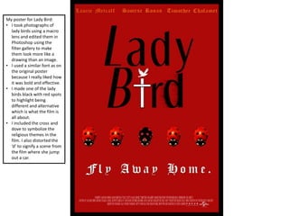
1. My poster for Lady Bird:
• I took photographs of
lady birds using a macro
lens and edited them in
Photoshop using the
filter gallery to make
them look more like a
drawing than an image.
• I used a similar font as on
the original poster
because I really liked how
it was bold and effective.
• I made one of the lady
birds black with red spots
to highlight being
different and alternative
which is what the film is
all about.
• I included the cross and
dove to symbolize the
religious themes in the
film. I also distorted the
‘d’ to signify a scene from
the film where she jump
out a car.
2. Alternative Lady Bird Poster:
• I multiplied images of the
lady bird and changed
the colours using the
camera raw filter and
filter gallery. I kept one
red and changed the
direction to once again
signify the theme of
individuality.
• I kept the same font
because I liked how bold
and eye catching it was.
• I changed the colour
scheme because I
thought that white black
and blue worked better
together.
• I removed the dove from
the cross because I
thought that it looked
too crowded.
3. Perks Graphic Poster:
• I used an image from
Google on the main
character as used the
shape tool to draw
flowers over. It was very
time consuming but I
am happy with the
outcome because even
though it is simple it is
still effective.
• For the title, I included
a drop shadow so that it
stood out more. I then
replaced the ‘O’s with
suns so that it looked
more bright and
colourful.
• Finally, I edited the
background so that it
had an old textured
paper effect. Even
though it is subtle, it is
still effective and makes
the poster slightly more
interesting.
4. Perks Photography Poster:
• I took a photograph of
flowers growing on the
wall and then used the
camera raw filter to edit
the image: make it look
brighter and more
colourful. I then
followed a YouTube
tutorial to make the
photo look more
vintage and have a
grain.
• The font and text is very
simple on the page with
just simple drop
shadows and inner
highlights.
• I then used the same
quote as on the graphic
poster as this is one of
my favourite quotes
from the book and film.
5. Black Swan Poster:
• I took portrait images in
the studio and then
smoothed the skin and
made the photo black
and white to have more
dramatic effect.
• I then cut out the pupil
of the eye and replaced
it with a feather. I then
followed a YouTube
tutorial that taught me
how to create red veins
and inner corners.
• To make the font more
interesting, I used a
feather font choice and
created a red drop
shadow so that it was
more eye catching.
• I then also included a
quote from the film
which are the main
characters last words.
6. Candy Poster:
• To create this poster, I
created a heart out of
pills because the film is
all about two people
that have drug
addictions.
• I wanted the fonts to be
very simple and elegant
but also eye catching.
• I included a quote from
the film to make the
poster more interesting
for the audience.
• Even though this poster
is very simple and
minimalistic, I think that
is what makes it so
effective.
7. Harry Potter Poster:
• I took the
photograph of the
owl at Lotherton
Hall; I then edited
the image using the
camera raw filter so
that the white
feathers were
brighter.
• To make the title
more interesting I
used the arc tool so
that it curved around
the owl. I then
incorporated a scar
into the ‘O’ so that
there was a hidden
meaning.
• I also included J.K
Rowling's name to
give significance to
the books.
8. The Invisible Guest:
• The film is Spanish and
starts off with the
characters getting in a
car accident because a
deer runs out into the
road. This is why I
decided to create a
clipping mask so that the
map was inside the deer
looking like veins. I then
created a red drop
shadow and a vignette so
that it looked more
dramatic.
• I wanted the colour
scheme to be very
simple and
monochromatic. I think
that the font choice
works really well on the
poster and makes it look
even more dramatic.