SlideShare a Scribd company logo
1 of 25
FMP- Evaluation
Research
To begin this project, I conducted research into existing products that I wanted create; theatrical poster
releases. I tried to find the artists of posters that I have purchased, however I found it hard to find
specific designers which is why I did not research many different artists. I firstly researched about Saul
Bass who is famous for designing the poster for the film ‘Vertigo’ and ‘The Shining’. He has a very
distinctive style that is highlighted across all his artwork by encompassing strong, harsh lines and bright
colour schemes with simple graphic artwork. His style inspired me greatly as I began creating mind
maps for simple artwork that I could create for films that would be as effective: this is how I then
progressed with the pill love heart idea for Candy. Another artist that I researched was Andrew
Sebastian Kwan who creates polaroid style posters that are very simple but effective. He takes a
snapshot from a film and uses this scene as the poster image with a simple cream border and grain
effect. Even though these posters are not as bold and eye catching; they act more as a memory for the
viewer rather than art which is a creative concept that makes his work stand out amongst the rest. I
analyzed what inspired Andrew to begin creating posters and how he developed his ideas. After further
investigation into his work, I discovered that his artwork appeals to a niche audience due to his editing
style. This lead me to understand what skills and techniques would appeal to a niche audience and what
would appeal to a mainstream audience. For example, a more simplistic design would appeal to a niche
audience because the graphic design is so simple but effective. However, a more detailed poster with a
bold colour scheme and several pieces of art work typically appeals to a mainstream audience.
Furthermore, I developed my research further looking at different styles of posters including
minimalistic, graphic designed and photography based. I like all these different poster styles because
they appeal to a wide audience which results in more people liking my posters: it also influences me to
experiment with different techniques and skills on Photoshop that I have not used before such as the
filter gallery. This element of research went well because I was introduced to different styles of artwork
that I had not seen before on theatrical releases. One way that my research could have gone better is
that if I looked at more artists and the different styles of art they produce for the posters as this could
have given me more ideas and inspiration for my own posters.
Research
Andrew Sebastian Kwan
artwork: a snapshot from the
film, usually contains the main
character. Extremely simple
and beige colour scheme with
bold title of film.
Saul Bass artwork: strong harsh
lines on the poster that are bold
and grab your attention. Usually
the colour scheme is
monochromatic to make it
simplistic but eye catching.
John Alvin artwork: much more
detailed, brighter colour scheme with
much larger font choices. Art work is
realistic and extremely detailed.
Targeted at a main stream audience.
Research
After researching different theories and practitioners, I created a survey on Survey Monkey so that I could learn
more about my target audience, (my target audience are teenagers and young adults). I asked the audience
several different questions that would lead me to producing posters that are best suited to them. 61% of
people that completed my survey were male and 46% of people had not purchased a film poster before. An
important question that I asked the audience was “what genre of film are you most likely to purchase a film
poster for?” The majority answered horror, thriller and fantasy which are perhaps the most challenging style
posters to create because of the editing techniques, bold colours and graphics. Another important question
that I asked which would help contribute to production was would the audience prefer detailed posters or
simple and minimal. The majority answered detailed, however the results were very close. This helped
contribute to production as I created a mixture of detailed graphically designed posters as well as minimal
photography based posters. All questions that I asked my target audience contributed to my production and
where it is now. To develop my research even further, I interviewed my friends that are in the target audience
and asked them what the most memorable film poster is to them and why. The answers highlighted to me that
the main focus is on the colour scheme and the image so that it stands out and grabs the audiences attention. I
then began choosing different colour schemes and fonts using Coolors.com and Dafont.com This was a difficult
task to execute as at this point I did not know what films I was going to produce, however I still selected
different colour schemes based on the genres. For example, a fantasy/sci fi film has a more blue and green
colour scheme whereas a horror or thriller has a red, black and white color scheme. The font choices are
equally as important as the colour scheme because the combination of these elements builds up the
foundation for the film and how it is represented. All of these elements and the research I conducted helped
build up my posters and appeal to the audience type.
Audience
I wanted my target audience to be aged from 16-24 years old because this is the age where
teenagers and young adults want to decorate their room with their favourite films. My target
audience are people who are obviously film fans but also appreciate the art work that goes into
the film and how the posters act as a memory. I wanted my posters to appeal to a niche audience
as well as a mainstream audience because this widens my audience as well as challenging me to
new techniques and skills that would appeal to those audience types. I personally prefer film
posters that are targeted at a niche audience because I think that you can easily tell what the film
means to the designer. Mainstream film posters have a purpose to sell the film and influence the
audience to want to watch it. For example, a niche audience would enjoy a minimalist style
poster as well as a vintage look to it because it is more unique: the art work has more of an
impact on the individual rather than the audience as a whole. However, a mainstream audience
would prefer a bright and bold colour scheme as well as a gripping image that stands out
amongst the rest which would impact on the audience as a whole. I conducted a survey to find
out more about my audience and what they would like to see and what they enjoy on film
posters. The results varied from wanting detailed designs but also minimalistic depending on the
film. The audience would like to see a wide range of film genres produced to appeal to them. I
wanted to try appeal all my work to as many people as possible which is why I included a horror
poster, romance, drama and fantasy. If I had more time during production, I would of liked to
have produced more horror/thriller posters as well as another fantasy poster and expand into a
new genre, (comedy).
Target Audience/Survey
Creating a survey on Survey Monkey was very beneficial to production for several different
reasons. For example, I had much more knowledge on what genre of films the target audience
would like to see as I have to produce posters that interest and entice the audience. It also
allowed me to understand what kind of style of poster they are most interested in, (graphically
designed or photography based). Even though the survey was extremely helpful, there were
some errors that I made. I asked the audience how much they would pay for a alternative film
poster which implies that I am going to sell my work, however I did not have enough time to
create a website for my work which means they are not going on sale. This question was
irrelevant and not helpful at all towards production. Another mistake that I made was I asked how
the audience purchased the film merchandise and over 70% said online. Once again this question
was not beneficial because this means that my audience will not be able to buy the product. If I
could improve the survey, I would improve some of the questions and ask specifically what films
they would like to see me produce as well as what is their favourite editing technique or skill that
have seen used on a theatrical film poster that I could mirror in my own work.
Time Management
To make sure that I stayed according to the college schedule, I made my own time sheet and
schedule so that I made sure that I was not wasting any time as well as not running out of time
on production. I separated each week and decided what poster I would work on in that week. All
photography shoots were planned for the weekend so that college time is not wasted. I also
worked out how much time I would spend at each location so that I have time to edit the images
to the best of my ability. This production schedule separated each poster and the graphics from
the photographs. I referred to my schedule throughout the project however I did not strictly stick
with it as it held me back from moving onto other posters. On my schedule, I had planned to
produce 6 or 7 posters, however I had around a week free at the end so I produced one more
poster. Another way to give myself more production time was to complete my development
diaries during tutorials so that time on the macs was not wasted. I did not miss a day off college
during production; this was vital to my production because I do not have access to Photoshop at
home which means I would not have had any time to catch up. I think all these precautions that I
assessed before hand allowed me to have one week spare to create one extra poster. Overall, my
work was posted to my website on time and I did not feel rushed or pressured for it to be
completed.
Management Issues
I had created a schedule of what posters I would work on each week so that I could plan what
style of pictures I would need to take at the weekend which would specify which location I would
need to visit. I began by taking pictures in my garden of lady birds which is why for the first week I
followed the schedule as I took nature themed photographs. However the following week I had
planned to mainly work in the studio on portrait photography for different horror/thriller themed
posters. This did not go according to plan because I worked on a second Lady Bird poster which
ran into the following week. I then had issues with who would be modeling for the Black Swan
poster which is why I had to quickly step in to resolve the problem. The Black Swan poster took
lots of work which ended up running into the following week where I was supposed to take street
style photographs for drama films. I did not take any photographs within this theme because I
had already come up with different graphic design ideas for my posters that would work much
better with the film. At the time of research and planning, a schedule made me feel much more
comfortable with production as I had no ideas of what my posters were going to look like.
Methods & Missed Opportunities
I used a range of different methods throughout this project to challenge myself to new skills and techniques to
expand my knowledge on Photoshop and make my work at distinction level. The first poster that I worked on
was Lady Bird. The first method I used was taking a photograph of a lady bird and using the filter gallery to
make it look like a graphic image instead of just an image. I also used the pen tool to draw over certain light
spots that had reflected from the camera. I then also on the other Lady Bird image I duplicated the lady birds
and made them blue using the camera raw filter so that the red lady bird stands out like an individual which is
what the film represents. Another method that I used was the shape tool by drawing over an image with
flowers so that the result was Charlie’s face out of flowers as the film is Perks Of Being A Wallflower. I am happy
with the outcome of this method because it makes the poster unique and stand out amongst other graphic
design posters. One missed opportunity in production was that I did not get to shoot with models. My friend
said that she was happy having her picture taken until it came down to being in the studio so I had to do it
instead. I would have liked to have shoot with different models as this would provide me with other
opportunities to create more posters that are photography based.
Lady bird image that I took in my garden with
my macro lens (70mm-200mm). A certain sun
light spot on the back of the lady bird that had
to be edited out and could not be avoided
when taking the image.
Using an image of Logan Lerman,( the
main character) I then used the shape tool
to draw different sized flowers over the
image and then eventually removed the
photograph. Was very time consuming but
eventually worked and looked good.
Methods & Missed Opportunities
This poster for Black Swan was
definitely most challenging to
make. I firstly had to smooth
my skin in the image so that it
almost looked like I was a doll.
I then made the image black
and white with a very strong
vignette so that the main
focus was on the eye. I cut out
the pupil of the eye and
replaced it with a black
feather to signify to the play. I
then smoothed out the rest of
the eye so that I was just
white so that it would
influence the red veins to
stand out more. I then used
the pencil tool at size 1 so that
I could very neatly add in the
veins. I am very happy with
the outcome even though it
did take over a week to
produce.
Another method that I used was
the shape tool by including the
swan into the title. I used a drop
shadow of a dark red to signify
the blood and death that occurs
during the film. I also
experimented with the camera
raw filter and the highlights and
shadows so that the photograph
was appropriate for a
horror/thriller poster. I think this
poster will appeal to a
mainstream audience as I have
not included any original ideas
however it still is different and
stands out. One missed
opportunity on this poster is
featuring a model instead of
myself as I would have felt more
comfortable editing the image
and having someone else as the
cover.
Final Concept
I came up with my final concept because I wanted to purchase some alternative film posters, however I
found it difficult to find some that were in the style that I wanted and were in a reasonable price range. I
did not like most of the mainstream theatrical releases which is why I felt inspired to develop my own. I
spent a lot of time on pinterest looking at different fan art which inspired me to build my own graphic
design and minimalist ideas for posters I would produce for my favourite films. I chose 5 of my favourite
films and began mind mapping ideas of what I could produce for a niche and mainstream audience.
Once I had decided that I wanted to progress with this idea for my FMP, I began researching different
artists who produce theatrical releases as well as alternative poster art. These artists included Andrew
Sebastian Kwan, Saul Bass and many more. These two particular artists inspired me because they
created artwork that was a similar style that appealed to me and my target audience. I then showed
some of this artwork to my peers in the target audience and they all said they enjoyed this style and
would purchase these posters, therefore production started on my 6 films. The concept of these posters
were to act as pieces of artwork that are different and alternative and do not follow stereotypes of film
poster releases. So many film posters have been released at this point that almost everything has been
done, which is why I wanted to break this stigma and bring back excitement again to film poster
releases so that they are influenced to purchase. However, I wanted my posters to appeal to both a
niche audience and mainstream because I have to include different techniques and skills that will
appeal to everyone such as: font types, colour schemes and photography style. I think that I have done a
successful job of combining different styles together to appeal a range of audience types. For example,
the film poster that I produced for Candy was targeted at a niche audience because it is very minimalist
and includes a alternative graphic design artwork. However, my poster for Black Swan is targeted at
more of a mainstream audience because the photograph style portrait is common on a horror poster. I
manipulated the portrait which is a common editing technique on horror posters as it used on The Nun
and Annabelle.
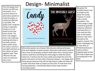
Design- MinimalistThe first design that I
had for my FMP was
minimalist- it is a
common theme on
alternative posters to
make the poster as
simple but effective
as possible. The
poster that I made for
Candy is especially
simple as it is all
based on the love
heart of pills. The
font is vey elegant
and is not a bold eye
catching font that is
normally used on
other poster styles.
The colour scheme is
very light and basic as
the colours all work
together well. They
influence the red
colour to stand out
even more.
Minimalist posters are all about little discreet editing techniques
that work together to build a poster. Minimalist style posters tend to
focus more on the graphic artwork itself rather than a strong colour
scheme, bold fonts and filling the entire page to make the poster
stand out: it tends to be the more subtle and simple the more the
poster will stand out from other theatrical releases. I am happy with
these posters because they did not take long to make and show off
smaller skills that make an impact on the cover. If I had more time
during production, I would have liked to have made another
minimalist poster.
My poster for
Invisible Guest is not
as simple as the
poster for Candy,
however it is built
with a similar
foundation. The
centre image is large
and bold to grab the
audiences attention
and draw them in. I
only used one font
type on this poster
because I was more
focused on the
graphics instead. This
poster challenged me
to new skills on
Photoshop because I
had to create a
clipping mask so that
the map of Spain was
encompassed in the
deer.
Design- Graphic Design
These graphic design
based posters that I
created for the film
Lady Bird were much
more time consuming
and challenging to
produce. The lady bird
is from a photograph
that I took in my
garden. I then used the
filter gallery to make it
appear like it had been
digitally drawn instead.
I also experimented a
lot with the text on the
graphic posters by
using a motion blur
and incorporating
graphics into the title
by using the cross and
dove. The font choice
also plays a big part on
a graphic design poster
because it has to be
bold and grab the
audiences attention.
The second poster for Lady
Bird was much more
challenging because I had
to duplicate the lady birds
so that they were equal
widths on the background.
I then had to make the lady
birds blue so that the red
one represented being an
individual which is what
the film represents. Other
than that, the poster is
almost the same instead
with a white colour
scheme. The colour
scheme is essential on a
graphic design poster
because they have to
connect to the graphics
and work together with the
hidden themes within the
film. The colour scheme is
red and white to symbolize
purity and innocence but
also love and growing up.
The font that I used on both posters was dream orphans
and old London for the cast name. The font is very bold and
large but also because graphics have been incorporated, it
makes it different and stand out. When a poster is graphic
design based, it tends to fill more of the space and
incorporate the graphics into the centre image as well as
background and text. This was challenging for me because I
have not experimented with graphic design before and
alternative film posters always have graphics on them. Even
though I had to watch several tutorials on how to create
certain techniques, I am happy with the outcomes.
Design- PhotographyI think that the poster I
created for Harry Potter is
one of my favourites
because I like how simple
but eye catching the
image is. I used a range of
photography styles on my
posters including
portraits, wildlife and
nature. The wildlife
photograph of the owl
required little editing: all I
had to do was lighten the
white so that it stood out
more as well as create a
strong vignette. For all my
photographs, I first start
out editing using the
camera raw filter to help
change the tones of the
highlights, shadows and
colours. The photograph
must be bold and
colourful to grab the
audiences attention and I
think that I have
successfully achieved
this.
The photograph that I
used on the Perks
poster is very simple
and minimal. The
colours are not
necessarily bright or
eye catching but I
think that it
appropriately fits with
the theme of the film
as it is a vintage film
with a vintage
soundtrack and
costume. The editing
style that I used for
this image includes
using a warm tone
and a grain as well as
an old photograph
texture over layed.
The theme is
highlighted
throughout the
photograph and font
which is why I am
really happy with
outcome of this
poster.
The colour schemes on both posters are very subtle and
simple but I think this is what makes them so effective. The
brighter the colour scheme, the more distracting it can be
from the actual message of the film. I had to experiment
with the font on both posters because it was difficult to
make it interesting and stand out so I used the blending
options to create drop shadows and textures. I am proud of
the outcomes because I think they are unique and will
appeal perfectly to my target audience.
Strengths
I think I have developed a range of strengths throughout the production process. The first strength that I
developed was the graphic design skills that I have experimented with. I have not included graphic
design into any of my previous projects which is why I wanted to try something new to challenge
myself. I used shape tools as well as PNG images and the filter gallery etc. On nearly all my posters, I
incorporated small elements into the background or font that are graphic design. For example, the
Harry Potter poster is photography based, however I wanted to make the font more interesting and
have some hidden meanings. To achieve this I included the small scar into the title which symbolizes the
scar on Harry’s forehead. Another element of production that I have improved on is picking the
appropriate font and colour scheme for the film posters. In my research, I picked a selection of different
films that I wanted to produce posters for and conducted several pages of research examining the
different font options that would work best. For example, for the film Candy I used the font ‘Matilda’
because it was bold but elegant. I knew that I wanted the poster to be minimalistic which is why the
font does not overpower the graphics or colour scheme: they all work together. I am happy with all the
font types that were selected for the posters. My final strength in the FMP was the amount of research I
conducted into different theories and practitioners. I researched three different artists and learned
what inspired them and what style of conventions they followed. I discovered that Andrew Sebastian
Kwan is much more minimalistic and Saul Bass is minimalistic and graphic design based. All this research
contributed to my production and allowed me to learn exactly what my niche and mainstream audience
wanted to see within my work as well as what film posters actually symbolize within the films.
Scar included in the title
font to make it more
interesting for the
audience and have
hidden meanings and
themes.
Matilda font that I used for the title for
Candy. Is very elegant but bold which fits
with the theme of the poster perfectly.
Weaknesses
Even though I am happy with my work, I did make several mistakes within the whole FMP project. For example,
I planned several different locations that I was going to shoot at: I had chosen what style photography and
what the image would look like including the weather complications, lighting and any technical difficulties.
However, the graphic design posters took up a lot of my time in production as I had not experimented with this
style of media before. This affected my schedule which means that I did not get chance to shoot at many of the
locations such as Castle Howard or Yorkshire Wildlife Park. Instead, I traveled to locations that were much
closer and more convenient such as nearby quiet towns, Askham Bog and Wheldrake Ings. This restricted me to
the certain style of photographs that I could take. For the Harry Potter poster, I referred to an image I took
several months ago at Lotherton Hall. My lack of organization when scheduling shoots influenced me to
produce more graphic design posters. Even though this was a challenge, I think it improved my work greatly
and made my posters much more interesting and alternative. An element of weakness during pre production
and production was that I should have watched more tutorials to help me produce the work that I wanted and
save time. I had several different alternative ideas in my head but could find tutorials that were appropriate
which is why I had to ask for help and take up a lot of lesson time. If I spent less time on the graphic design
posters; I could have produced more photography based posters and had more time to plan locations that I
would travel to and find the time to successfully shoot. Another major weakness throughout the project was
my initial idea: to create film posters. Usually I like to stick to something I know that focuses on nature, wildlife
and flower photography such as nature calendars, guide books etc. However for this FMP I wanted to challenge
myself to something completely different. This made me second guess myself several times during the project
and want to change my idea and produce something more in my comfort zone. This stress and worry made the
production element very stressful, however I am very happy with the outcome of my products and am very
proud of the new techniques and skills that I have learned on Photoshop.
Did not get chance to
shoot at Castle Howard
because I didn’t plan my
schedule for shooting
correctly. I also did not
plans what shots I
wanted at this location
which is why I never got
chance to go.
Planning
I came up with my idea for the FMP because I wanted to purchase some film posters that were alternative and different
to the theatrical posters. I couldn’t purchase the alternative ones which resulted in me coming up with the idea of
producing my own. I then made a list of my favourite films whilst trying to incorporate a wide genre. I then tried to
create different ideas graphically and photographs that I could take for the posters. When I decided the final films that I
wanted to produce, I looked at different tutorials so that I was able to achieve these ideas as I new they would challenge
me to something new. I watched tutorials on different text techniques such as how to create motion text
(https://www.youtube.com/watch?v=0sVsZNGERtQ) . Most of the tutorials were easy to follow, however the tutorial on
the blood shot eyes took some time to practice (https://www.youtube.com/watch?v=_Vainftyq7E). As well as watching
different tutorials to improve my skills and techniques on Photoshop I also researched into artists. I wanted to look into
what inspired them to create minimalist posters or photography based. I learnt that its all about what you are interested
in most and what are the common themes within the film. For example, Lady Bird is all about a teenage girl trying to fit
in society as well as expressing her individuality. I then had the idea to take a picture of several different lady birds and
then change the colours of the lady birds so that one stands out to show it is different. Planning took several weeks to
prepare and I felt very nervous to start production because I didn’t have all my posters planned out however, I worked it
out by asking my peers what they would like to see as well as conducting some research on pinterest.
Planning
I was anxious during the planning process because I was unsure how my posters were going to
look and even what films I was going to produce posters for. To develop my planning further, I
looked at examples of alternative film posters on Pinterest to inspire me but to also see any
common themes that are used on these posters and what films they focus on. Pinterest inspired
me greatly on this project because it allowed me to think of my own editing techniques and skills
that I could use on Photoshop for certain films. This is then when I thought of the Black Swan
poster idea of manipulating the eye with a feather. Even though we had several weeks for the
planning and research PowerPoint's, there are some things that I could have worked on or done
differently. For example, I could have drawn sketches of what I wanted some of my posters to
look like or mind maps in much more detail. This possibly would have lead to many more ideas
which would have influenced production to run much more smoothly and for me to not be so
stressed.
Production
• Production lasted several weeks and I planned each week out by producing a schedule. This schedule
allowed me to plan what week I would work on what poster and what style of photography. Even though I
did not refer to this exact schedule, it made me feel much more prepared for the production element of
the FMP. I also knew to leave 2 weeks of production dedicated to Black Swan because I knew that it would
take a lot of time to work on the photograph and to manipulate the eye. I firstly worked on the posters for
Lady Bird which went very well and took quite some time to apply the skills that I had experimented with.
My initial idea was to create 2 posters for each film that were photography and graphically designed
based, however I ended up not having enough time to successfully produce both. I didn’t have
photography ideas for certain films which is why I decided to work on as many different posters as I could.
To help production run more smoothly, I watched different tutorials that would challenge me to new
techniques and skills. For example, I watched a tutorial on how to make the font look like it was moving:
this did not take up much time and only improved my work. Overall, production went well as I got chance
to experiment with graphic design skills that I never would have used before now. It influenced my work to
be much more alternative and stand out amongst the rest of the theatrical poster releases.
• During production, I experimented with lots of new skills on Photoshop that I had not used previously on
other projects. I used the filter gallery to change how the image looked. For example, I changed the lady
bird photograph to look like it had been graphically drawn which made the poster look more professional.
I also used lots of clipping masks and mask layers to create the detail on the eye in Black Swan. Finally, a
technique that I have a lot of practice using is the camera raw filter which I use to alter the highlights and
colours in the image to make the photograph look better quality.
All fonts downloaded
from Dafont.com
Different camera filters that I
over layed to make the
photograph more cool toned
or warm etc.
Post Production
During the production process, I made daily development diaries to document the progress on
the posters as well as what went well and what did not work out. For example, I was struggling
for several days on the poster for Black Swan because the techniques that I had followed on the
tutorial were not working out well on my image. I then could see where I went wrong and
prepared myself for the next day of what I needed to do differently for it to work and look
professional. Throughout production, I regularly asked my peers what they thought about my
work and what they liked and disliked about it. The feedback really helped because whilst I was
working on the posters I could make necessary changes to improve the quality and suit the
target audience. An example of some feedback that I received was to re-position some of the text
and realign the images so that it worked more and stood out on the page. We also received
feedback in class which did not help me much during production because some people had not
seen the films so they did not understand that themes on the poster and thought they looked
strange and should be removed. I did get one good piece of feedback on the Black Swan poster to
make the eye more red so that it stood out more and grabbed the audiences attention which I
then progressed to work on. Over the next week, I am going to send my work to different artists
such as Aesthetica so that they can tell me what to improve on.
Feedback I received in class which I
had time to act on. I made the
background of the Perks poster yellow
and I also made the font more
readable by changing the font and
including drop shadows. I also made
the eye on Black Swan more red.
Feedback
• To receive more feedback and get some constructive criticism from experienced graphic designers
and photographers; I emailed my work to different artists in York. I emailed Graphic Power all my
work and they responded with: “Thanks for sending your work over for your final project. I think
the work is well executed and looks good. I especially like the Black Swan poster - carries impact.
When presenting your work you could consider putting the images into a pdf and laying out as a
presentation. Another thought would be to include with that the posters in situ so placed on
buildings or advertising situations (busses / buss stops) to help bring them to life.” This feedback
was very helpful because I now have ideas for different creative ways to present my work to the
public. I am going to act on these ideas and print off my work and photograph them in different
locations so that the public can give feedback on my work. I also emailed Aesthetica Magazine and
York Graphic Designers which I am still awaiting a response.
• I have a photography account on Instagram that is followed by different professional and amateur
photographers and graphic designers. I posted images of my work and asked for feedback which
turned out to be very helpful from this platform. One photography said they liked how I included
one of the best quotes from the book onto the Perks Of Being A Wallflower poster and that it had a
great colour scheme. They also really liked how on the second version on the Perks poster I
embedded Logan Lerman’s face into flowers as it was very creative. Another amateur photographer
said that they enjoyed the photography Perks poster and the Harry Potter poster because “when it
comes to design keep it simple.” The majority of my feedback online highlights that they enjoyed
the Harry Potter poster and the Candy poster the best because they enjoyed the imagery and how
simple but effective the designs are.
Feedback
• A lot of people on my photography account as well as Graphic Power said that they enjoyed the Black Swan poster
the best. I am happy with this feedback because during pre production I conducted a survey and the results
highlighted that my target audience were more interested in horror/thriller themed posters. It was very challenging
to create and took up several weeks of production, however I am very happy with the feedback as it makes me
proud of my work.
• One piece of feedback that I received from Instagram was about the first Lady Bird poster:” the black lady bug
makes me think of a black widow or an evil animal. It suggests a lot of mystery which makes it really interesting and
fun to look at.” This was not my intentions to portray on the poster as the film is a coming of age genre about
teenagers leaving school and trying to prepare for the future and fit in. The point of the black lady bird was to
portray individuality and standing out amongst the rest, however I can see from her point of view how it can look
mysterious. If I have time to work on this feedback, I will possibly change the colour of the lady bird so that it does
not look so dark. On the other hand, I have not received a similar comment on this poster which means that other
people have not thought this, although they could have seen the film and understood the message.
I experimented with making the
lady bird different colours,
however I preferred it to be black
to work with the colour scheme.
It was also important for the lady
bird to be a realistic colour
because in the film she is not this
unusual character: she is just
different.
Issues
Even though this FMP project was stressful I did not face many technical problems. I did not have chance to
borrow a macro lens from college which means that some of my more detailed photos are not the best of
quality that they could have been. If I were able to borrow one of these lens then the quality of my images
would have improved greatly and perhaps made the poster more appealing to the consumer. There were some
issues with the Black Swan poster because I had asked my friend to be the model and at the last minute she
changed her mind which did not give me any time to find a replacement so I had to step in. This was difficult
because I knew what I wanted the shot to look like and I did not want to be featured on any of the posters.
However, the problem was quickly resolved and I am happy with the outcome. If I had organized more time
with models, then I could have produced more posters that were horror or fantasy based which is what my
target audience wanted to see the most. This FMP project was quite stressful because I was challenged to
something that I have not experimented with before which means that I was worrying that I would not be able
to create the graphic design elements or that it would not look good and I would have to think of a whole new
idea. I was not worried about the amount of time we had because I thought that we had a sufficient amount of
time to complete the project. It was just the stress and worry that it would not turn out how I had imagined
which is thankfully did.
I spent lots of time editing the pills
to manipulate the size and colour
so that they fit inside the heart
perfectly and was eye catching.
I downloaded a map of Spain and
created a clipping mask so that the map
was inside the deer and looked like
veins. I then created a drop shadow and
a vignette to finish the product.
Intentions
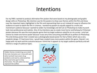
For my FMP, I wanted to produce alternative film posters that were based on my photography and graphic
design skills on Photoshop. My intention was for the posters to show case themes within the film and show
case the important topics highlighted in the film and representing them as art instead of a way to influence the
audience to want to watch the film in cinemas. I wanted my posters to equally appeal to a niche and
mainstream audience because I wanted to widen my knowledge and skill set on Photoshop to make my work
look more professional and realistic. One of my intentions was to create more horror and fantasy/sci fi themed
posters because this was the most popular genre that my target audience voted for on my survey. I only had
chance to create one horror poster because it was very time consuming and difficult to perfect on Photoshop.
The only fantasy poster that I created was a photography based poster for Harry Potter which was a very
simplistic design. If I had more time, I would have created many more posters within this genre. Overall, I am
happy with my work and the outcome because I think that it appeals to my target audience perfectly and will
interest a range of audience types.
Hidden themes include drug use as both
the main characters are in love with each
other but both have severe drug
problems and need to understand that
they need to be apart to help
themselves. The pills within the hear
represent the conflict.
Summary
Overall, I am very happy with my work and I am proud of the outcome. I am most proud of the
graphic design skills that I have practiced and encompassed into my work and this has challenged
me to something completely new and different for me on Photoshop. Black Swan was a very
challenging poster to create and at points I wanted to give up with the production of this poster
because it was so hard to perfect. However, I managed to create eye masks and clipping masks to
manipulate the eye successfully. I am also very proud of the Candy poster because I think the
colour scheme, font choice and graphic design all work well together to build a great film poster. I
had to download a PNG image of a pill and then change the colours and size to make it my own. I
then had to duplicate the image and edit the shape and size to make it fit into the heart. Even
though it was time consuming I am very happy with the outcome and so is my target audience as
several artists said this poster was their favourite. If I had more time during production, I would
have liked to have produced more posters so that the genre spectrum would have widened and
would mirror with the audience spectrum. Ideally, I would have liked to have created one more
horror and fantasy poster as these styles were most challenging to create. Furthermore, I would
have liked to have experimented with more photography instead of mainly focusing on graphic
design. This would have lead me to watch more tutorials which would have developed my skill set
further, although I am still proud with my work.

More Related Content

Similar to FMP- Evaluation Research

7. Evaluation FMP (Liberty Whitehorn)
7. Evaluation FMP (Liberty Whitehorn)7. Evaluation FMP (Liberty Whitehorn)
7. Evaluation FMP (Liberty Whitehorn)Libby Whitehorn
 
Production reflection
Production reflectionProduction reflection
Production reflectionAbbie Nicholls
 
Fmp production reflection finished
Fmp production reflection finishedFmp production reflection finished
Fmp production reflection finishedWilliamAnderson165
 
DONE NOW fmp production reflection
DONE NOW fmp production reflection DONE NOW fmp production reflection
DONE NOW fmp production reflection WilliamAnderson165
 
Changed fmp production reflection
Changed fmp production reflection Changed fmp production reflection
Changed fmp production reflection WilliamAnderson165
 
DONE Fmp production reflection
DONE Fmp production reflectionDONE Fmp production reflection
DONE Fmp production reflectionWilliamAnderson165
 
Poster Evaluation
Poster EvaluationPoster Evaluation
Poster Evaluationkdhcsgo
 
Media eval q 3
Media eval q 3Media eval q 3
Media eval q 3JessBrown97
 
FMP Reflections.pptx
FMP Reflections.pptxFMP Reflections.pptx
FMP Reflections.pptxShaniceYates
 
Evaluation Presentation
Evaluation PresentationEvaluation Presentation
Evaluation Presentationguestb81d2f
 
Presentation
PresentationPresentation
PresentationKevz2010
 
7. Evaluation FMP (Liberty Whitehorn)
7. Evaluation FMP (Liberty Whitehorn)7. Evaluation FMP (Liberty Whitehorn)
7. Evaluation FMP (Liberty Whitehorn)Libby Whitehorn
 
Critical evaluation[1]
Critical evaluation[1]Critical evaluation[1]
Critical evaluation[1]guest44fb6c2
 
Critical evaluation[1]
Critical evaluation[1]Critical evaluation[1]
Critical evaluation[1]guest44fb6c2
 
Evaluation FMP
Evaluation FMPEvaluation FMP
Evaluation FMPThomas Haase
 

Similar to FMP- Evaluation Research (20)

2. proposal
2. proposal2. proposal
2. proposal
 
7. Evaluation FMP (Liberty Whitehorn)
7. Evaluation FMP (Liberty Whitehorn)7. Evaluation FMP (Liberty Whitehorn)
7. Evaluation FMP (Liberty Whitehorn)
 
Production reflection
Production reflectionProduction reflection
Production reflection
 
Fmp production reflection finished
Fmp production reflection finishedFmp production reflection finished
Fmp production reflection finished
 
DONE NOW fmp production reflection
DONE NOW fmp production reflection DONE NOW fmp production reflection
DONE NOW fmp production reflection
 
Changed fmp production reflection
Changed fmp production reflection Changed fmp production reflection
Changed fmp production reflection
 
DONE Fmp production reflection
DONE Fmp production reflectionDONE Fmp production reflection
DONE Fmp production reflection
 
Poster Evaluation
Poster EvaluationPoster Evaluation
Poster Evaluation
 
Media eval q 3
Media eval q 3Media eval q 3
Media eval q 3
 
FMP Reflections.pptx
FMP Reflections.pptxFMP Reflections.pptx
FMP Reflections.pptx
 
Evaluation
EvaluationEvaluation
Evaluation
 
Evaluation Presentation
Evaluation PresentationEvaluation Presentation
Evaluation Presentation
 
Proposal
ProposalProposal
Proposal
 
2. proposal
2. proposal2. proposal
2. proposal
 
Presentation
PresentationPresentation
Presentation
 
7. Evaluation FMP (Liberty Whitehorn)
7. Evaluation FMP (Liberty Whitehorn)7. Evaluation FMP (Liberty Whitehorn)
7. Evaluation FMP (Liberty Whitehorn)
 
Critical evaluation[1]
Critical evaluation[1]Critical evaluation[1]
Critical evaluation[1]
 
Critical evaluation[1]
Critical evaluation[1]Critical evaluation[1]
Critical evaluation[1]
 
Evaluation FMP
Evaluation FMPEvaluation FMP
Evaluation FMP
 
Changed Fmp proposal
Changed Fmp proposalChanged Fmp proposal
Changed Fmp proposal
 

More from Abbie Nicholls

Presentation planning
Presentation planningPresentation planning
Presentation planningAbbie Nicholls
 
Fmp planning and production 2
Fmp  planning and production 2Fmp  planning and production 2
Fmp planning and production 2Abbie Nicholls
 
Fmp problem solving
Fmp problem solvingFmp problem solving
Fmp problem solvingAbbie Nicholls
 
Fmp theories and practitioners
Fmp theories and practitionersFmp theories and practitioners
Fmp theories and practitionersAbbie Nicholls
 
Fmp planning and production 2
Fmp  planning and production 2Fmp  planning and production 2
Fmp planning and production 2Abbie Nicholls
 
Ual ucas pro forma(1)
Ual ucas pro forma(1)Ual ucas pro forma(1)
Ual ucas pro forma(1)Abbie Nicholls
 
FMP Problem Solving
FMP Problem SolvingFMP Problem Solving
FMP Problem SolvingAbbie Nicholls
 
Fmp problem solving
Fmp problem solvingFmp problem solving
Fmp problem solvingAbbie Nicholls
 
Fmp pre proposal
Fmp pre proposalFmp pre proposal
Fmp pre proposalAbbie Nicholls
 
Fmp theories and practitioners
Fmp theories and practitionersFmp theories and practitioners
Fmp theories and practitionersAbbie Nicholls
 

More from Abbie Nicholls (20)

Show
ShowShow
Show
 
Presentation planning
Presentation planningPresentation planning
Presentation planning
 
Fmp planning and production 2
Fmp  planning and production 2Fmp  planning and production 2
Fmp planning and production 2
 
Fmp feedback
Fmp  feedbackFmp  feedback
Fmp feedback
 
Fmp problem solving
Fmp problem solvingFmp problem solving
Fmp problem solving
 
Fmp feedback
Fmp  feedbackFmp  feedback
Fmp feedback
 
Fmp theories and practitioners
Fmp theories and practitionersFmp theories and practitioners
Fmp theories and practitioners
 
Fmp research
Fmp  researchFmp  research
Fmp research
 
FMP- Proposal
FMP- ProposalFMP- Proposal
FMP- Proposal
 
Fmp planning and production 2
Fmp  planning and production 2Fmp  planning and production 2
Fmp planning and production 2
 
Ual ucas pro forma(1)
Ual ucas pro forma(1)Ual ucas pro forma(1)
Ual ucas pro forma(1)
 
FMP Problem Solving
FMP Problem SolvingFMP Problem Solving
FMP Problem Solving
 
FMP- Research
FMP- Research FMP- Research
FMP- Research
 
FMP-Proposal
FMP-ProposalFMP-Proposal
FMP-Proposal
 
Fmp problem solving
Fmp problem solvingFmp problem solving
Fmp problem solving
 
Fmp pre proposal
Fmp pre proposalFmp pre proposal
Fmp pre proposal
 
Fmp proposal
Fmp proposalFmp proposal
Fmp proposal
 
Fmp research
Fmp  researchFmp  research
Fmp research
 
Fmp theories and practitioners
Fmp theories and practitionersFmp theories and practitioners
Fmp theories and practitioners
 
Evaluation
EvaluationEvaluation
Evaluation
 

Recently uploaded

Concept of Vouching. B.Com(Hons) /B.Compdf
Concept of Vouching. B.Com(Hons) /B.CompdfConcept of Vouching. B.Com(Hons) /B.Compdf
Concept of Vouching. B.Com(Hons) /B.CompdfUmakantAnnand
 
18-04-UA_REPORT_MEDIALITERAĐĄY_INDEX-DM_23-1-final-eng.pdf
18-04-UA_REPORT_MEDIALITERAĐĄY_INDEX-DM_23-1-final-eng.pdf18-04-UA_REPORT_MEDIALITERAĐĄY_INDEX-DM_23-1-final-eng.pdf
18-04-UA_REPORT_MEDIALITERAĐĄY_INDEX-DM_23-1-final-eng.pdfssuser54595a
 
Introduction to ArtificiaI Intelligence in Higher Education
Introduction to ArtificiaI Intelligence in Higher EducationIntroduction to ArtificiaI Intelligence in Higher Education
Introduction to ArtificiaI Intelligence in Higher Educationpboyjonauth
 
How to Configure Email Server in Odoo 17
How to Configure Email Server in Odoo 17How to Configure Email Server in Odoo 17
How to Configure Email Server in Odoo 17Celine George
 
Call Girls in Dwarka Mor Delhi Contact Us 9654467111
Call Girls in Dwarka Mor Delhi Contact Us 9654467111Call Girls in Dwarka Mor Delhi Contact Us 9654467111
Call Girls in Dwarka Mor Delhi Contact Us 9654467111Sapana Sha
 
Paris 2024 Olympic Geographies - an activity
Paris 2024 Olympic Geographies - an activityParis 2024 Olympic Geographies - an activity
Paris 2024 Olympic Geographies - an activityGeoBlogs
 
Science 7 - LAND and SEA BREEZE and its Characteristics
Science 7 - LAND and SEA BREEZE and its CharacteristicsScience 7 - LAND and SEA BREEZE and its Characteristics
Science 7 - LAND and SEA BREEZE and its CharacteristicsKarinaGenton
 
The basics of sentences session 2pptx copy.pptx
The basics of sentences session 2pptx copy.pptxThe basics of sentences session 2pptx copy.pptx
The basics of sentences session 2pptx copy.pptxheathfieldcps1
 
Employee wellbeing at the workplace.pptx
Employee wellbeing at the workplace.pptxEmployee wellbeing at the workplace.pptx
Employee wellbeing at the workplace.pptxNirmalaLoungPoorunde1
 
“Oh GOSH! Reflecting on Hackteria's Collaborative Practices in a Global Do-It...
“Oh GOSH! Reflecting on Hackteria's Collaborative Practices in a Global Do-It...“Oh GOSH! Reflecting on Hackteria's Collaborative Practices in a Global Do-It...
“Oh GOSH! Reflecting on Hackteria's Collaborative Practices in a Global Do-It...Marc Dusseiller Dusjagr
 
Separation of Lanthanides/ Lanthanides and Actinides
Separation of Lanthanides/ Lanthanides and ActinidesSeparation of Lanthanides/ Lanthanides and Actinides
Separation of Lanthanides/ Lanthanides and ActinidesFatimaKhan178732
 
Interactive Powerpoint_How to Master effective communication
Interactive Powerpoint_How to Master effective communicationInteractive Powerpoint_How to Master effective communication
Interactive Powerpoint_How to Master effective communicationnomboosow
 
A Critique of the Proposed National Education Policy Reform
A Critique of the Proposed National Education Policy ReformA Critique of the Proposed National Education Policy Reform
A Critique of the Proposed National Education Policy ReformChameera Dedduwage
 
Incoming and Outgoing Shipments in 1 STEP Using Odoo 17
Incoming and Outgoing Shipments in 1 STEP Using Odoo 17Incoming and Outgoing Shipments in 1 STEP Using Odoo 17
Incoming and Outgoing Shipments in 1 STEP Using Odoo 17Celine George
 
Solving Puzzles Benefits Everyone (English).pptx
Solving Puzzles Benefits Everyone (English).pptxSolving Puzzles Benefits Everyone (English).pptx
Solving Puzzles Benefits Everyone (English).pptxOH TEIK BIN
 
_Math 4-Q4 Week 5.pptx Steps in Collecting Data
_Math 4-Q4 Week 5.pptx Steps in Collecting Data_Math 4-Q4 Week 5.pptx Steps in Collecting Data
_Math 4-Q4 Week 5.pptx Steps in Collecting DataJhengPantaleon
 
How to Make a Pirate ship Primary Education.pptx
How to Make a Pirate ship Primary Education.pptxHow to Make a Pirate ship Primary Education.pptx
How to Make a Pirate ship Primary Education.pptxmanuelaromero2013
 
MENTAL STATUS EXAMINATION format.docx
MENTAL     STATUS EXAMINATION format.docxMENTAL     STATUS EXAMINATION format.docx
MENTAL STATUS EXAMINATION format.docxPoojaSen20
 

Recently uploaded (20)

Concept of Vouching. B.Com(Hons) /B.Compdf
Concept of Vouching. B.Com(Hons) /B.CompdfConcept of Vouching. B.Com(Hons) /B.Compdf
Concept of Vouching. B.Com(Hons) /B.Compdf
 
18-04-UA_REPORT_MEDIALITERAĐĄY_INDEX-DM_23-1-final-eng.pdf
18-04-UA_REPORT_MEDIALITERAĐĄY_INDEX-DM_23-1-final-eng.pdf18-04-UA_REPORT_MEDIALITERAĐĄY_INDEX-DM_23-1-final-eng.pdf
18-04-UA_REPORT_MEDIALITERAĐĄY_INDEX-DM_23-1-final-eng.pdf
 
Introduction to ArtificiaI Intelligence in Higher Education
Introduction to ArtificiaI Intelligence in Higher EducationIntroduction to ArtificiaI Intelligence in Higher Education
Introduction to ArtificiaI Intelligence in Higher Education
 
How to Configure Email Server in Odoo 17
How to Configure Email Server in Odoo 17How to Configure Email Server in Odoo 17
How to Configure Email Server in Odoo 17
 
Call Girls in Dwarka Mor Delhi Contact Us 9654467111
Call Girls in Dwarka Mor Delhi Contact Us 9654467111Call Girls in Dwarka Mor Delhi Contact Us 9654467111
Call Girls in Dwarka Mor Delhi Contact Us 9654467111
 
Paris 2024 Olympic Geographies - an activity
Paris 2024 Olympic Geographies - an activityParis 2024 Olympic Geographies - an activity
Paris 2024 Olympic Geographies - an activity
 
Science 7 - LAND and SEA BREEZE and its Characteristics
Science 7 - LAND and SEA BREEZE and its CharacteristicsScience 7 - LAND and SEA BREEZE and its Characteristics
Science 7 - LAND and SEA BREEZE and its Characteristics
 
Model Call Girl in Bikash Puri Delhi reach out to us at 🔝9953056974🔝
Model Call Girl in Bikash Puri  Delhi reach out to us at 🔝9953056974🔝Model Call Girl in Bikash Puri  Delhi reach out to us at 🔝9953056974🔝
Model Call Girl in Bikash Puri Delhi reach out to us at 🔝9953056974🔝
 
The basics of sentences session 2pptx copy.pptx
The basics of sentences session 2pptx copy.pptxThe basics of sentences session 2pptx copy.pptx
The basics of sentences session 2pptx copy.pptx
 
Employee wellbeing at the workplace.pptx
Employee wellbeing at the workplace.pptxEmployee wellbeing at the workplace.pptx
Employee wellbeing at the workplace.pptx
 
“Oh GOSH! Reflecting on Hackteria's Collaborative Practices in a Global Do-It...
“Oh GOSH! Reflecting on Hackteria's Collaborative Practices in a Global Do-It...“Oh GOSH! Reflecting on Hackteria's Collaborative Practices in a Global Do-It...
“Oh GOSH! Reflecting on Hackteria's Collaborative Practices in a Global Do-It...
 
Separation of Lanthanides/ Lanthanides and Actinides
Separation of Lanthanides/ Lanthanides and ActinidesSeparation of Lanthanides/ Lanthanides and Actinides
Separation of Lanthanides/ Lanthanides and Actinides
 
Interactive Powerpoint_How to Master effective communication
Interactive Powerpoint_How to Master effective communicationInteractive Powerpoint_How to Master effective communication
Interactive Powerpoint_How to Master effective communication
 
A Critique of the Proposed National Education Policy Reform
A Critique of the Proposed National Education Policy ReformA Critique of the Proposed National Education Policy Reform
A Critique of the Proposed National Education Policy Reform
 
Incoming and Outgoing Shipments in 1 STEP Using Odoo 17
Incoming and Outgoing Shipments in 1 STEP Using Odoo 17Incoming and Outgoing Shipments in 1 STEP Using Odoo 17
Incoming and Outgoing Shipments in 1 STEP Using Odoo 17
 
Solving Puzzles Benefits Everyone (English).pptx
Solving Puzzles Benefits Everyone (English).pptxSolving Puzzles Benefits Everyone (English).pptx
Solving Puzzles Benefits Everyone (English).pptx
 
CĂłdigo Creativo y Arte de Software | Unidad 1
CĂłdigo Creativo y Arte de Software | Unidad 1CĂłdigo Creativo y Arte de Software | Unidad 1
CĂłdigo Creativo y Arte de Software | Unidad 1
 
_Math 4-Q4 Week 5.pptx Steps in Collecting Data
_Math 4-Q4 Week 5.pptx Steps in Collecting Data_Math 4-Q4 Week 5.pptx Steps in Collecting Data
_Math 4-Q4 Week 5.pptx Steps in Collecting Data
 
How to Make a Pirate ship Primary Education.pptx
How to Make a Pirate ship Primary Education.pptxHow to Make a Pirate ship Primary Education.pptx
How to Make a Pirate ship Primary Education.pptx
 
MENTAL STATUS EXAMINATION format.docx
MENTAL     STATUS EXAMINATION format.docxMENTAL     STATUS EXAMINATION format.docx
MENTAL STATUS EXAMINATION format.docx
 

FMP- Evaluation Research

  • 2. Research To begin this project, I conducted research into existing products that I wanted create; theatrical poster releases. I tried to find the artists of posters that I have purchased, however I found it hard to find specific designers which is why I did not research many different artists. I firstly researched about Saul Bass who is famous for designing the poster for the film ‘Vertigo’ and ‘The Shining’. He has a very distinctive style that is highlighted across all his artwork by encompassing strong, harsh lines and bright colour schemes with simple graphic artwork. His style inspired me greatly as I began creating mind maps for simple artwork that I could create for films that would be as effective: this is how I then progressed with the pill love heart idea for Candy. Another artist that I researched was Andrew Sebastian Kwan who creates polaroid style posters that are very simple but effective. He takes a snapshot from a film and uses this scene as the poster image with a simple cream border and grain effect. Even though these posters are not as bold and eye catching; they act more as a memory for the viewer rather than art which is a creative concept that makes his work stand out amongst the rest. I analyzed what inspired Andrew to begin creating posters and how he developed his ideas. After further investigation into his work, I discovered that his artwork appeals to a niche audience due to his editing style. This lead me to understand what skills and techniques would appeal to a niche audience and what would appeal to a mainstream audience. For example, a more simplistic design would appeal to a niche audience because the graphic design is so simple but effective. However, a more detailed poster with a bold colour scheme and several pieces of art work typically appeals to a mainstream audience. Furthermore, I developed my research further looking at different styles of posters including minimalistic, graphic designed and photography based. I like all these different poster styles because they appeal to a wide audience which results in more people liking my posters: it also influences me to experiment with different techniques and skills on Photoshop that I have not used before such as the filter gallery. This element of research went well because I was introduced to different styles of artwork that I had not seen before on theatrical releases. One way that my research could have gone better is that if I looked at more artists and the different styles of art they produce for the posters as this could have given me more ideas and inspiration for my own posters.
  • 3. Research Andrew Sebastian Kwan artwork: a snapshot from the film, usually contains the main character. Extremely simple and beige colour scheme with bold title of film. Saul Bass artwork: strong harsh lines on the poster that are bold and grab your attention. Usually the colour scheme is monochromatic to make it simplistic but eye catching. John Alvin artwork: much more detailed, brighter colour scheme with much larger font choices. Art work is realistic and extremely detailed. Targeted at a main stream audience.
  • 4. Research After researching different theories and practitioners, I created a survey on Survey Monkey so that I could learn more about my target audience, (my target audience are teenagers and young adults). I asked the audience several different questions that would lead me to producing posters that are best suited to them. 61% of people that completed my survey were male and 46% of people had not purchased a film poster before. An important question that I asked the audience was “what genre of film are you most likely to purchase a film poster for?” The majority answered horror, thriller and fantasy which are perhaps the most challenging style posters to create because of the editing techniques, bold colours and graphics. Another important question that I asked which would help contribute to production was would the audience prefer detailed posters or simple and minimal. The majority answered detailed, however the results were very close. This helped contribute to production as I created a mixture of detailed graphically designed posters as well as minimal photography based posters. All questions that I asked my target audience contributed to my production and where it is now. To develop my research even further, I interviewed my friends that are in the target audience and asked them what the most memorable film poster is to them and why. The answers highlighted to me that the main focus is on the colour scheme and the image so that it stands out and grabs the audiences attention. I then began choosing different colour schemes and fonts using Coolors.com and Dafont.com This was a difficult task to execute as at this point I did not know what films I was going to produce, however I still selected different colour schemes based on the genres. For example, a fantasy/sci fi film has a more blue and green colour scheme whereas a horror or thriller has a red, black and white color scheme. The font choices are equally as important as the colour scheme because the combination of these elements builds up the foundation for the film and how it is represented. All of these elements and the research I conducted helped build up my posters and appeal to the audience type.
  • 5. Audience I wanted my target audience to be aged from 16-24 years old because this is the age where teenagers and young adults want to decorate their room with their favourite films. My target audience are people who are obviously film fans but also appreciate the art work that goes into the film and how the posters act as a memory. I wanted my posters to appeal to a niche audience as well as a mainstream audience because this widens my audience as well as challenging me to new techniques and skills that would appeal to those audience types. I personally prefer film posters that are targeted at a niche audience because I think that you can easily tell what the film means to the designer. Mainstream film posters have a purpose to sell the film and influence the audience to want to watch it. For example, a niche audience would enjoy a minimalist style poster as well as a vintage look to it because it is more unique: the art work has more of an impact on the individual rather than the audience as a whole. However, a mainstream audience would prefer a bright and bold colour scheme as well as a gripping image that stands out amongst the rest which would impact on the audience as a whole. I conducted a survey to find out more about my audience and what they would like to see and what they enjoy on film posters. The results varied from wanting detailed designs but also minimalistic depending on the film. The audience would like to see a wide range of film genres produced to appeal to them. I wanted to try appeal all my work to as many people as possible which is why I included a horror poster, romance, drama and fantasy. If I had more time during production, I would of liked to have produced more horror/thriller posters as well as another fantasy poster and expand into a new genre, (comedy).
  • 6. Target Audience/Survey Creating a survey on Survey Monkey was very beneficial to production for several different reasons. For example, I had much more knowledge on what genre of films the target audience would like to see as I have to produce posters that interest and entice the audience. It also allowed me to understand what kind of style of poster they are most interested in, (graphically designed or photography based). Even though the survey was extremely helpful, there were some errors that I made. I asked the audience how much they would pay for a alternative film poster which implies that I am going to sell my work, however I did not have enough time to create a website for my work which means they are not going on sale. This question was irrelevant and not helpful at all towards production. Another mistake that I made was I asked how the audience purchased the film merchandise and over 70% said online. Once again this question was not beneficial because this means that my audience will not be able to buy the product. If I could improve the survey, I would improve some of the questions and ask specifically what films they would like to see me produce as well as what is their favourite editing technique or skill that have seen used on a theatrical film poster that I could mirror in my own work.
  • 7. Time Management To make sure that I stayed according to the college schedule, I made my own time sheet and schedule so that I made sure that I was not wasting any time as well as not running out of time on production. I separated each week and decided what poster I would work on in that week. All photography shoots were planned for the weekend so that college time is not wasted. I also worked out how much time I would spend at each location so that I have time to edit the images to the best of my ability. This production schedule separated each poster and the graphics from the photographs. I referred to my schedule throughout the project however I did not strictly stick with it as it held me back from moving onto other posters. On my schedule, I had planned to produce 6 or 7 posters, however I had around a week free at the end so I produced one more poster. Another way to give myself more production time was to complete my development diaries during tutorials so that time on the macs was not wasted. I did not miss a day off college during production; this was vital to my production because I do not have access to Photoshop at home which means I would not have had any time to catch up. I think all these precautions that I assessed before hand allowed me to have one week spare to create one extra poster. Overall, my work was posted to my website on time and I did not feel rushed or pressured for it to be completed.
  • 8. Management Issues I had created a schedule of what posters I would work on each week so that I could plan what style of pictures I would need to take at the weekend which would specify which location I would need to visit. I began by taking pictures in my garden of lady birds which is why for the first week I followed the schedule as I took nature themed photographs. However the following week I had planned to mainly work in the studio on portrait photography for different horror/thriller themed posters. This did not go according to plan because I worked on a second Lady Bird poster which ran into the following week. I then had issues with who would be modeling for the Black Swan poster which is why I had to quickly step in to resolve the problem. The Black Swan poster took lots of work which ended up running into the following week where I was supposed to take street style photographs for drama films. I did not take any photographs within this theme because I had already come up with different graphic design ideas for my posters that would work much better with the film. At the time of research and planning, a schedule made me feel much more comfortable with production as I had no ideas of what my posters were going to look like.
  • 9. Methods & Missed Opportunities I used a range of different methods throughout this project to challenge myself to new skills and techniques to expand my knowledge on Photoshop and make my work at distinction level. The first poster that I worked on was Lady Bird. The first method I used was taking a photograph of a lady bird and using the filter gallery to make it look like a graphic image instead of just an image. I also used the pen tool to draw over certain light spots that had reflected from the camera. I then also on the other Lady Bird image I duplicated the lady birds and made them blue using the camera raw filter so that the red lady bird stands out like an individual which is what the film represents. Another method that I used was the shape tool by drawing over an image with flowers so that the result was Charlie’s face out of flowers as the film is Perks Of Being A Wallflower. I am happy with the outcome of this method because it makes the poster unique and stand out amongst other graphic design posters. One missed opportunity in production was that I did not get to shoot with models. My friend said that she was happy having her picture taken until it came down to being in the studio so I had to do it instead. I would have liked to have shoot with different models as this would provide me with other opportunities to create more posters that are photography based. Lady bird image that I took in my garden with my macro lens (70mm-200mm). A certain sun light spot on the back of the lady bird that had to be edited out and could not be avoided when taking the image. Using an image of Logan Lerman,( the main character) I then used the shape tool to draw different sized flowers over the image and then eventually removed the photograph. Was very time consuming but eventually worked and looked good.
  • 10. Methods & Missed Opportunities This poster for Black Swan was definitely most challenging to make. I firstly had to smooth my skin in the image so that it almost looked like I was a doll. I then made the image black and white with a very strong vignette so that the main focus was on the eye. I cut out the pupil of the eye and replaced it with a black feather to signify to the play. I then smoothed out the rest of the eye so that I was just white so that it would influence the red veins to stand out more. I then used the pencil tool at size 1 so that I could very neatly add in the veins. I am very happy with the outcome even though it did take over a week to produce. Another method that I used was the shape tool by including the swan into the title. I used a drop shadow of a dark red to signify the blood and death that occurs during the film. I also experimented with the camera raw filter and the highlights and shadows so that the photograph was appropriate for a horror/thriller poster. I think this poster will appeal to a mainstream audience as I have not included any original ideas however it still is different and stands out. One missed opportunity on this poster is featuring a model instead of myself as I would have felt more comfortable editing the image and having someone else as the cover.
  • 11. Final Concept I came up with my final concept because I wanted to purchase some alternative film posters, however I found it difficult to find some that were in the style that I wanted and were in a reasonable price range. I did not like most of the mainstream theatrical releases which is why I felt inspired to develop my own. I spent a lot of time on pinterest looking at different fan art which inspired me to build my own graphic design and minimalist ideas for posters I would produce for my favourite films. I chose 5 of my favourite films and began mind mapping ideas of what I could produce for a niche and mainstream audience. Once I had decided that I wanted to progress with this idea for my FMP, I began researching different artists who produce theatrical releases as well as alternative poster art. These artists included Andrew Sebastian Kwan, Saul Bass and many more. These two particular artists inspired me because they created artwork that was a similar style that appealed to me and my target audience. I then showed some of this artwork to my peers in the target audience and they all said they enjoyed this style and would purchase these posters, therefore production started on my 6 films. The concept of these posters were to act as pieces of artwork that are different and alternative and do not follow stereotypes of film poster releases. So many film posters have been released at this point that almost everything has been done, which is why I wanted to break this stigma and bring back excitement again to film poster releases so that they are influenced to purchase. However, I wanted my posters to appeal to both a niche audience and mainstream because I have to include different techniques and skills that will appeal to everyone such as: font types, colour schemes and photography style. I think that I have done a successful job of combining different styles together to appeal a range of audience types. For example, the film poster that I produced for Candy was targeted at a niche audience because it is very minimalist and includes a alternative graphic design artwork. However, my poster for Black Swan is targeted at more of a mainstream audience because the photograph style portrait is common on a horror poster. I manipulated the portrait which is a common editing technique on horror posters as it used on The Nun and Annabelle.
  • 12. Design- MinimalistThe first design that I had for my FMP was minimalist- it is a common theme on alternative posters to make the poster as simple but effective as possible. The poster that I made for Candy is especially simple as it is all based on the love heart of pills. The font is vey elegant and is not a bold eye catching font that is normally used on other poster styles. The colour scheme is very light and basic as the colours all work together well. They influence the red colour to stand out even more. Minimalist posters are all about little discreet editing techniques that work together to build a poster. Minimalist style posters tend to focus more on the graphic artwork itself rather than a strong colour scheme, bold fonts and filling the entire page to make the poster stand out: it tends to be the more subtle and simple the more the poster will stand out from other theatrical releases. I am happy with these posters because they did not take long to make and show off smaller skills that make an impact on the cover. If I had more time during production, I would have liked to have made another minimalist poster. My poster for Invisible Guest is not as simple as the poster for Candy, however it is built with a similar foundation. The centre image is large and bold to grab the audiences attention and draw them in. I only used one font type on this poster because I was more focused on the graphics instead. This poster challenged me to new skills on Photoshop because I had to create a clipping mask so that the map of Spain was encompassed in the deer.
  • 13. Design- Graphic Design These graphic design based posters that I created for the film Lady Bird were much more time consuming and challenging to produce. The lady bird is from a photograph that I took in my garden. I then used the filter gallery to make it appear like it had been digitally drawn instead. I also experimented a lot with the text on the graphic posters by using a motion blur and incorporating graphics into the title by using the cross and dove. The font choice also plays a big part on a graphic design poster because it has to be bold and grab the audiences attention. The second poster for Lady Bird was much more challenging because I had to duplicate the lady birds so that they were equal widths on the background. I then had to make the lady birds blue so that the red one represented being an individual which is what the film represents. Other than that, the poster is almost the same instead with a white colour scheme. The colour scheme is essential on a graphic design poster because they have to connect to the graphics and work together with the hidden themes within the film. The colour scheme is red and white to symbolize purity and innocence but also love and growing up. The font that I used on both posters was dream orphans and old London for the cast name. The font is very bold and large but also because graphics have been incorporated, it makes it different and stand out. When a poster is graphic design based, it tends to fill more of the space and incorporate the graphics into the centre image as well as background and text. This was challenging for me because I have not experimented with graphic design before and alternative film posters always have graphics on them. Even though I had to watch several tutorials on how to create certain techniques, I am happy with the outcomes.
  • 14. Design- PhotographyI think that the poster I created for Harry Potter is one of my favourites because I like how simple but eye catching the image is. I used a range of photography styles on my posters including portraits, wildlife and nature. The wildlife photograph of the owl required little editing: all I had to do was lighten the white so that it stood out more as well as create a strong vignette. For all my photographs, I first start out editing using the camera raw filter to help change the tones of the highlights, shadows and colours. The photograph must be bold and colourful to grab the audiences attention and I think that I have successfully achieved this. The photograph that I used on the Perks poster is very simple and minimal. The colours are not necessarily bright or eye catching but I think that it appropriately fits with the theme of the film as it is a vintage film with a vintage soundtrack and costume. The editing style that I used for this image includes using a warm tone and a grain as well as an old photograph texture over layed. The theme is highlighted throughout the photograph and font which is why I am really happy with outcome of this poster. The colour schemes on both posters are very subtle and simple but I think this is what makes them so effective. The brighter the colour scheme, the more distracting it can be from the actual message of the film. I had to experiment with the font on both posters because it was difficult to make it interesting and stand out so I used the blending options to create drop shadows and textures. I am proud of the outcomes because I think they are unique and will appeal perfectly to my target audience.
  • 15. Strengths I think I have developed a range of strengths throughout the production process. The first strength that I developed was the graphic design skills that I have experimented with. I have not included graphic design into any of my previous projects which is why I wanted to try something new to challenge myself. I used shape tools as well as PNG images and the filter gallery etc. On nearly all my posters, I incorporated small elements into the background or font that are graphic design. For example, the Harry Potter poster is photography based, however I wanted to make the font more interesting and have some hidden meanings. To achieve this I included the small scar into the title which symbolizes the scar on Harry’s forehead. Another element of production that I have improved on is picking the appropriate font and colour scheme for the film posters. In my research, I picked a selection of different films that I wanted to produce posters for and conducted several pages of research examining the different font options that would work best. For example, for the film Candy I used the font ‘Matilda’ because it was bold but elegant. I knew that I wanted the poster to be minimalistic which is why the font does not overpower the graphics or colour scheme: they all work together. I am happy with all the font types that were selected for the posters. My final strength in the FMP was the amount of research I conducted into different theories and practitioners. I researched three different artists and learned what inspired them and what style of conventions they followed. I discovered that Andrew Sebastian Kwan is much more minimalistic and Saul Bass is minimalistic and graphic design based. All this research contributed to my production and allowed me to learn exactly what my niche and mainstream audience wanted to see within my work as well as what film posters actually symbolize within the films. Scar included in the title font to make it more interesting for the audience and have hidden meanings and themes. Matilda font that I used for the title for Candy. Is very elegant but bold which fits with the theme of the poster perfectly.
  • 16. Weaknesses Even though I am happy with my work, I did make several mistakes within the whole FMP project. For example, I planned several different locations that I was going to shoot at: I had chosen what style photography and what the image would look like including the weather complications, lighting and any technical difficulties. However, the graphic design posters took up a lot of my time in production as I had not experimented with this style of media before. This affected my schedule which means that I did not get chance to shoot at many of the locations such as Castle Howard or Yorkshire Wildlife Park. Instead, I traveled to locations that were much closer and more convenient such as nearby quiet towns, Askham Bog and Wheldrake Ings. This restricted me to the certain style of photographs that I could take. For the Harry Potter poster, I referred to an image I took several months ago at Lotherton Hall. My lack of organization when scheduling shoots influenced me to produce more graphic design posters. Even though this was a challenge, I think it improved my work greatly and made my posters much more interesting and alternative. An element of weakness during pre production and production was that I should have watched more tutorials to help me produce the work that I wanted and save time. I had several different alternative ideas in my head but could find tutorials that were appropriate which is why I had to ask for help and take up a lot of lesson time. If I spent less time on the graphic design posters; I could have produced more photography based posters and had more time to plan locations that I would travel to and find the time to successfully shoot. Another major weakness throughout the project was my initial idea: to create film posters. Usually I like to stick to something I know that focuses on nature, wildlife and flower photography such as nature calendars, guide books etc. However for this FMP I wanted to challenge myself to something completely different. This made me second guess myself several times during the project and want to change my idea and produce something more in my comfort zone. This stress and worry made the production element very stressful, however I am very happy with the outcome of my products and am very proud of the new techniques and skills that I have learned on Photoshop. Did not get chance to shoot at Castle Howard because I didn’t plan my schedule for shooting correctly. I also did not plans what shots I wanted at this location which is why I never got chance to go.
  • 17. Planning I came up with my idea for the FMP because I wanted to purchase some film posters that were alternative and different to the theatrical posters. I couldn’t purchase the alternative ones which resulted in me coming up with the idea of producing my own. I then made a list of my favourite films whilst trying to incorporate a wide genre. I then tried to create different ideas graphically and photographs that I could take for the posters. When I decided the final films that I wanted to produce, I looked at different tutorials so that I was able to achieve these ideas as I new they would challenge me to something new. I watched tutorials on different text techniques such as how to create motion text (https://www.youtube.com/watch?v=0sVsZNGERtQ) . Most of the tutorials were easy to follow, however the tutorial on the blood shot eyes took some time to practice (https://www.youtube.com/watch?v=_Vainftyq7E). As well as watching different tutorials to improve my skills and techniques on Photoshop I also researched into artists. I wanted to look into what inspired them to create minimalist posters or photography based. I learnt that its all about what you are interested in most and what are the common themes within the film. For example, Lady Bird is all about a teenage girl trying to fit in society as well as expressing her individuality. I then had the idea to take a picture of several different lady birds and then change the colours of the lady birds so that one stands out to show it is different. Planning took several weeks to prepare and I felt very nervous to start production because I didn’t have all my posters planned out however, I worked it out by asking my peers what they would like to see as well as conducting some research on pinterest.
  • 18. Planning I was anxious during the planning process because I was unsure how my posters were going to look and even what films I was going to produce posters for. To develop my planning further, I looked at examples of alternative film posters on Pinterest to inspire me but to also see any common themes that are used on these posters and what films they focus on. Pinterest inspired me greatly on this project because it allowed me to think of my own editing techniques and skills that I could use on Photoshop for certain films. This is then when I thought of the Black Swan poster idea of manipulating the eye with a feather. Even though we had several weeks for the planning and research PowerPoint's, there are some things that I could have worked on or done differently. For example, I could have drawn sketches of what I wanted some of my posters to look like or mind maps in much more detail. This possibly would have lead to many more ideas which would have influenced production to run much more smoothly and for me to not be so stressed.
  • 19. Production • Production lasted several weeks and I planned each week out by producing a schedule. This schedule allowed me to plan what week I would work on what poster and what style of photography. Even though I did not refer to this exact schedule, it made me feel much more prepared for the production element of the FMP. I also knew to leave 2 weeks of production dedicated to Black Swan because I knew that it would take a lot of time to work on the photograph and to manipulate the eye. I firstly worked on the posters for Lady Bird which went very well and took quite some time to apply the skills that I had experimented with. My initial idea was to create 2 posters for each film that were photography and graphically designed based, however I ended up not having enough time to successfully produce both. I didn’t have photography ideas for certain films which is why I decided to work on as many different posters as I could. To help production run more smoothly, I watched different tutorials that would challenge me to new techniques and skills. For example, I watched a tutorial on how to make the font look like it was moving: this did not take up much time and only improved my work. Overall, production went well as I got chance to experiment with graphic design skills that I never would have used before now. It influenced my work to be much more alternative and stand out amongst the rest of the theatrical poster releases. • During production, I experimented with lots of new skills on Photoshop that I had not used previously on other projects. I used the filter gallery to change how the image looked. For example, I changed the lady bird photograph to look like it had been graphically drawn which made the poster look more professional. I also used lots of clipping masks and mask layers to create the detail on the eye in Black Swan. Finally, a technique that I have a lot of practice using is the camera raw filter which I use to alter the highlights and colours in the image to make the photograph look better quality. All fonts downloaded from Dafont.com Different camera filters that I over layed to make the photograph more cool toned or warm etc.
  • 20. Post Production During the production process, I made daily development diaries to document the progress on the posters as well as what went well and what did not work out. For example, I was struggling for several days on the poster for Black Swan because the techniques that I had followed on the tutorial were not working out well on my image. I then could see where I went wrong and prepared myself for the next day of what I needed to do differently for it to work and look professional. Throughout production, I regularly asked my peers what they thought about my work and what they liked and disliked about it. The feedback really helped because whilst I was working on the posters I could make necessary changes to improve the quality and suit the target audience. An example of some feedback that I received was to re-position some of the text and realign the images so that it worked more and stood out on the page. We also received feedback in class which did not help me much during production because some people had not seen the films so they did not understand that themes on the poster and thought they looked strange and should be removed. I did get one good piece of feedback on the Black Swan poster to make the eye more red so that it stood out more and grabbed the audiences attention which I then progressed to work on. Over the next week, I am going to send my work to different artists such as Aesthetica so that they can tell me what to improve on. Feedback I received in class which I had time to act on. I made the background of the Perks poster yellow and I also made the font more readable by changing the font and including drop shadows. I also made the eye on Black Swan more red.
  • 21. Feedback • To receive more feedback and get some constructive criticism from experienced graphic designers and photographers; I emailed my work to different artists in York. I emailed Graphic Power all my work and they responded with: “Thanks for sending your work over for your final project. I think the work is well executed and looks good. I especially like the Black Swan poster - carries impact. When presenting your work you could consider putting the images into a pdf and laying out as a presentation. Another thought would be to include with that the posters in situ so placed on buildings or advertising situations (busses / buss stops) to help bring them to life.” This feedback was very helpful because I now have ideas for different creative ways to present my work to the public. I am going to act on these ideas and print off my work and photograph them in different locations so that the public can give feedback on my work. I also emailed Aesthetica Magazine and York Graphic Designers which I am still awaiting a response. • I have a photography account on Instagram that is followed by different professional and amateur photographers and graphic designers. I posted images of my work and asked for feedback which turned out to be very helpful from this platform. One photography said they liked how I included one of the best quotes from the book onto the Perks Of Being A Wallflower poster and that it had a great colour scheme. They also really liked how on the second version on the Perks poster I embedded Logan Lerman’s face into flowers as it was very creative. Another amateur photographer said that they enjoyed the photography Perks poster and the Harry Potter poster because “when it comes to design keep it simple.” The majority of my feedback online highlights that they enjoyed the Harry Potter poster and the Candy poster the best because they enjoyed the imagery and how simple but effective the designs are.
  • 22. Feedback • A lot of people on my photography account as well as Graphic Power said that they enjoyed the Black Swan poster the best. I am happy with this feedback because during pre production I conducted a survey and the results highlighted that my target audience were more interested in horror/thriller themed posters. It was very challenging to create and took up several weeks of production, however I am very happy with the feedback as it makes me proud of my work. • One piece of feedback that I received from Instagram was about the first Lady Bird poster:” the black lady bug makes me think of a black widow or an evil animal. It suggests a lot of mystery which makes it really interesting and fun to look at.” This was not my intentions to portray on the poster as the film is a coming of age genre about teenagers leaving school and trying to prepare for the future and fit in. The point of the black lady bird was to portray individuality and standing out amongst the rest, however I can see from her point of view how it can look mysterious. If I have time to work on this feedback, I will possibly change the colour of the lady bird so that it does not look so dark. On the other hand, I have not received a similar comment on this poster which means that other people have not thought this, although they could have seen the film and understood the message. I experimented with making the lady bird different colours, however I preferred it to be black to work with the colour scheme. It was also important for the lady bird to be a realistic colour because in the film she is not this unusual character: she is just different.
  • 23. Issues Even though this FMP project was stressful I did not face many technical problems. I did not have chance to borrow a macro lens from college which means that some of my more detailed photos are not the best of quality that they could have been. If I were able to borrow one of these lens then the quality of my images would have improved greatly and perhaps made the poster more appealing to the consumer. There were some issues with the Black Swan poster because I had asked my friend to be the model and at the last minute she changed her mind which did not give me any time to find a replacement so I had to step in. This was difficult because I knew what I wanted the shot to look like and I did not want to be featured on any of the posters. However, the problem was quickly resolved and I am happy with the outcome. If I had organized more time with models, then I could have produced more posters that were horror or fantasy based which is what my target audience wanted to see the most. This FMP project was quite stressful because I was challenged to something that I have not experimented with before which means that I was worrying that I would not be able to create the graphic design elements or that it would not look good and I would have to think of a whole new idea. I was not worried about the amount of time we had because I thought that we had a sufficient amount of time to complete the project. It was just the stress and worry that it would not turn out how I had imagined which is thankfully did. I spent lots of time editing the pills to manipulate the size and colour so that they fit inside the heart perfectly and was eye catching. I downloaded a map of Spain and created a clipping mask so that the map was inside the deer and looked like veins. I then created a drop shadow and a vignette to finish the product.
  • 24. Intentions For my FMP, I wanted to produce alternative film posters that were based on my photography and graphic design skills on Photoshop. My intention was for the posters to show case themes within the film and show case the important topics highlighted in the film and representing them as art instead of a way to influence the audience to want to watch the film in cinemas. I wanted my posters to equally appeal to a niche and mainstream audience because I wanted to widen my knowledge and skill set on Photoshop to make my work look more professional and realistic. One of my intentions was to create more horror and fantasy/sci fi themed posters because this was the most popular genre that my target audience voted for on my survey. I only had chance to create one horror poster because it was very time consuming and difficult to perfect on Photoshop. The only fantasy poster that I created was a photography based poster for Harry Potter which was a very simplistic design. If I had more time, I would have created many more posters within this genre. Overall, I am happy with my work and the outcome because I think that it appeals to my target audience perfectly and will interest a range of audience types. Hidden themes include drug use as both the main characters are in love with each other but both have severe drug problems and need to understand that they need to be apart to help themselves. The pills within the hear represent the conflict.
  • 25. Summary Overall, I am very happy with my work and I am proud of the outcome. I am most proud of the graphic design skills that I have practiced and encompassed into my work and this has challenged me to something completely new and different for me on Photoshop. Black Swan was a very challenging poster to create and at points I wanted to give up with the production of this poster because it was so hard to perfect. However, I managed to create eye masks and clipping masks to manipulate the eye successfully. I am also very proud of the Candy poster because I think the colour scheme, font choice and graphic design all work well together to build a great film poster. I had to download a PNG image of a pill and then change the colours and size to make it my own. I then had to duplicate the image and edit the shape and size to make it fit into the heart. Even though it was time consuming I am very happy with the outcome and so is my target audience as several artists said this poster was their favourite. If I had more time during production, I would have liked to have produced more posters so that the genre spectrum would have widened and would mirror with the audience spectrum. Ideally, I would have liked to have created one more horror and fantasy poster as these styles were most challenging to create. Furthermore, I would have liked to have experimented with more photography instead of mainly focusing on graphic design. This would have lead me to watch more tutorials which would have developed my skill set further, although I am still proud with my work.