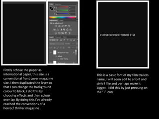
1. Firstly I chose the paper as
international paper, this size is a
conventional front cover magazine
size. I then duplicated the layer so
that I can change the background
colour to black, I did this by
choosing effects and then colour
over lay. By doing this I’ve already
reached the conventions of a
horror/ thriller magazine .
This is a basic font of my film trailers
name, I will soon edit to a font and
style I like and perhaps make it
bigger. I did this by just pressing on
the ‘T’ icon
2. Pristina – 36p Viner Hand – 36P
Traditional Arabic – 36p Mistral - 36p
Informal Roman- 36p
These are some of the fonts I really like and I
could potentially use these fonts for my tag line.
I believe they all meet the conventions of a
horror genre and it will look more creepier after
I’ve designed it to the style I want.
3. I then stroked the 2nd text in a
reddish/brown colour and also contoured it.
With my 3rd text
I left it as white
but put a Inner
shadow inside to
give it more of a
3D effect.
At first I stroked the main text with an
orange colour. This is an iconic colour for
Halloween. Also the text size is 48 and fits
perfectly across the page.
4. I have positioned my tag line at nearly the
bottom of the page inspired by EMPIRE
magazine.
5. I want my actresses name to
feature because it could
demonstrate that she’s new in
the film industry and no one her
just yet hence her name is being
featured. It could also be that
she’s a successful star like Tom
Cruise. Featuring the name is
way of promotion.
As you can see here I’ve already put a
barcode on. I might change it but this
is just to help me figure my text size.
However this is also a conventional
feature for a front cover.
Also the name that’s being featured is
the same style as the film name to
keep the continuity flowing.
6. For the sky line I used the font Cooper STD because I have noticed that the fonts used are usually big and bold to
appeal to the audience instantly. Also because it’s a pug and therefore needs to be catchy. As you can see here I
changed the colour of the font and stroke inside the tagline into purple. This is because the picture I will use to
feature on the front cover, the make up of the girls would be purple. I didn’t want the orange to look odd because
it’s an iconic Halloween colour. As you can also see, I’ve changed the word ‘covers’ to ‘posters’ because I felt as if it
didn’t make sense and also because posters are a freebie in almost any magazine. In the real film magazine of
Empire; there’s two different colours used in the skyline. This could be to demonstrate the importance of the ‘FREE
POSTERS’. I also wanted to demonstrate the importance of my limited edition posters by changing the colour to
purple to match my colour theme.
7. In here I added the conventional plus sign like seen the
Empire magazine. However my plus sign is purple. I also
added sell lines in white, this colour contrasts the black
background nicely. But I don’t like the font ‘Modern No.
20’ so I’m going to change it to something more simple
like seen in the Empire magazine. Photos
I can’t decide if I should put the text;
‘exclusive interview’ on top of the
actresses name or beneath it. I also
wrote the text in the Cooper STD
font same as the skylines font but I
stroked it with purple and also put a
black shadow in to give it that 3D
effect.
8. As you can see here I’m working on my masthead and
trying out different fonts. At first I used was called Algerian
and this is so that I can get the same effect as the picture I
put a white shape around. The stroke was orange to keep
my theme running. I am inspired to create a masthead
with the directors board design inside my font to make it
more professional.
9. I tried to develop my
masthead in the font;
Algerian. I used a red stroke
and made the font bigger in
size 100. I also gave it
shadow so it looks more 3D.
I then used a purple stroke
to see which one looks
better and I personally think
purple looks better.
This font is
Berlin Sans, I
like it
because it’s
bold and big.
I also like this font;
Cooper Black. I also
matched it to the sky
line however I find
these fonts too simple.
I want something more
professional.
10. Here I left the stroke and shadow
from previous and changed the colour
from white to purple. As you can see
in the Empire magazine the colour of
the plus sign is the same as the
masthead. Therefore it’s necessary for
me to keep that convention going.
I then changed the font of the
actresses name in to footlight MT
light because I wanted to see how
the cover looks when it’s simple. If
I’m honest I quite like the name in
white and the font size small
because it looks simple and clean.
As seen on the Entertainment
magazine; Johnny Depp’s name is in
white across the front cover and
therefore I’m slowly meeting the
conventions of a film front cover.
11. As you can see here, I’ve changed the
Colour of the masthead from purple
to white but left my purple stroke.
As I want to design the masthead with
the directors board effects.
I saved a spotlight
picture from google
because I wanted to
experiment how it
would look with
yellow spotlights
around the
masthead. I’m not
really liking it.
I started to fill the
bottom of the
masthead with
spotlights to see if
it looks any better.
However I’m still
not keen on this
design.
12. I then selected all
the spotlight
layers and then
used the vertical
tool, so that the
spotlight is on top
of the masthead
as they’re usually
above of
everything.
I then got rid of my
tag line and
changed the font of
the masthead to
Rockwell extra in
size 90.
I started to move
the cover lines
around the page
to see what looks
better and I quite
like it like this. On
the empire
magazine I am
inspired by, the
plus sign is on the
left side of the
magazine.
This is the colour wheel
which will help me in my
colour theme for the
magazine. As you can see
on this wheel the colour
that contrasts purple is
yellow. However I might
use orange because it’s an
iconic colour for
Halloween and also stands
out from the front cover.
13. I wanted light effects
around my text like this
But instead I watched a YouTube tutorial on
how to get a light effect on text And I ended
up doing this. To do this I clicked on the
‘Filter’ icon then blur and then radial blur I
then got options on how much blur I wanted
so chose the amount of blur; 21, Method;
zoom and the quality best. And this is
the result.
14. As you can see here, I’ve
used the selection tool and
the spot healing brush tool to
make her skin appear
smoother.
I wanted her face to be very sharp
and wanted it to give the
maleficent effect so I got a brush
tool in the colour white, put the
opacity down to highlight her
cheekbones. To blend the
highlights in I used the filter tool,
blur and then Radial blur.
15. I then cropped her out but I found cropping her hair out very difficult
So I had to use the patch tool and fill in the gaps of missing hair.
I also drew over her lips the same colour as my sky line and the plus sign. This
will make her lips look fuller and the face look sharper. To make it look natural I
had to draw shadows on the lips and then blur it out so it the shade blends in.
I also changed her eye colour by
using a paint brush. To do this I had
to put the opacity down to 12% so
that it looks natural and not fake.
Inspired by the empire magazine,
the eye colour matches the theme
of the magazine. There’s also a
change in her eyebrows; I didn’t fill
them in properly so I used a paint
brush again detected the original
colour and shaped them and filled
them in again.
16. I then filtered the picture black and white because I wanted to
see how it would look with the purple eyes and lips just in
colour. To do this I had to filter it first and then draw on the lips
on top of the actual lips and moving the layer on top of the filter
layer. For the eyes I had to un-filter the picture again, I used the
lasso tool cut out the eyes and moved the layer on top of the
black and white layer. I then filtered the picture back to black
and white.
I also fixed her eyeliner because it’s a bit dodgy.
To do this I used a paint brush in a small size and
put the opacity as this allows me to go over the
lines as many times as I want and it also matches
the black and white level.
17. After my research I finalised the price as £4 because in reality film magazines are
very expensive and because a lot of people had chosen £2-£4 in my questionnaire.
In the empire magazine front cover the price and date is always in the masthead of
the letter ‘M’. At first I didn’t have an alphabet that had enough space so I put the
price and date above the masthead on the right an side. However I didn’t like the
look of it so I made the font smaller in the font CoridaUPC and placed it inside the
‘O’ the second alphabet in the masthead like seen on the second alphabet ‘M’ of
the empire magazine.
18. As you can see here I have
added posters above the
masthead like this empire
magazine. I didn’t have any
new pictures so I couldn't
create another poster so
instead I put it at the bottom
with a shape on it.
19. I then out a glow on the plus sign so
that it stands out more. Although it
looks grey that is because it’s white
but the opacity is down. I also made
the ‘exclusive interview’ bigger in
scale and made the actors name
bigger in size so that it looks fuller.
I also added another cover line of
my film title. This chosen font of my
film title is in Lucida handwriting
and that is because in my film trailer
this font has also been used. This
technique is called synergy. The tag
line ‘Reveals..’ is in the same font as
the cover line ‘Zoe Kennington’ this
is so that I keep the continuity as
I’ve already used 3 different fonts
already.
20. Here I added another cover line. The font is the
same as my other cover line and was inspired by
Empire magazine but instead my number is
used to count all the reviews. The 30 has also
got a white glow to keep the continuity with the
plus sign and the plug at the bottom. I also
added this tag line on the right side because
when it’s piled on shelves people will only see
the right side of the magazine so the cover line
has to be appealing.
21. As you can see here I’ve added the price and date above the barcode because it wasn’t
noticeable. I then added text in the sphere shape like seen in the empire front cover I added a
2 in bold text so that the audience are appealed by it.