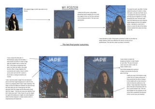
1. MY POSTERThe original image in which was taken on an
iPhone.
I edited the film poster using Adobe
photoshop which enabled me to re scale
the image to focus on the focus and part
of the background which I felt was most
appropriate.
To create the look I was after I further
edited the picture in order to show
that jade is not who she thinks she is ,
I completed this idea by combining
the two pictures together In a mask.
Revealing the main character jade
from the edited picture and using the
bright background from the original
photo. I decided to create this in
order to create the idea of her being
almost isolated from what she knew
as her life.
The two final poster outcomes:
I have decided to make 2 final poster outcomes in order to see what my
target audience finds most effective this will be carried out by a
questionnaire. This will then make my product successful.
I have chosen to make the
background darker in order to give
an eerie feel. The use of the dark
colour was also used in order to
imply a hidden story.
The all dark background is good as
it helps to accentuate the blurred
jade at the top.
I have created the title jade in
Photoshop by using a blurred effect , I
have chosen to do this in order to high-
light the problem later on within the
film. It also helps to emphasise that
jade is not who she really is. By using
the blur effect it helps heighten the
uncertainty and creates a haze in which
can be seen over her life. In which is
found later as being incomplete and
unclear.
I have used the darker image from the darkened
picture and then bright background in order for the
colours to juxtapose which helps create emphasis. This
helps to show the difference between her life and how
she feels about her life. Showing that she feels
disclosed. Both the image and the title works nicely
with the slogan ‘ how do you know your identity if you
don’t know your past’ I have chosen to use this slogan
as it gives the audience an insight into what happens
within the film however it creates mystery which is
emphasised by the faded text.
Credits are used at the bottom using
a italic font as it looks professional . I
have positioned the date of release
in the middle with no text around in
order to draw the audience to the
section. I have especially chosen the
date of the 9th of November 2017 as
this is world freedom day. I felt this
was suitable for the character as she
cannot feel completely free because
of her current issue and situation.