
Recommended
More Related Content
What's hot
What's hot (20)
Similar to Magazine steps
Similar to Magazine steps (20)
Recently uploaded
Recently uploaded (20)
Magazine steps
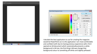
- 1. I decided the best application to use for creating the magazine would be PowerPoint as it is the application I am most comfortable and confident with due to having previous experience with, First I opened an A4 document which automatically presents a white background in A4 size, the first thing I did was change that background colour to something off white and slightly yellowed.
- 2. The reason as to why I chose the off white colour was due to a photograph I had taken, which was quite eerie and I thought would make for a good background , and I wanted to experiment with the opacity to make the background slightly fainter so that all attention and the focus of the viewer would be on the cover star.
- 3. Here is the opacity slider to gain the effect that I was going for. Making the image opacity lower by over 50% allows the background colour to seep through and to tone down the image with it still being noticeable.
- 4. One of the empire magazines that I had looked at and was inspired by was the minimalistic approach Empire took when the release of “Skyfall” saw Empire remove their house colour of red that they are stereotypically known for and opt for a gold colour that contrasts well with the image. I thought a colour similar to this gold would work well with the imagery I have chosen for the magazine so, I used the eyedropper tool to get the exact colour that empire used and began tweaking the colour, slightly choosing a different variation for our magazine.
- 5. Choosing a more formal photo of our featured actress Lizzie was a vital part of the magazine as I didn’t simply want the actress wearing normal clothes I wanted the cover to feel more professional. I used the following tools, Magic Wand, Magnetic Lasso and the eraser tools to carefully remove the background of the photograph leaving just Lizzie.
- 6. After removing Lizzie out of the background, I wanted to remove some of the jagged edges that were somewhat noticeable, I used a soft edge eraser brush and carefully smoothened out any of these edges to give the image a more seamless and professional look. I also used the clone stamp tool and some of the colour slider options to remove the actresses braces and also to brighten up and add more colour to the bouquet of flowers in her hand, I decided to do this as again I wanted the image to look as professional as possible and also wanted the image to really contrast with the background image.
- 7. Following a techniques that seemed prominent in almost all magazines I researched, I followed the same gold used for the Masthead when creating headlines, sub headlines and also a puff for the cover, to advertise other content in the movie which would be advertising upcoming movies and other movie related features such as the Oscars. Using the same colour also allows the text to stand out and grab the readers attention.