1. Audience: Adult in age of 20 – 30
Purpose : To have more volunteer for local orphanage
Skill
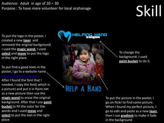
To put the logo in the poster, I
created a new layer and
removed the original background
I used the magic wand. I used
select and move to put the logo To change the
in the right place. background, I used
paint bucket to do it.
To put find a good texts in the
poster, I go to a website name
www.1001freefonts.com.
After I found the font that I
needed, I copy the font( which is
a picture) and put it in Paint.net
as a new picture then use the
magic wand to erase the original To put the picture in the poster, I
background. After that I use paint go on flickr to find some picture.
bucket to fill the color for the When I found my perfect picture, I
words and I used move and go to edit and paste as a new layer,
select to put the text in the right then I use gradient to make it fade
place in the background
2. Good Balance
My poster is balance
because I use layer
like for the logo,
background, words,
picture.
Good Color
In the background I use black
so people can see the focal Get Attention
point better because mostly I use the focal point where I
many thing stand out in black. tried to get people attention
The texts I used kind of same like the picture and I tried to
color because I don’t want put something important
people just see in my poster bigger.
only 1 color so it is really
boring.
Fantastic Font
I put a big font but
not complicated
font so people can Simple
easily read I had tried to kept it as
simple as I can like tried to
Graphic Design put only little picture and
words