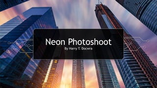
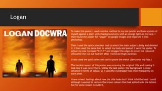
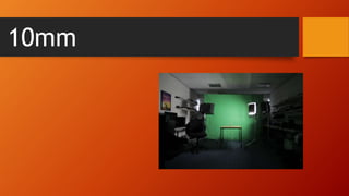
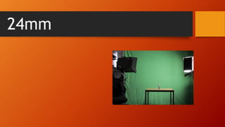
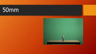
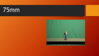
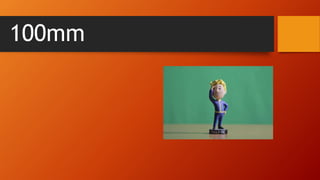
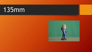
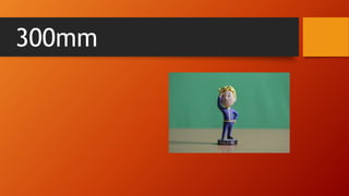
Photoshoot Experiments
By Harry T. Docwra
Shutter Speed
Low Shutter Speed Medium Shutter
Speed
High Shutter speed
Aperture
Medium Aperture in bright
light
Low Aperture in low light Failed attempt using low
Aperture
ISO
Low ISO Failed attempt with medium ISO Low ISO
Neon Photoshoot
By Harry T. Docwra
What we did?
• To create the images we placed to lights on each side of the subjects face. One
light was red, the other one blue. We shot the photos in an ISO of 200.
• I like how the photos turned out in the end. There is a good contrast of light
and dark thanks to the neon lights. I think they almost look like film posters like
the blue and red are good representations of the good and bad sides of our
characters.
Photoshop
Experiments
By Harry T. Docwra
Jaws
To make this poster I took an image of the upper part of my body against a plain white
background with a blue light being lit on my face. I then exported it from the card on
to the computer and into photoshop.
I saved the poster from google images, and removed the shark by using the “quick
selection tool” in photoshop, selecting the shark and then removing it. I then created
a new page in photoshop and used the same tool to remove my head from that image
and onto the page with the jaws poster on.
Replacing the title was easy as the background was very undetailed so all I had to do
was paint the upper top of the image plain white and write my name over it.
I looked for the font the original poster used on dafont.com. However I couldn’t find
it so I decided to use one of the fonts that were on photoshop.
(I added in the go-a-head bar as a nod to them being my favourite biscuit)
One of the most precisely detailed things I had to do for this photo was add in the
colour of the sea through the lines between my hairs. I did this by using the
“eyedropper tool” which selects the colour of the sea or any area you put it over, I
then used the paint tool to paint the areas between my hairs to make it look more
like I was underwater.
Logan
To make this poster I used a similar method to my last poster and took a photo of
myself against a plain white background only with an orange light on my face. I
then found the poster for “Logan” on google images and imported it into
photoshop.
Then I used the quick selection tool to select the main subjects body and deleted
it, I then used the same tool to select my body and pasted it onto the poster. To
adjust my size I pressed “Ctrl-T” and dragged the edges to cover the coloured
silhouette the cut out had left after I removed Hugh Jackman.
(I also used the quick selection tool to paste the metal claws onto my fists.)
The hardest aspect of this poster was removing the original title and making it
look like it was never there. Unlike the last poster, the background is more
detailed in terms of colour, so I used the eyedropper tool more frequently on
each pixel.
I have mixed feelings about how the title looks but I think I did the best I could
although I wanted to remove the brown colours that had spilled onto the letters
but for some reason I couldn’t.
What we did?
• To create the images we placed to lights on each side of the subjects face. One
light was red, the other one blue. We shot the photos in an ISO of 200.
• I like how the photos turned out in the end. There is a good contrast of light
and dark thanks to the neon lights. I think they almost look like film posters like
the blue and red are good representations of the good and bad sides of our
characters.
Fallout boy photoshoot
10mm
18mm
24mm
35mm
50mm
75mm
100mm
135mm
300mm

Unit 7 & 34 Photoshoot experiments

  • 1.
  • 2.
    Shutter Speed Low ShutterSpeed Medium Shutter Speed High Shutter speed
  • 3.
    Aperture Medium Aperture inbright light Low Aperture in low light Failed attempt using low Aperture
  • 4.
    ISO Low ISO Failedattempt with medium ISO Low ISO
  • 5.
  • 7.
    What we did? •To create the images we placed to lights on each side of the subjects face. One light was red, the other one blue. We shot the photos in an ISO of 200. • I like how the photos turned out in the end. There is a good contrast of light and dark thanks to the neon lights. I think they almost look like film posters like the blue and red are good representations of the good and bad sides of our characters.
  • 8.
  • 9.
    Jaws To make thisposter I took an image of the upper part of my body against a plain white background with a blue light being lit on my face. I then exported it from the card on to the computer and into photoshop. I saved the poster from google images, and removed the shark by using the “quick selection tool” in photoshop, selecting the shark and then removing it. I then created a new page in photoshop and used the same tool to remove my head from that image and onto the page with the jaws poster on. Replacing the title was easy as the background was very undetailed so all I had to do was paint the upper top of the image plain white and write my name over it. I looked for the font the original poster used on dafont.com. However I couldn’t find it so I decided to use one of the fonts that were on photoshop. (I added in the go-a-head bar as a nod to them being my favourite biscuit) One of the most precisely detailed things I had to do for this photo was add in the colour of the sea through the lines between my hairs. I did this by using the “eyedropper tool” which selects the colour of the sea or any area you put it over, I then used the paint tool to paint the areas between my hairs to make it look more like I was underwater.
  • 10.
    Logan To make thisposter I used a similar method to my last poster and took a photo of myself against a plain white background only with an orange light on my face. I then found the poster for “Logan” on google images and imported it into photoshop. Then I used the quick selection tool to select the main subjects body and deleted it, I then used the same tool to select my body and pasted it onto the poster. To adjust my size I pressed “Ctrl-T” and dragged the edges to cover the coloured silhouette the cut out had left after I removed Hugh Jackman. (I also used the quick selection tool to paste the metal claws onto my fists.) The hardest aspect of this poster was removing the original title and making it look like it was never there. Unlike the last poster, the background is more detailed in terms of colour, so I used the eyedropper tool more frequently on each pixel. I have mixed feelings about how the title looks but I think I did the best I could although I wanted to remove the brown colours that had spilled onto the letters but for some reason I couldn’t.
  • 11.
    What we did? •To create the images we placed to lights on each side of the subjects face. One light was red, the other one blue. We shot the photos in an ISO of 200. • I like how the photos turned out in the end. There is a good contrast of light and dark thanks to the neon lights. I think they almost look like film posters like the blue and red are good representations of the good and bad sides of our characters.
  • 12.
  • 13.
  • 14.
  • 15.
  • 16.
  • 17.
  • 18.
  • 19.
  • 20.
  • 21.