Fall Out Boy's Digipak Analysis for Infinity On High
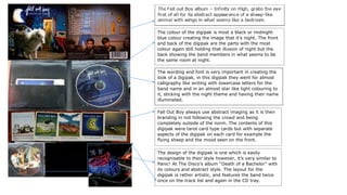
1. The colour of the digipak is most a black or midnight
blue colour creating the image that it’s night. The front
and back of the digipak are the parts with the most
colour again still holding that illusion of night but the
back showing the band members in what seems to be
the same room at night.
The wording and font is very important in creating the
look of a digipak, in this digipak they went for almost
calligraphy like writing with lowercase letters for the
band name and in an almost star like light colouring to
it, sticking with the night theme and having their name
illuminated.
Fall Out Boy always use abstract imaging as it is their
branding in not following the crowd and being
completely outside of the norm. The contents of this
digipak were tarot card type cards but with separate
aspects of the digipak on each card for example the
flying sheep and the mood seen on the front.
The design of the digipak is one which is easily
recognisable to their style however, it’s very similar to
Panic! At The Disco’s album “Death of a Bachelor” with
its colours and abstract style. The layout for the
digipak is rather artistic, and features the band twice
once on the track list and again in the CD tray.