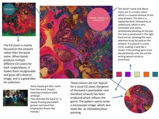
The document discusses several CD and album covers, analyzing their visual design elements and artistic styles:
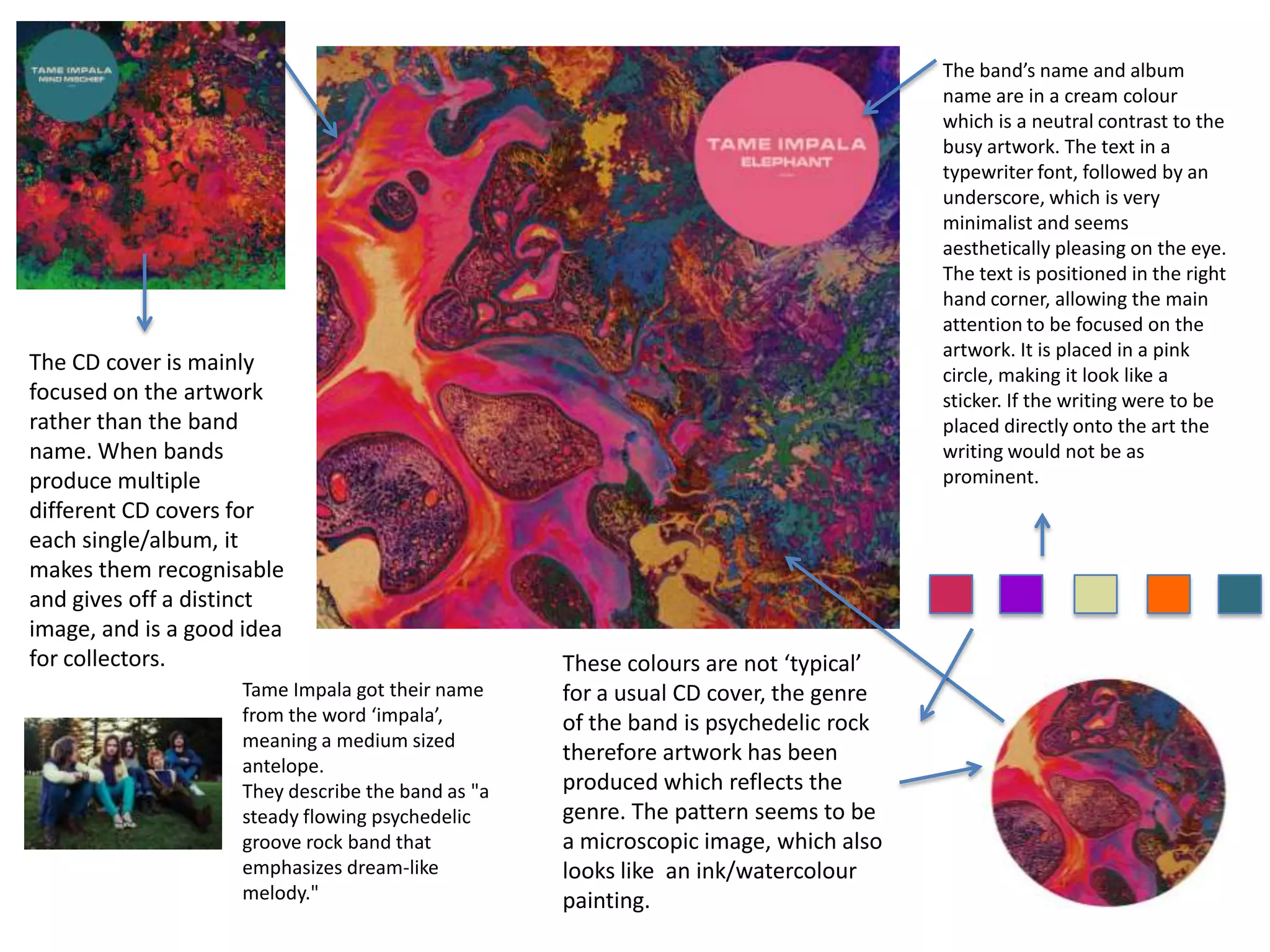
- The Tame Impala cover features psychedelic artwork in a cream palette with minimalist text, allowing the art to be the focus.
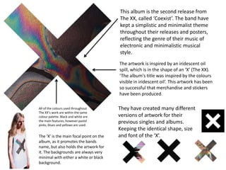
- The XX cover depicts an iridescent oil spill in the shape of an X, reflecting their minimalist electronic style. Their consistent use of a limited black/white/pastel color palette and the X logo builds recognition.
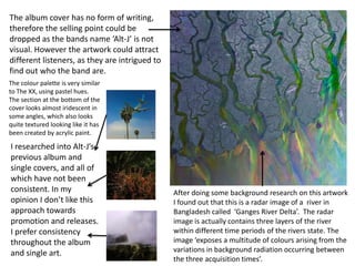
- The Alt-J cover has no text, relying on intriguing pastel artwork to attract listeners without identifying the band. In contrast to The XX's consistency, Alt-J's covers have not followed a single approach.
-