Deconstructing Brands - A Branding WorkshopThe Mechanism
The Mechanism's Dave Fletcher discusses the "8 Elements of Successful Branding" with examples and video from globally renowned brands. Originally presented at the North Alabama Chapter of the Public Relations Council of Alabama as part of a branding workshop on September 21, 2011.
Critical Evaluation (February 2014) slides. Delivered as part of the Durham University Researcher Development Programme. Further Training available at https://www.dur.ac.uk/library/research/training/
The Roman Empire A Historical Colossus.pdfkaushalkr1407
The Roman Empire, a vast and enduring power, stands as one of history's most remarkable civilizations, leaving an indelible imprint on the world. It emerged from the Roman Republic, transitioning into an imperial powerhouse under the leadership of Augustus Caesar in 27 BCE. This transformation marked the beginning of an era defined by unprecedented territorial expansion, architectural marvels, and profound cultural influence.
The empire's roots lie in the city of Rome, founded, according to legend, by Romulus in 753 BCE. Over centuries, Rome evolved from a small settlement to a formidable republic, characterized by a complex political system with elected officials and checks on power. However, internal strife, class conflicts, and military ambitions paved the way for the end of the Republic. Julius Caesar’s dictatorship and subsequent assassination in 44 BCE created a power vacuum, leading to a civil war. Octavian, later Augustus, emerged victorious, heralding the Roman Empire’s birth.
Under Augustus, the empire experienced the Pax Romana, a 200-year period of relative peace and stability. Augustus reformed the military, established efficient administrative systems, and initiated grand construction projects. The empire's borders expanded, encompassing territories from Britain to Egypt and from Spain to the Euphrates. Roman legions, renowned for their discipline and engineering prowess, secured and maintained these vast territories, building roads, fortifications, and cities that facilitated control and integration.
The Roman Empire’s society was hierarchical, with a rigid class system. At the top were the patricians, wealthy elites who held significant political power. Below them were the plebeians, free citizens with limited political influence, and the vast numbers of slaves who formed the backbone of the economy. The family unit was central, governed by the paterfamilias, the male head who held absolute authority.
Culturally, the Romans were eclectic, absorbing and adapting elements from the civilizations they encountered, particularly the Greeks. Roman art, literature, and philosophy reflected this synthesis, creating a rich cultural tapestry. Latin, the Roman language, became the lingua franca of the Western world, influencing numerous modern languages.
Roman architecture and engineering achievements were monumental. They perfected the arch, vault, and dome, constructing enduring structures like the Colosseum, Pantheon, and aqueducts. These engineering marvels not only showcased Roman ingenuity but also served practical purposes, from public entertainment to water supply.
Synthetic Fiber Construction in lab .pptxPavel ( NSTU)
Synthetic fiber production is a fascinating and complex field that blends chemistry, engineering, and environmental science. By understanding these aspects, students can gain a comprehensive view of synthetic fiber production, its impact on society and the environment, and the potential for future innovations. Synthetic fibers play a crucial role in modern society, impacting various aspects of daily life, industry, and the environment. ynthetic fibers are integral to modern life, offering a range of benefits from cost-effectiveness and versatility to innovative applications and performance characteristics. While they pose environmental challenges, ongoing research and development aim to create more sustainable and eco-friendly alternatives. Understanding the importance of synthetic fibers helps in appreciating their role in the economy, industry, and daily life, while also emphasizing the need for sustainable practices and innovation.
Ethnobotany and Ethnopharmacology:
Ethnobotany in herbal drug evaluation,
Impact of Ethnobotany in traditional medicine,
New development in herbals,
Bio-prospecting tools for drug discovery,
Role of Ethnopharmacology in drug evaluation,
Reverse Pharmacology.
We all have good and bad thoughts from time to time and situation to situation. We are bombarded daily with spiraling thoughts(both negative and positive) creating all-consuming feel , making us difficult to manage with associated suffering. Good thoughts are like our Mob Signal (Positive thought) amidst noise(negative thought) in the atmosphere. Negative thoughts like noise outweigh positive thoughts. These thoughts often create unwanted confusion, trouble, stress and frustration in our mind as well as chaos in our physical world. Negative thoughts are also known as “distorted thinking”.
The French Revolution, which began in 1789, was a period of radical social and political upheaval in France. It marked the decline of absolute monarchies, the rise of secular and democratic republics, and the eventual rise of Napoleon Bonaparte. This revolutionary period is crucial in understanding the transition from feudalism to modernity in Europe.
For more information, visit-www.vavaclasses.com
Read| The latest issue of The Challenger is here! We are thrilled to announce that our school paper has qualified for the NATIONAL SCHOOLS PRESS CONFERENCE (NSPC) 2024. Thank you for your unwavering support and trust. Dive into the stories that made us stand out!
Operation “Blue Star” is the only event in the history of Independent India where the state went into war with its own people. Even after about 40 years it is not clear if it was culmination of states anger over people of the region, a political game of power or start of dictatorial chapter in the democratic setup.
The people of Punjab felt alienated from main stream due to denial of their just demands during a long democratic struggle since independence. As it happen all over the word, it led to militant struggle with great loss of lives of military, police and civilian personnel. Killing of Indira Gandhi and massacre of innocent Sikhs in Delhi and other India cities was also associated with this movement.
Instructions for Submissions thorugh G- Classroom.pptxJheel Barad
This presentation provides a briefing on how to upload submissions and documents in Google Classroom. It was prepared as part of an orientation for new Sainik School in-service teacher trainees. As a training officer, my goal is to ensure that you are comfortable and proficient with this essential tool for managing assignments and fostering student engagement.
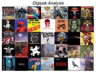
2. Digipak Analysis 1
Label: The Far Out Recoding Company
Format: CD, Single
Country: UK
Released: 1994
Genre: Rock
Style Indie Rock
The Wonder Stuff- Unbearable
The cover includes a minimal number of colurs
that are generally black, white and different
shades of yellow, this pallet of colurs continues
onto the back of the CD and the CD itself. The
band name is clear and the band name is clearly
visible. It is important to note that the bands name
is in a specific style of font and positioned on all
of the bands albums which creates their bands
title into a memorable logo that their audience
look for when purchasing their CD’s and therefore
buying into their record label. The picture of the
young boy is associated to the album and acts as
a memorable piece of branding and motif that is
evident on the front and back of the CD packaging
as well as the CD. The bands element of the
young boy grinning helps to create a character
and set the atmosphere for the music inside,
which helps to attract the audience to the album.
The picture of the boy is dominating and
attractive, the album name is presented in capital
letters in an old fashioned typewriter style to add
the authenticity of the CD as a whole and the
bands image.
The colour-scheme of the front and back of the
CD as well as the CD is designed to look older
then the album is actually is giving it an indie and
vintage finish which reflects the song featured
and the music style of the band. The style of the
digipak attracts The Wonder Stuff target
audience as it appeals to their tastes through
being different and indie. The CD itself shares
the colour of the front and back of the CD cover
and follows the simplistic design. The CD has the
bands logo and the albums featuring picture
made smaller, which is an occurring motif across
the digipak as well as the record label, legal
jargon, stereo- requirement information and the
CD code. I feel the CD work well with the bands
image and the front and the back of the digipak
as it follows the same colour pallet e and minimal
styling whilst staying in direct connection with the
bands target audience.
The back of the digipak follows the the colour
scheme and visual styling of the front cover
with black dirt marks spotted around the the
design. This CD is different to others as the
song listing or timings are not included on the
back. What is included is the albums motif, the
band name/logo the barcode, legal jargon, the
producers of the album and the record label.
This simplistic approach of the back of the
digipak follows the trend of the front and CD
parts of the digipak. Throughout the digipak the
band name and logo stands out due to the
contrast of colour such as the font in black with
a yellow background and the font in yellow with
the background in black. This means a visual
style is followed which the audience recognise.
3. Digipak Analysis 2
The Smashing Pumpkins- Adore
Genre: Rock
Style: Alternative Rock
Released: 1998
The colour palette of the front of the digipak features
monochrome colours to create a sombre and
depressing impression on the audience when
purchasing the CD and also conveys a deeper
meaning to what is included within the CD. This
monochrome colour palette continues throughout the
digipak and in my opinion ios very effective. The front
features one large dominating picture of an almost
vampire girl with pure white skin and solid black hair.
The female looks seductive due to her eyes that are
looking directly at the fourth wall which helps to draw
in and attract the audience. The long wavy dress of
the female has connotations of freedom due to the
dress being wavy and unrestrictive which reflects The
Smashing Pumpkins style of music and the audience
that listen to their music. The album font styling is
also loose and not structured which gives the visual
style that the font is floating. The font is also smooth
and delicate. The front of the digibak differentiates to
other mainstream albums as the CD does not display
the bands name but does on the back in the small
print in the form of a spine.
The back of the CD digipak shows an old and
blurred image that appears to of being purposely
given the effect of looking damaged with horses
that appear to be pulling a carriage in an old
Victorian style street. The back of the digipak
matches the front cover due to the sombre and
depressing colour pallet used that features little
hope creating a depressing feeling to the product
which the audience will recognise when
purchasing the product. The back of the digiback
like the front has a minimalistic design with no
track listing or timings but has got the record
label, the producer, the barcode and legal jargon
aswell of the band name and album title and
catalogue number in the form of a spine to the
left and the right CD back.
The CD itself is minimalistic with Monochrome
colours that match the front and back of the
digiback. The CD is a black colour with cream
writing for the album and band name which
makes it stand out and they are both inlarger
font compared to the other information on the
CD. Other information on the CD inlcudes the
albums record label and legal jargon. The
darkness and somberness of the front, back and
CD of the digipak are directly connected that
create a visual style and image for the The
Smashing Pumpkins audience. Throughout the
digipak the dominant colours are black and white
which is reflected in the font which is white on a
black background which make the information
being provided on the digipak clear to the
customer.
4. The monochrome colours continue inside the
digpack, the colours palette of the digipak is almost
identical throughout with little variation which
continues the theme of the digipak and makes the
visual style evident to the bands audience. Inside,
the disk impression in in front of another black and
white picture of a male that takes on the form of a
dead body but is open to interpreation from the
individual. The pictures used throughout the digipak
are sombre and depressing due to no happiness or
positive energy beings evident in the styling and
editing of the images which is a recurring motif for
the Adore digipak used by the band to reflect the
emotions and mood of themselves and the songs
within.
Within the inside of the digipak there is a band
information section that is in the from of a booklet.
The booklet includes abstract uses of photography
that coveys a deeper meaning to the album by
using pictures of band members and varieties of
mise en scene that different from mainstream rock
bands to reflect some of the songs meanings. The
booklet also includes the lyrics to all of the songs
that are presented in a number of different ways
and fonts.
The pictures of the band within the digipak band
information booklet represent the bands feeling and
emotions. This is conveyed through focusing on the
bands facial expressions during the photo-shoot
using only close up and mid shots. The band
photographs are in direct connection to the rest of
the digipak due to the matching colour pallet and
ambiguity and uncertainty surround all of the
pictures used in the digipak.
5. Digipak Analysis 3
The Cranberries- No Need To Argue
Genre: Rock
Style: Alternative Rock, Pop Rock, Ballad
Year: 1994
The Cranberries, No need to argue album front is very lights
with a mixture of pastille colours that makes the front look
inviting and warming to the their audience. The band is
positioned in the centre of the album front sitting on a sofa,
making them the centre of the audiences attention when
purchasing the CD. The cranberries present their record label
through the band being evident on the front of the digipak and
their band name that stands out on the white background in
bold writing and the album name in smaller writing just below.
The album name is in softer writing in a handwriting stable
reflecting the music that is featured in the album. The softness
of the writing works well with the picture and the pastille
colours.
The back of the digipack is very informative to the audience as
it features the tracks on their album and the timings. The back
also features other relevant information to the album such as
the barcode, record label, and legal jargon. The back of the
digipak differentiates from the front as it is in grey scale
meaning there is no connection between the front and the back
of the digipak. The use of grey-scale creates a darker and
gloomier feel to the digibpck that may be used to represent
some of the darker meanings of the songs on the album.
However, the picture features the lead singer, Dolores looking
over a mountain giving the connotations of hope and new
horizons that the band may hope this album will provide for
them. The back view of the digipak also makes the bands
record label clear through the recurring use of the bands name
and album name as well as the catalogue number in the spine
of the digipak.
The CD part of the digipak continues the motif of
the sofa that appears on the front, with similar
colours to the front of the digipak which creates a
recurring visual style. The CD is rather simple and
features little information, the CD only includes
legal jargon, record labels and production
information.
Inside the digipak there is a small booklet that includes the song names, the bands
members parts within the music album., legal jargon, record labels and crediting to the
directors and producers of the album. The booklet part of the digipak is in pastille
colours that looks delicate and structured to the eye
7. Magazine Album Advert Analysis 1
Kasabian- The Debut Album
I have looked at many magazine adverts and
have found Kasibian- The Debut Album which I
feel is very effect due to the colour contrasts of
white and black which makes the whole poster
standout. The poster on a whole works well due
to the simplicity and contrasts of colour in the
poster. The magazine adverts picture is striking
and effective as it has references to gang culture
and is also a Kasibian recurring motif in relation
to the album which works alongside the harsh
and sharp font that is all in capital letters and
makes all of the information being displayed on
the magazine advert standout to the band
audience. The focus points for information of the
poster when first viewing it is the bands name as
it is in large dominating writing, secondly the
bands album also attracts the audiences
attention. The poster is advertising Kasabian’s
new album and includes informative information
such as the bands website, the singles that the
album includes and limited edition items which
encourage the audience to purchase the album.
8. Magazine Album Advert Analysis 2
Evanescence- Haunted
I was attracted to Evanescence’s, haunted magazine album
advert due to the rock genre conventions that the magazine
possesses which is evident to the audience from the start.
The first thing that attracts the attention of the audience is
Amy Lee's face in an animated form where her eyes attract
the audience to the advert due to her blue eyes looking
straight at the fourth wall and therefore the audience which
attracts their attention. Amy Lee’s eyes also attract the
audience as they are blue and stand out in the otherwise
black and white magazine album advert. The use of black
and white makes the picture and the writing stand out to the
audience meaning the information that the band is passing
on to the audience is clear and easily accessible. The
information included on the magazine album advert includes
the band name in the form of their logo/motif that recurs
across all of the bands work, the album name, information
that the special edition album is now available, social media
and website information and finally a review from an
acclaimed rock magazine. The use of the social media links
being added means that the audience can find out more
information about the band and the release of their album
with ease. The review from Kerrang (acclaimed rock
magazine) encourages the audience to purchase the album
as it is described at ‘Their best album to date!’.
9. Magazine Album Advert Analysis 3
Kings of Leon- Only By The Night
The Kings of Leon album- Only By The Night album is
attractive to the audience due to the striking and also
confusing picture that dominates the magazine album advert.
The picture appears to be a man with an eagle layered onto
the band members faces that is made of four different
pictures. The audience of the band would be attracted to this
advert due to the complexity of the image that has a yellow
and brown tint to it which makes the picture appear to be
aged but still detailed. At the top of the image is the bands
name in capital letters making the bands record label clear to
the audience. The bands album they are advertising is also
clear to the audience as that is in a big font like the bands
name in capital letters and also in a different colour to the
rest of the advert making it stand out. Other information that
is included is the singles the album includes and the release
date in red which is again is the only information presented in
this colour making it clear to the audience. The information
being presented is easily accessible and visualised to the
audience due to the different colours being used to mark
different information and the use of a dominant font in capital
letters. The magazine album also included the bands website
where fans can access even more information about the
band and the album which increases the chances of
purchases due to the extended information supplied to the
audience by Kings of Leon.
10. Reflection of Digipak and Magazine
Album Advert analysis
Reflection of digipak analysis: Through analysing digipaks I have learnt
the important of colour regarding coordination to create a visual style
and the contradiction of colour to make important information stand out
to the audience. I have also learnt that it is important to have a recurring
motif across the digipak to reinforce and consolidate the bands record
label and band image. The use of different fonts and font size as well of
the layout of the digipak is also vital to get right to ensure the digipak is
aesthetically pleasing to the audience and meets their tastes which
encourages purchases of the album.
Reflection of magazine album advert analysis: Through analysing
magazine album adverts I have learnt the important of attracting the
bands audience through the use of dominant images and use of bold
fonts that all contribute to this. The use of different colours is also vital to
the success of the advertisement as different colours work well together
to make certain parts of information clear and easily visible to the
audience of the band. The use of reviews and social media on the
advertisement is also important as it helps to attract audience members
and encourage purchases. Another aspect that is significant in a
magazine album advert is that the bands record lable and style must be
made clear to their audince.