
Recommended
More Related Content
What's hot
What's hot (20)
Viewers also liked
Viewers also liked (14)
Similar to Analyzing Digipak Covers of Indie Pop Band Seafret
Similar to Analyzing Digipak Covers of Indie Pop Band Seafret (20)
Recently uploaded
Recently uploaded (20)
Analyzing Digipak Covers of Indie Pop Band Seafret
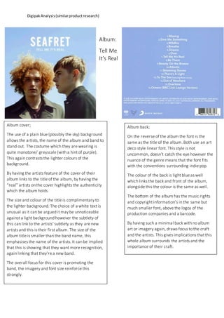
- 1. DigipakAnalysis(similarproductresearch) Album: Tell Me It’s Real Album cover; The use of a plain blue (possibly the sky) background allows the artists, the name of the album and band to stand out. The costume which they are wearing is quite monotone/ greyscale (with a hint of purple). This again contrasts the lighter colours of the background. By having the artists feature of the cover of their album links to the title of the album, by having the “real” artists on the cover highlights the authenticity which the album holds. The size and colour of the title is complimentary to the lighter background. The choice of a white text is unusual as it can be argued it may be unnoticeable against a light background however the subtlety of this can link to the artists’ subtlety as they are new artists and this is their first album. The size of the album title is smaller than the band name, this emphasises the name of the artists. It can be implied that this is showing that they want more recognition, again linking that they’re a new band. The overall focus for this cover is promoting the band, the imagery and font size reinforce this strongly. Album back; On the reverse of the album the font is the same as the title of the album. Both use an art deco style linear font. This style is not uncommon, doesn’t catch the eye however the nuance of the genre means that the font fits with the conventions surrounding indie pop. The colour of the back is light blue as well which links the back and front of the album, alongside this the colour is the same as well. The bottom of the album has the music rights and copyright information’s in the same but much smaller font, above the logos of the production companies and a barcode. By having such a minimal back with no album art or imagery again, draws focus to the craft and the artists. This gives implications that this whole album surrounds the artists and the importance of their craft.
- 2. DigipakAnalysis(similarproductresearch) Ep – Oceans Album cover: This cover is very minimal, it has a similar palette to the previous cover of “Tell Me It’s Real” with blues and dark colours being used. The image itself is linking indirectly to the title. The colour and use of water gives the impression of looking out of a window, possibly looking out to sea. The same font, size and positioning of the band’s name is used on this ep cover. The only difference is that the colour has changed to black. This makes the wording stand out more and draws attention to the unidentifiable blurred shapes. It also gives links to the origin of the band’s name as ‘Seafret’ which is popular local name for sea fog, common in spring and summer in Cornwall and on the south, east, and north-east coasts of England I could not find any images of the back of this ep however it can be implied from their previous cover and back that this will be basic and focusing on the song names (above) and again. the craft.