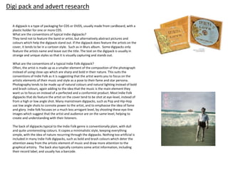
This document discusses conventions of indie digipacks and album artwork. It provides examples of digipacks from indie folk artists such as Of Monsters and Men, The Lumineers, and Fleet Foxes. The digipacks typically feature muted colors, natural photography, and minimal text. Album artwork is also summarized, showing posters for Gabrielle Aplin, The XX, and Haim that keep designs simple with a focus on the music.
Winning Shots from Siena International Photography Awards 2015
Digipack and advert research
1. Digi pack and advert research
A digipack is a type of packaging for CDS or DVDS, usually made from cardboard, with a
plastic holder for one or more CDS.
What are the conventions of typical Indie digipacks?
They tend not to feature the band or artist, but alternatively abstract pictures and
colours which help the digipack stand out. If the digipack does feature the artists on the
cover, it tends to be in a cartoon style. Such as in Blurs album. Some digipacks only
feature the artists name and leave out the title. The text on the digipack is usually in
strange and unique styles so that it is visually capturing and stands out.
What are the conventions of a typical Indie Folk digipack?
Often, the artist is made up as a smaller element of the composition of the photograph
instead of using close ups which are sharp and bold in their nature. This suits the
conventions of Indie Folk as it is suggesting that the artist wants you to focus on the
artistic elements of their music and style as a pose to their fame and star persona.
Photography tends to be made up of natural colours and natural lighting instead of bold
and brash colours, again adding to the idea that the music is the main element they
want us to focus on instead of a perfected and a conformist product. Most Indie Folk
digipacks that do feature the artist on the cover tend to be shot at eye-level, instead of
from a high or low angle shot. Many mainstream digipacks, such as Pop and Hip-Hop
use low angle shots to connote power to the artist, and to emphasise the idea of fame
and glory. Indie folk focuses on a much less arrogant level, by shooting these eye-line
images which suggest that the artist and audience are on the same level, helping to
create and understanding with their listeners.
The back of digipacks typical to the Indie Folk genre is conventionally plain, with dull
and quite uninteresting colours. It copies a minimalistic style, keeping everything
simple, with the idea of nature recurring through the digipacks. Nothing too artificial is
included in many Indie Folk digipacks, such as bold and brash colours which deter the
attention away from the artistic element of music and draw more attention to the
graphical artistry. The back also typically contains some artist information, including
their record label, and usually has a barcode.
2. This first cover of a digipack belongs to Indie Folk
group-Of Monsters and Men. This is conventional of
the genre, as we can see that it consists of very dull,
unsatured colours. It is in a black and white style, and
is not eye catching, nor visually very interesting,
which suggests the artists want their audience to
focus more on the musical artistry. Furthermore, it
also contains natural photography, the inside of the
letters appear to show images of rocks, and natural
land formations. As I saw in my research from Indie
Digipacks, the cover does not contain a title but
simply the initialised outlines of the group’s name.
This keeps a minimalistic design and allows them to
display only the essential information.
Examples of some Indie Folk Digipacks:
Gabrielle Aplin is the artist of the song that we have chosen for
our music video; therefore I thought it would be wise to look at
an example of one of her digipacks. I find this one interesting,
from how there is a combination of black and white effects with
the pastel colours in certain overlay elements of the pictures
such as the umbrella and the balloons. The setting in the
background of the images is all within natural scenery, such as
fields, with the sky and clouds clearly in view. The monochrome
colours suggest that the artists aim is to draw our attention to
the pastel colours within the image.
3. This digipack cover is from the Lumineers album. The recurring
theme throughout looking at these covers has been of dark and
dull colours. Again, this digipack cover is based around black and
white colours. The image is very quirky, and appears to be an
image taken in the past or sometime in modern history. The
cover is kept minimalistic, possibly done deliberately to keep the
attention on the musical artistry. As I discussed in my evaluation
of Indie Digipacks, only the band’s name is written on the cover,
and the name of the album is left out, therefore fitting with these
conventions. Furthermore, the photography looks more
spontaneous than staged which again is conventional for this
genre, which tries to stay away from fakery and appearing
superficial.
This is the back cover of a digipack from fleet foxes. The
text on the back is very large and the text resembles
something that would have been a recognizable font in
the Tudor days. The text runs over onto the next line
regardless of whether the song title has finished being
written fully. This represents the alternative style of the
music within the album. Furthermore, the image from the
front of the digipack runs over onto the back, again
another of the quirky features that is conventional for
alternative genres. The back is kept relatively minimalistic
in its design as it is simply text apart from the run over of
the image.
4. This is the back of Noah and the Whales digipack. This is
less minimalist than the typical styles, as it I not just plain
but features an image. However this image is typical of
the Indie Folk genre, from the styling to the
scenery/setting. The colours used create a stark contrast,
with the colours at the bottom being dark (black) and the
colour at the top, which is the sky, being white. The image
has also been edited with a vintage like effect, which is
becoming more conventional within the Indie Folk genre.
The barcode is unconvnetially displayed at the top, with
all legal information such as record company, date of
publication etc. displayed on the bottom.
The colours featured on the back of this digipack are dull
and vintage styled. The writing is in white which allows it
to stand out above the sombre background. Again, the
theme within the picture is a natural setting. The barcode
is conventionally displayed at the bottom of the digipack,
with the signature logo/band name displayed above the
text of the songs.
5. Why have I chosen ‘Spirits’ as the title of my album?
One of the definitions I found on the internet for spirits is: the non-physical part of a person which is the seat of emotions and character; the soul.
This album and our song choice is heavily based upon the emotions of the character and is very reminiscent about the past, such as in our music video:
‘please don’t say you love me’ which includes flashbacks to the artists memories with her childhood best friend and soon to be lover. Spirits doesn’t
focus on physical beings and therefore removes the superficial factors of human life and strips things back to the spiritual side of life. Therefore, it is
conventional for the genre, which doesn’t like focussing on the superficial factors of the music production process, such as extravagant appearances,
and publicity stunts, but actually the words and overall, general messages that come from the songs which are portrayed subtly in the music.
6. The main artistic feature of this advert is of the central image
of Lana, the artist. The image is very symmetrical such as the
pockets on her shirt which create an aesthetically pleasing
image. The colours used link to the natural themes
throughout the digipacks I have analysed and the general style
conventions from the genre such as a natural setting. These
colours are white, blue and greens, all natural colours which
we can link to the environment. The title of the artist is the
main centre of visual interest within the poster, and is
displayed in white which is striking above the blue
background. The vital information is given on the poster such
as the album release date. I like the design of this poster as it is
striking yet still keeps a simple design and is relative to the
conventions of the genre.
This poster boasts a minimalistic design. It is kept simple
through its use of colours, such as a relatively plain and
naturalistic background with a splash of colour in the umbrella,
to make the image visually stimulating and interesting. The font
style is complementary to Gabrielle Aplins persona and musical
attributes. The essential information is displayed conventionally
at the bottom of the poster, such as the date of release and the
songs included on the album. The poster consists of nothing too
striking and therefore matches the conventions of Indie Folk by
keeping attention focussed on the music and not the superficial,
artistic and design factors of the album.
7. The main artistic feature of this poster is
the large X symbol which consists of an
abstract pattern. It is an unusual design,
therefore eye catching, whilst still
keeping the poster minimalistic. The xx
is displayed on both posters which
informs those who are unaware of the
symbol and the band, as well as
important information on the 2nd poster.
Apart from the symbolic X, the poster is
kept blank and therefore links to the
indie folk genre as it is keeping the
attention on the music by not distracting
from it with bold and brash designs.
This poster by Haim uses a typical Indie Folk style
appearance. For example, the colours are mainly dull and
dark colours, with nothing too brash or outstanding to the
eye. For example, a black and white image is used on the
poster, which covers half of the page. The title ‘Haim’ is
displayed in a baby pink colour which perhaps represents the
female sex of the women in the band, instead of keeping it
‘boyish’ by using a blue or white colour for the title. The
essential information is displayed below in a stylish and clear
font, with the most important text displayed slightly larger
than some of the rest. The image is conventional of the
genre, as the nature of it is quite abstract, we can’t easily
infer what the image is of and what the artists are meant to
be doing in the image. Furthermore, the poster is kept
relatively minimalistic, with lots of empty space surrounding
the black background. It incorporates a vintage style and feel
by the editing that is used in the image and the black and
white scheme used throughout.
8. This Mumford and Sons poster incorporates an interesting
design into the poster. The colours used such as the green are
representative of the idea of nature and the outdoors,
conventional of the Indie and Indie Folk genre in particular.
The text is visually capturing, as it is bold, and displayed over a
white background which is separated off by a white bubble.
This makes the text stand out more than if it was presented
above the green background, therefore making the poster
more effective for its purpose. The style of the poster makes it
look like the poster is strung up with pegs, giving more of an
artistic and alternative look to the poster than the others.
Only a small image is used, which is perhaps significant when
looking at the conventions of Indie and Indie Folk music as the
main aim of the poster isn’t the artistic design however
displaying the essential/important information and keeping
the focus on the musical aspects of the artists.
9. The design style of this
digipack is kept very
minimalistic. For example, the
song titles are displayed in a
neat and convenient column.
Nothing flashy or edgy is used
to display the text on this
back page. The colours used
are black and white, which is
practical as it makes the text
stand out above the black
background The analysis of
the language of this digipack
is interesting as I found a
recurring theme that
intertwines the artistic
designs and the language
used, the theme of nature.
For example, words such as
‘flowers’, ‘sea’, and ‘morning’
are used which creates a
semantic field within the lexis
used.
The barcode is conventionally displayed in the bottom
right hand corner of the page, occasionally presented
with some additional information, displayed at the
bottom. The additional information provided at the
bottom of the page includes legalize and offers essential
information such as the name of producers& recorders,
as well as copyright laws policies and the year of release.
Some of the language used includes terms such as
‘produced and recorded by’, ‘additional engineering’ and
‘produced by’. These are all important displays of
information that I will need to include on my digipack.
The spine of this CD
contains the name of
the artist, in a
different font from
the other pieces of
text from the back
cover and the same
as the signature artist
name on the cover.
The spine also
presents some legal
information such as
logos of corporations
and production
companies. This is
something that I
should incorporate
into my work to
make it look
authentic and
professional.
10.
11. This first mood board shows the type of colour scheme I like and can see on my digipack. The colours are quite subtle, yet still eye catching and
visually interesting. Furthermore, a lot of the images contain natural scenery, such as the clouds, the seaside, and water, which would be conventional
to the genre I am producing this digipack for. Some of the images show a colour gradient, and a subtle divide of pink and blue. I think this would work
well with my album title ‘spirits’ and colour connote the divide between life and death and past and present which is something reflected in the album
I am aiming to produce, which is something nostalgic and reminiscent.
12.
13. This second mood board displays silhouette photography. I think this works well as it creates a feeling of nostalgia and also incorporates a lot of
natural scenery. The photos also present quite a warm feel, as we can see a lot of the photos show couples, or childhood friends as the
silhouette within the photography. I got this idea from the Brave station digipack cover which can be seen in the top left hand corner of my first
mood board which presents a colour scheme that I like. However, I would need to research into how to produce silhouette photography before
I commit to idea or alternatively learn how to superficially create this effect on Photoshop. This is only an initial idea, yet I think the silhouette's
are both visually attractive and enticing and represent the feel of our song and the connotations that I would like to present.
14.
15. This third mood board again shows the silhouette photography, but with a couple in all of the photos. The song that we have chosen
‘please don’t say you love me’ has a narrative largely based around childhood love and soul mates, as would many of the songs on
the fictional album. Therefore it is important to reflect this idea through the photography and images used throughout the digipack.
The sunset creates a warm feeling, creating a connotation of love and content between the partners in the images.
Editor's Notes
This first cover of a digipack belongs to Indie Folk group-Of Monsters and Men. This is conventional of the genre, as we can see that it consists of very dull, unsatured colours. It is in a black and white style, and is not eye catching, nor visually very interesting, which suggests the artists want their audience to focus more on the musical artistry. Furthermore, it also contains natural photography, the inside of the letters appear to show images of rocks, and natural land formations. As I saw in my research from Indie Digipacks, the cover does not contain a title but simply the initialised outlines of the group’s name. This keeps a minimalistic design and allows them to display only the essential information.