
Recommended
More Related Content
What's hot
What's hot (20)
Viewers also liked
Viewers also liked (16)
Similar to Digipak analysis
Similar to Digipak analysis (20)
Recently uploaded
Recently uploaded (20)
Digipak analysis
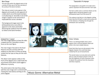
- 1. Music Genre: Alternative Metal Main Image Composition / Layout Colour Scheme Typography & Language The shot type within the digipak seems to be a variety of close-ups of the face and also of the variety of the band members. The mise-en-scene is very sparse in the digipack and visually its only apparent of a table which one of the band members is actually lying on. Secondly in one of the images it appears to be some kind of impassable bar across a window. The background images seem to be whitewashed and so very little is apparent in the shots and further distancing the audience from the ability to relate to the band members. The main image appears to have the sides cropped and this is possibly to show a focus on the main figure. The main image is focused on the facial features and also connects with the audience as they feel as if they are being sucked into her eyes as they are the main features. The album name appears solely on the front of the digipak and is underneath the actual band name which could suggest a difference in priority The artist name is the main focus along with the main image and is centered with it being the most obvious writing on the entire digipak There is no distinguishable colour and it appears that a contrast between black and white is the most notable features Some faint blue hues are also present in the digipak, however this could have been created by the use of monochrome The overall colours are very dark and could be akin to a lack of emotion present in the cd, also the brightness of some characters seem to detach the audience from the characters and there response. The topography is very gothic in its style and is used to represent the band and their main style. The font is white and is a common theme on the digipak where everything appears to be whitewashed apart from the actual CD The audience may feel as is the digipak is telling them that the CD itself is a dark source where all of the darkness is flooding into through the whitewash over everything.
- 2. Music Genre: Indie Rock Main Image Composition / Layout Colour Scheme Typography & Language Shot type is very orientated towards a medium shot with a focus on the band playing instruments . With the majority at eye level. Mise-en-scene shows instruments primarily through the four different shots, also the showing of the studio environment could suggest a more professional production to the music. Background images are bland with a grey backdrop to the photos being the main focus and then also a mirror is also dominant in one shot. A monochrome colour scheme is apparent with the main colours being black and white. Red becomes the supporting color and becomes more dominant as the digipak continues. Overall the colours present demonstrate a dark atmosphere and then the use of red could signify danger presented from the music. The topography is very bold and appears to be very identifiable to the audience. It also could hint at the harsh rock that the band will perform. The colour rotates between black, white and red, these colours could signify danger and death. Whilst the white album name could suggest it has lighter tones within the songs. The audience may start to feel ‘pumped’ when looking at the digipak as it keeps with the usual indie rock conventions and allows for a brief moment of reflection before they listen to the song. The main image appears to have been cropped at the sides for the second photo and some overlap from another photo is shown The main image focuses on the band and is centered with it focusing on showing all of the band members within the shot The album name is underneath the band name, however this also shows how the main identifier should be the band instead of the album name. The band name is another major focus, however it is incredibly small in the entire digipak when compared with the rest of the photo.
- 3. Music Genre: Nu Metal Main Image Composition / Layout Colour Scheme Typography & Language The shot type maintains a large amount of long shots of the band in the focus or just long shots of nature, thereby representing distance generated between the artists and audience. There is limited mise-en-scene used in the video with basic costumes in the colours of black and red, a pentagram is also present on the disk itself. The image of a field is the most common image with this being the only background image. The main image is cropped to position the band in the center. The main image is centered with the band in the center and clearly visible through the reeds. The album name is small and to the right of the artist name, it also is not clearly visible from a distance. The artist name is to the right of the album name and considerablly larger than the album name making it one of the most recongnisable features of the digipak. The most noticeable colour would be the white colour in the sky and also the grey green colour from the long reeds of grass. Black and some light shades of blue are the most identifiable supporting colours in the background images, with red being the most when identifiable on the bands outfits. The colour pallet as a whole is varied however the majority of it is hidden behind a weird effect which darkens the image as a whole. The typography is very gothic and represents the genre of the digipak and also could be a representation of the content within the digipak. The font is in a typical black colour which further emphasizes the gothic tone and suggests a lack of emotion within the video. The cover speaks to the audience by showing a group of people in a fairly lonely area with no other distinguishable features present apart from the band and the long blades of grass.
- 4. Music Genre: Post Hardcore Main Image Composition / Layout Colour Scheme Typography & Language There is a limited use of shot type in the fact that there is not real signifier of an actual photo, instead this is replaced by the main image of the lion. In correspondence with the lack of shot there is no mise-en-scene used on the digipak at all. The background image is the main focus with a weird focus on a stone background with some subsequent cracks and detailing among the different segments The main image seems to be the lion in the colour red which could correlate with the characteristics of a lion and then also the colour could show that it is dangerous. The main image is focused centrally which means the audience see it as the first thing and will be able to identify the album cover from a-far The album name is underneath the lion in the shot and is underneath the artist name which shows how the artist is more recognizable than the album name. The most dominant colour is grey from the background image and is very repetitive in its styling. The colour red is the most obvious supporting colour with the lion image being the main source of this colour. The overall colour palette of the digipak is very dull, however the red colour adds a different alterative to the monotonous grey The topography is very old fashioned in its presentation, however the artist name is in a completely different font and very difficult to read clearly The font is very bland and only in a grey colour which is very boring. The cover speaks of professional attitudes mixed in with old fashioned values due to the topography and main lion image. The artist name is focused centrally, however it is at the very top and almost demonstrates how important it is to the total recognition.