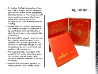
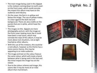
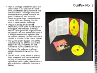
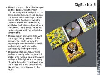
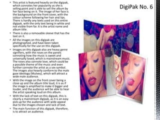
This document analyzes and summarizes several music album digipaks. For one digipak, the summary notes that it lacks images and has a simple orange and yellow color scheme, with text in big letters to identify the artist and album title in a retro, 1970s style. A second digipak features a front cover image of meteors that could represent the album's impact and appeal more to an indie audience with its cosmic theme. A third colorful digipak uses images of instruments to indicate an upbeat, happy genre and brands the artist as retro and summer-focused in style.
2. On this first DigiPak that I analysed, there
was a lack of images, which is a negative
point because it then has no iconography.
The colour scheme is very simple too, with
background in orange and all writing in
yellow, which is clear against the
background, but this is not very stand out
in a shop.
The text itself has the artist name at the
top, and the album title at the bottom in
big clear letters, which connotes that is
what the artist wants to be recognised by
the audience.
The styling of this digipak comes from the
font originally, which has a more retro
style to it, like the disco signs of the 70s,
which also is connoted through the title
of the album, ‘groove’ a term which was
used more often in that era.
The only branding on this digipak is the
use of the 3 o’s on the title groove, which
may be something artist want to be
specific to be them, however it is not very
memorable.
The main function for this digipak is to
inform, with the credits on the panels.
3. The main image being used in this digipak
is the meteors coming down to earth used
on the front cover, which could connote
the impact this album may have on the
audience and industry.
On the cover, the font is in yellow and
below the image. The use of yellow makes
it a clear against the dark red and
background. There are also credits on the
panels that are in white, which have the
function.
The images on this digipak are more
photography and art, with the image on
the front cover looking more like it could
have been a real scene, which may
connote the style of this album; it may be
more about real situations, not as light
hearted as other albums.
With the use of the meteors, this could be
a rock album, however as the theme has a
more cosmic theme, this may be
appealing to an indie audience.
The image and text on the colour feature
the same colour, which will create a bond
between what is being said in the text and
the initial impact the image has on the
viewer.
Due to the colour scheme and image, this
seems like it may be more of an indie
album than mainstream.
4. There is an image on the front cover that
takes up half of the space on the front
cover, with the rest being the album title
and artist name. The image shows the
artists instrument, which connotes the
genre of the music. This is further
connoted by the bright colours that are
used on this cover, showing that this
music is more upbeats and happy.
The panels are covered in credit
information, which is the main function of
this digipak. The text itself is in black,
which is clear against the bright coloured
background. The font on the front cover is
in a bright yellow colour against a pink
background. Yellow is the only constant in
colours, as it is also on the cd and a panel.
This again is a retro digipak, with all the
colours looking like a throw back to the
disco of the 70s, pop of the 80s and
commercial Hip-Hop of the early 90s.
This brands the audience as a happy
upbeat, also exclusively summer time
band.
This will attract many people in a music
shop, however it may be somewhat offputting, so this is more likely to be an
indie album, with a niche target audience
who is definitely looking for this style of
digipak.
5. Images are used all over this
digipak, with the panels shown as a
keyboard, which connotes the
genre and artist style of music
without having to listen to the
album, which is a positive function
of this digipak. Also the cd is
presented as a vinal record, which
may be a throw back to the origins
of the music on the album.
The text is white on the panels,
which is used for credit
information.
As the artist used these images,
they are branded as someone who
is heavily influenced by the orgins
of the music they are making, and
likes to pay tribute to them. This
further connotes that the audience
is heavily niche, as this digipak was
made to appeal to particular kind
of person, and the majority will not
pick this up unless the arte looking
for it.
6. There is a bright colour scheme again
on this digipak, with the main
colours being yellow and pink on the
cover, and yellow, green and blue on
the panels. The main image is at the
centre of the front cover, with the
title o at the bottom in the black,
which is a fairly standard layout for a
front cover. There is not a lot of text
on this digipak, with the only visible
text the title.
This is a mainly animated style, with
the images being drawings of the
animals. This could connote the
artists style, which could also be wild
and animated, which is further
connoted by the bright colours.
This is made for a particular niche
audience, mainly indie, because this
sort of style will not appeal to a wide
audience. This digipak acts as a way
of giving the audience a view of what
the artist’s music and personality is
like without them listening to the
music.
7. This artist is featured heavily on the digipak,
which connotes her popularity as she is
selling point and is able to sell the album by
her face being on it. The image of her face is
the background on the front cover, with the
colour scheme following her hair and lips.
There is hardly any texts used on this entire
digipak, with the only text being in white and
not visible from far. It is the artist name and
album title.
There is also a removable sleeve that has the
text on it.
All the images on this digipak are
photographed, and have been taken
specifically for the use on this digipak.
Images on this digipak also are heavy genre
signifiers, with the roses on the panels
connoting how the music is sweet and
universally loved, which is mainstream music.
The roses also connote love, which could be
a possible theme of the music and even
further connote the artist as a sex symbol.
The images also heavily conform to the male
gaze ideology (Mulvey), which will attract a
wide male audience.
With the image on the front cover being a
close up and the album title loud, it is as if
the image is amplified to make it bigger and
louder, and the audience will be able to hear
the artist speaking loud on this album.
With the lack of text on this digipak, this is
clearly a mainstream digipak, as it is an easy
pick up for the audience with wide appeal
due to the images chosen and lack of text.
The main function of this digipak, therefore,
is to attract an audience.